Sunburst is a multilevel donut chart, used to visualize hierarchical data, depicted by concentric circles.
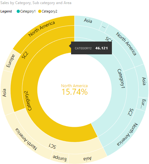
Sunburst chart is used to visualize hierarchical data, depicted by concentric circles. The circle in the centre represents the root node, with the hierarchy moving outward from the center. A segment of the inner circle bears a hierarchical relationship to those segments of the outer circle which lie within the angular sweep of the parent segment.
See also Sunburst chart at Microsoft Office store
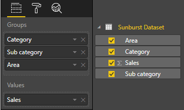
- Category - Field with a list of categories for each circle segment. It can accept many values.
- Values - Field with values for Category field. It can accept one value. Also this field is used for cross filtering with other visuals.
You can select any segment of the chart for data filtering. For cleaning of selection you should click outside to "Сlear" button on the right top corner of a visual.
-
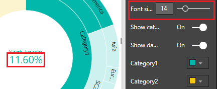
Font size: size of the label in the center of sunburst (see screenshot):
-
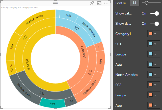
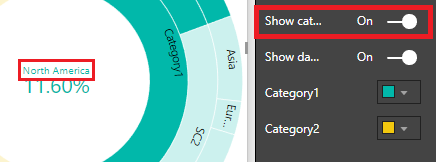
Show category label: show category label in the center of the visual
-
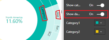
Show data labels: show text labels inside of arc segments of Sunburst
-
Category colors: to change colors of each category of the visual. Changing element color will also change its child elements color, but if you changed child element color before then it'll keep unchanged.
