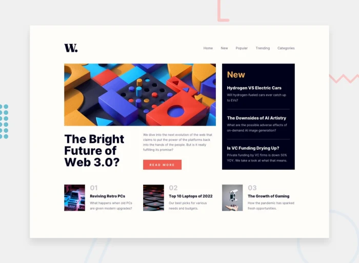
News Homepage
Table of contents
Overview
Visit a tech news homepage for the latest updates on tech news, product launches, and expert analysis. Stay informed and ahead of the curve in this fast-paced industry!
The challenge
Users should be able to:
- View the optimal layout for the interface depending on their device's screen size
- See hover and focus states for all interactive elements on the page
Screenshot
Links
- Live Site URL: News Homepage
My process
I usually start by breaking it into parts(components). I started creating the main content. Layouting it with CSS Grid. Create and put each of its component. Make it responsive. Then I move the navbar. Layouting it with flexbox. Create and put each of its component. Make it responsive.
Built with
- HTML5
- CSS3 (CSS Grid)
What I learned
- Semantic HTML
- Using compressed fonts to minimize FOUT or FOIT and maximize initial load speed.
- Art Direction
<picture>
  <source
    media="(max-width: 425px)"
    srcset="./assets/images/image-web-3-mobile.jpg"
  />
  <source
    media="(min-width: 426px)"
    srcset="./assets/images/image-web-3-desktop.jpg"
  />
  <img
    class="header-img"
    src="./assets/images/image-web-3-desktop.jpg"
    alt="An Art for Web 3."
  />
</picture>- Checkbox Trick
#nav-menu-checkbox:checked ~ .nav-links {
  left: 35vw;
}
Continued development
In the future projects, I want to create a website with mobile-first approach.
Useful resources
- Checkbox Trick - This helped me toggle the sidebar.
Author
- Website - Gerwin Baula
Acknowledgments
I wanna thank fontsquirrel for free fonts. Check em out!
