The Alchemists
An exploration of labor force metrics changing over time at the county level.
Visualizations
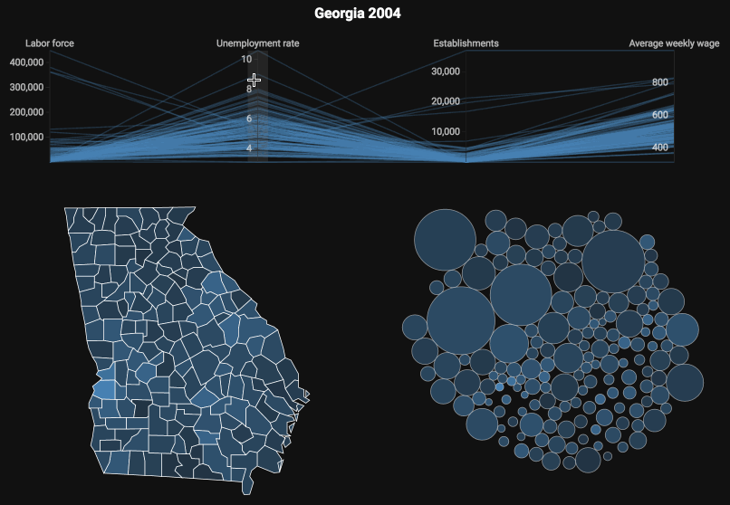
Single Year: Georgia 2004
Investigate differences between counties for a single year of data. An alternative "bubble chart" is used to give a sense of proportionality for counties that have high rates of unemployment but have a very small population.
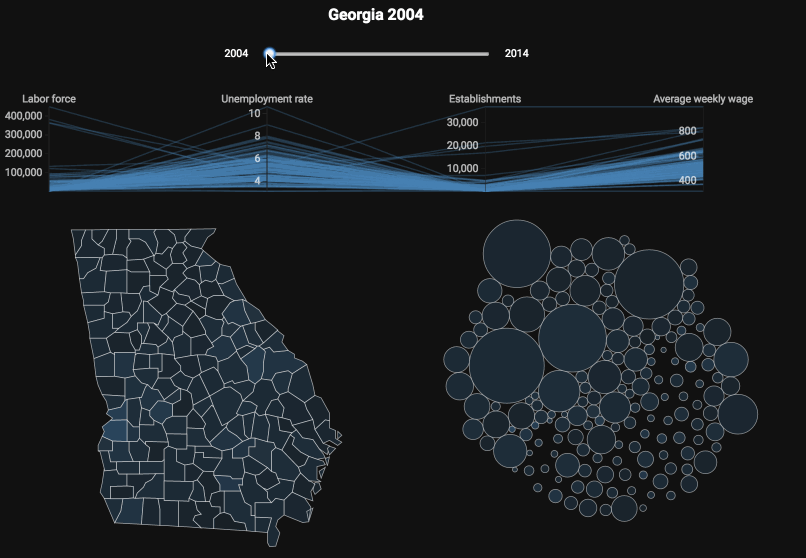
Multiple years: Georgia 2004 - 2014
Quickly see the same visualizations as the one above for the years 2004 through 2014. You can clearly see the effect of the 2008-2009 recession as the unemployment rate is color on an absolute scale.
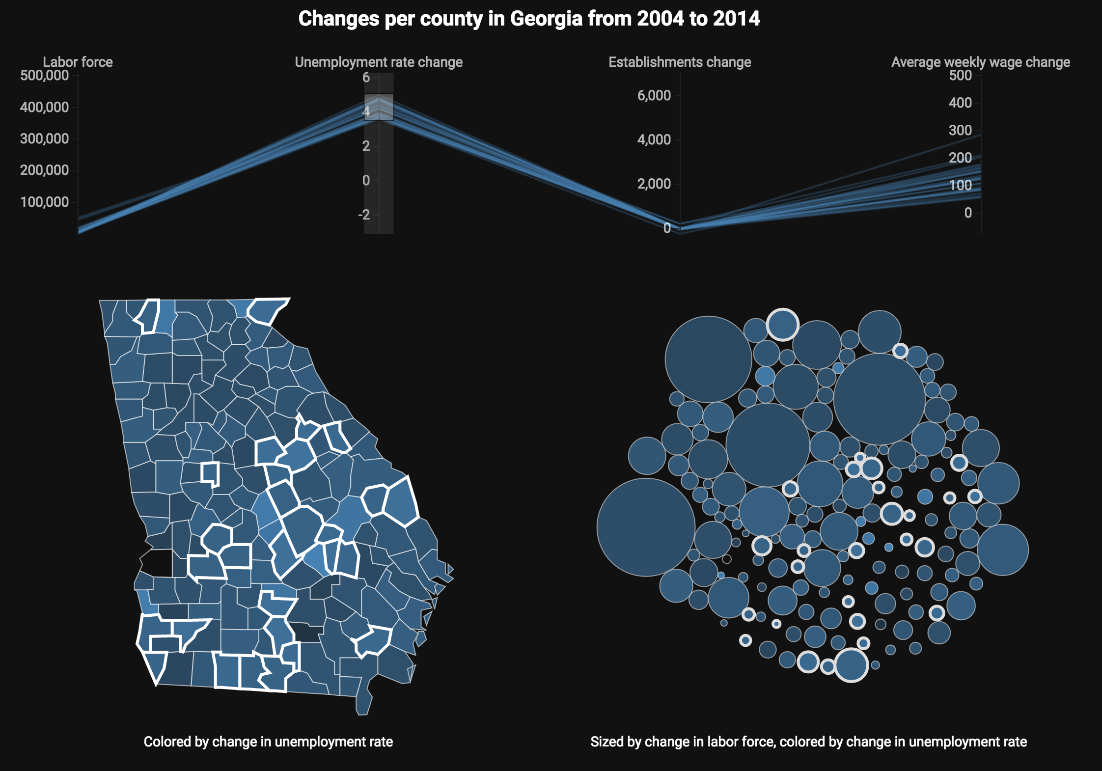
Compare two years: Georgia from 2004 to 2014
Compare two years with each other directly, by taking the difference of each metric (unemployment rate, establishments and average weekly wage) and rendering the difference.
Further work
With more time we would like to:
- explore similar techniques for showing all the counties at once.
- investigate SSI disability claims alongside labor metrics
- investigate more granular wage and establishment data (breaking down by industry at various aggregation levels)
- explore more visualization types, particularly the commet chart for showing changes in aggregate statistics over time
- explore rural vs. metropolitan changes (town populations declining http://blockbuilder.org/enjalot/fe88df78ff6982c11cb92002b7410d84)
Methodology
We chose to focus on exploring available data at the county level as it is the most granular and consistent spatial data across the agencies we are interested in comparing (BLS, Census, SSI). An interesting problem given the time constraints was the overwhelming amount of quality data from BLS, we spent a good bit of time narrowing down what we would try to extract and use. This was a nice challenge given that usually at least 50% of the work is cleaning data (this was still the case with Census and SSI unfortunately).
We downloaded and investigated the below data sources. We wrote python scripts in Jupyter and pandas to process some excel files. We also wrote some node.js scripts to download and manipulate some data. It should be noted that there was a good deal of manual investigation into making sense of the various data sets and making sure we could get the same fidelity data across different years and agencies.
The visulizations were created in d3.js with the help of the d3 parallel coordinates library.
Data Sources
BLS LAU
BLS QCEW
Quarterly Census of Employment and Wages
Directory of downloads per year
Data slices by county and year
BLS Area codes (FIPS)
BLS GPS
Geographic Profile of Employment and Unemployment
Social Security
US Atlas
counties and state geography in topojson format
Census (population estimates)
1990-1999:
https://www.census.gov/popest/data/counties/asrh/1990s/CO-99-09.html
2000-2010
https://www.census.gov/popest/data/intercensal/county/county2010.html
2010-2014
PEP_2014_PEPAGESEX http://factfinder.census.gov/faces/tableservices/jsf/pages/productview.xhtml?pid=PEP_2015_PEPANNRES&src=pt