The censusviz package
provides an interface for exploring and visualizing historical racial
demographic census data (1950-2020) sourced from
IPUMS for any region in the United
States (by county). The package provides functionality for visualizing
the data on leaflet maps as well as for accessing the data in an
accessible, tidy format such that the user can then create their own
visualizations.
Since the data is very large, it is hosted on GitHub and is not contained in the package itself. The package includes a few smaller samples of the data as examples. The raw data can be accessed here. See the vignette for more details.
This package was inspired by the nepm package. The nepm package was
initially created as part of a
DSC-WAV project in fall
2021 funded by the NSF with the goal of creating
an interactive map to
visualize the demographics over time of Springfield, MA in partnership
with New England Public Media.
censusviz is hosted on GitHub and can be installed by running the
following function:
remotes::install_github("rporta23/censusviz")library(censusviz)We have included 5 sample datasets to demonstrate the functionality of the package. These datasets consist of:
- Three sample datasets for users to immediately visualize the
demographic data for any census year 1950-2020 on a map:
boston_samplesanfrancisco_samplemanhattan sample
Users can visualize these datasets on a leaflet map using the
base_map() and add_people() functions, as demonstrated in Example 1.
- One dataset to demonstrate the structure of the dataset returned by
the
get_data_wide()function:madison_data_wide
This dataset can be used to visualize the census tract boundary lines
for Madison County, NY on a leaflet map using the base_map() and
add_tracts() functions, as demonstrated in the vignette.
- One dataset to demonstrate the structure of the dataset returned by
the
get_data_long()function:boston_data_long
This dataset can be used for exploratory analysis of racial demographic
data for Suffolk County, MA using dplyr and ggplot2 functionality,
as demonstrated in Example 2
See the vignette and full documentation for more information on how to access and visualize the data for any county in the U.S.
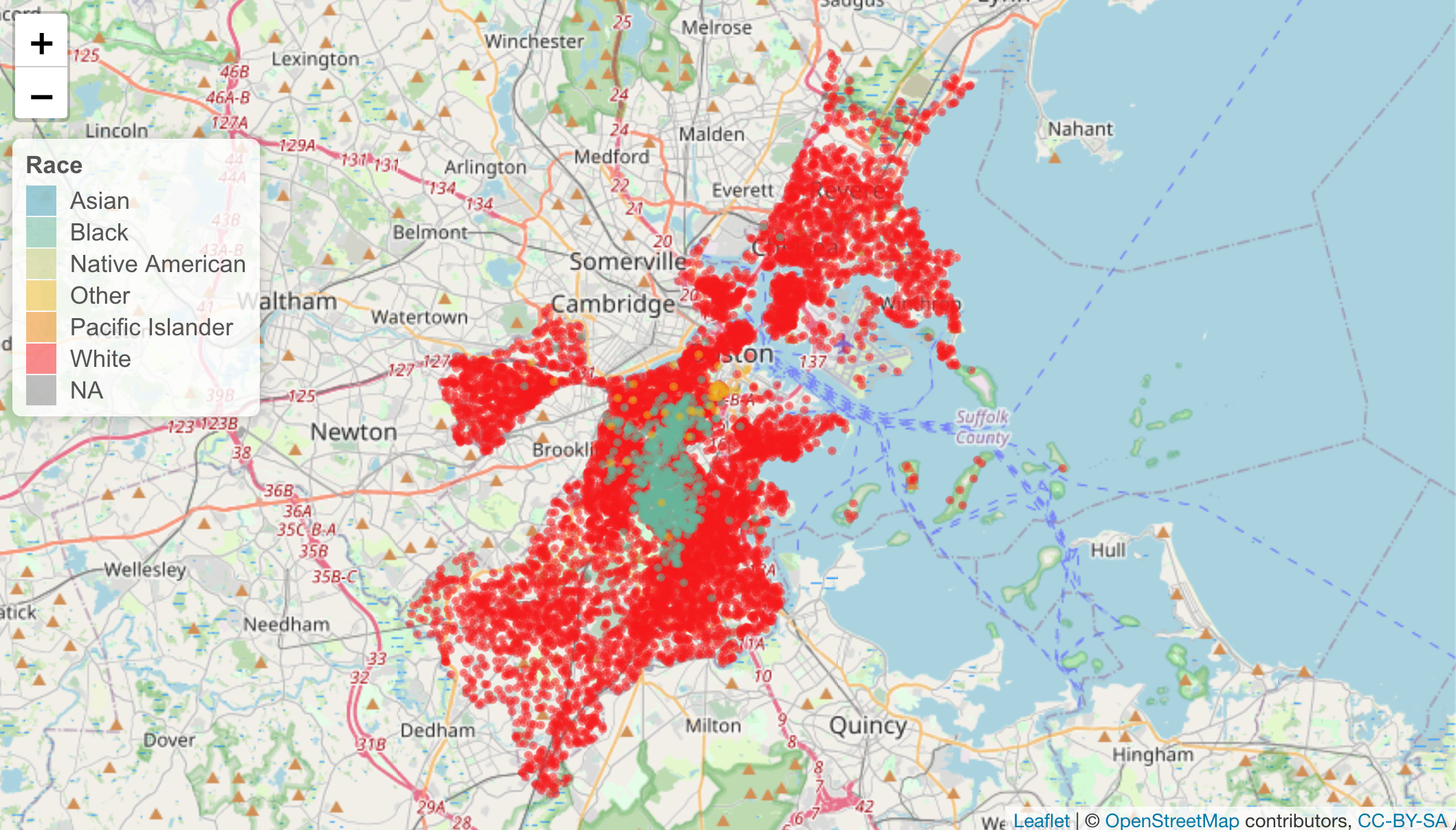
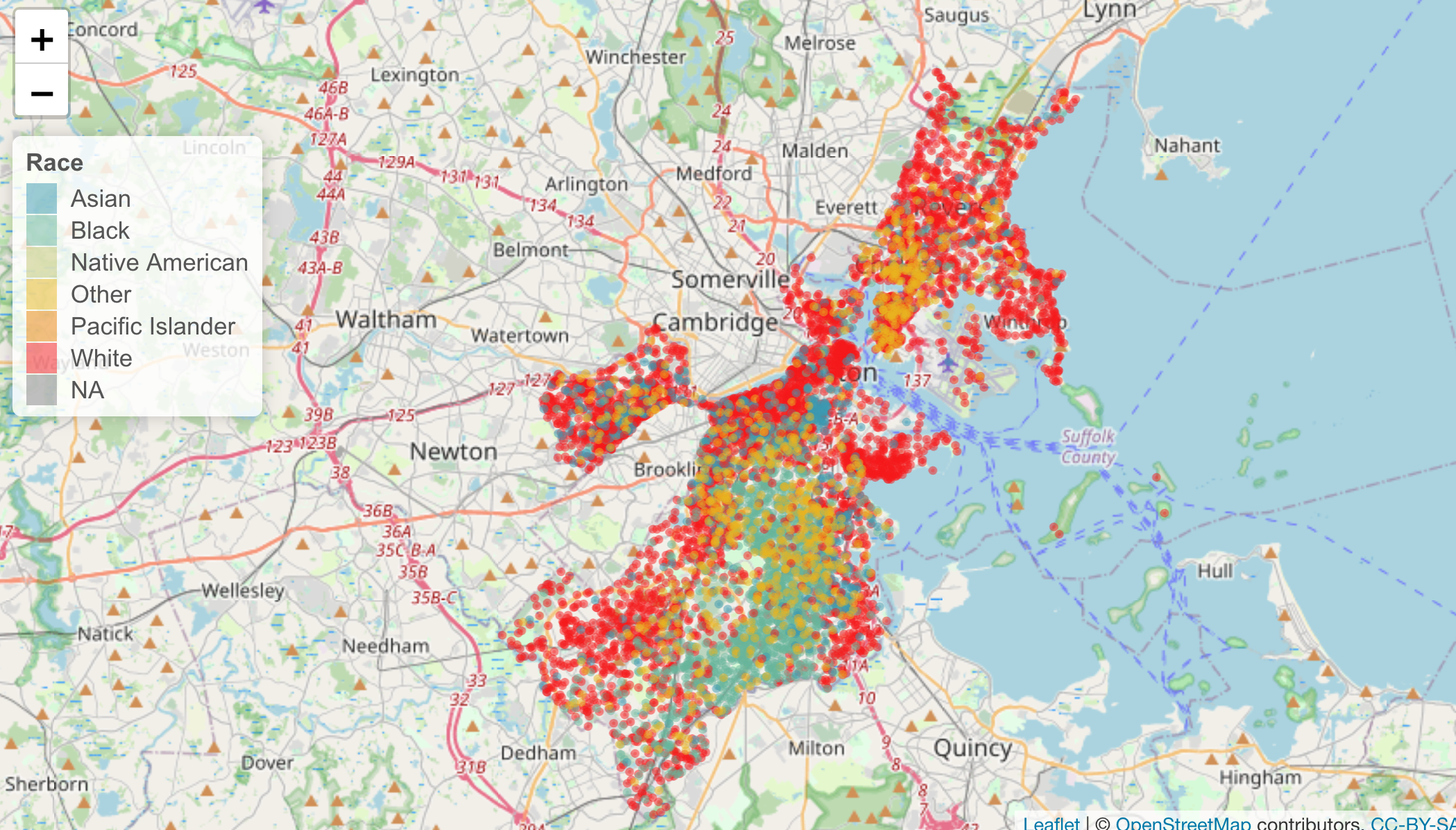
Visualize spatial distribution of racial demographics for any census
year between 1950-2020 using add_people(). Dataframes with locations
of dots to plot on the map for Boston, MA, Manhattan, NY, and San
Francisco, CA, are included in the package. However, you can get the
data for any county in the U.S. using the functions provided in
censusviz. See the vignette for more details on how to create this
type of map for any region in the U.S.
# create map for Boston, MA in 1960
base_map() %>%
  add_people(1960, boston_sample)
# create map for Boston, MA in 2000
base_map() %>%
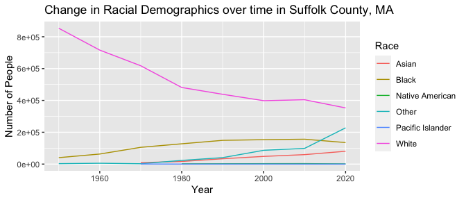
add_people(2000, boston_sample)Create a line graph to show changes in demographics over time for Boston (Suffolk County), MA. The sample of data to create this graph for Boston is included in the package. See the vignette for details on how to create this type of graph for any region.
head(boston_data_long)
#> # A tibble: 6 × 11
#>   GISJOIN   STATE COUNTY variable     n num_people pct_people  year census_label
#>   <chr>     <chr> <chr>  <chr>    <dbl>      <dbl>      <dbl> <dbl> <chr>
#> 1 G2500250… Mass… Suffo… DFB001    3550       3831    0.927    1980 White
#> 2 G2500250… Mass… Suffo… DFB002     188       3831    0.0491   1980 Black
#> 3 G2500250… Mass… Suffo… DFB003       8       3831    0.00209  1980 American In…
#> 4 G2500250… Mass… Suffo… DFB004       0       3831    0        1980 American In…
#> 5 G2500250… Mass… Suffo… DFB005       0       3831    0        1980 American In…
#> 6 G2500250… Mass… Suffo… DFB006      10       3831    0.00261  1980 Asian and P…
#> # … with 2 more variables: race_label <chr>, is_hispanic <lgl>
# group by year and race_label and summarize to create dataframe for line graph
data_long_sum <- boston_data_long %>%
group_by(year, race_label) %>%
summarize(total = sum(n))
#> `summarise()` has grouped output by 'year'. You can override using the
#> `.groups` argument.
# create line graph to show change over time in demographics
ggplot(data_long_sum, aes(x = year, y = total, color = race_label)) +
geom_line() +
labs(
title = "Change in Racial Demographics over time in Suffolk County, MA",
x = "Year",
y = "Number of People",
color = "Race"
)If you are interested in exploring U.S. census data, see related package
tidycensus


