-- (Jan. 22)
| React | 16.0.0 | √ |
| Responsivity | 2 breakpoints | iPad,iPhone7,8,X(with some sizing problems),GalaxyS5 |
| Normalization | normalize.css | √ |
| Layout | CSS Grid | √ |
| CSS Variables | in :root{} of stylesheet | √ |
| Tiny Stylesheet | Styled-Components | √ |
| Validation | npm-validator | √ |
| Tooling | Webpack | √ |
| babel-core | env,react | √ |
| Animations | CSS & SVG | √ |
| Routes | React-Router) | √ |
| Hosting | Heroku | √ |
| Slider | Handcoded | √ |
| TabIndex Attrs | a-tags and btns | Pending |
-
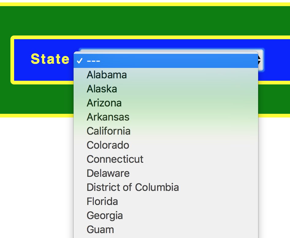
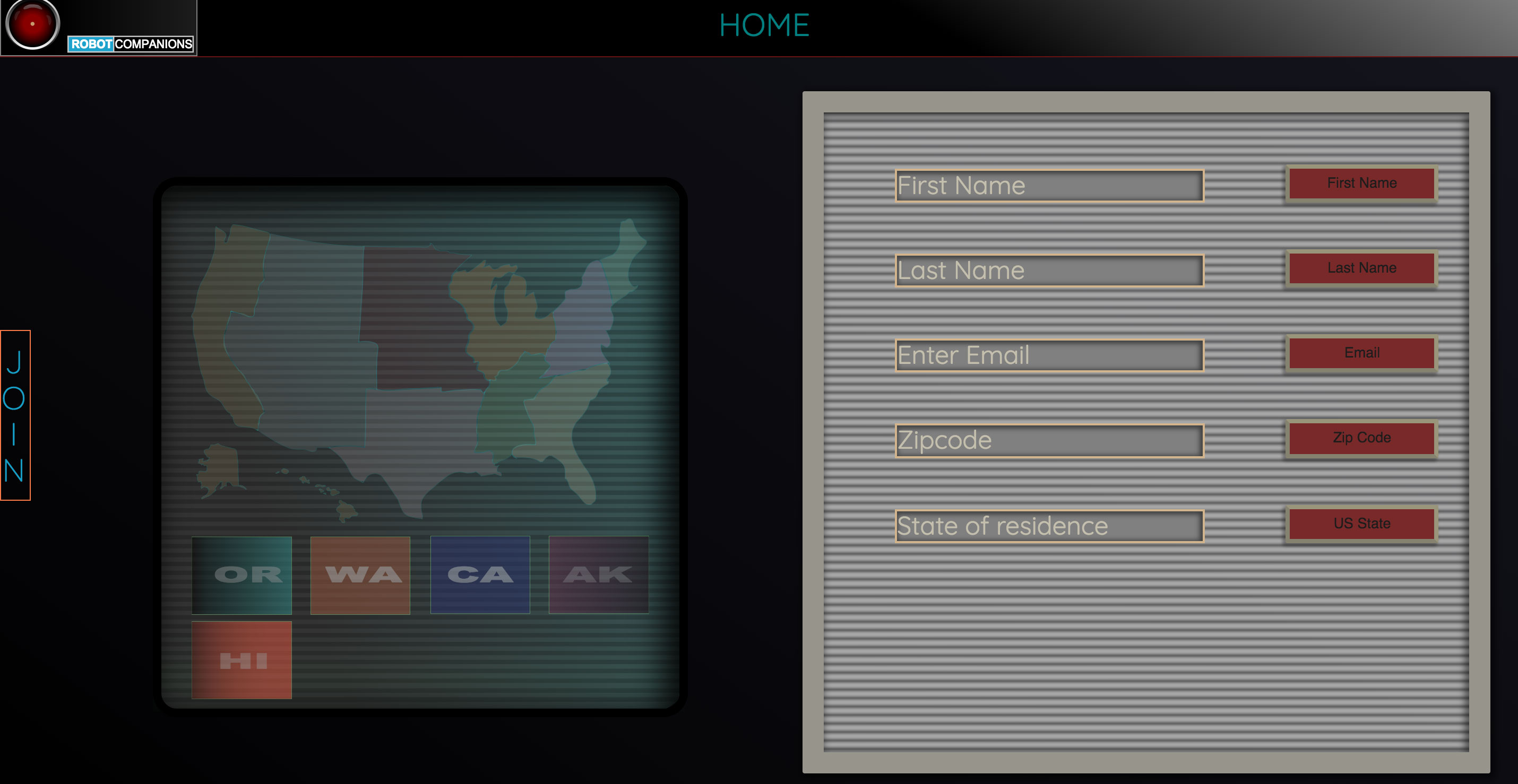
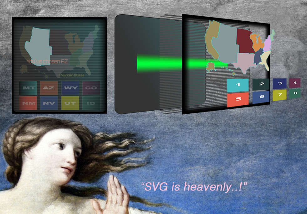
A new approach to the (United States) drop-down in the form of a clickable map.
-
Only 9 rules in stylesheet. Almost completely done in styled components. Challenged myself to exploit the powers of StyledComponents and theming. The cost comes as CSS being parsed twice--by css parser and by the js
-
Executing audio with the signup page as a short UX response to valid & invalid inputs by the user. (pending)
The coding challenge was simply to clone the general style of the Doosan Baseball & to add a second page with user validation:
- First Name
- Last Name (with dashes and apostrophes)
- US zipcode
- US States Dropdown
In the spirit of the hiker's ethic of "leaving a site nicer than when I found it", I was ambitious to add an improvement or two while trying not to do too much damage :).
I met with both success and... "yet-to-be-solved" problems.
Implemented a version of a slider/carousel within a very few lines of javascript. After a few hours & tears, it's functional.
This has nowhere near the functionality that the jQuery Owl-Carousel plugin has (used on original site), but I managed a quick and dirty & very light-weight version.
...but it's a bicycle--not a Lexus.
(I was as ambitious to do a youtube API... but I didn't want to get too into the weeds with trying to do something impressive--while missing the core points of the coding that was requested which was sign-up and user validation.)
I wanted to give a kind of sinister--but--satirical feel to the idea of AI and the coming "robo-pocalypse". I therefore chose this theme of images and styling.
I took a risk by replacing videos with .gifs and this lead me to a robotics theme. I simply wanted people to smile when they visit.
The cost comes at having delivered a non-generic feel to the site I've built.
The larger-(more serious) cost comes at page-load.
15 .gifs with any of up to 100+ frames. The result is it is EXTREEMLY slow. (I didn't build the slider mindful that close to 1500 images would be loading at once.)
The result is something with a theme of "shitty-robots". https://www.reddit.com/r/shittyrobots/ The Hero video is taken from videos done by a woman who works in robotics. https://www.patreon.com/simonegiertz
Onboarding and signup is a critical process. If a first-visit to a site is a first meeting...the signup is an agreement to start dating. This critical process, when done well, can & ought to be an enjoyable experience. It is a welcome.
Engagement ought to be engaging. So, let's pump up that oxyticin!
Therefore, instead of a conventional drop-down
It's a vector display monitor with a glitch.
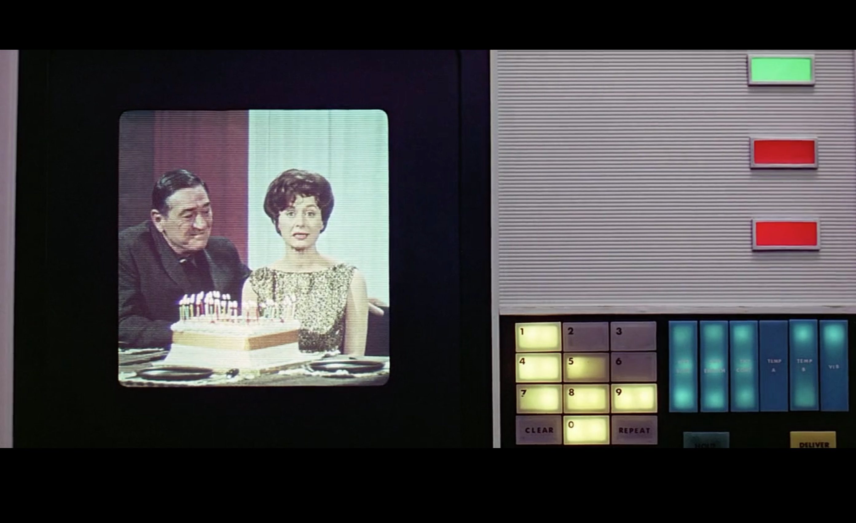
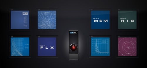
(I Recently watched Stanley Kubrick's 2001 and liked the drab and deliberately ugly colors.)
I used these two images for reference:
- (SVG) base layer with drab-green linear gradient
- (SVG) rect with a gradient that runs up the screen every 20s or so with @keyframe animation infinitely.
- (SVG) single-pixel-wide horizontal lines depicting deinterlacing
- (CSS) div with inset box-shadow for a vignette
- (SVG) A clickable interactive map divided according to US Census Divisions (hoverstate reveals separate "bursts" of color to contrast with the drab style of the entire page and adjacent paneling).
- (SVG) buttons with corresponding states appear on click.
- (SVG) finally a resulting "You've chosen VA..." appears offset in the map.
Here is an icon in svg (illustrator) I did for this site.
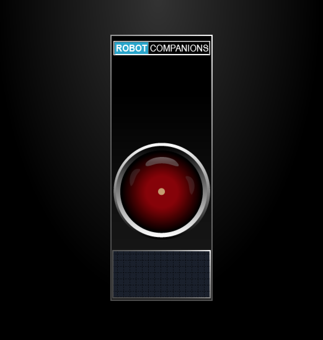
- scrnshot to cover the gifs to simulate playbuttons
- landscape breakpoints for iphones. --> Now, they look pretty awful.
- reworking of the color palette and typography.
- prep data inputs for back-end storage.
- yarn run build
- yarn run dev-server
- yarn run build:prod
-
Deprioritized media queries during the development. As a result the layout lacks consistency....More difficult targeting of elements, more css, more queries, less fun for the user and developer.
-
Used rems for font-sizes. Boo! 🤮 Implemented Solution: Perfect use-case for css-variables at :root{} in the stylesheet.
-
Too much styling early in the dev-process. --Hey, future Self, hook up the damned routes and buttons etc before you screw around with colors and typograpy!
- Routes, then layout, then styling, then features (capiche?!)
-
Stylistically, landing page above the fold has too much movement for the human eye to handle. This is why covering those .gifs with static images would have been a good choice.
-
Comment more of the major components!
-
Gif files are too big! None are optimized! Implemented Solution: gzipped those puppies for a huge win (by comparison). TTP is much sooner (though, the browser/server still hates me).
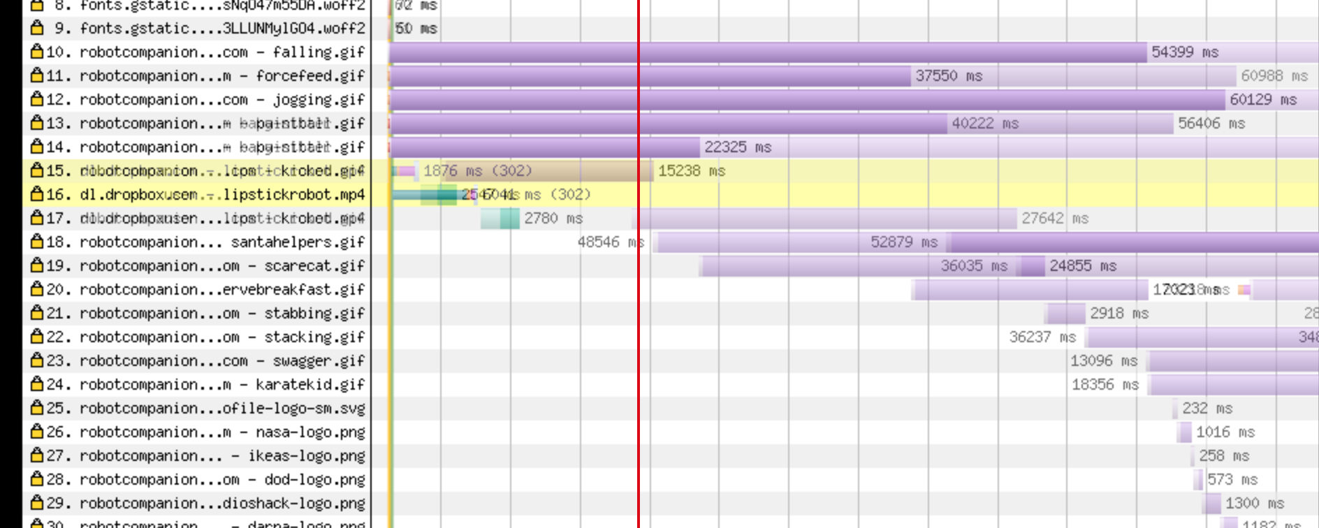
- The lighter purple represents the original file-size of gifs.
- Darker purple represents current files that are gzipped.
Film strip above is the first prod candidate. It is compared to the second which shows a complete load at 1/3rd the speed.
Complete load that once took 60s (!!!) now takes 20s
--which, yes... still sucks, (but this is only after ONE pass of gzipping gifs)
https://www.webpagetest.org/result/180119_YP_552a762ed78cd3cf4228eb1163d2b67f/
- I used id's for accurate targeting in components which, I forgot, you should never do. It completely defeats the purpose of reuse. (--What use is a component if it's only usable in one place?).
