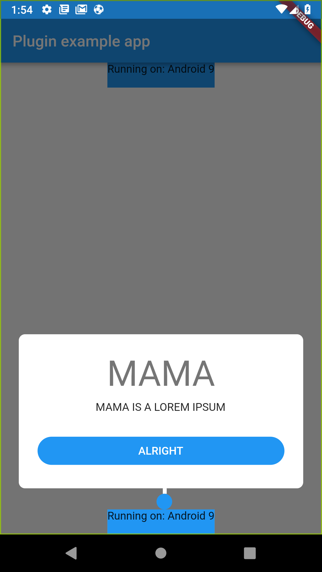
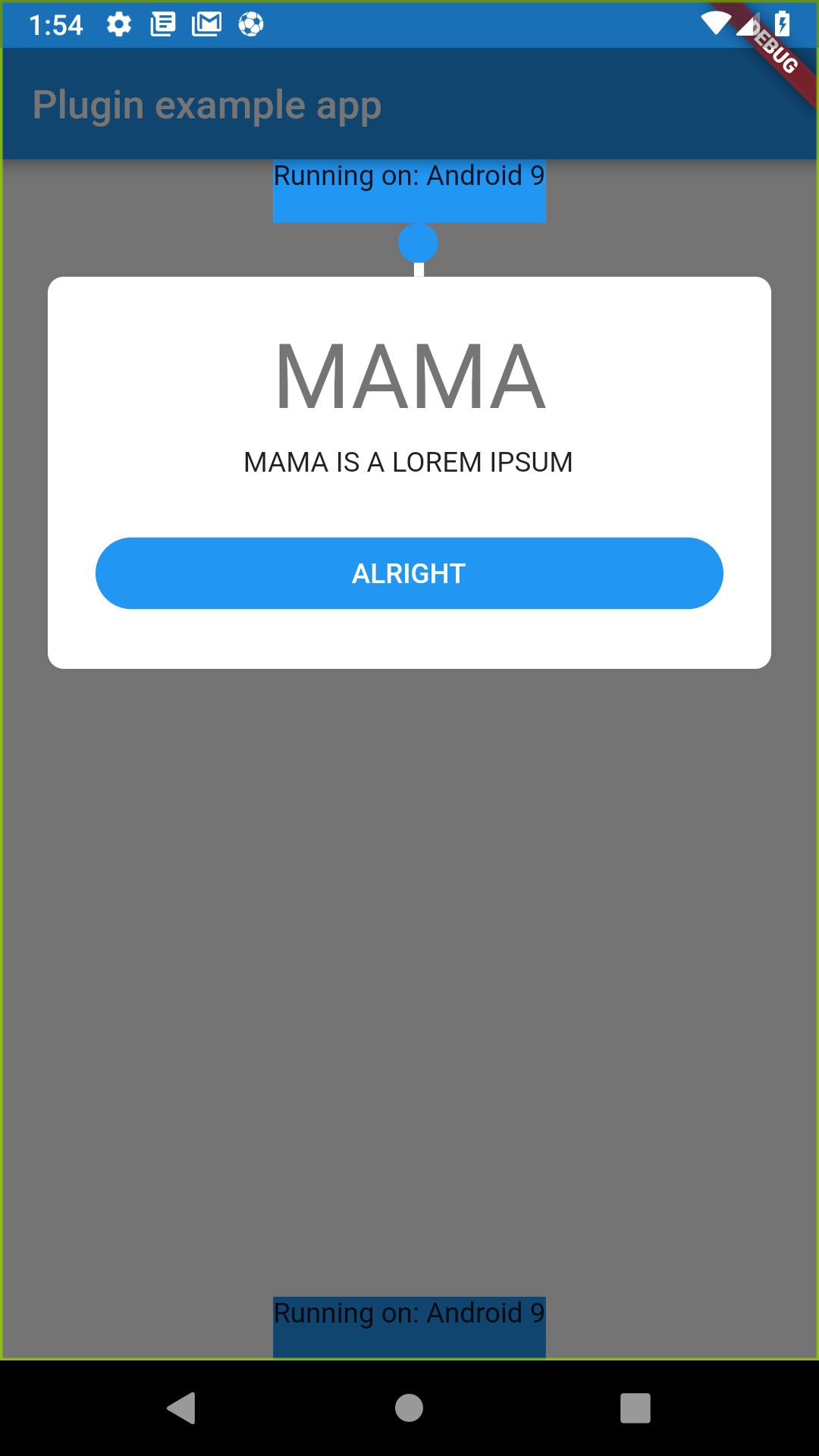
A new Flutter plugin to show introduction tooltip for first timer user of the app.
It should support both Android and iOS since it's pure written in Dart.
For help getting started with Flutter, view our online documentation.
For help on editing plugin code, view the documentation.
To install this package, you need to add flutter_introduction_tooltip (0.1.0 or higher) to the dependencies
list of the pubspec.yaml file as follow:
dependencies:
  flutter:
    sdk: flutter

  flutter_introduction_tooltip: ^0.1.0
Then run command flutter packages get on the console.
Add the import to flutter_introduction_tooltip/flutter_introduction_tooltip.dart
Create a global key and attach to the widget you preferred.
import 'package:flutter_introduction_tooltip/flutter_introduction_tooltip.dart

GlobalKey globalKey = GlobalKey();
bool isShowing = false;

@override
  Widget build(BuildContext context) {
    showTutorial(context);
    return MaterialApp(
      home: Scaffold(
        appBar: AppBar(
          title: const Text('Plugin example app'),
        ),
        body: Builder(
            builder: (BuildContext context) {
              showTutorial(context);
              return Stack(
                children: <Widget> [
                  Container(
                    width: MediaQuery
                        .of(context)
                        .size
                        .width,
                    alignment: Alignment.bottomCenter,
                    child: Container(
                      color: Colors.blue,
                      key: globalKey,
                      child: Text(
                        'Running on: $_platformVersion\n',
                      ),
                    ),
                  ),
                ],
              );
            }
        ),
      ),
    );

void showTutorial(BuildContext context) async {
    if (!isShowing) {
      new Timer(Duration(milliseconds: 100), () async {
        try {
          FlutterIntroductionTooltip.showTopTutorialOnWidget(
              context,
              globalKey,
              Colors.blue,
                  () => popAndNextTutorial(context),
              "MAMA",
              "MAMA IS A LOREM IPSUM",
              "ALRIGHT");
          print("SHOWING");
          setState(() {
            isShowing = true;
          });
        } catch (e) {
          print("ERROR $e");
        }
      });
    }
  }
If you want the dialog to be on top of the widget, use showTopTutorialOnWidget, If you want the dialog to be on bottom of the widget, use showBottomTutorialOnWidget
The reason i use delay for the execution is because i run the function on the build method, and the build hasn't done yet so i can't draw the tutorial right there, so i delayed it.
Other alternative for doing this is to use library like https://pub.dartlang.org/packages/after_layout
MANDATORY
- BuildContext (current context)
- GlobalKey (globalkey attached to your widget)
- Color primaryColor (primary color used for the button and circle pointer)
- VoidCallback positiveCallback (positive callback used when the positive button is clicked)
- String title (title of the dialog)
- String subtitlte (subtitle of the dialog)
- String positiveBtn (title of the positive btn)
OPTIONAL
- LineHorizontalPosition lineHorizontalPosition (where you want the line to be, the options is Left, Center, and Right)
- Widget childBoxWidget (the custom widget if you don't want to use the dialog i provided)
- bool showLine *defaults to true (whether you want to show the line on top of the dialog or not)
- double lineHeight *defaults to 7.0 (the height of the line you desired)
- Widget circleWidget (the circle widget at the end of the line if you want to customize it)
- bool barrierDismissable *defaults to true (whether you want the background click will dismiss it or not)
- Angga Dwi Arifandi github
Any contributions is very welcomed in this package, just fork this repository to your own github account and create a pull request with the changes description.
If you need to ask or discuss about anything, just email me at anggadwiarifandi96@gmail.com
- 0.0.4 (BREAKING)
- Migrate to AndroidX and change kotlin dependencies
- Fix example
- 0.0.3
- Fix missing commas (compile error)
- 0.0.2
- Refactor
- 0.0.1
- Initial Version

