Source data is obtained at https://data.cdc.gov/NCHS/Provisional-COVID-19-Death-Counts-by-Sex-Age-and-W/vsak-wrfu.
To validate the data, first I will recreate some of the exhibits in Briand’s lecture featured in the article. Since I’m using R instead of Excel, I can use the Viridis package, which is helpful for people experiencing colorblindness in viewing color-contrasted visualizations.
## [1] "That worked OK? TRUE"
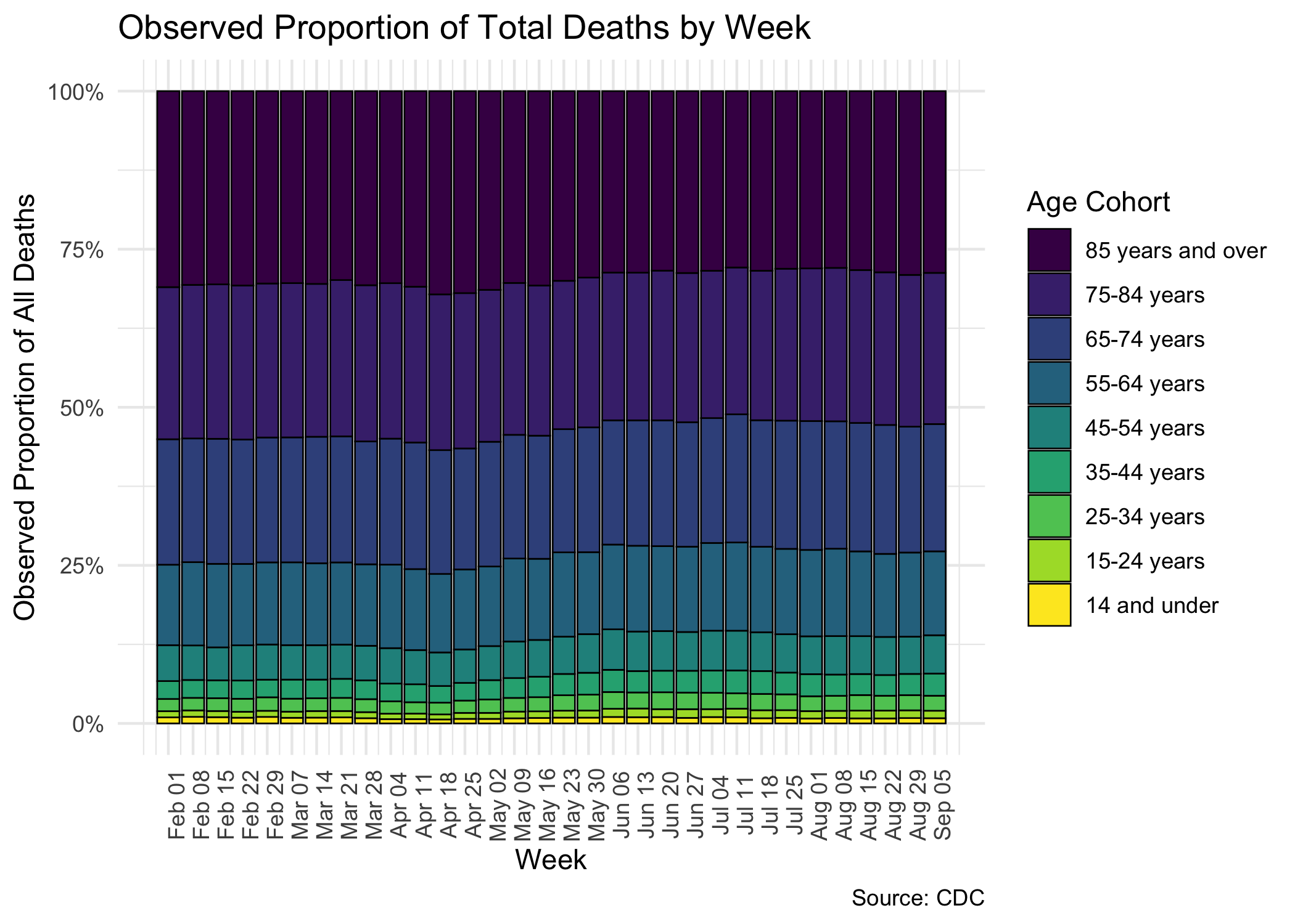
This chart lines up very nicely with Briand’s version of the same presentation, so I’m happy to call this a good shot at making sure we’re dealing with the same data. I’m calling the validation portion of this exercise complete.
Let’s also take care to note that the preceding graph does not describe the mortality rate broken out by cohort. Rather, it describes the proportion of observed deaths out of the total number of observed deaths, broken out by age cohort. These two things are very different measurements, though a quick reading of the article in question appears to (a) make a case for the lack of excess deaths observed in 2020 which is, to be technical, totally nutso; and (b) sets up the argument that there is some kind of misunderstanding of COVID mortality figures because the total proportion of mortality by age group has not changed over time. Again, trying to be totally charitable here, but I refer you to the following direct article quotation:
“These data analyses suggest that in contrast to most people’s assumptions, the number of deaths by COVID-19 is not alarming. In fact, it has relatively no effect on deaths in the United States.”
Let’s explore this assertion further.
Now we’ll look at another presentation of the data available on the CDC website, where we take the total overall proportion of deaths, and slice and dice that by age cohort, and by time period, and look at this in data visualization again in different ways - and you are free to modify and run this code to explore different angles yourself!
Using the CDC Wonder system we can query mortality by the same age banded cohorts all the way back to 1999! Use of this system requires you agree to not use the data for bad purposes such as using it to positively identify people, so I can’t write the code that generates this document to pull the data in automatically. Nonetheless, the data used here is retrieved from the link above on Sat Nov 28 2020 at around 8:30 PM. Finally, since death is seasonal over time I’m only going to look at data on an annual basis, but split out into the same age-banded cohorts.
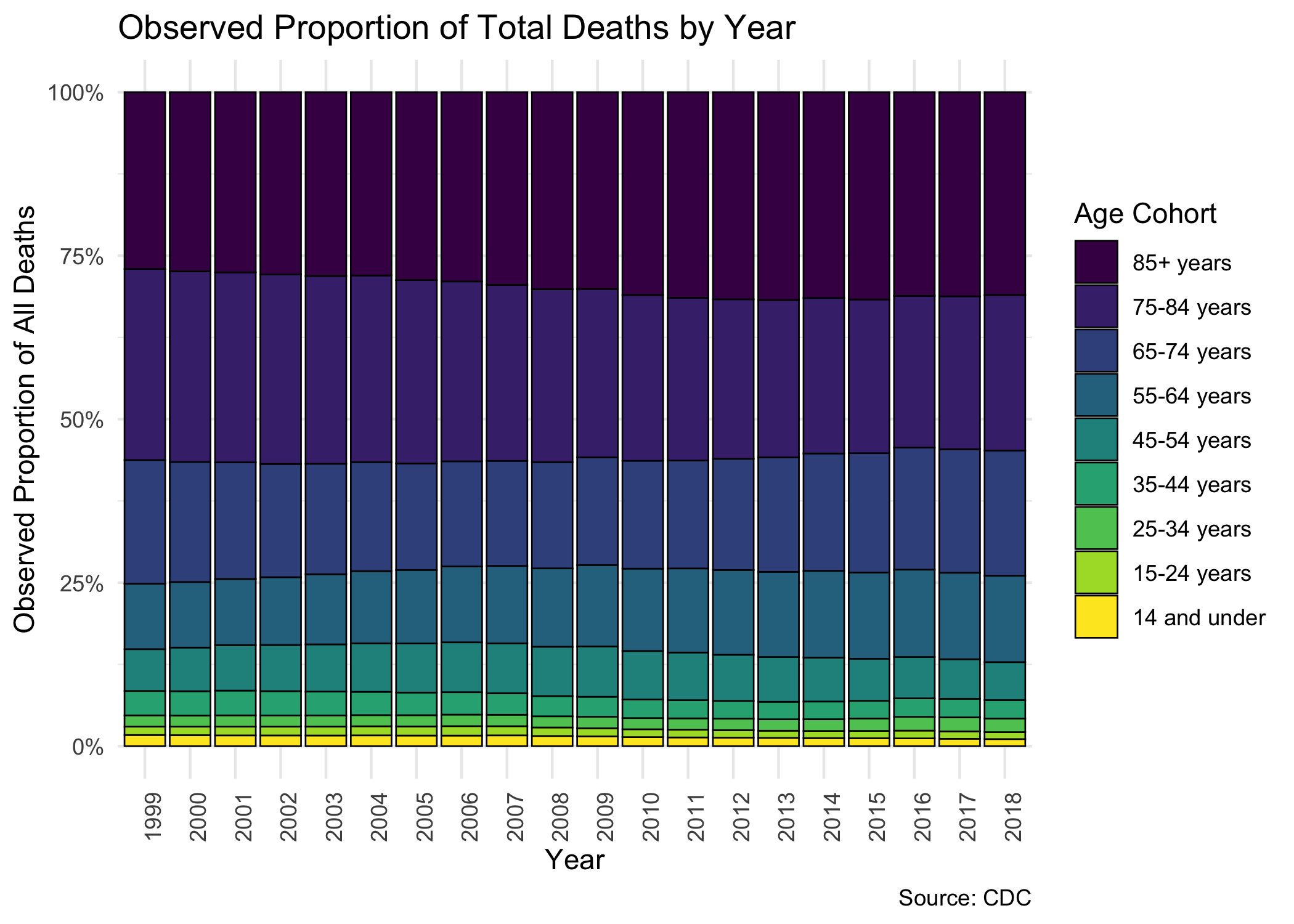
This graph should look unsurprisingly similar to the one in the previous section. The one difference we can see is that the larger time horizon allows us to take into perspective the slowly shrinking 75-84 age band. This absolutely does not mean fewer people are dying in aggregate. In fact, due to population increases and other reasons, more people are dying (judged on the basis of just raw death counts).
So, all this chart can tell us is that it appears more and more folks are moving to the 85+ band or to other bands out of the 75-84 age band. A concurrence of phenomena are at play here: people are are living longer is just one bit of the answer.
The point of this initial discussion is that we can glean absolutely no information whatsoever about total excess mortality in the US in aggregate from the presentation of the data in this manner. Doing so with this chart amounts to academic catfishing, in my opinion.
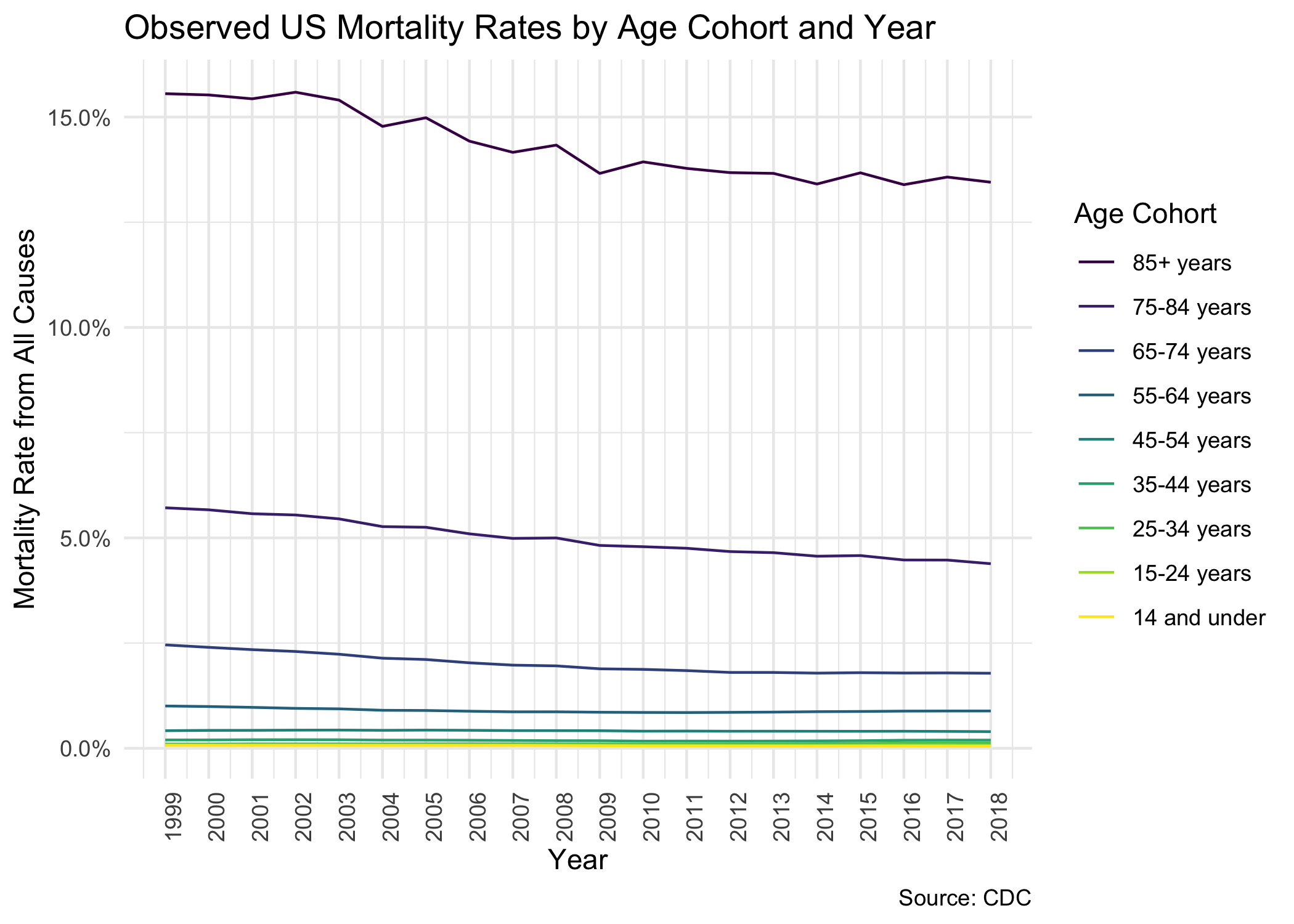
Now let’s take a look at mortality rates over time broken out by the age cohorts.
What a lovely sight! Mortality rates appear to be going down for the elderly! The compression of the mortality curves down at the bottom conceals a bit of a tragedy we’ll unearth in a moment, but we can see that, in general, it’s never been a better time to be elderly in America.
Now we’ll look at a proxy for what the CDC refers to as age-adjusted mortality. It is essentially a weighted calculation with population volumes in each cohort as the weighting mechanism.
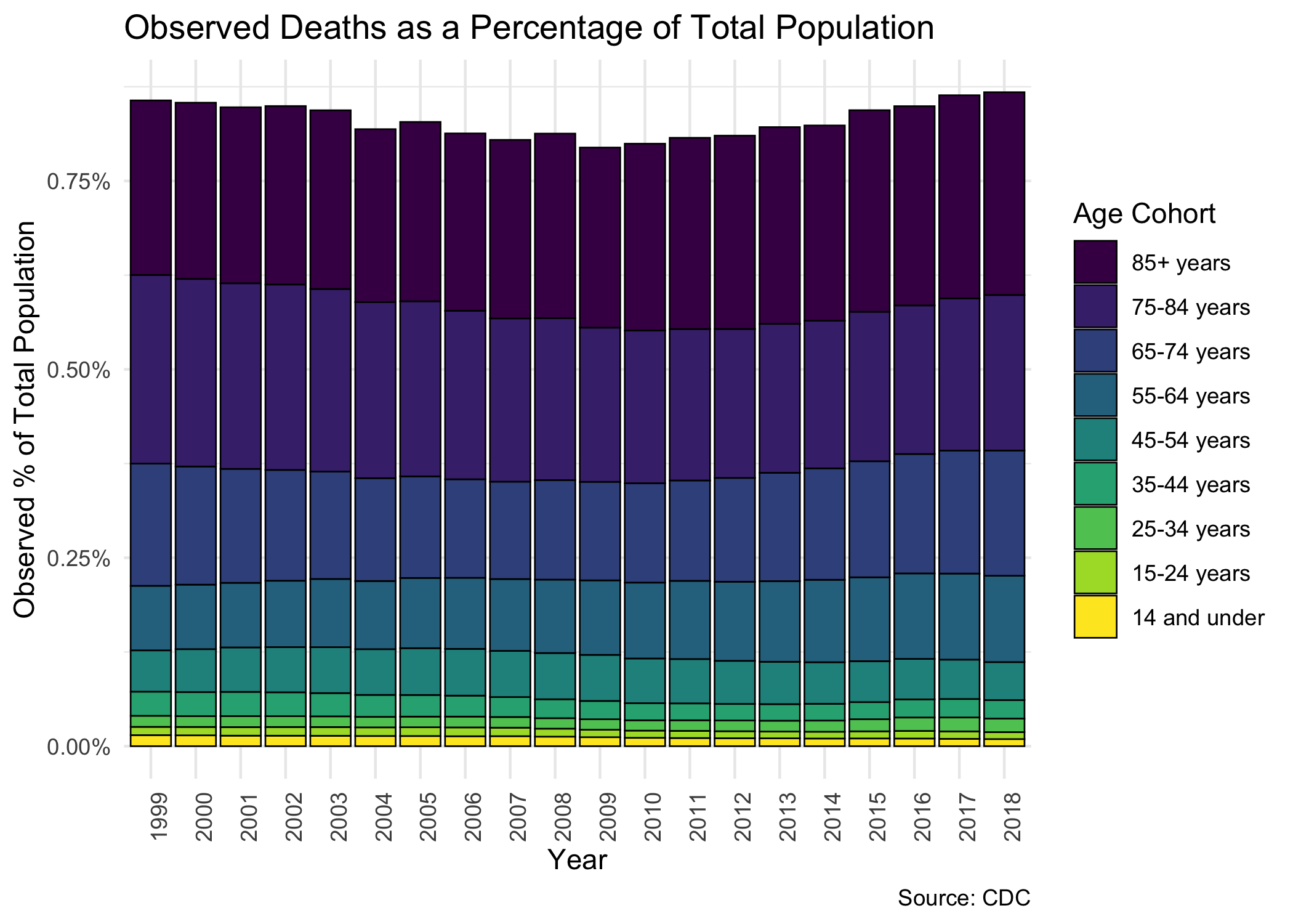
We’ll capture that in another view similar to the first two graphs, where we’ll break down each age cohort’s contribution to the total mortality rate in the US for that year.
This is interesting because it tells a slightly different story than the prior graph - that expressed as a percentage of the population, deaths in aggregate are on the rise in the last decade or so in the US.
This is unsurprising: we see that the largest percentages of death are focused into the elder age bands, but we already know that these age bands are seeing decreased mortality rates. In fact, we can see in this graph more clearly the substantial increase in the size of the middle age bands, confirming what we know to be true about the toll of the Opioid Crisis in the US over the last decade.
One thing I’d like to do now is combine the historical data I’ve obtained with the 2020 COVID dataset, but the latter does not have a population total tabulation by age. Because I am holding myself to building visuals using only actual available CDC data, I will instead just plot raw deaths over time, from 1999 - 2018, and 2020, all on the same graph.
We have a problem, though. Our CDC data is really complete through, at
best, 10/31/2020, and it is also missing January 2020! So I’m going to
have to go back to CDC Wonder to grab total historical death figures by
month and year instead of just by month. I’ve got the monthly data
pulled in the file Underlying Cause of Death, 1999-2018_pull2.txt and
cut out January, November, and December for each year so that we’re
dealing with a genuine apples-to-apples comparison.
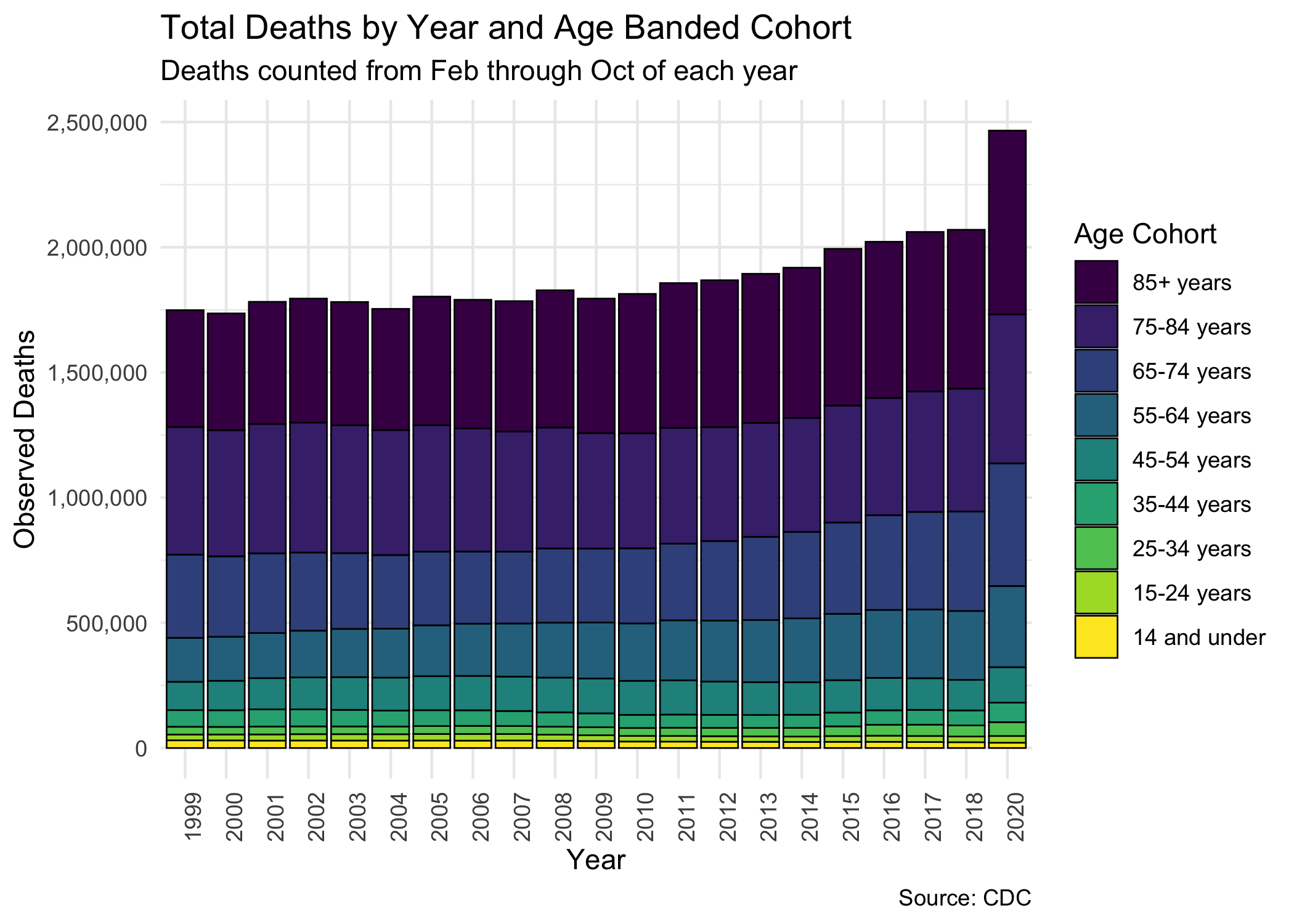
Because I think we’ve thrashed this dead horse, and because I like to end on a “cut the crap” visualization that shows things as they are, no filtration, no rates, just raw numbers and sizes and colors: I present to you a stacked histogram of raw deaths over time in the US.
That’s a pretty clear difference observed here. You can make a case for some of the differnce due to 2019 being skipped due to lack of data availability, but unless 2019 was some kind of mysterious slaughterhouse event and 2020 is expressing the new normal, then what we see here is very plainly due to excess mortality.
Briand also noted that 50,000 to 70,000 deaths are seen both before and after COVID-19, indicating that this number of deaths was normal long before COVID-19 emerged. Therefore, according to Briand, not only has COVID-19 had no effect on the percentage of deaths of older people, but it has also not increased the total number of deaths.
These data analyses suggest that in contrast to most people’s assumptions, the number of deaths by COVID-19 is not alarming. In fact, it has relatively no effect on deaths in the United States.
I mean this with all due professionalism: GTFOH.
This is a bonus section - I want to scrutinize an exhibit Briand put together about reporting discrepancies. I’m talking about this image:
To go along with this exhibit we have this juicy nugget:
This trend is completely contrary to the pattern observed in all previous years. Interestingly, as depicted in the table [above], the total decrease in deaths by other causes almost exactly equals the increase in deaths by COVID-19. This suggests, according to Briand, that the COVID-19 death toll is misleading. Briand believes that deaths due to heart diseases, respiratory diseases, influenza and pneumonia may instead be recategorized as being due to COVID-19.
Then the icing on the cake is the historical pattern of deaths plotted by cause for the last 5 years, and inset on that graph is a depiction of this small sliver of 6 weeks in which COVID data is reported in a seemingly nonsensical way while heart disease data drops. Here it is:
Isn’t it plausible to believe in the early days of the pandemic, when we were first figuring out which end is up, how testing could be done reliably, and getting hospital systems worked out for the long haul - that some cases were misreported as other things? I believe so, and I don’t think that’s malicious, and I don’t think Briand would think that either.
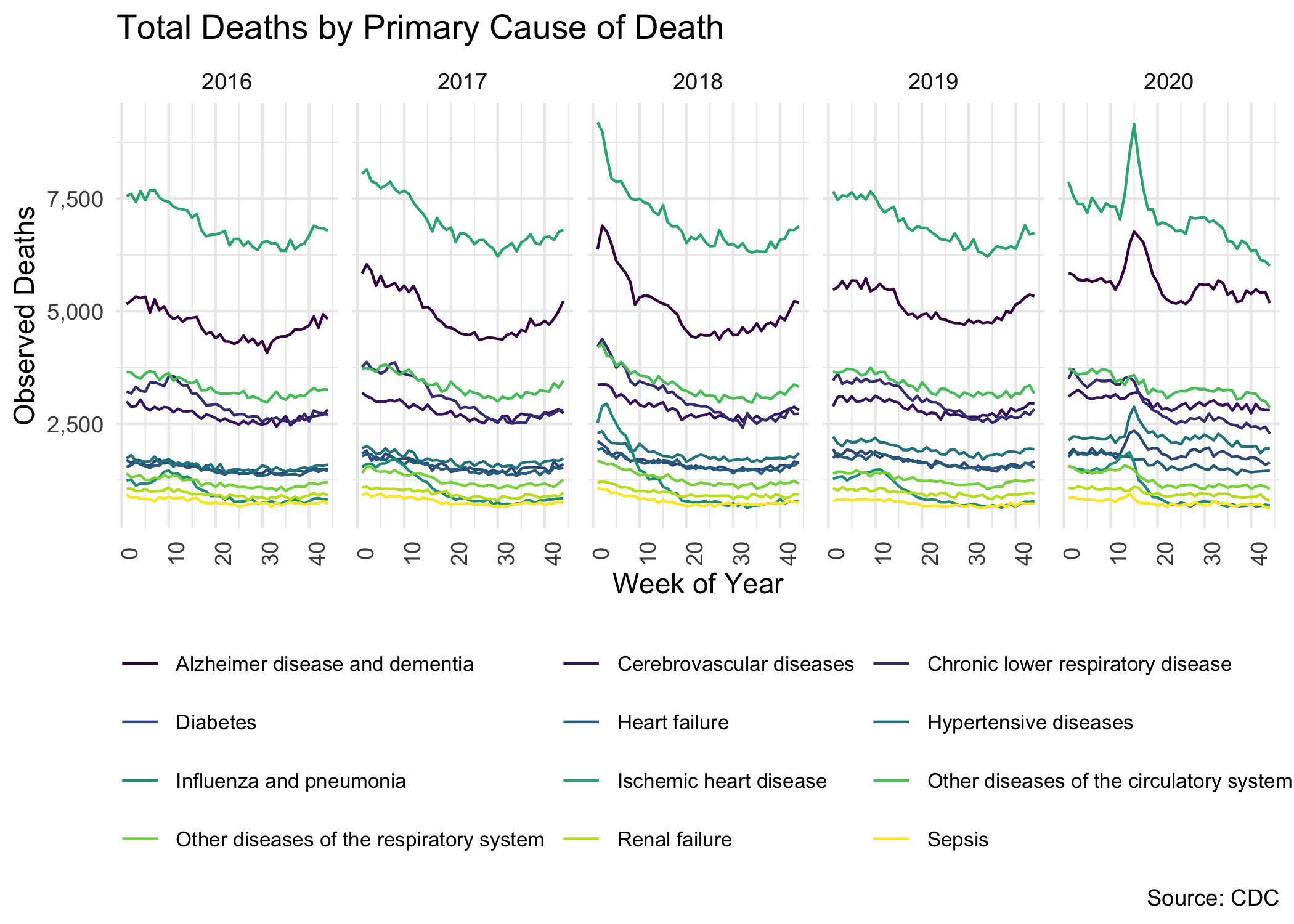
Let’s re-create this chart, but using better tools that we can access in R. If I’m going to take this argument seriously (that is, the argument that COVID-19 mortality is overstated due to systemic erroneous cause-of-death reporting), then I would want to see continued evidence of this reporting anomaly sustained throughout 2020 and not just in the opening months of the pandemic.
To build a whole case on there being systemic misreported COVID data based on three weeks of data is a risky move, and we’re going to take a look at the CDC data again, now split out by cause of death.
## [1] "That worked OK? TRUE"
Again, and I say this with all force of me trying to not be a dick about shitty analysis passed off with a veneer of some authority or expertise: with the full available 2020 data plotted side-by-side with prior years’ death counts split out by cause-of-death, do you see anything off?
This content does not necessarily express the viewpoint of my employer or the CDC. This content furthermore does not constitute an actuarial opinion professionally rendered, nor is it intended for that purpose.
– This is an R Markdown document. Markdown is a simple formatting syntax for authoring HTML, PDF, and MS Word documents. For more details on using R Markdown see http://rmarkdown.rstudio.com.
