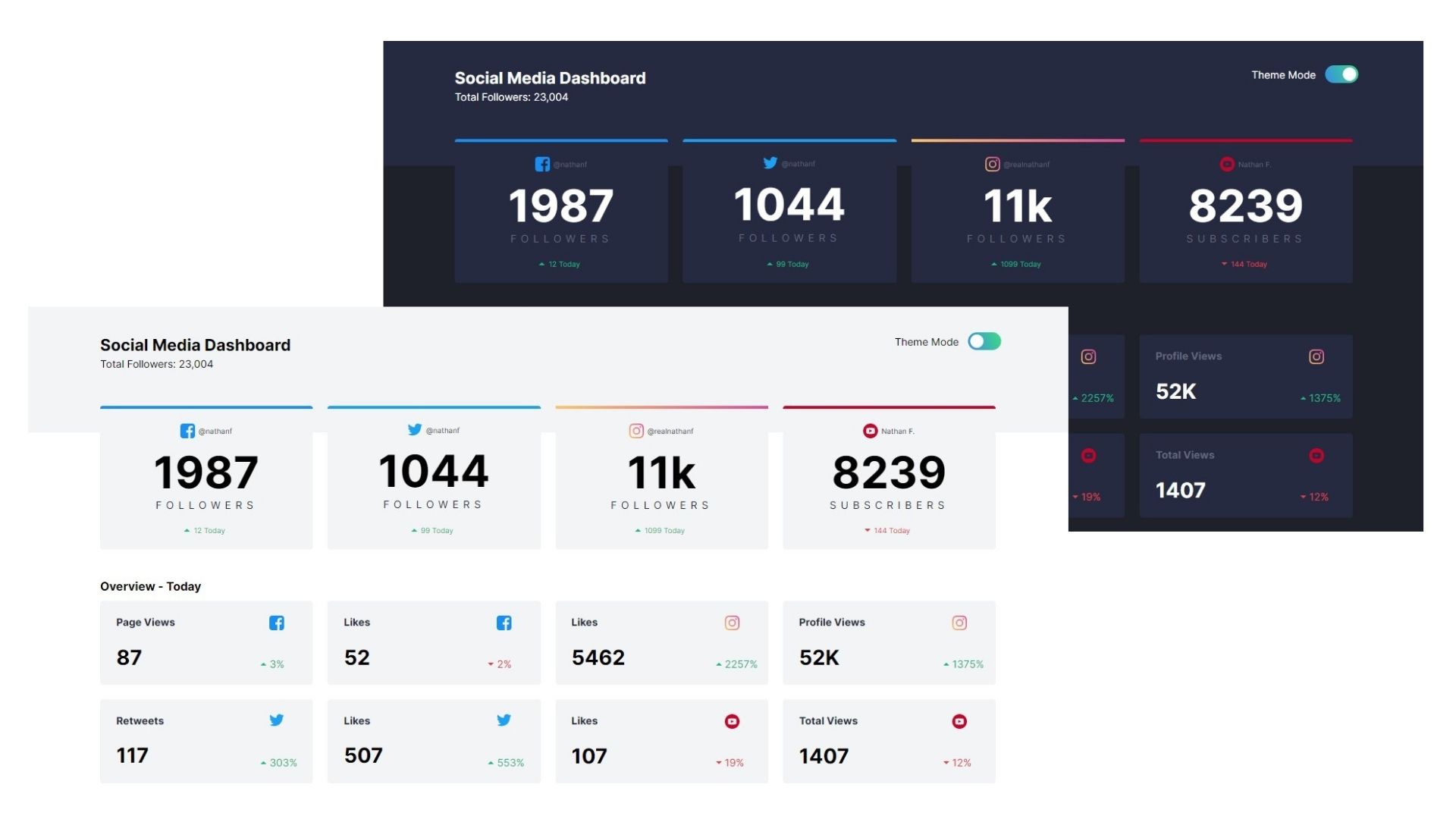
This is a solution to the Social media dashboard with theme switcher challenge on Frontend Mentor.
- View the optimal layout for the site depending on their device's screen size
- See hover states for all interactive elements on the page
- Toggle color theme to their preference
- Solution URL: Add solution URL here
- StarterKit from Adalab (Bootcamp)
- Semantic HTML5 markup
- Sass (variables, reset and mixins)
- CSS Grid
- Mobile-first workflow
- Javascript
Highlights:
Variables
Mixins
Media Queries
const change = document.getElementById('check');
change.addEventListener('change', checkingCheckbox, false);
function checkingCheckbox() {
let checked = change.checked;
if (checked) {
document.getElementById('styles').href = './assets/css/mainDark.css';
} else {
document.getElementById('styles').href = './assets/css/main.css';
}
}
};I want to continue working on code optimization and acquire knowledge to add testing to my projects.
- CSS-tricks - This helped me to understand grid container/items properties . I really liked this pattern and will use it going forward.
- Website - Bertapsan - My github
- Linkedin - Berta Pluma
- Twitter - @yourusername
- Frontend Mentor - @bertapsan
A special mention to @fmontes for letting me know Frontend Mentor.
