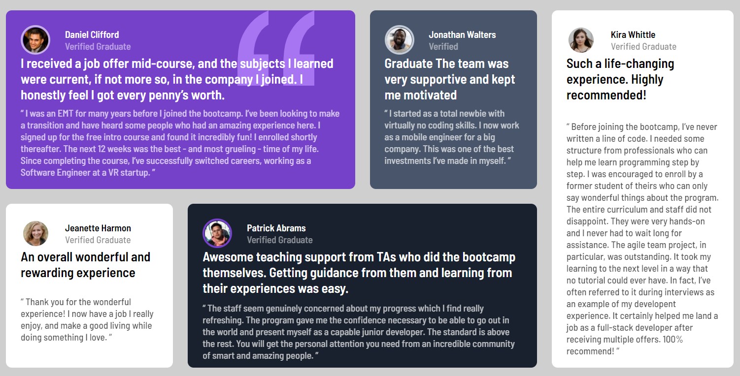
This is a solution to the Testimonials grid section challenge on Frontend Mentor. Frontend Mentor challenges help you improve your coding skills by building realistic projects.
Users should be able to:
- View the optimal layout for the site depending on their device's screen size.
- View a final "product" as similar as possible to the original design, in my case I have had no access to the sketch or the Figma file, therefore spaces/sizes/... are "estimated"
- StarterKit from Adalab (Bootcamp)
- Semantic HTML5 markup
- Sass (variables, reset and mixins)
- CSS Grid
- Mobile-first workflow
My major learning with this project has been to "translate" design into grid
- Grid
- Variables
- Sass
- Mixins
I want to continue working on code optimization and acquire knowledge to add testing to my projects.
- CSS-tricks - This helped me to understand grid container/items properties . I really liked this pattern and will use it going forward.
- Website - bertapsan - My github
- Linkedin - Berta Pluma - My Linkedin
- Twitter - @bertapsan - My Twitter
- Frontend Mentor - @bertapsan - My Frontmentor
A special thankyou to @NataliaMigallon (https://github.com/NataliaMigallon) to help me with some image root issues ;-)
Also, a special mention to @fmontes for letting me know Frontend Mentor.
