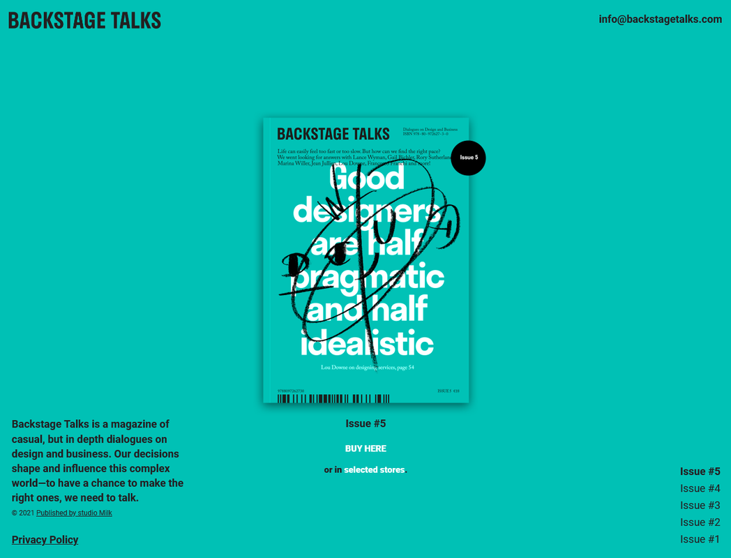
This is my solution for this challenge from Frontend Practice
- Live Site URL: Final result
Note: Delete this note and update the table of contents based on what sections you keep.
Users should be able to:
- View the optimal layout for the site depending on their device's screen size
- See the brochure snap every scroll in desktop size
- Choose the Issue to navigate to on click to link
- Live Site URL: The final results of my version
- Original Site URL: Original Backstage Talks Site
- Challenge URL: Frontend Practice challenge page
- Semantic HTML5 markup
- SCSS
- Flexbox
- CSS Grid
- Mobile-first workflow
- fullPage JS
- Netlify
Note: These are just examples. Delete this note and replace the list above with your own choices
For the scrolling functionality, I used the fullPage JS by alvarotrigo and it is a life saver. I really like it and I will be using it for the next projects that would need a smooth and clean-looking smooth scrolling. I learned about how to style a beautiful minimalistic layout with a mobile-first approach which is something that I wished I did with my previous projects because adding complexity makes it so much easier to make a page responsive as opposed to overriding properties which was a common pattern I saw in a desktop-first development approach. I am very satisfied with the results of this page and I will uilize the concepts I learned here for my future projects.
- alvarotrigo's documentation for full Page is very comprehensive and easy to follow. - fullPage JS
- Website - Add your name here
- Frontend Mentor - @yourusername
- Twitter - @yourusername
Note: Delete this note and add/remove/edit lines above based on what links you'd like to share.
Thank you to Frontend practice for providing this challenge. Thank you to the creative minds behind Backstage Talks' beautiful webpage. Thank you to the people behind fullPage JS for the very useful library used for this project.
