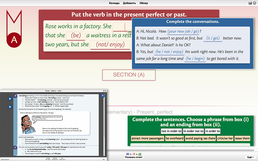
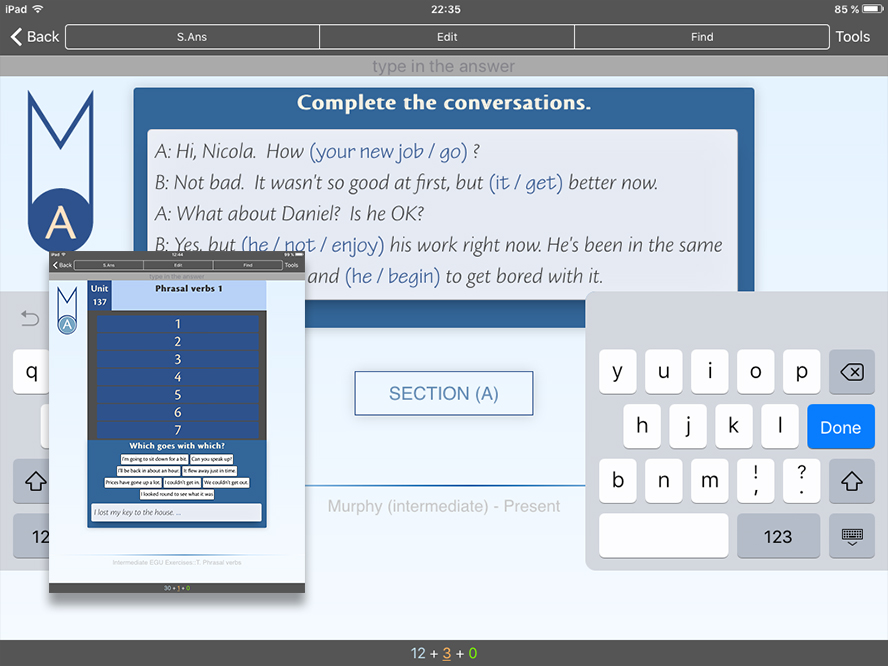
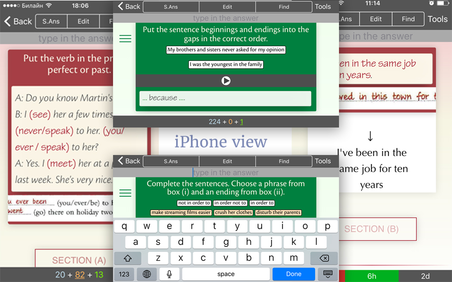
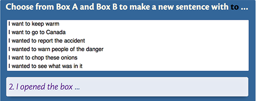
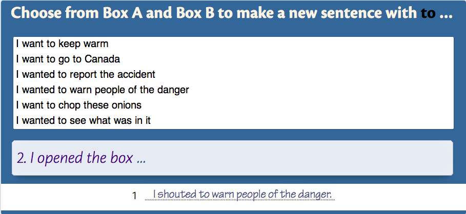
Themes for Raymond Murphy’s system books and not only. (tested on macOs, AnkiMobile, Windows)
This Anki theme will help make your English decks a little more effectively. Janki method, spaced repetition software is a helpful learning tool for English grammar from beginner to experienced.
The template is built in html, javascript and css. Include fields: audio, transcriptions.
Creating your own deck is the most effective way to learn a complex subject. Subjects like languages and the sciences can’t be understood simply by memorizing facts — they require explanation and context to learn effectively. Furthermore, inputting the information yourself forces you to decide what the key points are, leading to a better understanding.
Do not learn if you do not understand. —SuperMemo
Each Anki client and each Anki version may implement card display differently, so you will need to test the behaviour across platforms. Currently was tested only Mac clients (desctop and iPad). But was made responsive layout for iPhones versions. Also was tested on the Windows 10 (desctop) last version Anki.
The type of card.
[Cloze]
- Freeform show/hide, question/answer, audio/subtitles fields.
- Anki doesn’t import fonts, so you need install these fonts to your OS:
_CronosPro-Bold.ttf
_CronosPro-Lt.ttf
_CronosPro-LtIt.ttf
_CronosPro-Regular.ttf
_CronosPro-Semibold.ttf
_TektonPro-Regular.ttf
This fonts were taken from original source for best fitness. And some layouts were made for them. So it’s recommended. For instaling in a folderReference files/fonts
- On mobile version it is necessary switch off tap zones.
- Instal a plug-in: Replay buttons on card for sound fields.
- For convenient filling of forms instal a plug-in: Power Format Pack: Markdown, code blocks, lists, tables, syntax highlight & more
- Additional Card Fields for distinction by color text of question:
new card = blue
studied card = maroon
Repeated card = green
.q0 { color: blue; }
.q1 { color: maroon; }
.q2 { color: darkgreen; }
- ↑ - show modal window with theory
- ↓ - show Unit, name of the Unit
- → - show similar answer example
- ^ + [1-7] (numbers) - show corresponding to the number extra. window with gram. rules.
pressing these keys again returns the previous card display
Fields marked Optional fields (♟ ♻ ✎ ♫ ♨) can be left blank and the template will ignore them. Required fields (✔) are required in order for a card to be generated.
Required
example - “3.4.9” = (3-unit); (4-exercise); (9-question).
Required / optional (hiding field by button)
example - “Unit 3”.
Required (hiding field by button)
example - “Present continuous and present simple 1 (I am doing and I do)”.
Required
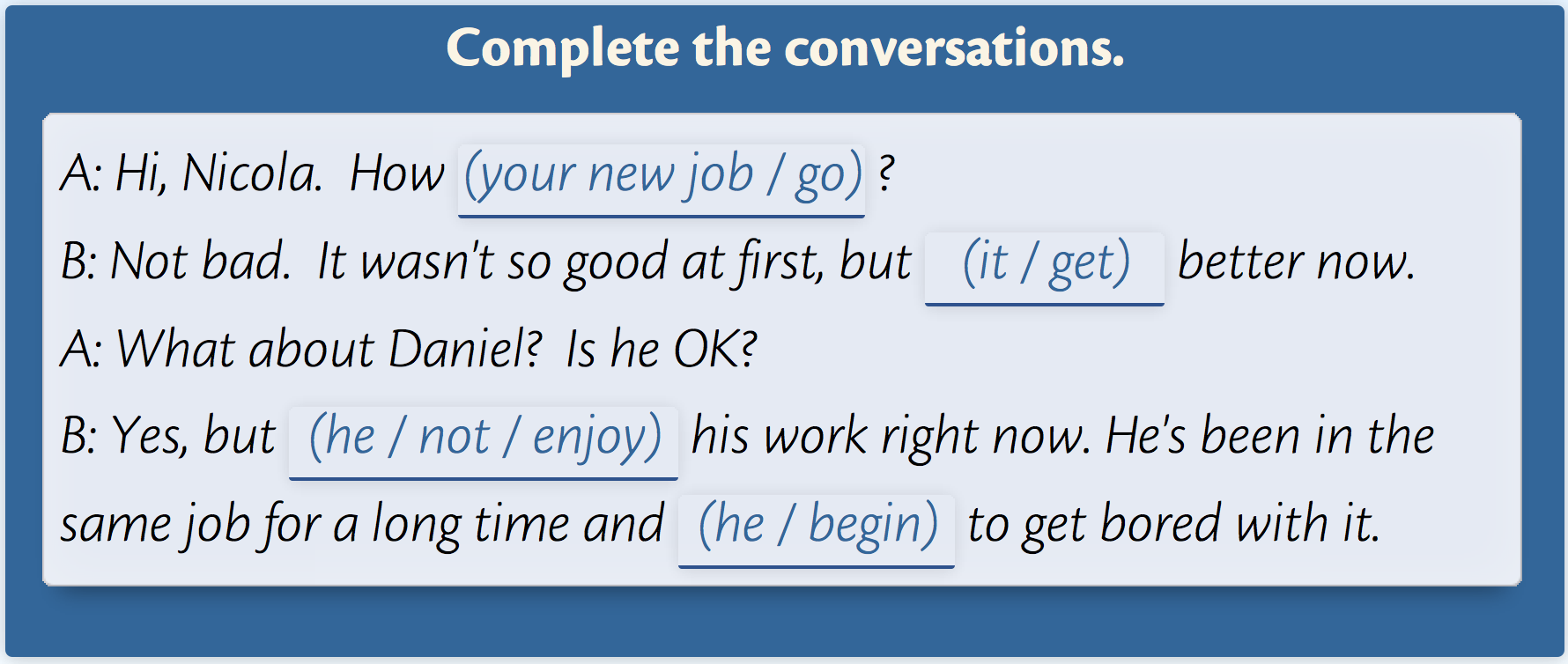
example - “Complete the conversations.”.
Required
example -
“A: Hi, Nicola. How{{c1::'s your new job going::(your new job / go)}}?
B: Not bad. It wasn't so good at first, but{{c1::it's getting::(it / get)}}better now.
A: What about Daniel? Is he OK?
B: Yes, but{{c1::he isn't enjoying / he's not enjoying::(he / not / enjoy)}}his work right now. He's been in the same job for a long time and{{c1::he's beginning / he is beginning::(he / begin)}}to get bored with it.”
To choose typing area press tab - once or twice.
When you start typing in field the cursive example disappear. But it can be displayed by hover on the input field.
This field is button also. By the tap on this field
♟ Examplefield opens
You can add sound into this field:
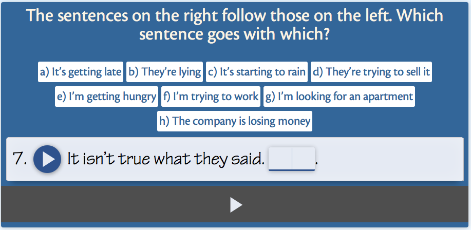
7. [sound:rec1491131723.mp3] It isn’t true what they said. {{c1::They’re lying / (b}}.
(available only for [base] type of card) | (was not tested in AnkiDroid & Linux)
Optional
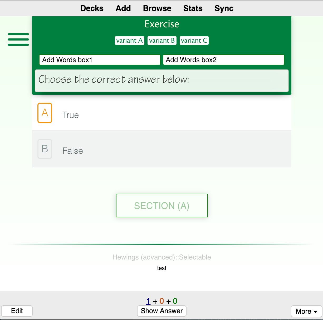
- Choose from the suggested answers.
- The correct answer can be one or more.
- if the number of selected fields is more or less than the correct ones, any of the answers is not correct.
- filling this field must correspond to the following (divide the variants through this character "|"):
variant-1 | <i>variant-2</i> | variant-3
Optional (on the back side of card)
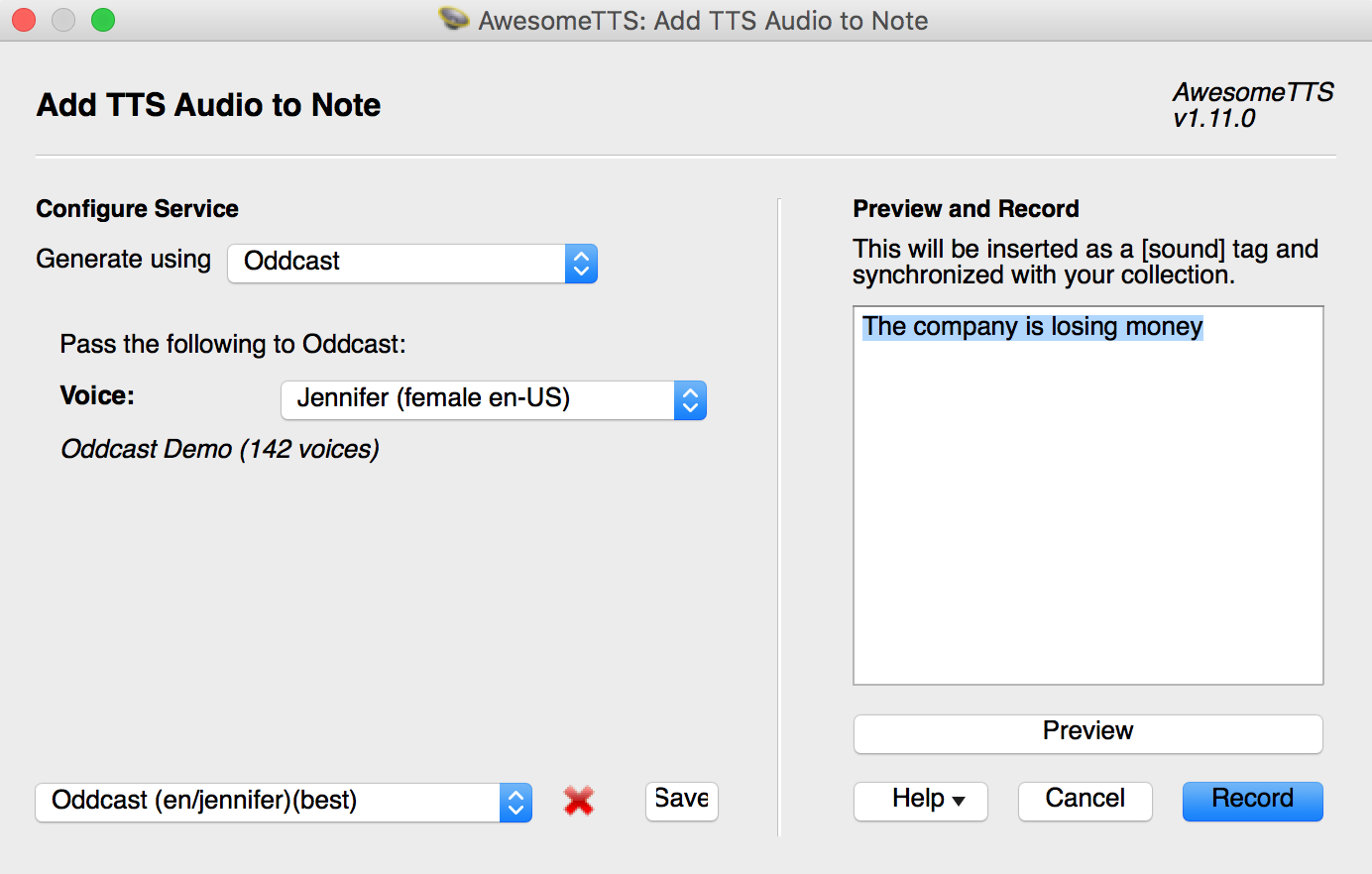
recommended use AwesomeTTS text-to-speech add-on for this field.
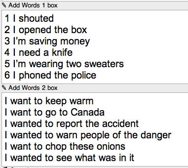
Optional
example 1 -
“start; get; increase; change; rise”
example 2
“not in order to;in order not to;in order to | attract more passengers;be overheard;avoid paying tax there;criticise her;tease them”
Optional
example -
And for anything but use sparingly, as it's always best to be succinct with Anki. Think of this as a 'reference' for future use:
- Links to documentation
- Supplementary notes
- Anything that is universal between cards
Optional
Sound for question if it necessary. In this case use
♟ Examplefield for subtitles.
Optional (hiding field by button)
image or text
Optional
Use it for image.
Optional (hiding field by button)
as idea this field for the theory
If this field for image use - recommended width: ~ 1000px;
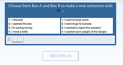
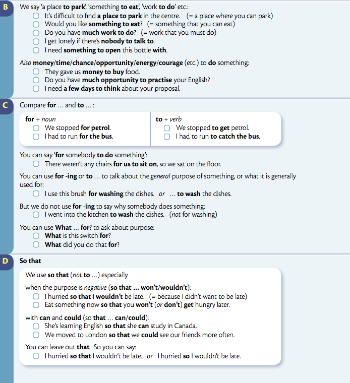
by example I paste “A”section’s screenshot from original book.
Optional (hiding field by button)
Sound for content of
♨ Hint Frontfield.
! If them several then - by a new row each sound.
Optional
(hiding field by button for back side card)
as idea this field for the theory
If this field for image use - recommended width: ~ 1000px;
by example I paste “B C D”sections’s screenshot from original book.
Optional
(hiding field by button for back side of card)
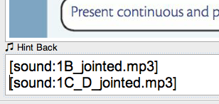
Sound for content of
♨ Hint Backfield.
! If them several then - by a new row each sound.
There is a little, but noticeable difference in the display of the font (line-height) in comparison with Anki 2.0 and Anki 2.1.
For 2.1 no changes require. For correct display of button in Anki 2.0 add the following code in the edit mode, in "Styling" field to the end of this section.
For templates "Elementary" and "Intermediate":
.win #overlay_title #p_button,
.mac #overlay_title #p_button {
  line-height: 120%;
}

.mac .overlay .p_app_button,
.win .overlay .p_app_button {
   line-height: 180%;
}

.win .material-icons,
.mac .material-icons {
    line-height: 168%;
}
For template "Advanced":
.win #overlay_title #p_button,
.mac #overlay_title #p_button {
  line-height: 120%;
}

.mac .overlay .p_app_button,
.win .overlay .p_app_button {
   line-height: 180%;
}

.win .material-icons,
.mac .material-icons {
    line-height: 168%;
}
.win .appendixes,
.mac .appendixes {
 margin-top: -340px;
}Created by gh-md-toc
