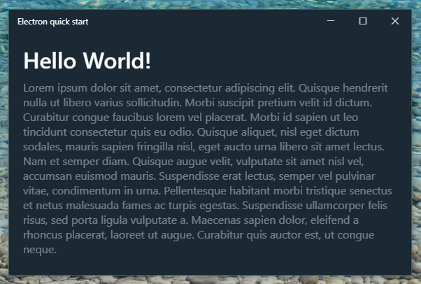
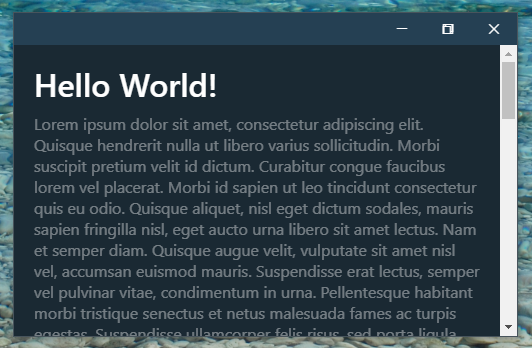
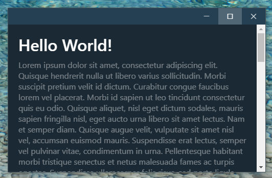
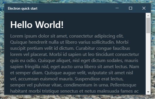
A guide to creating a seamless Windows 10 title bar in your Electron app.
I was inspired by the way Hyper terminal achieved a native look, and a tutorial by Shawn Rakowski (no longer available, it seems).
I'm going to start with a version of the Electron quick start app - see the src-start directory of this repo for the starting point of the tutorial, including installation instructions.
(The full final source code is located in the src directory.)
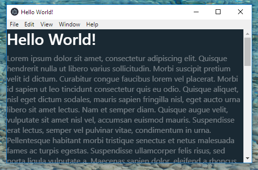
First, I'm just going to add some basic styles to the quick start app make it look a bit better than some sort of web 1.0 site. Open/create the empty style.css and add the following:
* {margin: 0; padding: 0; border: 0; vertical-align: baseline;}
html {box-sizing: border-box;}
*, *:before, *:after {box-sizing: inherit;}
html, body {height: 100%; margin: 0;}

body {
  font-family: "Segoe UI", sans-serif;
  background: #1A2933;
  color: #FFF;
}
h1 {margin: 0 0 10px 0; font-weight: 600; line-height: 1.2;}
p {margin-top: 10px; color: rgba(255,255,255,0.4);}
If there isn't already a link to it in the <head> element of index.html, add one.
We're going to remove the standard Windows title bar and border. In main.js, modify the new BrowserWindow() line so it includes frame: false:
mainWindow = new BrowserWindow({
    width: 800,
    height: 600,
    frame: false,
    backgroundColor: '#FFF',
    webPreferences: {
        nodeIntegration: true
    }
});
N.B. we have included backgroundColor: '#FFF' so that subpixel anti-aliasing is enabled (see here for details). nodeIntegration is enabled for the window controls JavaScript to work (which we will get to later).
Tip: uncomment mainWindow.webContents.openDevTools() to open developer tools every time the app is run.
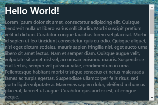
If you run the app now, you'll see the title bar is gone. See the docs for more info on frameless windows.
We're going to create our own title bar using HTML and CSS. Let's also put the rest of the app content in its own div:
<body>

  <header id="titlebar"></header>

  <div id="main">
    <h1>Hello World!</h1>
    <p>Lorem ipsum dolor sit amet...</p>
  </div>

  <script>
    require('./renderer.js')
  </script>
</body>
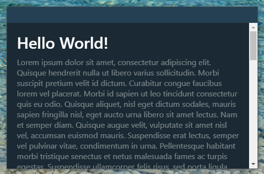
The default title bar height in Windows is 32px. We want the titlebar fixed at the top of the DOM. I'm giving it a background colour temporarily so we can see where it is. I've also added a subtle 1px border to the window. We need to add 32px top margin to #main, and change the overflow-y for #main and body (#main is now replacing body as the scrolling content).
body {
  border: 1px solid #48545c;
  overflow-y: hidden;
}

#titlebar {
  display: block;
  position: fixed;
  height: 32px;
  width: calc(100% - 2px); /*Compensate for body 1px border*/
  background: #254053;
}

#main {
  height: calc(100% - 32px);
  margin-top: 32px;
  padding: 20px;
  overflow-y: auto;
}
Tip: you can do ctrl+R to reload the app.
You might notice our new titlebar isn't actually draggable. To fix this, we add a div to #titlebar:
<header id="titlebar">
  <div id="drag-region"></div>
</header>
We need to give it a style of -webkit-app-region: drag. The reason we don't just add this style to #titlebar is that we also want the cursor to change to resize when we hover near the edge of the window at the top. If the whole title bar was draggable, this wouldn't happen. So we also add some padding to the non-draggable #titlebar element.
#titlebar {
  padding: 4px;
}

#titlebar #drag-region {
  width: 100%;
  height: 100%;
  -webkit-app-region: drag;
}
If you reload now, you will be able to drag the window around again, and the window can be resized at the top.
It's time to add the minimise, maximise, restore and close buttons. To do this, we'll need the icons. A previous version of this tutorial used the Segoe MDL2 Assets font for the icons. However, these have some issues, such as high DPI display scaling and lack of cross-platform compatibility.
To overcome these issues, I recreated the icons as PNGs for crisp viewing at display scaling factors from 100-350% (but only the predefined Windows 10 scaling values; for custom scaling values you will probably see some anti-aliasing blur/pixelation and may be better off using the old method or the SVG approach). The icons are located in src/icons. Making use of the srcset attribute of the <img>, we can load the correct resolution icons for the user's display scaling factor/device pixel ratio.
We'll put the buttons inside the #drag-region div
<header id="titlebar">
  <div id="drag-region">
    <div id="window-controls">

      <div class="button" id="min-button">
        <img class="icon" srcset="icons/min-w-10.png 1x, icons/min-w-12.png 1.25x, icons/min-w-15.png 1.5x, icons/min-w-15.png 1.75x, icons/min-w-20.png 2x, icons/min-w-20.png 2.25x, icons/min-w-24.png 2.5x, icons/min-w-30.png 3x, icons/min-w-30.png 3.5x" draggable="false" />
      </div>

      <div class="button" id="max-button">
        <img class="icon" srcset="icons/max-w-10.png 1x, icons/max-w-12.png 1.25x, icons/max-w-15.png 1.5x, icons/max-w-15.png 1.75x, icons/max-w-20.png 2x, icons/max-w-20.png 2.25x, icons/max-w-24.png 2.5x, icons/max-w-30.png 3x, icons/max-w-30.png 3.5x" draggable="false" />
      </div>

      <div class="button" id="restore-button">
        <img class="icon" srcset="icons/restore-w-10.png 1x, icons/restore-w-12.png 1.25x, icons/restore-w-15.png 1.5x, icons/restore-w-15.png 1.75x, icons/restore-w-20.png 2x, icons/restore-w-20.png 2.25x, icons/restore-w-24.png 2.5x, icons/restore-w-30.png 3x, icons/restore-w-30.png 3.5x" draggable="false" />
      </div>

      <div class="button" id="close-button">
        <img class="icon" srcset="icons/close-w-10.png 1x, icons/close-w-12.png 1.25x, icons/close-w-15.png 1.5x, icons/close-w-15.png 1.75x, icons/close-w-20.png 2x, icons/close-w-20.png 2.25x, icons/close-w-24.png 2.5x, icons/close-w-30.png 3x, icons/close-w-30.png 3.5x" draggable="false" />
      </div>

    </div>
  </div>
</header>
The buttons are 46px wide & 32px high. We'll use CSS grid to overlap the maximise/restore buttons, and later use JavaScript to alternate between them.
#titlebar {
  color: #FFF;
}

#window-controls {
  display: grid;
  grid-template-columns: repeat(3, 46px);
  position: absolute;
  top: 0;
  right: 0;
  height: 100%;
}

#window-controls .button {
  grid-row: 1 / span 1;
  display: flex;
  justify-content: center;
  align-items: center;
  width: 100%;
  height: 100%;
}
#min-button {
  grid-column: 1;
}
#max-button, #restore-button {
  grid-column: 2;
}
#close-button {
  grid-column: 3;
}
For some reason, the PNG icons are not rendered at the correct 10 device independent pixels width/height for the scaling factors 150%, 200% or 300%, so we need to target those using a media query and the -webkit-device-pixel-ratio feature.
@media (-webkit-device-pixel-ratio: 1.5), (device-pixel-ratio: 1.5),
(-webkit-device-pixel-ratio: 2), (device-pixel-ratio: 2),
(-webkit-device-pixel-ratio: 3), (device-pixel-ratio: 3) {
  #window-controls .icon {
    width: 10px;
    height: 10px;
  }
}
The feature device-pixel-ratio without the webkit prefix does not exist yet, but no harm in future-proofing. The reason we don't just give the width/height rule for all device pixel ratios is that this leads to fuzzy anti-aliasing for some of them.
First of all, the buttons shouldn't be part of the window drag region, so we'll exclude them. Also, we don't want to be able to select the icon images. We also need to add hover effects. The default Windows close button hover colour is #E81123. When active, the button becomes #F1707A and the icon becomes black, which can be achieved using the invert filter. Lastly, we'll hide the restore button by default (again, we'll implement switching between the maximise/restore buttons later).
#window-controls {
  -webkit-app-region: no-drag;
}

#window-controls .button {
  user-select: none;
}
#window-controls .button:hover {
  background: rgba(255,255,255,0.1);
}
#window-controls .button:active {
  background: rgba(255,255,255,0.2);
}

#close-button:hover {
  background: #E81123 !important;
}
#close-button:active {
  background: #F1707A !important;
}
#close-button:active .icon {
  filter: invert(1);
}

#restore-button {
  display: none !important;
}There are lots of ways you could do this, depending on whether you wanted to add any buttons or file menus to the titlebar, and whether you wanted the title centered or to the left.
My way is to put it the left. Add this inside the #drag-region div, above the window controls:
<div id="window-title">
  <span>Electron quick start</span>
</div>
I've gone with grid, as you can change the template columns to suit whatever you decide to do. Here we have an auto width column and a 138px column (3 * 46px = 138px). The default Windows window title font size is 12px. The default margin/padding on the left of the title is 10px, but 2px is already taken up by #titlebar's padding, so 8px of margin/padding is needed on the left. I've taken the precaution of hiding any overflowing text if the title happens to be very long.
#titlebar #drag-region {
  display: grid;
  grid-template-columns: auto 138px;
}

#window-title {
  grid-column: 1;
  display: flex;
  align-items: center;
  margin-left: 8px;
  overflow: hidden;
  font-family: "Segoe UI", sans-serif;
  font-size: 12px;
}

#window-title span {
  overflow: hidden;
  text-overflow: ellipsis;
  white-space: nowrap;
  line-height: 1.5;
}
At this point, you can remove the background colour from #titlebar and admire your handiwork.
Now, open renderer.js. We're going to code the windows controls, which is part of a single BrowserWindow instance and so should be in renderer.js as opposed to main.js (according to my interpretation of the docs). The code isn't too complex so here it is in its entirety:
const remote = require('electron').remote;

const win = remote.getCurrentWindow(); /* Note this is different to the
html global `window` variable */

// When document has loaded, initialise
document.onreadystatechange = (event) => {
    if (document.readyState == "complete") {
        handleWindowControls();
    }
};

window.onbeforeunload = (event) => {
    /* If window is reloaded, remove win event listeners
    (DOM element listeners get auto garbage collected but not
    Electron win listeners as the win is not dereferenced unless closed) */
    win.removeAllListeners();
}

function handleWindowControls() {
    // Make minimise/maximise/restore/close buttons work when they are clicked
    document.getElementById('min-button').addEventListener("click", event => {
        win.minimize();
    });

    document.getElementById('max-button').addEventListener("click", event => {
        win.maximize();
    });

    document.getElementById('restore-button').addEventListener("click", event => {
        win.unmaximize();
    });

    document.getElementById('close-button').addEventListener("click", event => {
        win.close();
    });

    // Toggle maximise/restore buttons when maximisation/unmaximisation occurs
    toggleMaxRestoreButtons();
    win.on('maximize', toggleMaxRestoreButtons);
    win.on('unmaximize', toggleMaxRestoreButtons);

    function toggleMaxRestoreButtons() {
        if (win.isMaximized()) {
            document.body.classList.add('maximized');
        } else {
            document.body.classList.remove('maximized');
        }
    }
}
Note: there is a bug with window maximization in some Electron versions on Windows (see #6). It seems to have been fixed as of Electron 8.2.1+.
Now all there is to do is to add some CSS for when the window is in the maximized state. When the window is maximized we should be able to drag from the very top down to restore it, so we should remove the drag region padding and set its width to 100%. We also need to swap between the maximize and restore buttons.
.maximized #titlebar {
  width: 100%;
  padding: 0;
}

.maximized #window-title {
  margin-left: 12px;
}

.maximized #restore-button {
  display: flex !important;
}

.maximized #max-button {
  display: none;
}