A theme for Active Admin based on Blaze CSS 3.x
Features:
- CSS only theme with clean UI
- compact nested forms
- customizable options: colors, sidebar position, squared style, scroll on cells
- custom controls / components: toggle, Sidebar menu, Accordion, Readonly field, Styled table
- Blaze CSS widgets
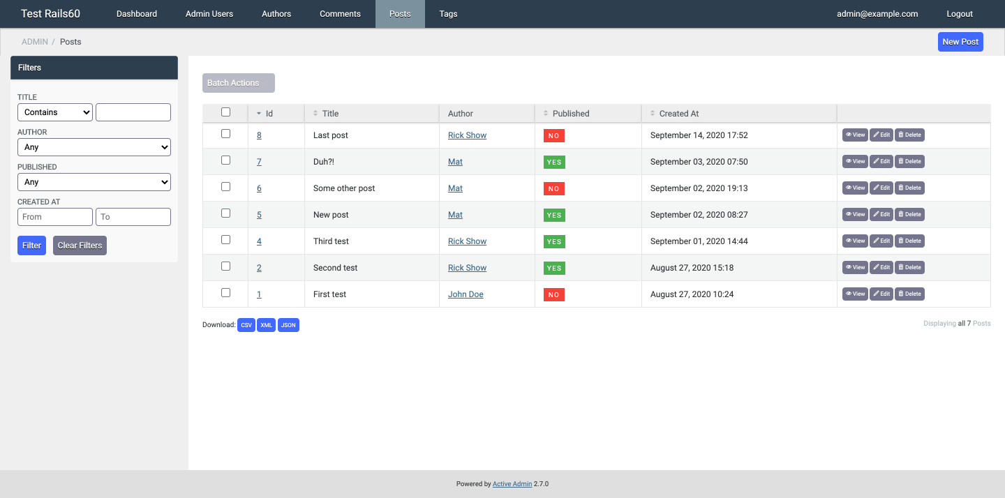
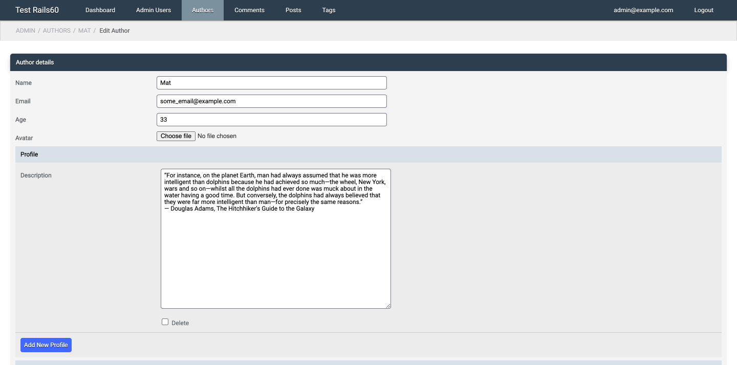
See some screenshots.
Please ⭐ if you like it.
First, add to your Gemfile: gem 'activeadmin_blaze_theme' (and execute bundle)
Then, if you installed Active Admin without Webpacker support (so using Sprockets):
- Add a SASS/SCSS gem to your Gemfile (ex.
gem 'sassc') - Add at the end of your Active Admin styles (app/assets/stylesheets/active_admin.scss):
@import "activeadmin_blaze_theme/theme";Otherwise, with Webpacker:
- Add the component to the package.json:
yarn add blocknotes/activeadmin_blaze_theme - Add at the end of your Active Admin javascript pack (app/javascript/packs/active_admin.js):
require('activeadmin_blaze_theme');- Another option is appending to app/javascript/stylesheets/active_admin.scss (in this case the JS require line is not needed):
// ...
// optionally add custom colors variables here
@import "~activeadmin_blaze_theme/app/assets/stylesheets/activeadmin_blaze_theme/theme";- Sometimes it could be necessary to remove the node_modules path and recreate it (using
yarn install --check-files) or to clean the tmp path:bin/rails tmp:clear
- Colors customization is available using some Sass variables;
- With Sprockets: you need to update your Active Admin styles (before activeadmin_blaze_theme/theme import line);
- With Webpacker: you need to import the theme using the Sass/Scss option as described above.
// blaze colors
$color-brand: #2c3e50;
$color-info: #4dabf5;
$color-warning: #ff9800;
$color-success: #4caf50;
$color-error: #f44336;
// main variables
$bg-footer: #dfdfdf;               // bg footer bar
$bg-form1: #f4f4f4;                // bg 1st level forms
$bg-form2: darken($bg-form1, 3%);  // bg 2nd level forms (nested)
$bg-form3: darken($bg-form1, 6%);  // bg 3rd level forms (nested)
$bg-form4: darken($bg-form1, 9%);  // bg 4th level forms (nested)
$bg-form-sub-headings: lighten($color-brand, 64%);  // bg nested forms title
$bg-header: $color-brand;          // bg header bar
$bg-inputs: #fff;                  // bg forms inputs
$bg-menu-active: #7b929e;          // bg menu item current / hover
$bg-sidebar: #efefef;              // bg sidebar
$fg-box-title: #fff;
$fg-button-link: #fff;
$fg-menu-items: #f8f8f8;
$fg-table-borders: #e4e4e4;
$fg-table-link: #eee;
// other variables
$form-padding: 10px;
$inputs-spacing: 10px;
$height-inputs: 26px;
$height-topbar: 40px;
$height-titlebar: 38px;
$text-shadow: #000;- To move sidebar on the left add to your Active Admin styles (after blaze theme import):
#active_admin_content.with_sidebar {
  @extend .sidebar_left;
}- Squared style (no rounded borders):
#active_admin_content, .active_admin #title_bar {
  @extend .no_rounded;
}- More options:
// scrollable table cells
body.active_admin .index_content table {
  @extend .scrollable_cells;
}
// fix ckeditor width
body.active_admin .cke {
@extend .ckeditor_width_fix
}In form \ inputs block:
f.input :boolean, as: :blaze_toggleTo change toggle color:
f.input :boolean, as: :blaze_toggle, input_html: { toggle_class: 'c-toggle--brand' }Available: c-toggle--brand, c-toggle--info, c-toggle--warning, c-toggle--success, c-toggle--error
Standard checkbox with label on the left:
f.input :boolean, as: :blaze_toggle, input_html: { simple_checkbox: true }A sidebar menu (priority option permit to put the sidebar above the filters):
sidebar :help, priority: 0 do
  ul class: 'blaze-menu' do
    li do
      link_to 'Menu item 1', admin_root_path
    end
    li do
      link_to 'Menu item 2', admin_root_path
    end
    li do
      link_to 'Menu item 3', admin_root_path
    end
  end
endAn accordion group in a form:
f.accordion_group do
  f.accordion 'First accordion' do
    f.inputs for: [:detail, f.object.detail || Detail.new] do |f2|
      f2.input :meta_title
      f2.input :meta_keywords
    end
  end
  f.accordion 'Second accordion' do
    f.inputs for: [:more_detail, f.object.morel_detail || Detail.new] do |f2|
      f2.input :meta_title
      f2.input :meta_keywords
    end
  end
endSome readonly fields in a form:
f.readonly :positionf.readonly :position, f.object.position * 2f.readonly 'Code', 'Automatically set after save', class: 'a-wrapper-class'f.readonly nil, 'Value only, no label'Table styles:
table_for User.all, class: 'blaze-table table-rows table-striped' do
  # ...
endSee components available in Blaze CSS docs.
Badge example:
f.input :price, label: raw( 'Price <span class="c-badge c-badge--warning" style="position: relative; top: -5px">in $</span>' )Button example:
a 'clear form', href: '#', class: 'c-button c-button--error', onclick: 'event.preventDefault();document.forms[0].reset();'Progress bar example:
div class: 'c-progress' do
  div class: 'c-progress__bar c-progress__bar--success', style: "width: #{f.object.a_field}%;"
end- To use this plugins with Active Admin 1.x please use the version 0.5.12
The changelog is available here.
If you use this component just star it. A developer is more motivated to improve a project when there is some interest. My other Active Admin components.
Or consider offering me a coffee, it's a small thing but it is greatly appreciated: about me.
- Mattia Roccoberton: author
- The good guys that opened issues and pull requests from time to time
The gem is available as open-source under the terms of the MIT.

