Storybook Addon Status
Storybook Status Addon can be used to add a component status label in Storybook.
Installation
npm install @etchteam/storybook-addon-status --save-devConfiguration
Then create a file called main.js in your storybook config.
Add the following content to it:
module.exports = {
  addons: ['@etchteam/storybook-addon-status/register']
}
Usage
Then write your stories like this:
import React from 'react';
export default {
title: 'BetterSoftwareLink',
parameters: {
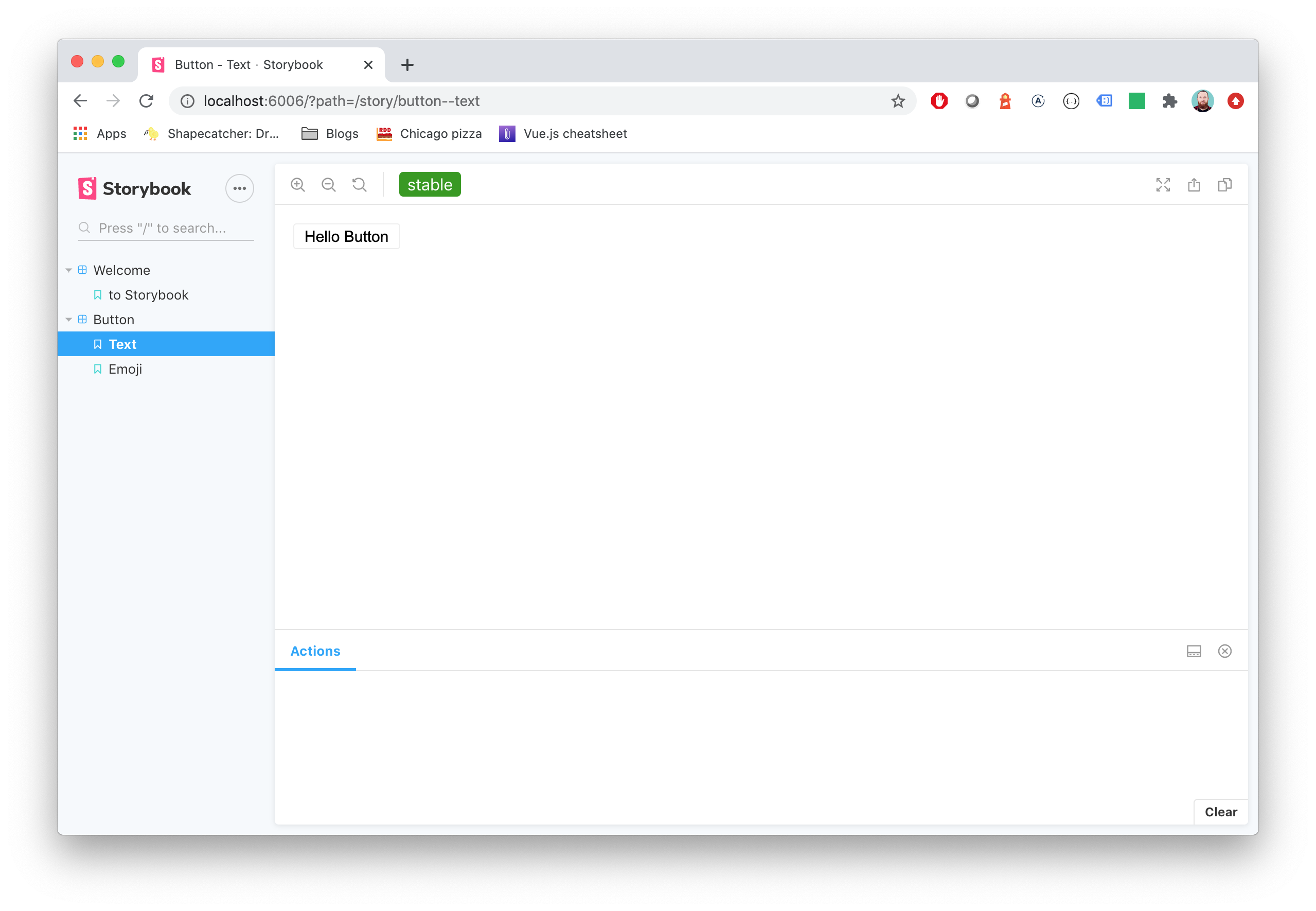
status: 'stable' // stable | beta | deprecated
},
};
export const defaultView = () => (
<a href="https://makebetter.software">Make Better Software</a>
);You'll get an awesome label injected in the top toolbar.
Custom statuses
You caan add a custom status/colour map in preview.js using addParameters.
import { addParameters } from '@storybook/react';

addParameters({
  statuses: {
    wonky: '#8b008b',
    perfect: '#2e8b57',
    'run away': '#dc143c',
  },
});
Made with ☕ at Etch
Migration guide
Need to update your major version?