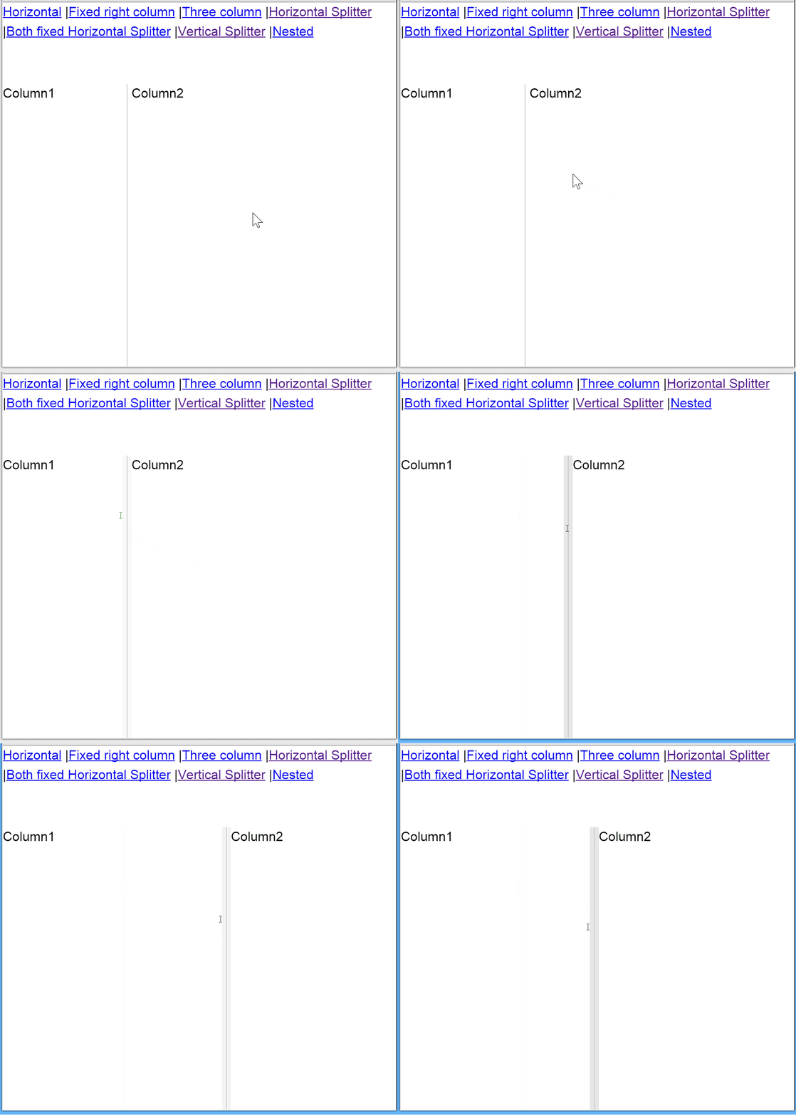
react-flex-layout
react-flex-layout combines ideas from react-split-pane and react-layout into a single project which has good browser compatibility
Demo
Usage
var Layout = require('react-flex-layout').Layout

<Layout fill='window'>
  <Layout layoutWidth='flex'>Column1</Layout>
  <Layout layoutWidth={100}>Column2</Layout>
</Layout>
This will work as expected, the outer layout will fill the browser window exactly, the right panel will be fixed at 100px and the left panel will fill the rest. As the browser is resized the layouts will update.
If you want to allow the user to resize it is as simple as dropping a <LayoutSplitter /> between the panels
var Layout = require('react-flex-layout').Layout
var LayoutSplitter = require('react-flex-layout').LayoutSplitter

<Layout>
  <Layout layoutWidth={100}>Column1</Layout>
  <LayoutSplitter />
  <Layout layoutWidth='flex'>Column2</Layout>
</Layout>
If you are using ES6 Imports
import {Layout, LayoutSplitter} from 'react-flex-layout'

<Layout>
  <Layout layoutWidth={100}>Column1</Layout>
  <LayoutSplitter />
  <Layout layoutWidth='flex'>Column2</Layout>
</Layout>
Compatibility
- Chrome
- FireFox
- Internet explorer ? (untested...)
