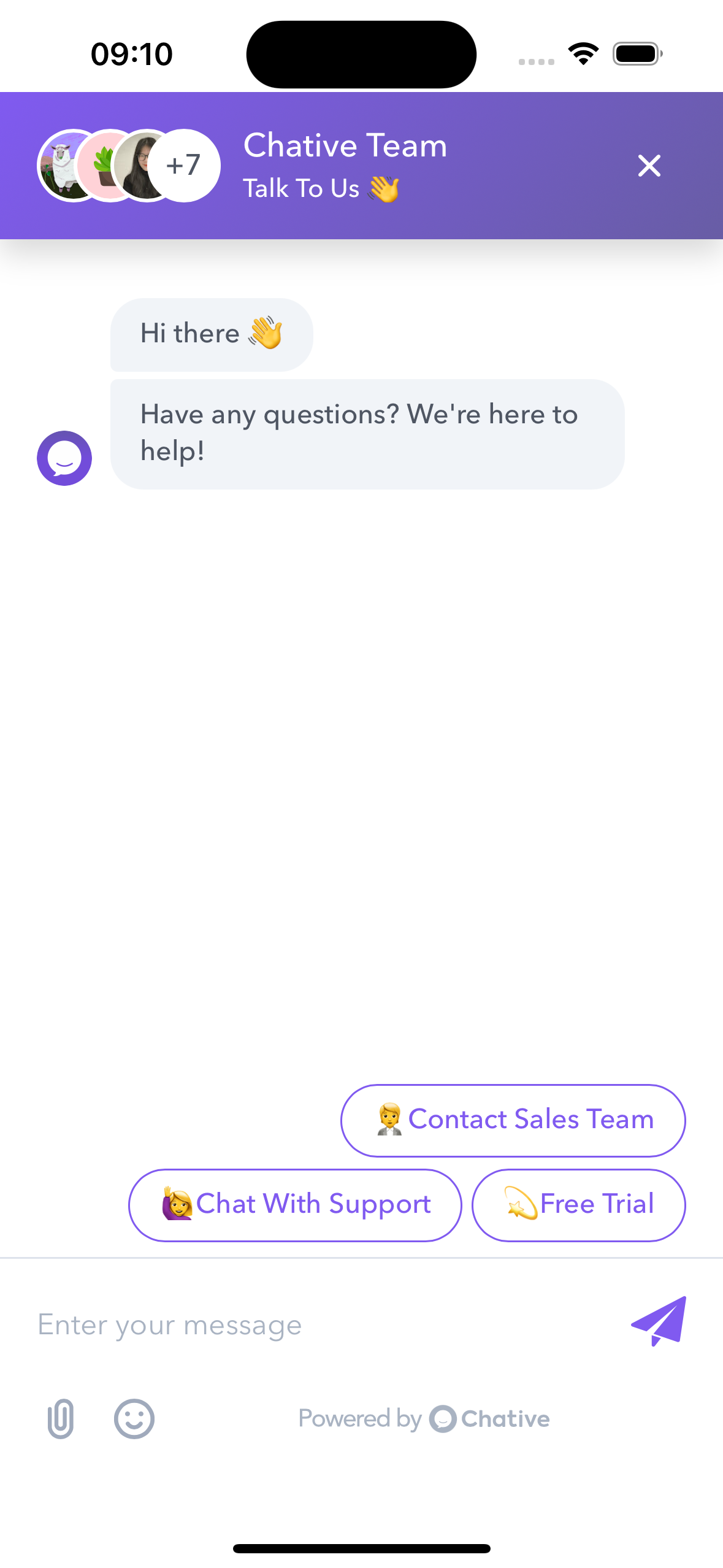
Chative.IO Widget for React Native
Chative.IO Widget is a React Native component that provides an easy-to-use chat widget for your mobile applications. It allows you to integrate a customizable chat interface with minimal setup.
- Customizable chat interface
- Easy to show/hide programmatically
- Supports custom header components
- Supports filling user information into live chat. (v0.5 or higher)
- Adjustable insets for different device sizes
- TypeScript support
npm install @chative.io/react-native-widget
# or
yarn add @chative.io/react-native-widget
This library depends on react-native-webview and async-storage. Please follow the instructions provided in the docs.
Here's a basic example of how to use the ChativeWidget in your React Native application:
import React, { useRef } from 'react';
import { Button, View } from 'react-native';
import ChativeWidget from '@chative.io/react-native-widget';

export default function App() {
  const widgetRef = useRef(null);

  const handleOpenChat = () => {
    widgetRef.current?.show();
  };

  const handleCloseChat = () => {
    // widgetRef.current?.hide();
  };

  const user = {
    user_id: 'UNIQUE_USER_ID',
     user: {
        email: 'acme@example.com', // Your user's email address
        first_name: 'John',
        last_name: 'Doe',
        phone: '+1234567890',
        custom_field: 'CUSTOMER_FIELD_VALUE' // Replace key and value with your custom field
    },
  }

  return (
    <View style={{ flex: 1 }}>
      <Button title="Open Chat" onPress={handleOpenChat} />
      <ChativeWidget
        ref={widgetRef}
        channelId="your-channel-id"
        user={user} // v0.5 or higher
        onClosed={() => console.log('Widget closed')}
        onLoaded={() => console.log('Widget loaded')}
        onNewMessage={(message) => console.log('New message:', message)}
        onError={(message) => console.log('Error', message)}
      />
    </View>
  );
}| Prop | Type | Required | Description |
|---|---|---|---|
| channelId | string | Yes | The ID of the chat channel |
| user | ChativeWidgetUser | No | Information about the user, used for booting into live chat. |
| headerComponent | ReactElement | No | Custom header component |
| containerStyle | ViewStyle | No | Custom style for the container |
| insetTop | number | No | Top inset (default: 50 for iOS, 20 for Android) |
| insetBottom | number | No | Bottom inset (default: 50 for iOS, 20 for Android) |
| onClosed | () => void | No | Callback when the widget is closed |
| onLoaded | () => void | No | Callback when the widget is loaded |
| onNewMessage | () => void | No | Callback when a new message is received |
| onError | (error:string) => void | No | Callback function triggered when an error occurs. |
The following methods are available via the ref:
show(): Display the chat widgethide(): Hide the chat widgetreload(): Reload the widget
You can customize the appearance of the widget by providing a custom header component and container style:
<ChativeWidget
  ref={widgetRef}
  channelId="your-channel-id"
  headerComponent={<YourCustomHeader />}
  containerStyle={{ backgroundColor: 'lightgray' }}
/>This module includes TypeScript declarations. You can import types like this:
import ChativeWidget, { ChativeWidgetRef, ChativeWidgetUser } from '@chative.io/react-native-widget';| Field | Type | Required | Description |
|---|---|---|---|
| user_id | string | Yes | A unique identifier for the user. This is used to track the user's session in the chat. |
| user.email | string | No | The user's email address. Optional, but recommended for better user identification. |
| user.first_name | string | No | The user's first name. Optional, useful for personalized interactions. |
| user.last_name | string | No | The user's last name. Optional, useful for personalized interactions. |
| user.phone | string | No | The user's phone number. Optional, can be used for follow-up contact. |
| user.[key: string]: any | any | No | Any additional information about the user, represented as key-value pairs. This can be used for custom data. |
If you encounter any issues or have questions, please file an issue on the GitHub repository.
