Just Write is a client-side web application built in React. It allows a user from any WordPress website to log in and manage posts via its REST API. The project structure and build process come from my personal React boilerplate.
I completed the bulk of this project's design and development in about 10 days. So while no software is ever complete, to say Just Write is "ready to ship" would be a bit of a stretch. This project is about exploring React, the WordPress API, and the potential possibilities.
Featured on WP Tavern: Just Write: A Client-Side React App for Writing and Editing WordPress Posts
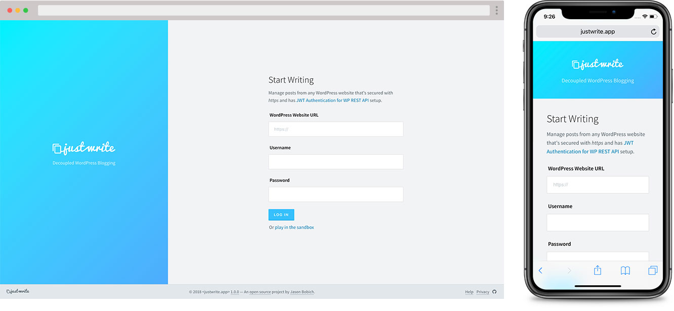
You can use the application at justwrite.app.
In order to log in through the application, your WordPress website needs to be secured on https and have the JWT Authentication for WP REST API plugin set up.
Curious to try it, but don't trust it enough to put in your actual WordPress site?
No worries, I won't take it personally! On the application's login page, just click the Play in the sandbox link and you can edit posts from this simple WordPress blog I've set up with my Jump Start theme.
Feel free to play around and edit anything you want. The demo site has a cron job that resets itself every few hours.
It's important to note that Just Write is simply a client-side application, with no backend. When a user logs in, a POST request is sent to their WordPress website to generate a JWT authentication token. If successful, Just Write then saves this token to the user's local browser storage.
Every time Just Write loads, this token is verified through the WordPress API to maintain the user's logged-in state within the application. This authentication token is then sent in the Header with every API request to WordPress, giving the user the ability to edit content of the website.
If you'd like to fork or clone the project, after installing all of the node modules, here are the project's relevant commands:
npm run start- Start development server, watch for changes & continuously build into the/publicdirectory.npm run build:prod- Re-build the/publicdirectory for production.
Note: For a full list of terminal commands, see my React boilerplate, which this project is based from.
When browsing Github repos, you may not be used to seeing a section like this called "Application Design" but this section is so important. When building any application, we have to think about why we're doing what we're doing, and how that relates to who's using it
So in this section, let's explore the various parts of the application, and the motivation behind how all of the pieces look, feel and function.
Before starting any application, although it in the end it may not be completely literal to the end-user, I believe it's important to design the physical space the user will travel through, when using the application.
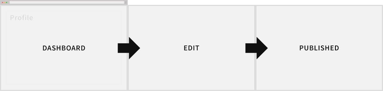
Consider the above diagram. I want the physical space and overall flow through it to be determined by the primary application's objective. In more complex applications, this can be pretty difficult to determine. However, it's pretty straight forward here. I want the user to view their posts, then edit one (or add a new one), and finally, publish that post.
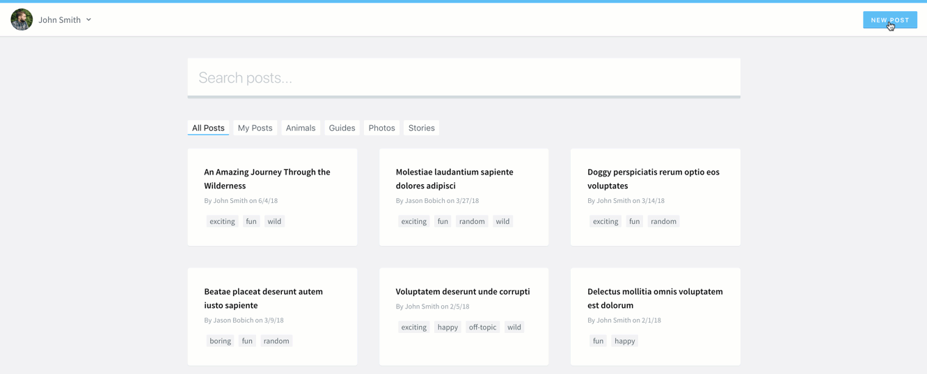
- Dashboard - Application's starting point. An overview of all posts.
- Edit - Adding or editing content.
- Published - More of a metaphysical space that the user is inevitably always traveling towards.
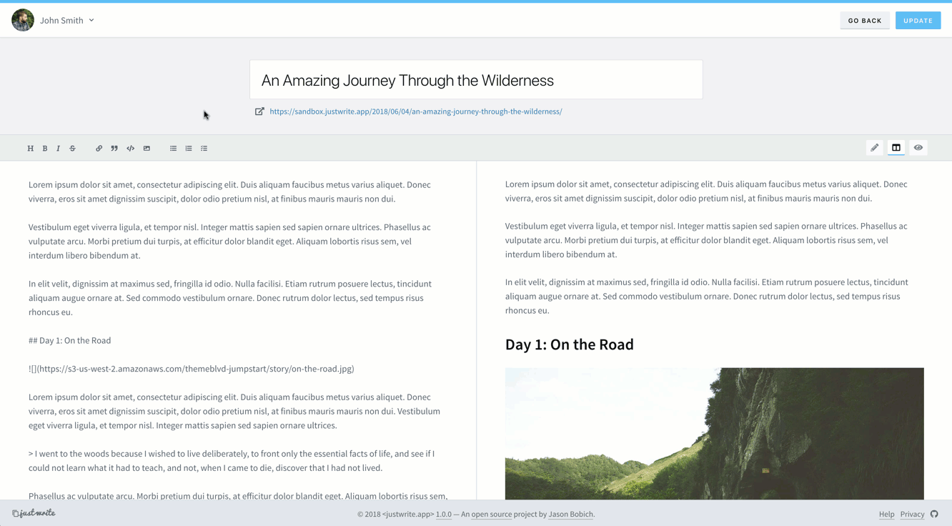
When designing the application's flow, I toyed with how literal I wanted this spacial representation to actually feel to the user. I initially had it extremely literal with the entire view shifting in the direction of the space across the screen. But this was just too jarring on a large desktop view.
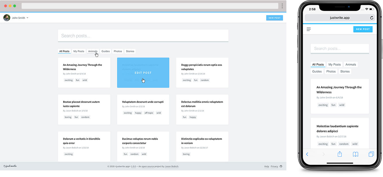
The screenshot below shows how the transitions between primary views inevitably took form. While it's subtle, you can see that the dashboard enters from, and exits to, the left. And the edit view enters from, and exits to, the right.
With the spacial design centering around that primary objective, there needs to be room in the space for extras, or secondary objectives. In this application, we've just got the user's profile but this could potentially grow to more things in the future. This is where our space begins to transform into something more three-dimensional.
And so the panel to edit the profile can be stacked beneath the application, waiting to be revealed by bringing it forward along the z-axis in front of the application's base plane. This idea of "stacking" is also useful because it will allow our application to easily grow in the future to accommodate more secondary objectives.
The ultimate goal of the dashboard is to motivate the user to do one thing - to just write.
A more common CMS design (like what I've done in Back Road) would be to present the editable content in a more "top-level" accessible manner, like in a table or list. This would allow the user to get a better visual overview of all things available to edit.
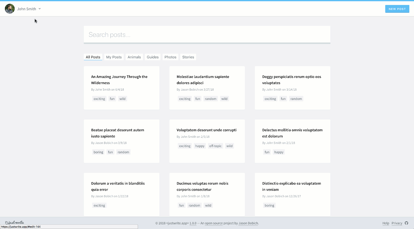
However, in encouraging the user to "just write" I wanted to foster this concept of presenting the user with what they're currently passionate about. And for most people, this is often what they're in the process of writing or what they've written recently. So I prominently display the user's most recent posts, but in a more interesting and pleasing way than a simple list or table.
The downside to this in a "content management" sense is that it's difficult to drill down and find older things. To combat this, I've added the giant, can't miss search box and the filtering options below it.
With an application that focuses on writing, it's understandable that the primary goal would be to decouple that experience away from the other complications of the WordPress admin. So with all of the additional things I could potentially pluck from WordPress to make editable, you may be wondering why I chose the user's profile information.
In trying to empathize with my target user, I'm making the assumption that someone passionate about writing and blogging is most likely proud of things they're spending all this time to write. And since most WordPress themes tend to display the post author's name, bio, links, etc, somewhere in single posts, it makes sense that the user will want to tweak and edit this over time.
Arguably the most important part of the application is probably where the user actually authors their posts. Make sense, right?
Because this project came together so fast, I made a few quick, hard decisions that impact things pretty heavily. And of course, these decisions could easily be debated until the end of eternity.
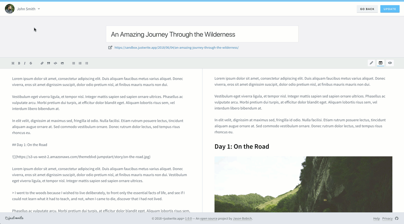
- The user will edit in Markdown. - Highly debatable for a writing application. As a developer, I'm just naturally drawn to Markdown. I love it.
- The user may need help with Markdown. - A Markdown aficionado can get to writing, but other users should have basic controls to help them, if they need them.
- The user needs a preview. - This application walks a very fine line between a CMS and Headless CMS. If you think about it as a decoupled extension of the WordPress admin, it's more part of a CMS. But if you think of it as a means to post to an API, you could call it a headless CMS because the application itself doesn't actually do any front-end rendering. Technically, neither description alone really sums it up well. If I were building strictly a Headless CMS, I might avoid their being a preview representation of what's being written because it's then more about a block of data being posted to an API to be consumed in whatever way the front-end client decides. However, in this case, we know this block of data will become HTML content in a WordPress blog; so let's give the user a little guidance in what they're writing. Also, the user will stay more engaged in the application if they can see a well displayed rendering of what they're authoring.
Taking the above factors into account, I decided to extend André Pena's react-mde, which extends Facebook's draft.js.
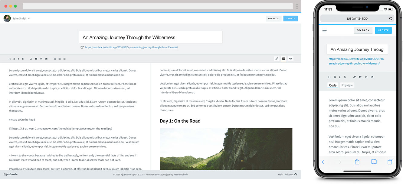
When implementing the editor, it became apparent that having the toolbar stick when scrolling was extremely important for absolute basic usability. Adding that helped things quite a bit.
After showing this application to a few colleagues, it was pointed out to me that the editing experience was very similar to Ghost. Now while I've definitely heard of the infamous NodeJS blogging application, I had admittedly never used it or seen its admin panel. So this was sort of a coincidence.
But then after looking at Ghost's editing experience to compare, I quickly realized it had a fantastic feature Just Write's editor was sorely missing. And that was the ability to scroll the preview panel independently of the editor panel. Adding this made the editor so much more usable.
And lastly, this often gets overlooked, but let's not count out the importance of a smooth update flow to keep the user engaged in the application.
In this case, the primary action button in the top right corner has the user's direct attention to begin with. They've moved the mouse and clicked (or tapped with their finger), and so it's important for this to provide immediate feedback. Next, there is actually a slight explicit delay between the button's animation and the success notification to let the user be a part of the flow that's happenning. The notification then smoothly displays and disappears, with no action or effort from the user.
Jason Bobich