| Android | iOS | PickerIOS | Windows | MacOS |
|---|---|---|---|---|
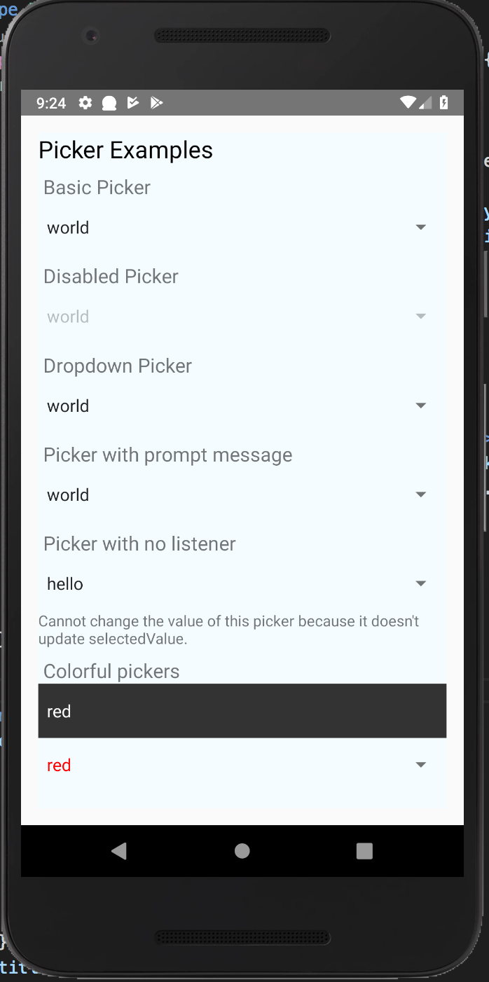 |
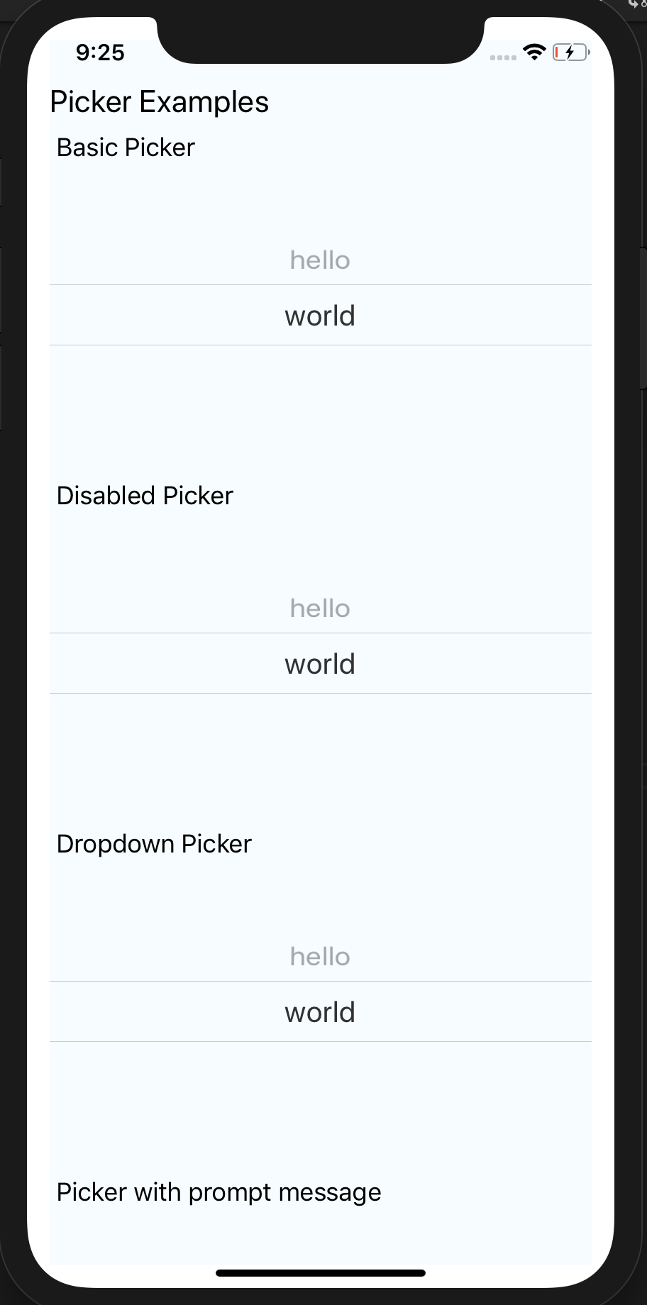 |
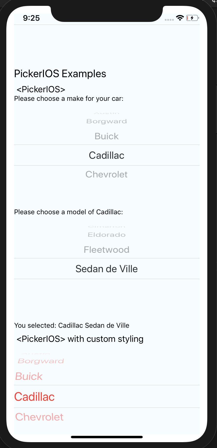 |
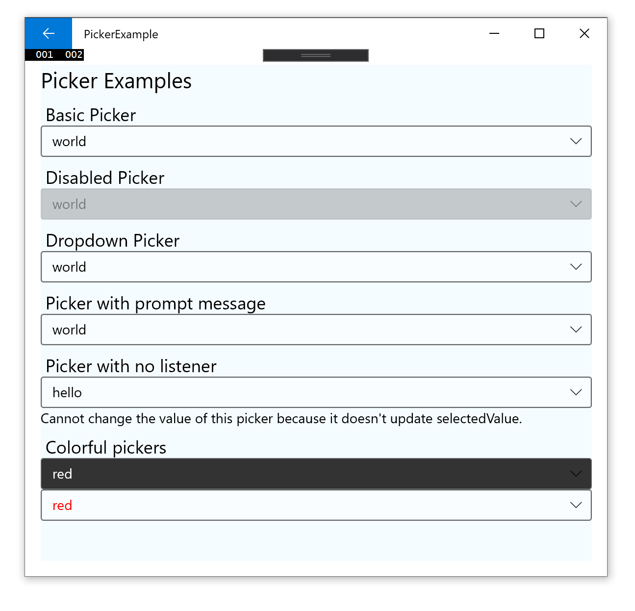 |
 |
| @react-native-picker/picker | react-native |
|---|---|
| >= 1.2.0 | 0.60+ or 0.59+ with Jetifier |
| >= 1.0.0 | 0.57 |
This component is not supported in the managed workflow for expo sdk 37. Please import the Picker from react-native.
See more info here
$ npm install @react-native-picker/picker --save
or
$ yarn add @react-native-picker/picker
As react-native@0.60.0 or above supports autolinking, so there is no need to run linking process. Read more about autolinking here.
CocoaPods on iOS needs this extra step
npx pod-install
No additional step is required.
- Open the solution in Visual Studio 2019
- Right-click Solution icon in Solution Explorer > Add > Existing Project
Select
D:\dev\RNTest\node_modules\@react-native-picker\picker\windows\ReactNativePicker\ReactNativePicker.vcxproj
Add a reference to ReactNativePicker to your main application project. From Visual Studio 2019:
Right-click main application project > Add > Reference...
Check ReactNativePicker from Solution Projects.
Add #include "winrt/ReactNativePicker.h".
Add PackageProviders().Append(winrt::ReactNativePicker::ReactPackageProvider()); before InitializeComponent();.
CocoaPods on MacOS needs this extra step (called from the MacOS directory)
pod install
$ react-native link @react-native-picker/picker
- In XCode, in the project navigator, right click
Libraries➜Add Files to [your project's name] - Go to
node_modules➜@react-native-picker/pickerand addRNCPicker.xcodeproj - In XCode, in the project navigator, select your project. Add
libRNCPicker.ato your project'sBuild Phases➜Link Binary With Libraries - Run your project (
Cmd+R)<
- Open application file (
android/app/src/main/java/[...]/MainApplication.java)
- Add
import com.reactnativecommunity.picker.RNCPickerPackage;to the imports at the top of the file - Add
new RNCPickerPackage()to the list returned by thegetPackages()method
- Append the following lines to
android/settings.gradle:include ':@react-native-picker_picker' project(':@react-native-picker_picker').projectDir = new File(rootProject.projectDir, '../node_modules/@react-native-picker/picker/android') - Insert the following lines inside the dependencies block in
android/app/build.gradle:implementation project(path: ':@react-native-picker_picker')
- In XCode, in the project navigator, right click
Libraries➜Add Files to [your project's name] - Go to
node_modules➜@react-native-picker/pickerand addRNCPicker.xcodeproj - In XCode, in the project navigator, select your project. Add
libRNCPicker.ato your project'sBuild Phases➜Link Binary With Libraries - Run your project (
Cmd+R)<
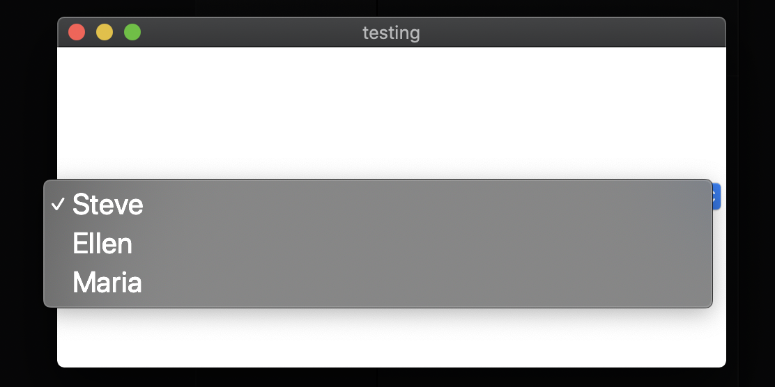
Renders the native picker component on iOS and Android. Example:
Import Picker from @react-native-picker/picker
import {Picker} from '@react-native-picker/picker';Create state which will be used by the Picker
state = {
  language: 'java',
};
Add Picker like this:
<Picker
  selectedValue={this.state.language}
  style={{height: 50, width: 100}}
  onValueChange={(itemValue, itemIndex) =>
    this.setState({language: itemValue})
  }>
  <Picker.Item label="Java" value="java" />
  <Picker.Item label="JavaScript" value="js" />
</Picker>Callback for when an item is selected. This is called with the following parameters:
itemValue: thevalueprop of the item that was selecteditemPosition: the index of the selected item in this picker
| Type | Required |
|---|---|
| function | No |
Value matching value of one of the items. Can be a string or an integer.
| Type | Required |
|---|---|
| any | No |
| Type | Required |
|---|---|
| pickerStyleType | No |
Used to locate this view in end-to-end tests.
| Type | Required |
|---|---|
| string | No |
If set to false, the picker will be disabled, i.e. the user will not be able to make a selection.
| Type | Required | Platform |
|---|---|---|
| bool | No | Android, Windows |
On Android, specifies how to display the selection items when the user taps on the picker:
- 'dialog': Show a modal dialog. This is the default.
- 'dropdown': Shows a dropdown anchored to the picker view
| Type | Required | Platform |
|---|---|---|
| enum('dialog', 'dropdown') | No | Android |
On Android, specifies color of dropdown triangle. Input value should be hexadecimal string
| Type | Required | Platform |
|---|---|---|
| string | No | Android |
Prompt string for this picker, used on Android in dialog mode as the title of the dialog.
| Type | Required | Platform |
|---|---|---|
| string | No | Android |
Style to apply to each of the item labels.
| Type | Required | Platform |
|---|---|---|
| text styles | No | iOS, Windows |
| Type | Required |
|---|---|
| text styles | No |
| Type | Required |
|---|---|
| function | No |
| Type | Required |
|---|---|
| any | No |


