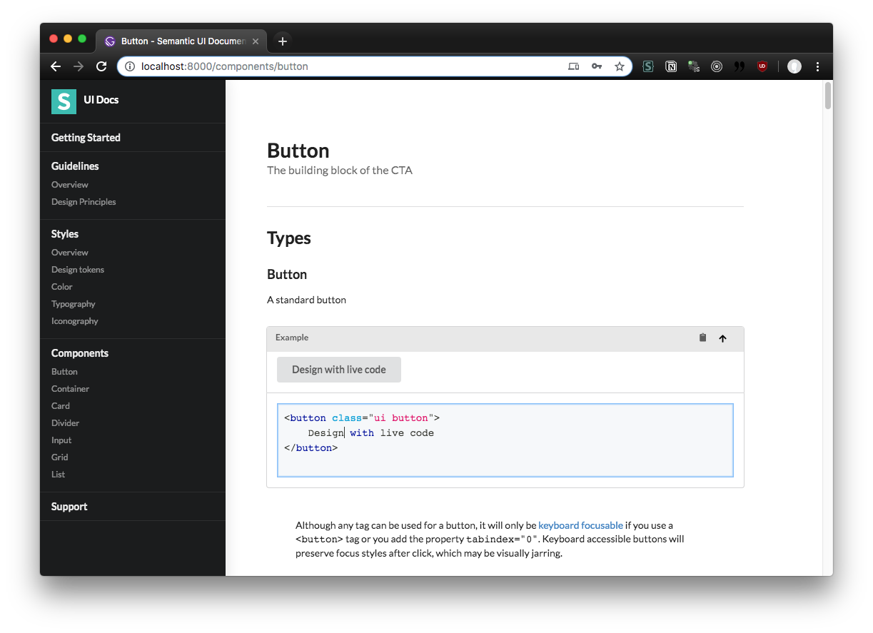
Documentation for the Semantic UI design system and component library. This is a statically generated PWA built using GatsbyJS, using MDX to render Markdown and React components into pages.
Feel free to use this as a basis for your next documentation project (particularly if you already use Semantic UI). Works great with HTML/CSS based component libraries.
- 🎛 MDX
- 💄 SASS/LESS
- 🔷 Semantic UI
- 💻️ Live Code component
- ☎️ SEO component
- 🕹 PWA
✈️ Offline-ready- 📱 Mobile-friendly
- 📡 Webpack aliasing
- 📦 JSON support
- 👕 Prettier + Markdown lint
- 🔌 Nodemon
- Install NodeJS
cd /path/to/semantic-ui-docs-gatsby/npm inpm run develop
This project uses semantic-ui-css to quickly boostrap a default SUI theme. You can change this in gatsby-browser.js and import your own themed CSS.
SASS and LESS is supported out of the box if you want to import source files vs production CSS.
npm run build
This runs the Gatsby build process (gatsby build under the hood). Gatsby will create a /docs/public/ folder if it already doesn't exist, and add everything you need for the docs PWA inside there. Since the /public folder contains an index.html, you can just upload the folder to any server or CDN to run the docs.
There are two ways to create pages with this Gatsby setup, with ReactJS files or MDX.
Gatsby builds pages by using the JS files in /src/pages/. Each JS file is a React component that represents page content, which should be wrapped in a <Layout> component (/src/components/layout.js) that contains documentation template.
You can create a new page by adding a new JS file in the pages directory. The name of the file will be the slug of the page (e.g. /src/pages/about.js == yourwebsite.com/about). Inside the file, Gatsby requires that you export a React component. This might seem intimidating, but any function can be a React component as long as you return HTML or JSX (basically React's way of writing components like <Layout>).
Page Template:
import React from "react"

import Layout from "@components/layout"

export default function PageName() {
  return (
    <Layout>
      <div className="content"></div>
    </Layout>
  )
}
With React pages you're not limited to documentation style pages. If you check out the
/src/pages/index.jsfile, you'll see I forego using the<Layout>component completely to break the documentation convention. Just make sure to usereact-helmetto add meta tags to the document<head>, otherwise your page title won't show (and SEO will suffer).
The easiest way to create content is using MDX. Gatsby for MDX files inside the /content/ subdirectories. If you're looking to write component documentation, it should go in /content/definitions/. Otherwise any other type of page should go in the /content/pages/ folder.
Gatsby uses Markdown "frontmatter" to create pages and is required for pages to work. Inside the frontmatter, you'll need a title (page title), path (the actual page slug), date (last date modified), and created (also a date) fields.
Since you're also using MDX, you have the ability to use any React components passed into the rendering scope (see: /src/templates/posts.js). This means you can use any Semantic UI React components, as well as special layout components created for the docs (e.g. <Masthead title="Getting Started" subheader="Getting up and running with Semantic UI" />).
Page Template:
---
title: Getting Started
path: /introduction/getting-started
date: 2019-10-23
created: 2019-10-23
---

<Masthead
  title="Getting Started"
  subheader="Getting up and running with Semantic UI"
/>

## Preface

Semantic UI packaged Gulp build tools so your project can preserve its [own theme changes](https://semantic-ui.com/usage/theming.html).

```jsx live
<Button>Get Started</Button>
```The sidebar is controlled by gatsby-config.js, where you'll find the siteMetadata.sidebar.pages property. The pages property accepts an array of objects with a slug, title, and optionally an array of more sub-pages (similarly structured).
{
      pages: [
        {
          slug: "/getting-started",
          title: "Getting Started",
        },
        {
          slug: "/guidelines/overview",
          title: "Guidelines",
          pages: [
            {
              slug: "/guidelines/overview",
              title: "Overview",
            },
            {
              slug: "/guidelines/design-principles",
              title: "Design Principles",
            },
          ],
        },
        ...
      ]
}
You can see how this array is rendered in /src/components/sidebar.js. Each page is rendered as a SUI menu item, and if there are nested pages, it's rendered using the <Dropdown> component. This current setup only supports one level of nested pages.
You can place images in Gatsby's /static/ folder, which gets uploaded to the CDN. This allows you to reference the image by https://yourgatsbysite.com/assets/img/image.png by adding an image to /static/assets/img/image.png. This is recommended for images you plan to use in multiple places across the app and need easy access.
Otherwise you should use the methods below.
You can import "local" images using Markdown syntax or HTML that are contained in the same folder. This uses a Markdown plugin to copy images to your bundle, and process them using Gatsby's image plugin (giving you lazy loading, device based sizing, etc):
Gatsby uses Webpack to bundle the site, so if you use the import JS syntax, you can include images in your React components:
import YourImage from "../../your/relative/path/image.png"
// Refers to any images inside `/src/images/`
// using Webpack's aliasing (see `gatsby-node.js`)
import YourOtherImage from "@images/image.png"

export const Image = () => <img src={YourImage} />We use MDX to allow more accessible authoring of documentation, which enables you to use Markdown to create code snippets.
For example, to display a code snippet and live editable example:
## Button example

```html live=true
<button class="ui button">
  Follow
</button>
```You can use the same component that's used when rendering MDX, the <CodeBlock>. It accepts code as 'children' and the classname determines the language used for highlighting.
import CodeBlock from "@components/CodeBlock/CodeBlock"

const codeExample = `<div>Legalize it</div>`

<div className="ui inverted segment">
  <h3>Code snippet:</h3>
  <CodeBlock className="language-js">{codeExample}</CodeBlock>
</div>
