Simple Theme for ggplot2 Based on W.E.B. Du Bois' Data Visualizations.
To install from Github, use the devtools package:
## Install package
devtools::install_github("vladmedenica/themedubois")

## Load package
library(themedubois)Inspired by the excellent posts tagged #DuBoisChallenge and Dr. Charlie Eaton's custom Stata scheme, this basic package offers a very simple ggplot2 theme that mimics the overall look of W.E.B. Du Bois' Data Portraits. It provides a starting point for R users who want to make Du Bois-inspired plots who can then can modify and customize their visualizations further.
The core theme, theme_dubois(), is built using the "Jefferies" font, which can be downloaded and installed for free and then imported into R using the extrafonts package. This font is a rough (but nowhere near perfect) approximation of the font style used in Du Bois' original data portraits. The "Amarillo USAF" font is also a great choice for plot titles and text. Unfortunately, it is limited in that it does not include important characters like parentheses.
Also included are two color palettes, which can be accessed using the following functions:
scale_color_dubois1()&scale_fill_dubois1(): Discrete color scale that includes a palatte of 7 colors inspired by plate #25scale_color_dubois2()&scale_fill_dubois2(): Discrete color scale that includes a palatte of 3 colors inspired by plate #10 palette
## Load the tidytuesday package to access Du Bois data
 library(tidytuesdayR)
 tt <- tt_load("2021-02-16")

## Load tidyverse and themedubois packages
 library(tidyverse)
 library(themedubois)

## Load and wrangle the GA population dataset
 ga_pop_dat <- tt$georgia_pop %>%
  pivot_longer(-Year, names_to = "Race", values_to = "pct") %>%
  mutate(Race = glue::glue(" = {Race}"))

## Replicate the line graph using theme_dubois()
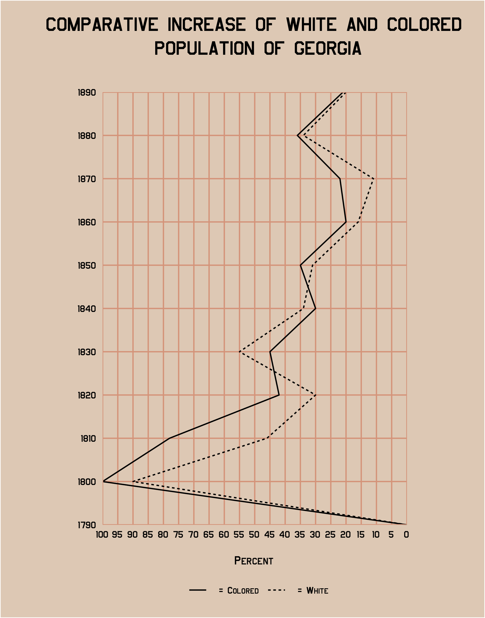
ggplot(ga_pop_dat, aes(y = pct, x = Year, group = Race, linetype = Race)) +
  geom_line(size = 0.5) +
  # reverse the y-axis and format breaks
  scale_y_reverse(breaks = seq(0, 100, 5),
                  expand = c(0, 0)) +
  # format x-axis breaks
  scale_x_continuous(breaks = seq(1790, 1890, 10),
                     expand = c(0, 0)) +
  # add plot title and labels
  labs(linetype = NULL,
       y = "Percent",
       x = NULL,
       title = "COMPARATIVE INCREASE OF WHITE AND COLORED\n POPULATION OF GEORGIA") +
  # apply theme_dubois()
  theme_dubois() +
  # flip plot coordinates to match original
coord_flip()| Original | Using theme_dubois() |
|---|---|
 |
 |
## Load the tidytuesday package to access Du Bois data
 library(tidytuesdayR)
 tt <- tt_load("2021-02-16")

## Load tidyverse and themedubois packages
 library(tidyverse)
 library(themedubois)

## Load and wrangle the conjugal dataset
conjugal_data <- tt$conjugal %>%
  # put the data in tidy format
  pivot_longer(cols = c(-Population, -Age), names_to = "Status", values_to = "Percent") %>%
  # adjust the Population variable and create percentage labels
  mutate(Population = factor(Population),
         Population = fct_rev(Population),
         pct_label = paste0(round(Percent), "%"))

## Replicate the stacked bar graph using theme_dubois()
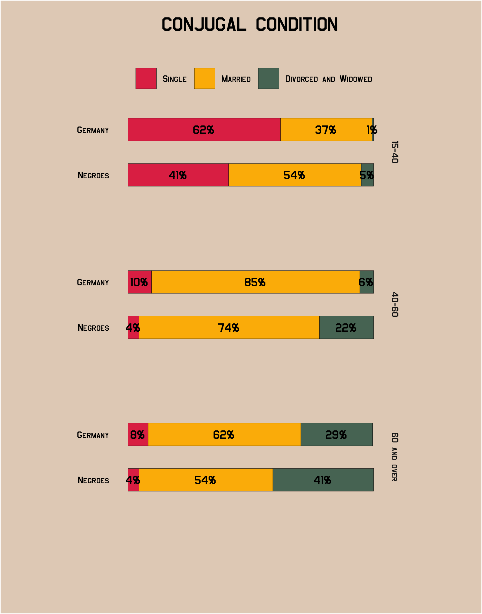
ggplot(conjugal_data, aes(x = Percent, y = Population, fill = Status)) +
  # stack the columns
  geom_col(position = position_stack(),
           width = 0.5,
           color = "black",
           size = 0.1) +
  # add percentage labels
  geom_text(aes(label = pct_label),
            position = position_stack(vjust = 0.5),
            size = 4,
            family = "Jefferies") +
  # arrange in single column
  facet_grid(vars(Age)) +
  # add plot labels
  labs(title = "CONJUGAL CONDITION",
       fill = NULL,
       x = NULL,
       y = NULL) +
  # use the correct color palette
  scale_fill_dubois2() +
  # add theme_dubois
  theme_dubois() +
  # adjust a few theme elements that are specific to this replication
  theme(legend.position = "top",
        panel.grid.major = element_blank(),
        panel.border = element_blank(),
        plot.margin = margin(0.5, 2.25, 3, 2.25, "cm"),
        panel.spacing.y = unit(3, "lines"),
axis.text.x = element_blank())| Original | Using theme_dubois() |
|---|---|
 |
 |
## Load tidyverse
library(tidyverse)

## The classic mtcars plot
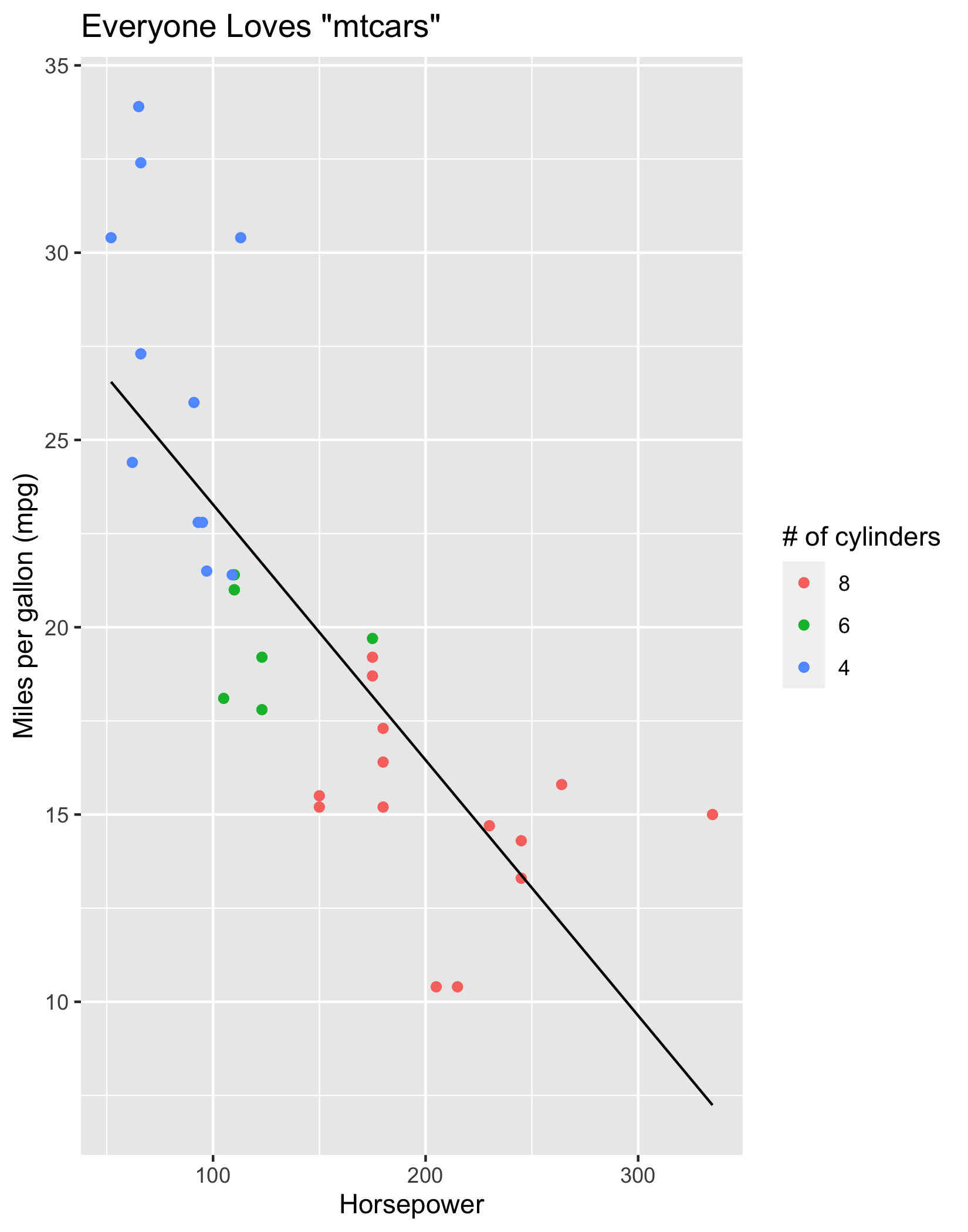
mpg <- ggplot(data = mtcars, aes(x = hp, y = mpg, color = fct_rev(factor(cyl)))) +
         geom_point() +
         geom_smooth(method = "lm", se = FALSE,
                     color = "black", size = 0.5) +
         labs(title = "Everyone Loves \"mtcars\"",
              color = "# of cylinders",
              x = "Horsepower",
              y = "Miles per gallon (mpg)")

## Add Du Bois theme and color palette
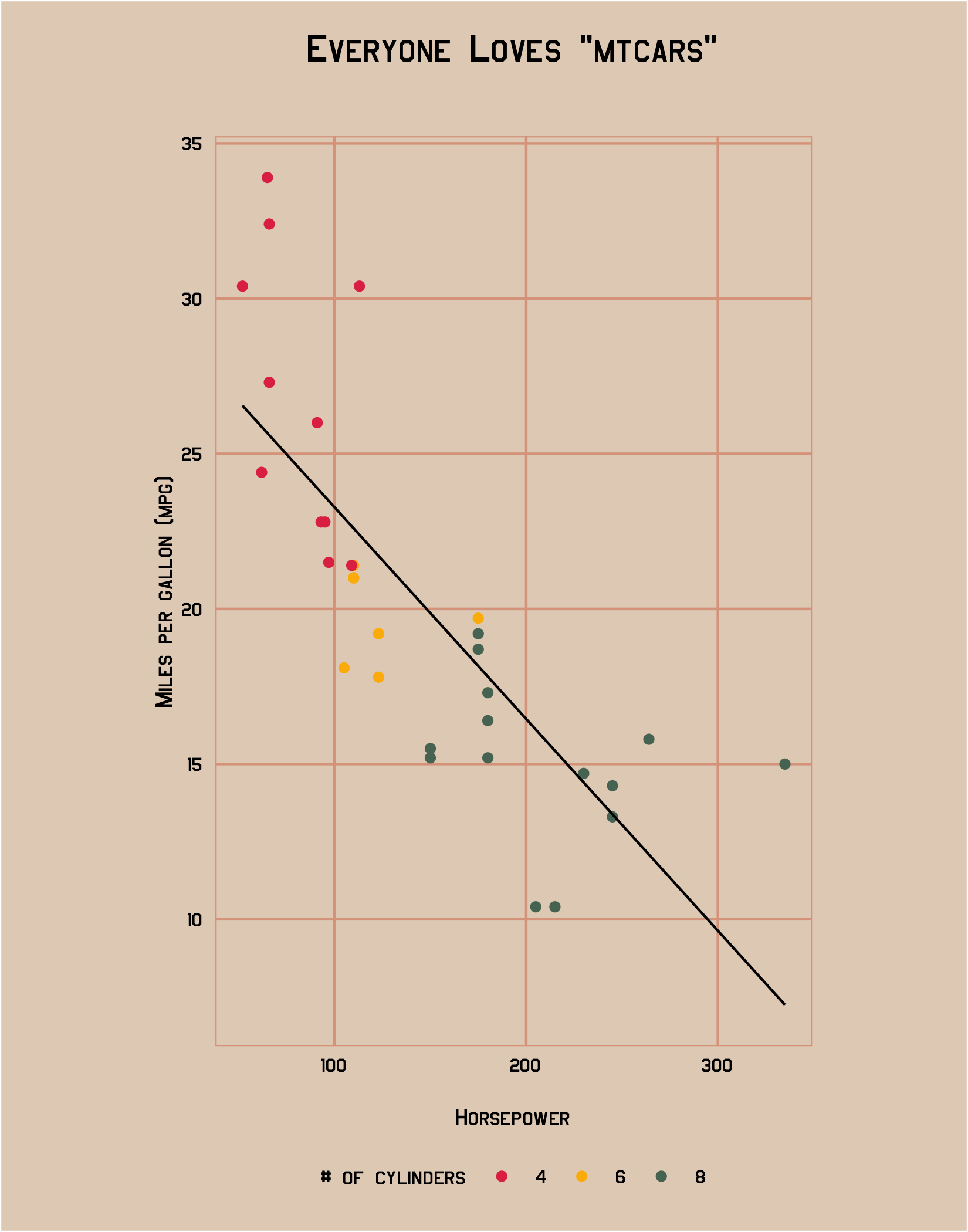
mpg +
  scale_color_dubois2() +
theme_dubois()| Default theme_grey() | Using theme_dubois() |
|---|---|
 |
 |