Examples of how to visualize data dumbly.
On December 14, the National Review Online tweeted the following chart plotting annual global temperature over time.
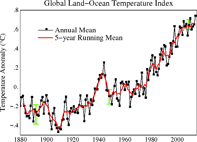
Of course blowing out the y-axis to show the temperature scale from 0-100 F obscures the underlying trend from official NASA data, which shows a significant increase in average temperatures over the past century:
Building off of Sean McElwee's appropriate response, let's have some fun at the expense of NRO's inept data visualization choices using basic economic data.
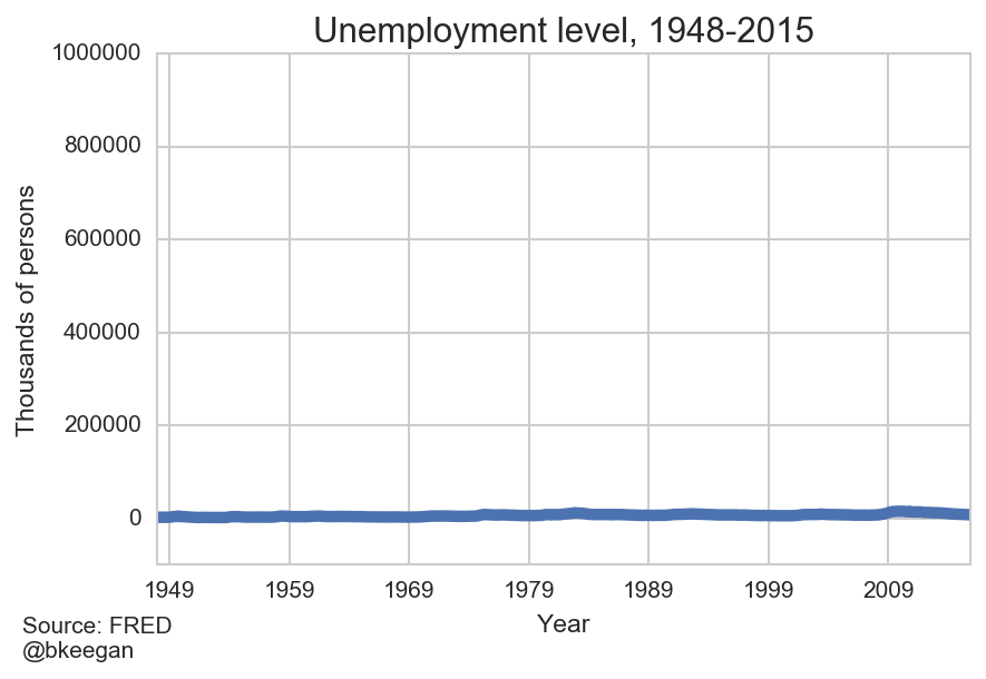
Unemployment has been flat for decades!
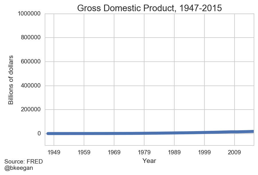
Unfortunately, US GDP hasn't grown despite constant employment levels.
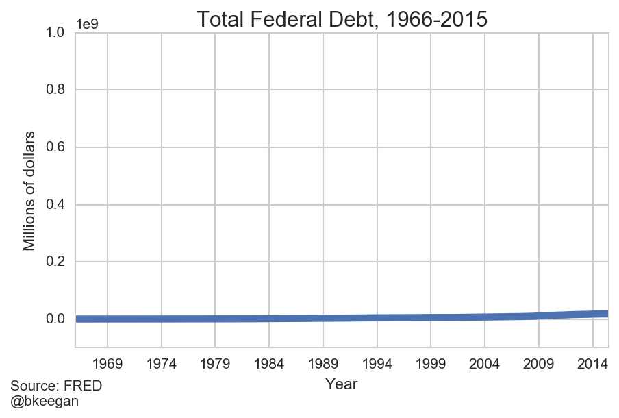
This chart proves that the federal debt isn't actually growing.
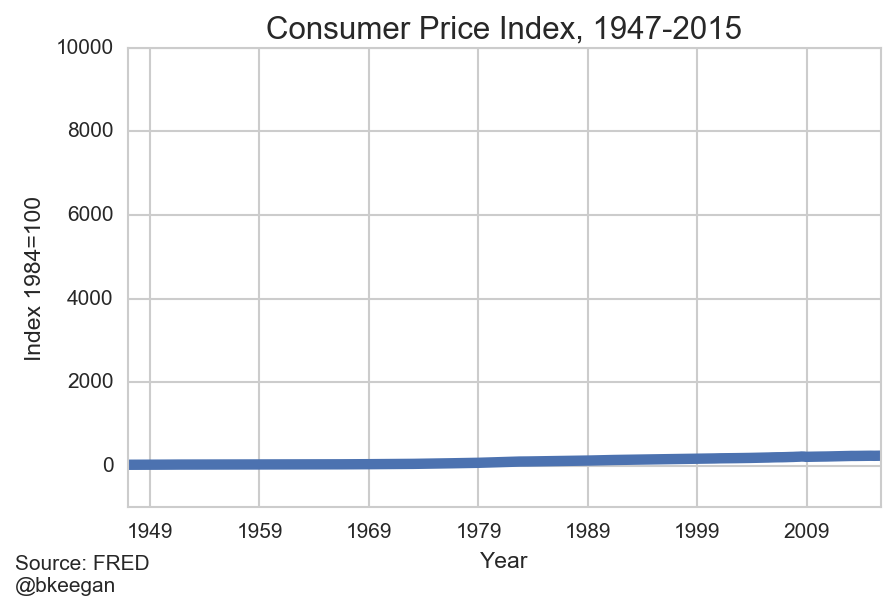
It's remarkable how consistent inflation has been over this whole timeframe.
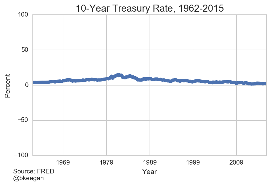
Treasury yields are very stable over time.
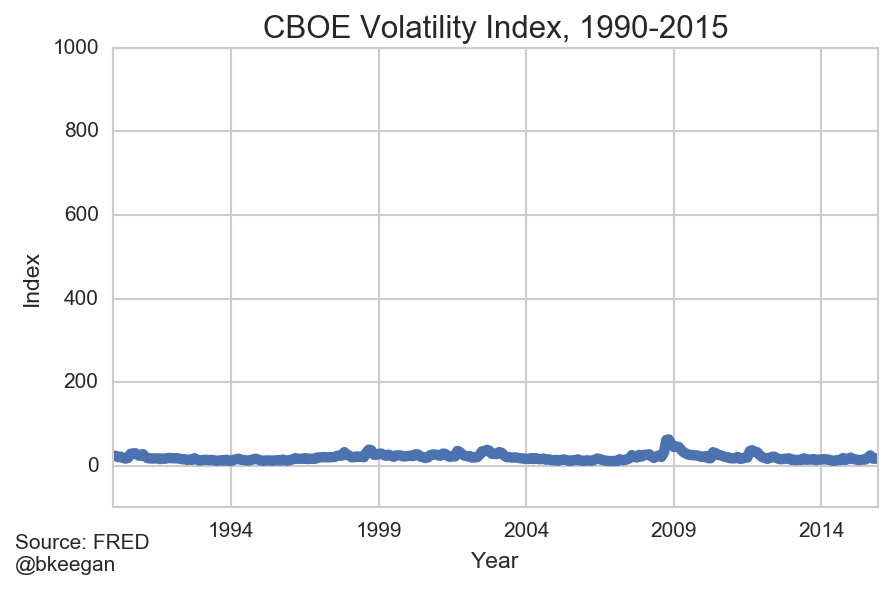
Market volatility is rare and minor.
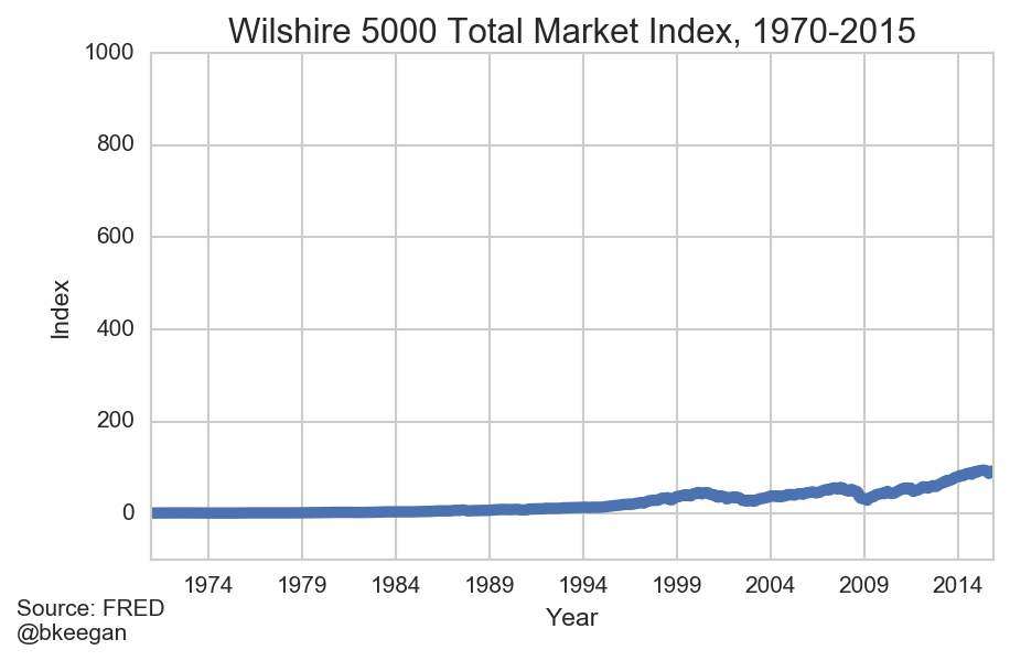
Equity prices are generally stable with consistent growth.
