ggplot2bdc is a collection of themes and other things that can be used when creating plots with ggplot2. For those using the development version of ggplot, subtitles and captions are supported.
- Themes
theme_bdc_greytheme_bdc_paneledtheme_bdc_microtitertheme_bdc_lattice_population
- Modifying Plots
- Removing Plot Elements
gg_remove_titles,gg_remove_title,gg_remove_subtitle,gg_remove_caption,gg_remove_title.x,gg_remove_title.ygg_remove_ticks,gg_remove_ticks_x,gg_remove_ticks_ygg_remove_grid,gg_remove_grid_major,gg_remove_grid_minor,gg_remove_grid_x,gg_remove_grid_ygg_remove_legend,gg_remove_legend_title,gg_remove_legend_key,gg_remove_legend_text,gg_remove_legend_backgroundgg_remove_background,gg_remove_background_canvas,gg_remove_background_legend,gg_remove_background_facet
- Rescaling
gg_rescalegg_rescale_goldengg_rescale_square
- Removing Plot Elements
- Modifying Files Containing Plots
trim_whitespace
- Misc
ggsave_goldenspan
ggplot2bdc is not on CRAN, but you can
use
devtools
to install the latest and greatest version. To do so:
if(!require("devtools")) install.packages("devtools")
devtools::install_github("briandconnelly/ggplot2bdc")
To gain access to the following themes, etc. provided, first load the
gplot2bdc package. We'll also load ggplot, dplyr, and magrittr
for these examples.
library(ggplot2bdc)
library(ggplot2)
library(dplyr)
library(magrittr)
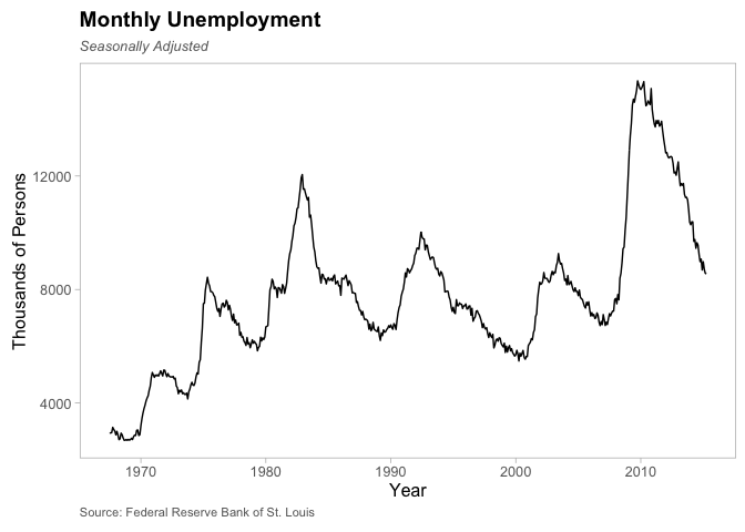
theme_bdc_grey is a clean theme that uses thin grey panels on a white
background. Legends are placed above. Facet labels are displayed as
black text on a grey background.
pUnemploy <- ggplot(data = economics, aes(x = date, y = unemploy)) +
    geom_line() +
    scale_x_date() +
    labs(x = "Year", y = "Thousands of Persons",
         title = "Monthly Unemployment", subtitle = "Seasonally Adjusted",
         caption = "Source: Federal Reserve Bank of St. Louis") +
    theme_bdc_grey()
pUnemploy
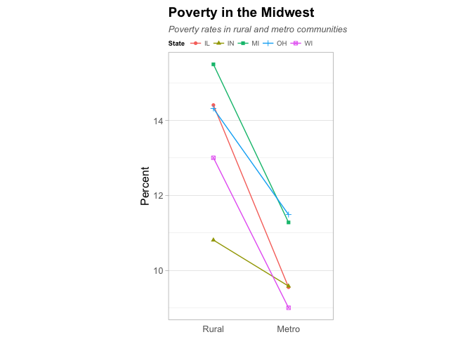
Subtle grid lines can be added to the panels with the grid.x and
grid.y parameters. These also affect minor grid lines, which can
further be controlled with the gridmin.x and gridmin.y parameters.
midwest$inmetro <- factor(midwest$inmetro, levels = c(0, 1),
                          labels = c("Rural", "Metro"))

ggplot(data = midwest,
       aes(x = inmetro, y = percbelowpoverty, color = state, shape = state)) +
    stat_summary(fun.y = "mean", geom = "line", aes(group = state)) +
    stat_summary(fun.y = "mean", geom = "point") +
    scale_color_hue(name = "State") +
    scale_shape_discrete(name = "State") +
    labs(x = NULL, y = "Percent",
         title = "Poverty in the Midwest",
         subtitle = "Poverty rates in rural and metro communities") +
    coord_equal(ratio = 0.5) +
    theme_bdc_grey(ticks.x = FALSE, grid.y = TRUE)
Some people prefer to display categorical data without tick marks along
the axis. These are included by default, but can be removed by setting
either the ticks.x or ticks.y parameters to FALSE.
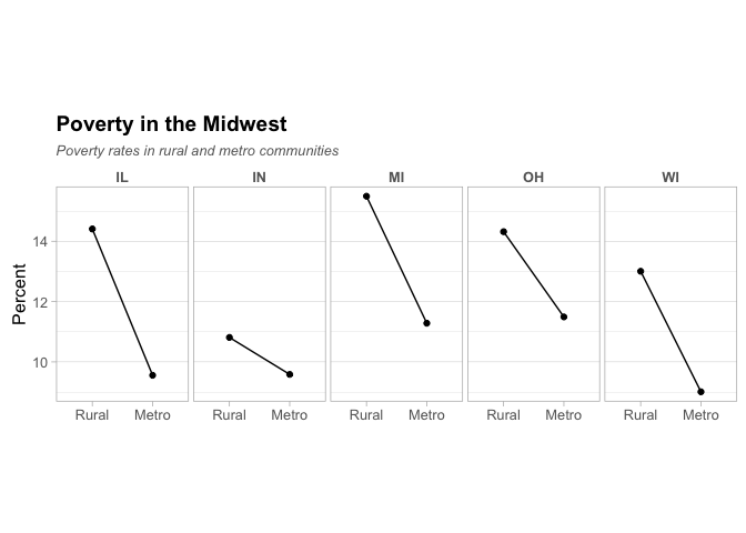
We can also use facets to divide the data by state:
ggplot(data = midwest, aes(x = inmetro, y = percbelowpoverty)) +
    facet_grid(. ~ state) +
    stat_summary(fun.y = "mean", geom = "line", aes(group = state)) +
    stat_summary(fun.y = "mean", geom = "point") +
    labs(x = NULL, y = "Percent",
         title = "Poverty in the Midwest",
         subtitle = "Poverty rates in rural and metro communities") +
    coord_equal(ratio = 0.5) +
    theme_bdc_grey(grid.y = TRUE)
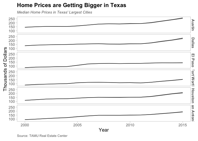
txcities <- txhousing %>%
    filter(city %in% c("Austin", "Dallas", "El Paso", "Fort Worth", "Houston",
                       "San Antonio"))

pTX <- ggplot(data = txcities, aes(x = year, y = median / 1000)) +
    facet_grid(city ~ .) +
    stat_summary(fun.data = "mean_cl_boot", geom = "ribbon",
                 color = NA, alpha = 0.3) +
    stat_summary(fun.y = "mean", geom = "line") +
    labs(x = "Year", y = "Thousands of Dollars",
         title = "Home Prices are Getting Bigger in Texas",
         subtitle = "Median Home Prices in Texas' Largest Cities",
         caption = "Source: TAMU Real Estate Center")

pTX + theme_bdc_grey()
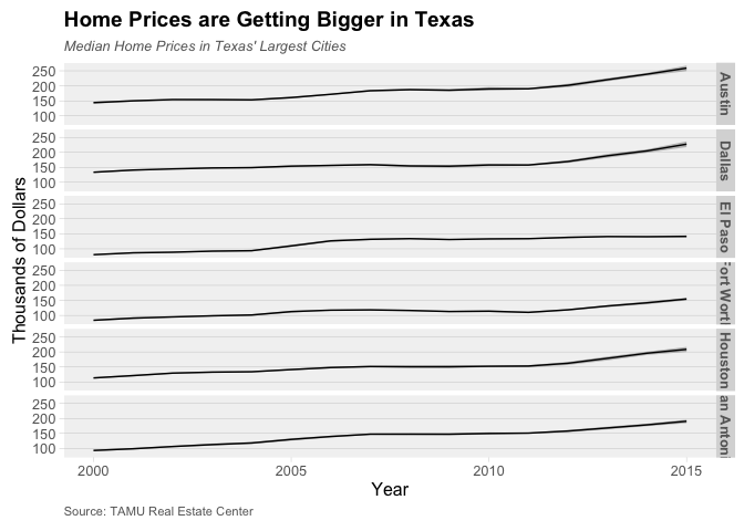
theme_bdc_paneled is a clean theme that displays plots without borders
on grey panels. Legends are placed above. Facet labels are displayed as
plan black text. Subtle grid lines can be added to the panels with the
grid.x and grid.y parameters, and tick marks can be managed with
ticks.x and ticks.y. By default, grid lines are used along the Y
axis. This theme is best suited for plots with multiple facets.
pTX + theme_bdc_paneled()
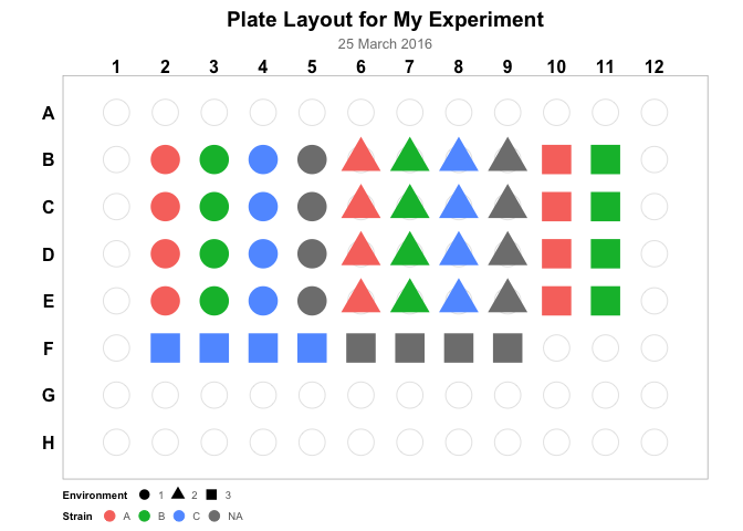
theme_bdc_microtiter is a specialized theme for use in creating
figures that represent 96-well microtiter plates.
pPlate <- ggplot(data = platemap, aes(x = Column, y = Row)) +
    geom_point(data = expand.grid(Column = seq(1,12), Row = seq(1,8)),
               color = "grey90", fill = "white", shape = 21, size = 8) +
    geom_point(aes(shape = Environment, color = Strain), size = 9) +
    coord_fixed(ratio = (13/12)/(9/8), xlim = c(0.5, 12.5), ylim = c(0.6, 8.4)) +
    scale_y_reverse(breaks = seq(1, 8), labels = LETTERS[1:8]) +
    scale_x_continuous(breaks = seq(1, 12), position = "top") +
    labs(title = "Plate Layout for My Experiment", subtitle = "25 March 2016") +
    guides(shape = guide_legend(override.aes = list(size = 3)),
           color = guide_legend(override.aes = list(size = 3))) +
    theme_bdc_microtiter()

pPlate
For more information, see the Plotting Microtiter Plate Maps.
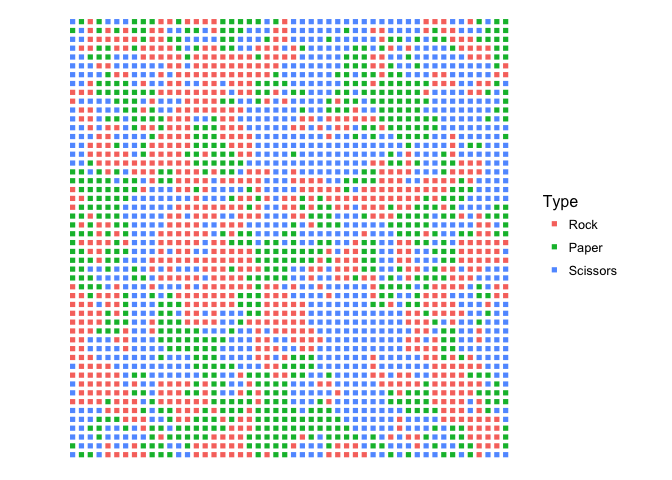
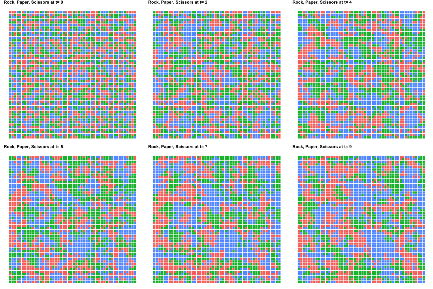
theme_bdc_lattice_population is a specialized theme intended to
display populations of individuals structured spatially in a lattice.
ggplot(data = filter(rockpaperscissors, Time == 10),
       aes(x = X, y = Y, color = Type)) +
        geom_point(shape=15) +
        coord_equal(ratio=1) +
        scale_color_hue() +
        theme_bdc_lattice_population()
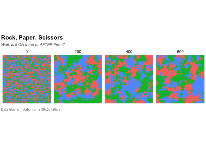
We can also show multiple population states:
ggplot(data = filter(rockpaperscissors, Time %in% c(0, 200, 400, 600)),
       aes(x = X, y = Y, color = Type)) +
    facet_wrap(~Time, nrow = 1, ncol = 4) +
    geom_point(shape = 15) +
    coord_equal(ratio = 1) +
    scale_color_hue(guide = FALSE) +
    labs(title = "Rock, Paper, Scissors",
         subtitle = "Wait, is it ON three or AFTER three?",
         caption = "Data from simulation on a 50x50 lattice") +
    theme_bdc_lattice_population()
This is also a great opportunity to create an animation. We can use gganimate to create an animated GIF showing the population for the first 10 time steps.
library(gganimate)

p <- ggplot(data = filter(rockpaperscissors, Time < 10),
       aes(x = X, y = Y, color = Type, frame = Time)) +
    geom_point(shape = 15, size = 3) +
    coord_equal(ratio = 1) +
    scale_color_hue(guide = FALSE) +
    labs(title = "Rock, Paper, Scissors at t=") +
    theme_bdc_lattice_population()

gg_animate(p = p, saver = "gif", interval = 0.2)
Although you can always change a plot's properties using ggplot2's
theme function, it's often difficult to remember which elements
control a plot's visual characteristics. These and other gg_ functions
make it a bit easier to quickly alter a plot.
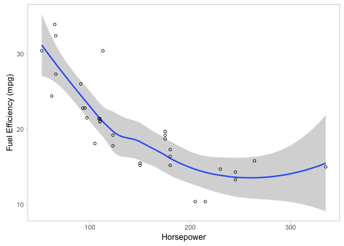
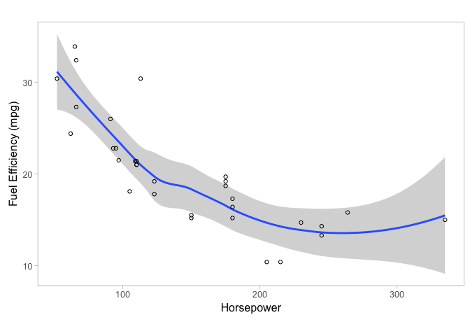
gg_rescale_golden adjusts the proportions of the axes of the given
plot object so that follow the golden ratio (horizontally). If no plot
is provided, the last plot that was displayed is used.
ggplot(mtcars, aes(x = hp, y = mpg)) +
    geom_smooth(method = "loess") +
    geom_point(shape = 1) +
    labs(x = "Horsepower", y = "Fuel Efficiency (mpg)") +
    theme_bdc_grey()
gg_rescale_golden()
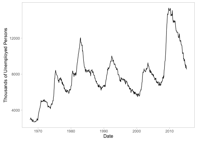
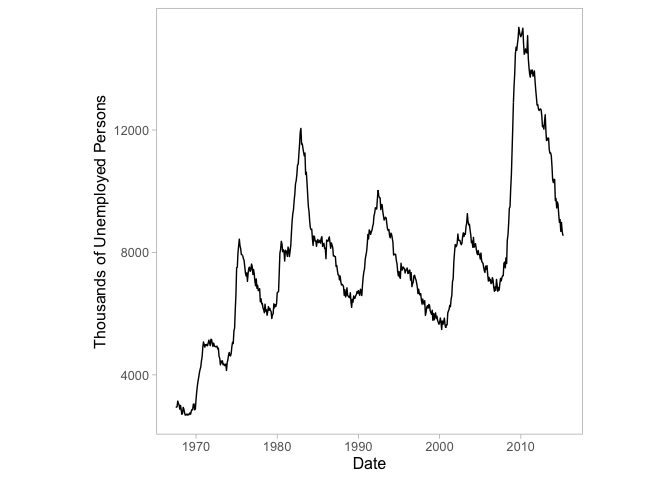
gg_rescale_square adjusts the proportions of the axes of the given
plot object so that they are equal. If no plot is provided, the last
plot that was displayed is used.
ggplot(data = economics, aes(x = date, y = unemploy)) +
    geom_line() +
    labs(x = "Date", y = "Thousands of Unemployed Persons") +
    theme_bdc_grey()
gg_rescale_square()
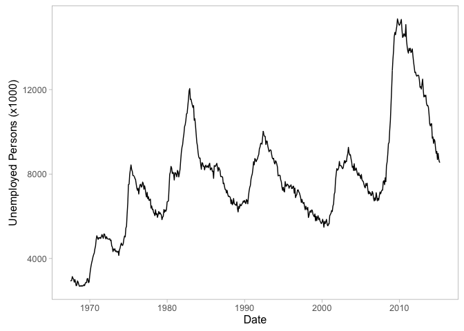
gg_rescale adjusts the proportions of the axes of the given plot
object to the given ratio. If no plot is provided, the last plot that
was displayed is used.
ggplot(data = economics, aes(x = date, y = unemploy)) +
    geom_line() +
    labs(x = "Date", y = "Unemployed Persons (x1000)") +
    theme_bdc_grey()
gg_rescale(ratio = 16 / 9)
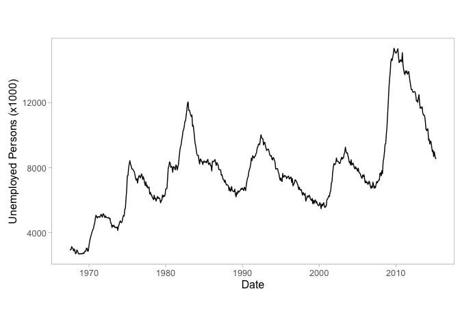
ggsave_golden saves the given plot to the given filename. The
dimensions of the resulting image file's canvas will follow the golden
ratio, which is useful in conjunction with gg_rescale_golden. If no
plot is specified, the most recently displayed plot is used.
# Save our plot of unemployment from earlier
ggsave_golden(filename = "monthly_unemployment.pdf", plot = pUnemploy)
