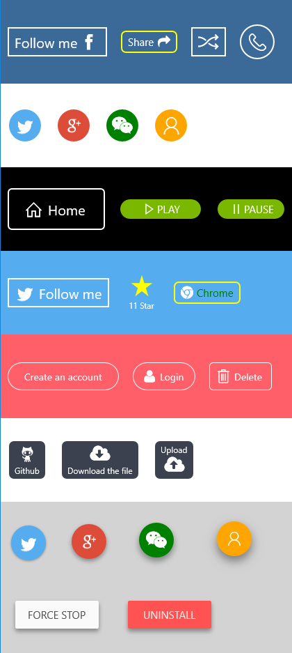
XPButton will help you to create icon button much easier for UWP (Universal Windows Platform)
- Left, top, right, bottom, onlyicon, noicon, 6 way to customize your icon buttons
- Border with radius, color, thickness
- Customize icon size, font size
- Interval of icon and content
- Normal state, pointer over state, pressed state
- Easy use like normal button
- Suppport Symbol, Image, Custom Font Icon, Path Icon
With XPShadow, can make Material Design button
<xp:XPButton Margin="10"
Content="Follow me" // text
Background="Transparent" //background
BorderBrush="White" //border brush
IconForeground="White" //icon foreground, default is same as Foreground
Foreground="White" //text foreground
PointerOverBackground="Black" //background when mouse hover, default is same as Background
PointerOverBorderBrush="White" //border brush when mouse hover, default is same as BorderBrush
PointerOverIconForeground="Gray" //icon foreground when mouse hover, default is same as BorderBrush
PointerOverTextForeground="Gray" //text foreground when mouse hover, default is same as Foreground
PressedBackground="LightGray" //background when press/touch, default is same as Background
PressedBorderBrush="LightGray" //border brush when press/touch, default is same as BorderBrush
PressedIconForeground="Black" //icon foreground when press/touch, default is same as BorderBrush
PressedTextForeground="Black" //text foreground when press/touch, default is same as Foreground
DisabledBackground="DarkGray" //background when disable, default is same as Background
DisabledBorderBrush="DarkGray" //border brush when disable, default is same as BorderBrush
DisabledIconForeground="DarkGray" //icon foreground when disable, default is same as BorderBrush
DisabledTextForeground="DarkGray" //text foreground when disable, default is same as Foreground
FontSize="20" //font size
IconSize="30" //icon size, default is 20
IconInterval="3" //interval of icon and text, default is 5
IconPosition="Right" //Left, Right, Bottom, Top, NoIcon, OnlyIcon, default is Left
BorderThickness="2" //default is 2
CornerRadius="0"> //corner radius, default is 0
<xp:XPButton.Icon> //Icon, can be Symbol, Bitmap, Font, Path, [Icon = Like]/[<BitmapIcon UriSource="ms-appx:///Assets/facebook.png"/>]/[<FontIcon FontFamily="/Assets/Fonts/fontawesome-webfont.ttf#FontAwesome" Glyph=""/>]
<BitmapIcon UriSource="ms-appx:///Assets/facebook.png"/>
</xp:XPButton.Icon>
</xp:XPButton><xp:XPButton Margin="10"
Background="#55ACEE"
Foreground="White"
IconForeground="White"
PointerOverBackground="#2599EE"
PressedBackground="#2099EE"
IconSize="30"
IconPosition="OnlyIcon"
Width="50"
Height="50"
CornerRadius="25">
<xp:XPButton.Icon>
<BitmapIcon UriSource="ms-appx:///Assets/twitter.png"/>
</xp:XPButton.Icon>
</xp:XPButton>PM> Install-Package XPButton Copyright 2015 Brook Shi
Licensed under the Apache License, Version 2.0 (the "License");
you may not use this file except in compliance with the License.
You may obtain a copy of the License at
http://www.apache.org/licenses/LICENSE-2.0
Unless required by applicable law or agreed to in writing, software
distributed under the License is distributed on an "AS IS" BASIS,
WITHOUT WARRANTIES OR CONDITIONS OF ANY KIND, either express or implied.
See the License for the specific language governing permissions and
limitations under the License.
Email: iwxiaot@gmail.com
