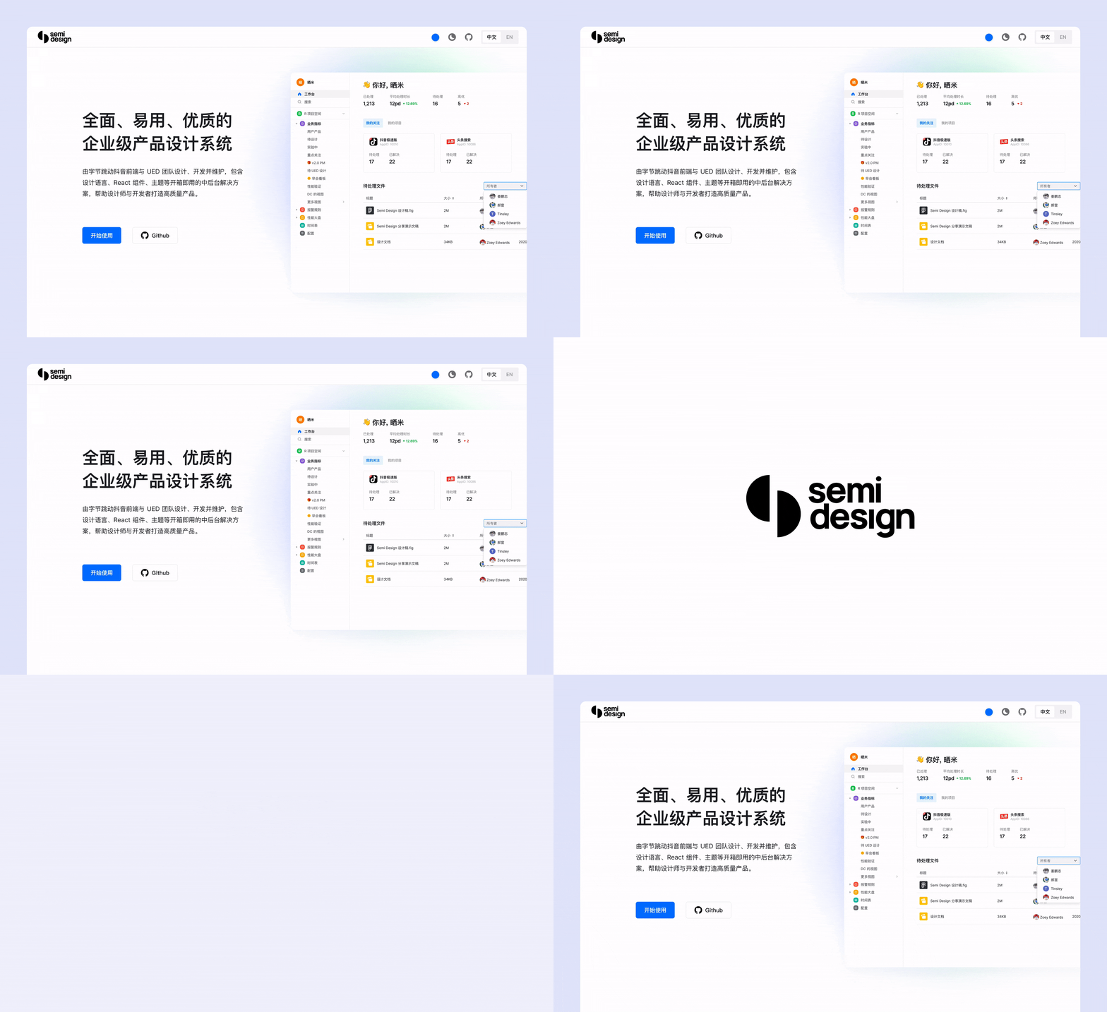
A modern, comprehensive, flexible design system and UI library. Quickly build beautiful React apps.
English | 简体中文
- 💪 Up to 58 high-quality Components.
- 💅 Thousands Design Tokens. Powerful Themes Customizing.
- 🌍 Internationalization Support for Dozens of Languages.
- 👏 Written in Typescript, Friendly Static Type Support.
- 🥳 SSR (Server Side Rendering) Compatible.
# with npm
npm install @douyinfe/semi-ui

# with yarn
yarn add @douyinfe/semi-ui
Here is a quick example to get you started, it's all you need:
import React from 'react';
import ReactDOM from 'react-dom';
import { Button, Switch } from '@douyinfe/semi-ui';

const App = () => (
  <>
    <Button type='primary'>primary button</Button>
    <Switch size='large' />
  </>
);

ReactDOM.render(<App />, document.querySelector('#app'));
And Semi UI Doc Site has hundreds of editable examples and live preview, welcome to play with those examples.
- Quick Start
- Components Overview
- Customizing Themes
- Design Tokens
- Dark Mode
- Semi Icons
- Global Config
- Internationalization
- FAQ
- CHANGELOG
Semi UI supports all major modern browsers.
 chrome |
 firefox |
 safari |
 IE/Edge |
 Electron |
|---|---|---|---|---|
| latest 2 versions | latest 2 versions | latest 2 versions | Edge | latest 2 versions |
Read the contributing guide to learn about our development process, how to propose bugfixes and improvements, and how to build and test your changes to Semi UI.
See CONTRIBUTING documentation.
Join User Group.
Semi UI is MIT Licensed


