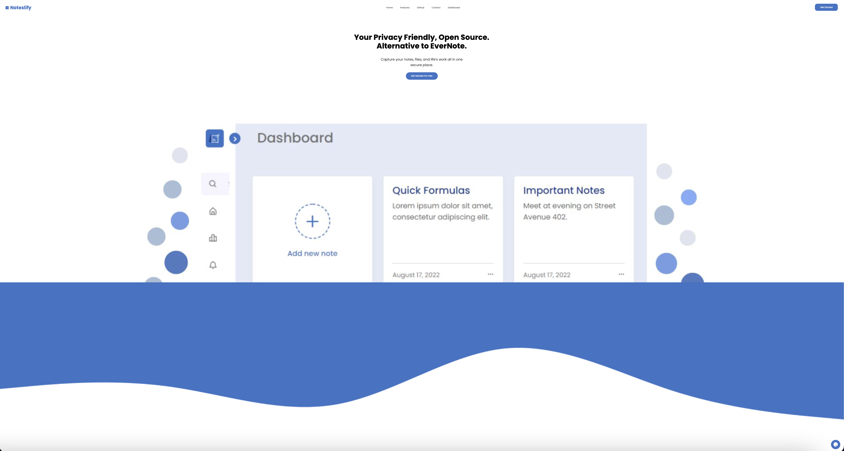
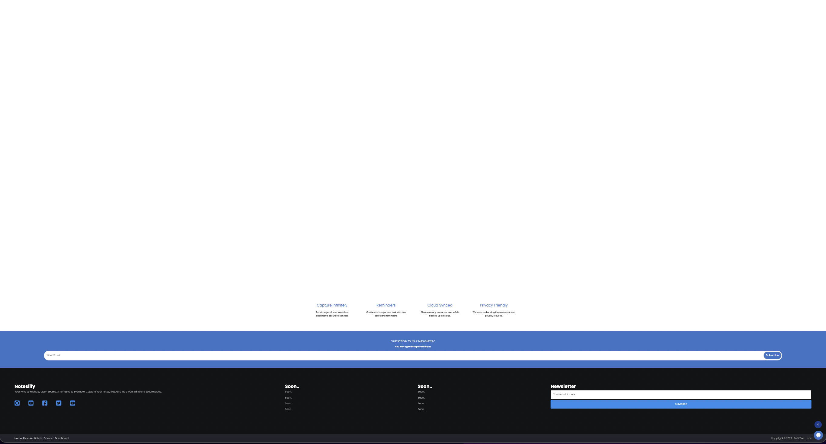
🐛 [BUG] - Max-width in the layout
nirajpdn opened this issue · 14 comments
Description
In wider screen the layout is not good as expected design wise and the components in the navbar and footer are not aligned properly.
So, max-width can be a better to use.
Reproduction URL
https://noteslify.stonecss.com
Reproduction steps
1. Go to `https://noteslify.stonecss.com`
2. Decrease the browser zoom
Screenshots
Logs
No response
Browsers
Chrome
OS
Mac
Hey @nirajpdn, Thanks for contributing and Congrats on opening Issue 🎉
We will try to review as soon as possible and a maintainer will get back to you soon!
Thanks For Notifying!! Would you like to contribute to the same as well?
@devarshishimpi sure. Happy to contribute again.
@devarshishimpi sure. Happy to contribute again.
Okay, have assigned
@nirajpdn Done with the same? Do keep in sync with the repo commits
@nirajpdn Done with the same? Do keep in sync with the repo commits
I am syncing upstream. Thanks. Will push very soon
This issue is already done or are you waiting for something more to do here? Thank you
Yep, just apart from specific mobile sizes
The responsive part is someone working on?
No one at the moment
Okay, Have assigned you
Do you have some considerations that I've to take to work on this?
Closed