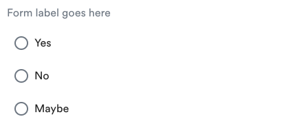
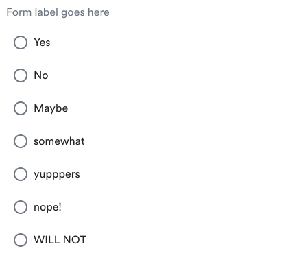
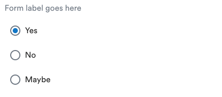
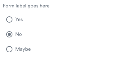
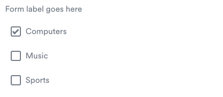
<ods-inputoptions> is a wrapper component for a HTML <input type"checkbox"> or <input type"radio"> elements containing styling and behavior.
All information regarding Project Setup, Technical Details, Tests and information regarding ODS Stateless Components can be found in the ./docs repository.
$ npm i @alaskaairux/ods-inputoptionsThe use of any ODS Component has a dependency on the ODS Design Tokens (npm install). See repository and API information here.
For additional details in regards to using Orion Design Tokens with components, please see ./docs/TECH_DETAILS.md
CSS Custom Properties are not supported in older browsers. For this, fallback properties are pre-generated and included with the npm. Any update to the Orion Design Tokens will be immediately reflected with browsers that support CSS Custom Properties, legacy browsers will require updated components with pre-generated fallback properties.
Define the component dependency within each component that is using the <ods-inputoptions> component.
import "@alaskaairux/ods-inputoptions";Reference component in HTML
<ods-inputoptions></ods-inputoptions>See additional examples below.
class Odsinputoptions extends LitElementOption(s) for component customization not supported
| Selector | Type | State | Description |
|---|---|---|---|
| ::part() | pseudo-element | experimental | Update shadowDOM CSS from outside the component |
The <ods-inputoptions> element should be used in situations where users may:
- Want an element that can be turned on and off.
- Have a collections of radio buttons describing a set of related options
- Require users to check an options
| Attribute | Value type | Description |
|---|---|---|
| disabled | boolean | enables disabled state of the element |
| horizontal | boolean | toggles layout direction, default is vertical, max 3 options |
| error | string | set error message for button/checkbox group |
| for | string | sets the for attribute for button/checkbox group label |
| label | string | sets content for button/checkbox group label |
| name | string | Accepts any string, DOMString representing the value of the input |
| type | string | Accepts radio or checkbox to assume functional type |
| componentData | object | Required to pass in id, value and label strings for each input |
Checking options for either radio buttons or checkboxes, the value of that selection is bubbled up to the parent component itself.
| Type | data type | Object name |
|---|---|---|
| radio | array | value |
| checkbox | array | value |
const rdos = document.getElementById('rdo');
alert(rdos.value);<ods-inputoptions id="rdo" type="radio" name="rdo" label="Even Asher can do this!" for="radio1" componentData='[
{ "id": "radio1", "value": "yes", "label": "Yes" },
{ "id": "radio2", "value": "no", "label": "No" },
{ "id": "radio3", "value": "maybe", "label": "Maybe" }
]'></ods-inputoptions>const cbxs = document.getElementById('cbx');
alert(cbxs.value);<ods-inputoptions id="cbx" type="checkbox" name="cbx" label="Form label goes here" for="cbx1" componentData='[
{ "id": "cbx1", "value": "yes", "label": "Yes" },
{ "id": "cbx2", "value": "no", "label": "No" },
{ "id": "cbx3", "value": "maybe", "label": "Maybe" }
]'></ods-inputoptions>For more complete examples using React.
name attribute is required to associate radio button group.
componentData object addresses id, value and label for each radio button in the group.
<ods-inputoptions type="radio" name="radios" label="Form label goes here" for="radio1"
  componentData='[
    { "id": "radio1", "value": "yes", "label": "Yes" },
    { "id": "radio2", "value": "no", "label": "No" },
    { "id": "radio3", "value": "maybe", "label": "Maybe" }
]'></ods-inputoptions><ods-inputoptions type="radio" horizontal name="radios" label="Form label goes here" for="radio1"
componentData='[
{ "id": "radio1", "value": "yes", "label": "Yes" },
{ "id": "radio2", "value": "no", "label": "No" },
{ "id": "radio3", "value": "maybe", "label": "Maybe" }
]'></ods-inputoptions><ods-inputoptions type="radio" horizontal name="radios" label="Form label goes here" for="radio1"
componentData='[
{ "id": "radio1", "value": "yes", "label": "Yes" },
{ "id": "radio2", "value": "no", "label": "No" },
{ "id": "radio3", "value": "maybe", "label": "Maybe" },
{ "id": "radio4", "value": "somewhat", "label": "somewhat" },
{ "id": "radio6", "value": "yupppers", "label": "yupppers" },
{ "id": "radio7", "value": "nope!", "label": "nope!" },
{ "id": "radio8", "value": "WILL NOT", "label": "WILL NOT" }
]'></ods-inputoptions><ods-inputoptions type="radio" name="radios" label="Form label goes here" for="radio1"
componentData='[
{ "id": "radio1", "value": "yes", "label": "Yes", "checked": true },
{ "id": "radio2", "value": "no", "label": "No" },
{ "id": "radio3", "value": "maybe", "label": "Maybe" }
]'></ods-inputoptions><ods-inputoptions type="radio" name="radios" disabled label="Form label goes here" for="radio1"
componentData='[
{ "id": "radio1", "value": "yes", "label": "Yes" },
{ "id": "radio2", "value": "no", "label": "No", "checked": true },
{ "id": "radio3", "value": "maybe", "label": "Maybe" }
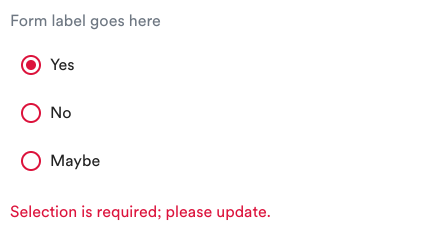
]'></ods-inputoptions><ods-inputoptions type="radio" name="radios" for="radio1" label="Form label goes here" error="Selection is required; please update."
componentData='[
{ "id": "radio1", "value": "yes", "label": "Yes", "checked": true },
{ "id": "radio2", "value": "no", "label": "No"},
{ "id": "radio3", "value": "maybe", "label": "Maybe" }
]'></ods-inputoptions>name attribute is needed to associate checkbox group.
componentData object addresses id, value and label for each checkbox in the group.
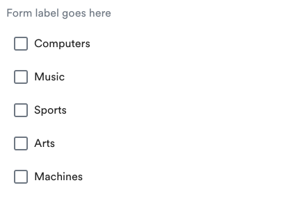
<ods-inputoptions type="checkbox" name="interests" for="coding" label="Form label goes here"
  componentData='[
    { "id": "computers", "value": "computers", "label": "Computers" },
    { "id": "mucic", "value": "music", "label": "Music" },
    { "id": "sports", "value": "sports", "label": "Sports" },
    { "id": "arts", "value": "arts", "label": "Arts" },
    { "id": "machines", "value": "machines", "label": "Machines" }
]'></ods-inputoptions><ods-inputoptions type="checkbox" horizontal name="interests" label="Form label goes here" for="computers"
componentData='[
{ "id": "computers", "value": "computers", "label": "Computers" },
{ "id": "mucic", "value": "music", "label": "Music" },
{ "id": "sports", "value": "sports", "label": "Sports" }
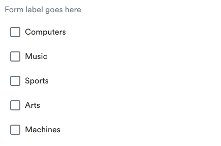
]'></ods-inputoptions><ods-inputoptions type="checkbox" horizontal name="interests" label="Form label goes here" for="computers"
componentData='[
{ "id": "computers", "value": "computers", "label": "Computers" },
{ "id": "mucic", "value": "music", "label": "Music" },
{ "id": "sports", "value": "sports", "label": "Sports" },
{ "id": "arts", "value": "arts", "label": "Arts" },
{ "id": "machines", "value": "machines", "label": "Machines" }
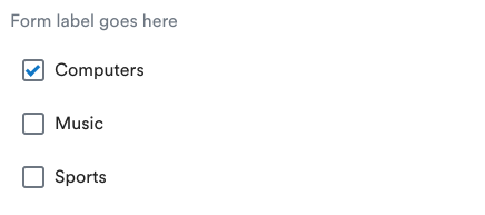
]'></ods-inputoptions><ods-inputoptions type="checkbox" name="interests" for="computers" label="Form label goes here"
componentData='[
{ "id": "computers", "value": "computers", "label": "Computers", "checked": true },
{ "id": "mucic", "value": "music", "label": "Music" },
{ "id": "sports", "value": "sports", "label": "Sports" }
]'></ods-inputoptions><ods-inputoptions type="checkbox" name="interests" disabled for="computers" label="Form label goes here"
componentData='[
{ "id": "computers", "value": "computers", "label": "Computers", "checked": true },
{ "id": "mucic", "value": "music", "label": "Music" },
{ "id": "sports", "value": "sports", "label": "Sports" }
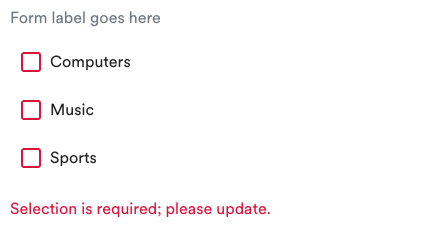
]'></ods-inputoptions><ods-inputoptions type="checkbox" name="interests" for="computers" label="Form label goes here" error="Selection is required; please update."
componentData='[
{ "id": "computers", "value": "computers", "label": "Computers"},
{ "id": "mucic", "value": "music", "label": "Music" },
{ "id": "sports", "value": "sports", "label": "Sports" }
]'></ods-inputoptions>React does not require specific support, but if you are choosing to place your componentData in a variable, you will be required to stringify that data when using it with the component.
const options = [
  { "id": "radio1", "value": "yes", "label": "Yes" },
  { "id": "radio2", "value": "no", "label": "No" },
  { "id": "radio3", "value": "maybe", "label": "Maybe" } ]

return <ods-inputoptions componentData={JSON.stringify(options)} />Included with the distributed npm are two additional directories, ./altImportsCanonical and ./altImportsVariable.
| directory | description |
|---|---|
| altImportsCanonical† | Sass using canonical values within the scope of the file |
| altImportsVariable* | Sass using CSS Custom Properties within the scope of the file |
† Using canonical CSS properties breaks inheritance chain from Orion Design Tokens
* Orion Design Tokens are required to import any file using CSS Custom Properties. Also see Orion Design Tokens pre-processed resources. PostCSS using postcss-custom-properties will need to be added to your project if you are supporting legacy browsers.
Within the respective directories is the style_clean.scss file.
├── altImports
|  ├── canonical
|  |  ├── style.css
|  |  └── style_clean.scss
|  └── variable
|     ├── style.css
|     └── style_clean.scss
It is highly recommended that you import the style_clean.scss this into a name-space as not to create style collisions. For example:
.ods-inputoptions {
  @import "./node_modules/@alaskaairux/ods-inputoptions/altImports/variable/style_clean.scss";
}
This pattern will produce all the selectors within style_clean.scss with the prefixed selector.
.ods-inputoptions .inputoptions {
  display: var(--ods-inputoptions-display);
  font-family: var(--ods-inputoptions-font-family);
  border-width: var(--ods-inputoptions-border-width);
  border-radius: var(--ods-inputoptions-border-radius);
  ...
}
Warning! Using the canonical CSS will break the chain of using Design Tokens. If Tokens are updated, this will require the update of the components and their canonical output. Use with caution.
Alaska Airlines Orion Design System
Copyright 2019 Alaska Airlines, Inc. or its affiliates. All Rights Reserved.


