React Native Picker Modal View
React Native Module to select item picker modal.
Created by Pankod
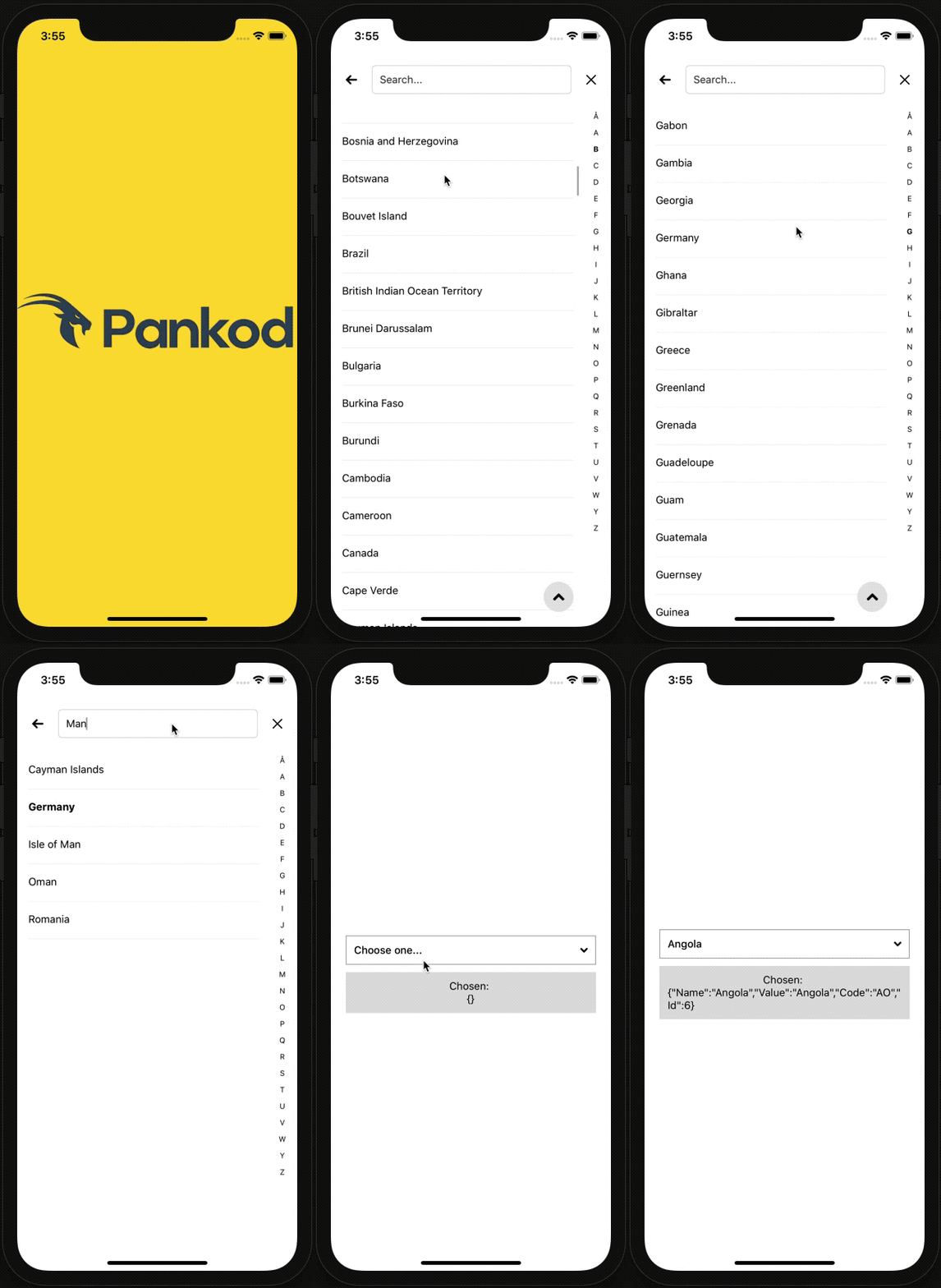
An alternative to Picker and PickerIOS components with an unified API and consistent look & feel on both plaforms. It's fully configurable and includes built-in support for text search and alphabetical index. Ideal for longer lists not suitable for "wheel-pickers".
Getting started
$ npm install react-native-picker-modal-view --save
or
$ yarn add react-native-picker-modal-view
Live Demo with Expo
Example
import * as React from 'react';
import { Button, SafeAreaView, Text, View } from 'react-native';

import PickerModal from 'react-native-picker-modal-view';

import data from '../../../top20.json';

export default class Main extends React.Component<{}, { selectedItem: {} }> {

	constructor(props: {}) {
		super(props);

		this.state = {
			selectedItem: {}
		};
	}

	public render(): JSX.Element {
		const { selectedItem } = this.state;

		return (
			<SafeAreaView style={{ flex: 1, justifyContent: 'center', marginHorizontal: 20 }}>
				<PickerModal
					renderSelectView={(disabled, selected, showModal) =>
						<Button disabled={disabled} title={'Show me!'} onPress={showModal} />
					}
					onSelected={this.onSelected.bind(this)}
					onClosed={this.onClosed.bind(this)}
					onBackButtonPressed={this.onBackButtonPressed.bind(this)}
					items={data}
					sortingLanguage={'tr'}
					showToTopButton={true}
					selected={selectedItem}
					showAlphabeticalIndex={true}
					autoGenerateAlphabeticalIndex={true}
					selectPlaceholderText={'Choose one...'}
					onEndReached={() => console.log('list ended...')}
					searchPlaceholderText={'Search...'}
					requireSelection={false}
					autoSort={false}
				/>
				<View style={{ padding: 10, alignItems: 'center', backgroundColor: '#ddd' }}>
					<Text>Chosen: </Text>
					<Text>{JSON.stringify(selectedItem)}</Text>
				</View>
			</SafeAreaView>
		);
	}

	private onClosed(): void {
		console.log('close key pressed');
	}

	private onSelected(selected: any): void {
		this.setState({ selectedItem: selected });

		return selected;
	}

	private onBackButtonPressed(): void {
		console.log('back key pressed');
	}
}
Options
| Properties | Type | Description | Default |
|---|---|---|---|
| modalAnimationType | string |
The RN Modal show/hide animation type | "slide" |
| showAlphabeticalIndex | boolean |
Hides alphabetical index | "true" |
| onClosed | Function |
Fired when the modal is closed | |
| onBackButtonPressed | Function |
Fired when the back key is pressed | |
| onSelected *required |
Function |
Returns selected item object | "{Id, Name, Value, [key: string]: any}" |
| items *required |
array |
Array of list items | "[{Id, Name, Value, [key: string]: any}]" |
| renderSelectView | Element |
Render Select Component | <SelectBoxComponent (built-in)> |
| renderListItem | Element |
Render List item | <ListItemComponent (built-in)/> |
| alphabeticalIndexChars | array |
Chracters array for the alphabetical index | <Turkish alphabet chracters> |
| searchInputTextColor | string |
Search input placeholder text color | "#252525" |
| keyExtractor | Function |
Flatlist defined {key} function | <Predefined return map index> |
| autoGenerateAlphabeticalIndex | boolean |
Auto-generates alphabetical index from list items data | "false" |
| sortingLanguage | string |
Country ISO (Alpha 2) Code for localeCompare | "tr" |
| showToTopButton | boolean |
Button for scroll to offset 0 | "true" |
| onEndReached | Function |
Fired when the list reaches the end | |
| selectPlaceholderText | string |
Select box placeholder text | "Choose one..." |
| searchPlaceholderText | string |
Search input placeholder text | "Search..." |
| selected | object |
Default selected item | |
| autoSort | boolean |
Auto-sort data list | "false" |
| disabled | boolean |
Disable Select box | |
| requireSelection | boolean |
Require at least one list item is selected | "false" |
| backButtonDisabled | boolean |
Hide to back button | "false" |
| renderSearch | Function |
Render custom search input | `` |
Core Props of React Native
| Properties | Type | Description | Default |
|---|---|---|---|
| ModalProps | object |
React Native Modal Props | |
| FlatListProps | object |
React Native Flatlist Props | |
| SearchInputProps | object |
React Native TextInput Props |
Running example project
- You should have React Expo CLI to be installed in order to run example. Follow this instructions if you need to install Expo CLI.
- Install the dependencies:
npm install- Once the installation is done, you can run the following command:
npm
npm start
You can also use:
expo
expo start
yarn
expo start
Notes
- Auto-alphabetical index supported for Turkish and English languages.
Releases
- 1.3.2 - Added renderSearch feature #54 Thanks to @murilo-campaner
- 1.3.1 - Fixed #44 Thanks to @fnando
- 1.3.0 - No back button support #42 Thanks to @ChildishForces
- 1.2.8 - Fixed #37
- 1.2.6 - Deprecated lifecycle methods fix
- 1.2.5 - Flatlist initialNumToRender property hotfix
- 1.2.3 - Refactor and code coverage
- 1.2.2 - Fixed #5
- 1.2.0 - Added renderSelectView and renderListItem properties.
- 1.0.0 - Initial release


