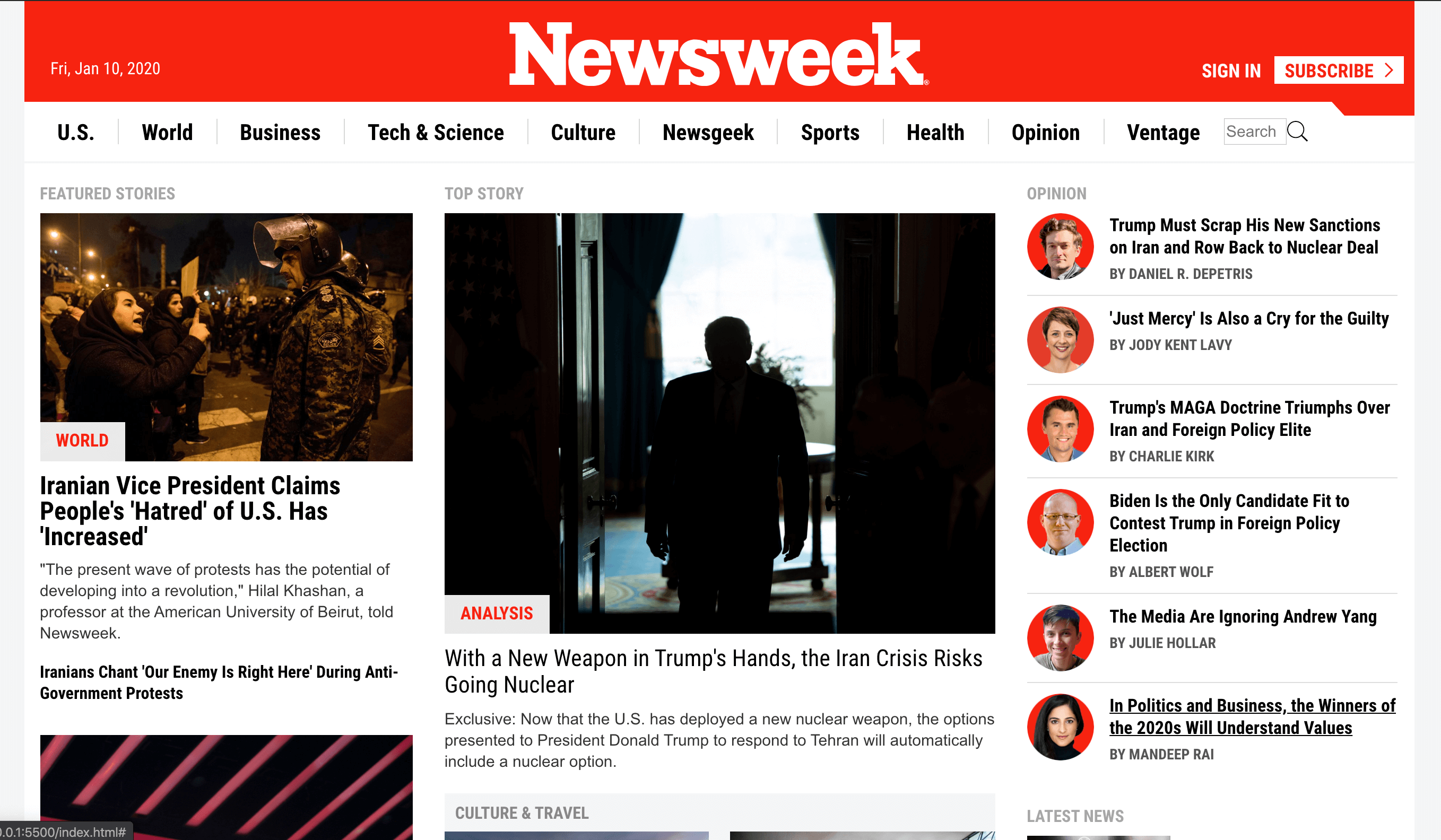
This project requests students to build a replica of the news site Newsweek.com using the Bootstrap framework.
The overall page contains the following sections:
- Navbar
- Key Columns: columns that organize information with articles responding to specific media sizes.
- 'In the Magazine' Section
- Newsweek Conversations
- Editor Pick
- Featured Slideshow
- <Hidden - HiDPI screen section> -- See NOTE paragraph below.
- Subscribe
- Footer
Important NOTE: This page has a special section that only appears on laptops with HiDPI screens. For this section to render appropriately, make sure using chrome in developer mode, and adding the screen type: "Laptop with HiDPI screen." You add this option, by going into the Edit menu, in the list where you select the model of devices to test responsiveness.
This project offers a great chance to practice in a repetitive way key concepts of positioning, image positioning and adjustment, CSS responsiveness, and much more. Prepare for several hours of fun. Drink lots of water in the process of enjoying this project.
The following media breaks represent a crucial CSS responsiveness detail in the page design:
- 991px media
Column-4 contains:
- Column 1 ('Top-Story', 'Culture an Travel' and 'More Stories' subsections)
- Column 2 ('Featured Stories', 'sponsored Insights') Column-3 contains: 'Opinion", 'Latest News', 'Sponsored Insights', 'Sign Up' and some more 'Sponsored Insights.
- On media <992, Columns structure changes To the following:
- Column 4 is placed on 100% of the viewport with Column 2 on 45% and Column 1 55% of that viewport. Article order and structure remain the same.
- Column 2 ('Featured Stories', 'sponsored Insights') - To the left of viewport.
- Column 1 ('Top-Story', 'Culture an Travel' and 'More Stories' subsections)
- Column 3 locates now wrapping below column 4 with the same order in articles
- Column-3 contains: 'Opinion", 'Latest News', 'Sponsored Insights', 'Sign Up' and some more 'Sponsored Insights.
- Column 4 is placed on 100% of the viewport with Column 2 on 45% and Column 1 55% of that viewport. Article order and structure remain the same.
- On media <768, Columns structure changes and becomes a single page column
- Column 4 goes on top position, but now Column 1 and 2 are shown on 100% viewport wrapping on top of each other.
- Column 1, this time, goes first with a change in sub-columns order: ('Top-Story,' 'More Stories', and then 'Culture and Travel.'
- Column 2, wraps below showing 'Featured Stories' and then 'sponsored Insights.'
- Column 3 comes last with the same order: 'Opinion", 'Latest News,' 'Sponsored Insights,' 'Sign Up', and some more 'Sponsored Insights.
The rest of the project presents exciting challenges and requires specific attention. Have fun!.
- HTML5, CSS3, Js
- Visual Studio Code
- This project is a requirement for the HTML_CSS module @Microverse Program.
- The project is part of The Odin project, and you can get access to the project specifications here The Odin Project Link
To get a local copy up and running, follow these simple example steps.
-
Clone the repository in your local machine
-
enjoy
👤 Carlos Anriquez
- Github: @canriquez
- Twitter: @cranriquez
- Linkedin: linkedin
Contributions, issues, and feature requests are welcome!
Feel free to check the issues page.
Give a ⭐️ if you like this project!
- The Corgis @Microverse
- My family
This project is MIT licensed.
