remarkable-admonitions
Adds admonitions parsing support to Remarkable. (There's also a React component)
Installation
With npm:
npm install --save remarkable-admonitionsor with Yarn:
yarn add remarkable-admonitionsUsage
import Remarkable from 'remarkable';
const md = new Remarkable();

import admonitions from 'remarkable-admonitions';
md.use(admonitions());

md.render(`
:::caution
Beware Ogre
:::
`);
/* ->
    <div class="admonition admonition-caution">
      <div class="admonition-heading">
        <h5><div class="admonition-icon">🔥</div> caution</h5>
      </div>
      <div class="admonition-content">
        <p>Beware Ogre</p>
      </div>
    </div>
*/
Supported admonition types are: caution, note, important, tip,
warning.
By default block title is the admonition type. You can provide a custom title after the opening tag:
:::note This is my custom title
A note.
:::
With Docusaurus
If you are using Docusaurus, you can load the plugin
in siteConfig.js:
const siteConfig = {
  // ...
  markdownPlugins: [
    // Highlight admonitions.
    require('remarkable-admonitions')({ icon: 'svg-inline' })
  ]
};
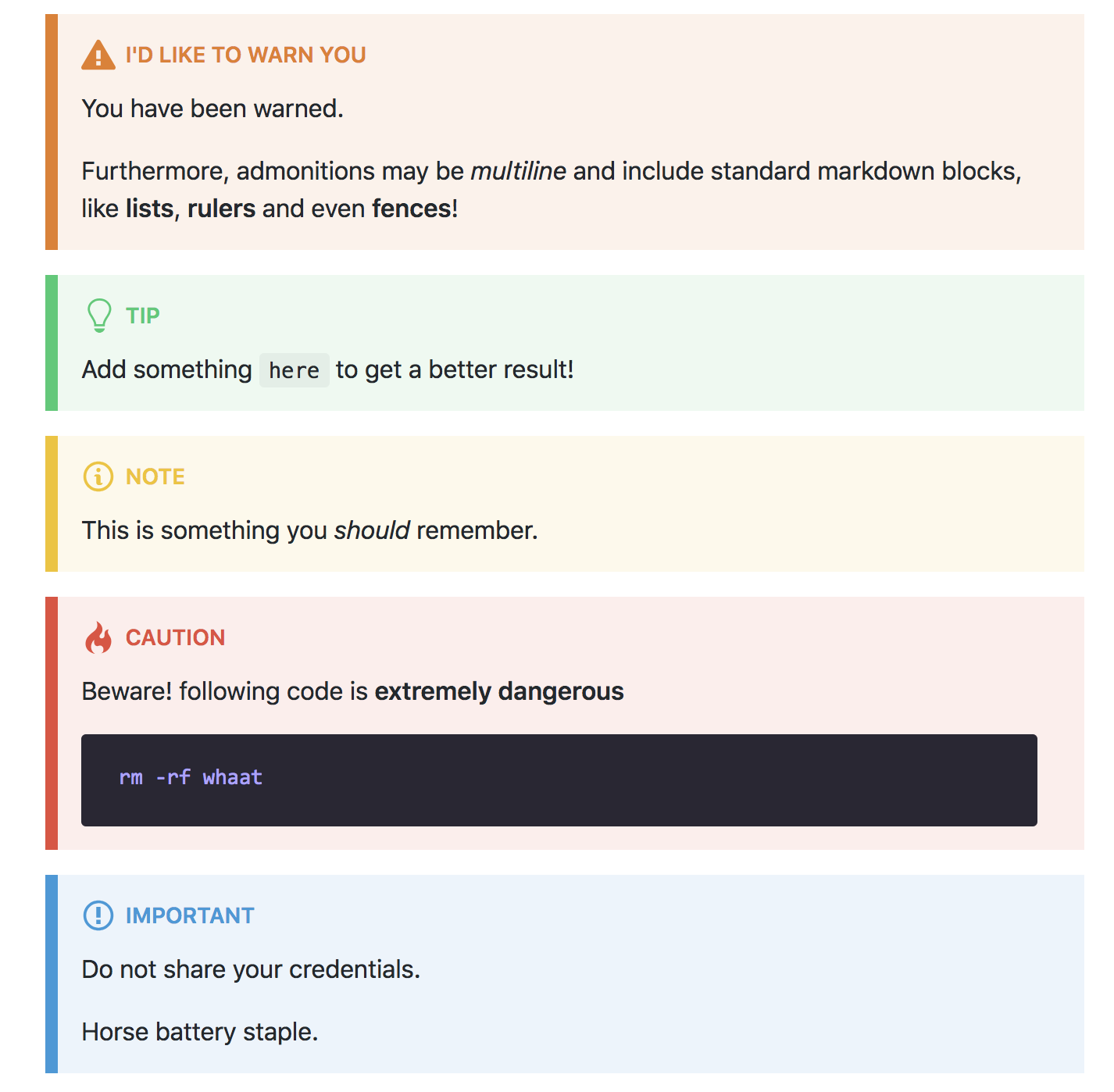
There is a style developed to match its visual appearence (the same you can see
in the preview image up here). Due to Docusaurus CSS loading system, you need to download the css from
docusaurus-admonitions.css and place it
into your custom/ folder.
Options
You may configure this plugin with the following options:
| Option | Default | Description |
|---|---|---|
icon |
emoji |
Allows to use a different method to render admonition icons. By default it uses emoji (unicode Emojis). Choose svg-inline to use Octicons. |


