| title | output | vignette |
|---|---|---|
R package multipleROC |
rmarkdown::html_vignette |
%\VignetteIndexEntry{multipleROC} %\VignetteEngine{knitr::rmarkdown} %\VignetteEncoding{UTF-8}
|
R package multipleROC is for ROC analysis with models with multiple predictors. You can draw a ROC plot with ggplot2 for models with multiple predictors. You can draw several ROC curves in a plot. You can perform automatic stepwise logistic regression analysis and compare the initial and final models.
You can install multipleROC package from github.
install.packages("remotes")
remotes::install_github("cardiomoon/multipleROC")library(multipleROC)Data radial from package moonBook is a dataset containing demographic data and laboratory data of 115 patients. If you want to differentiate male and female patients with their heights(in centimeter), you can perform exploratory analysis first.
library(webr)
library(ggplot2)
library(dplyr)
library(tidyr)

theme_set(theme_bw())
data(radial,package="moonBook")
radial %>% group_by(sex) %>% numSummaryTable(height)
sex | n | mean | sd | median | trimmed | mad | min | max | range | skew | kurtosis | se |
F | 56.00 | 153.61 | 6.01 | 153.00 | 153.70 | 5.93 | 140.00 | 166.00 | 26.00 | -0.07 | -0.46 | 0.80 |
M | 58.00 | 167.53 | 5.84 | 169.00 | 167.48 | 5.93 | 155.00 | 180.00 | 25.00 | -0.01 | -0.60 | 0.77 |
ggplot(data=radial)+geom_density(aes(x=height,fill=sex),alpha=0.5)
ggplot(data=radial)+geom_boxplot(aes(x=sex,y=height,fill=sex),alpha=0.5) 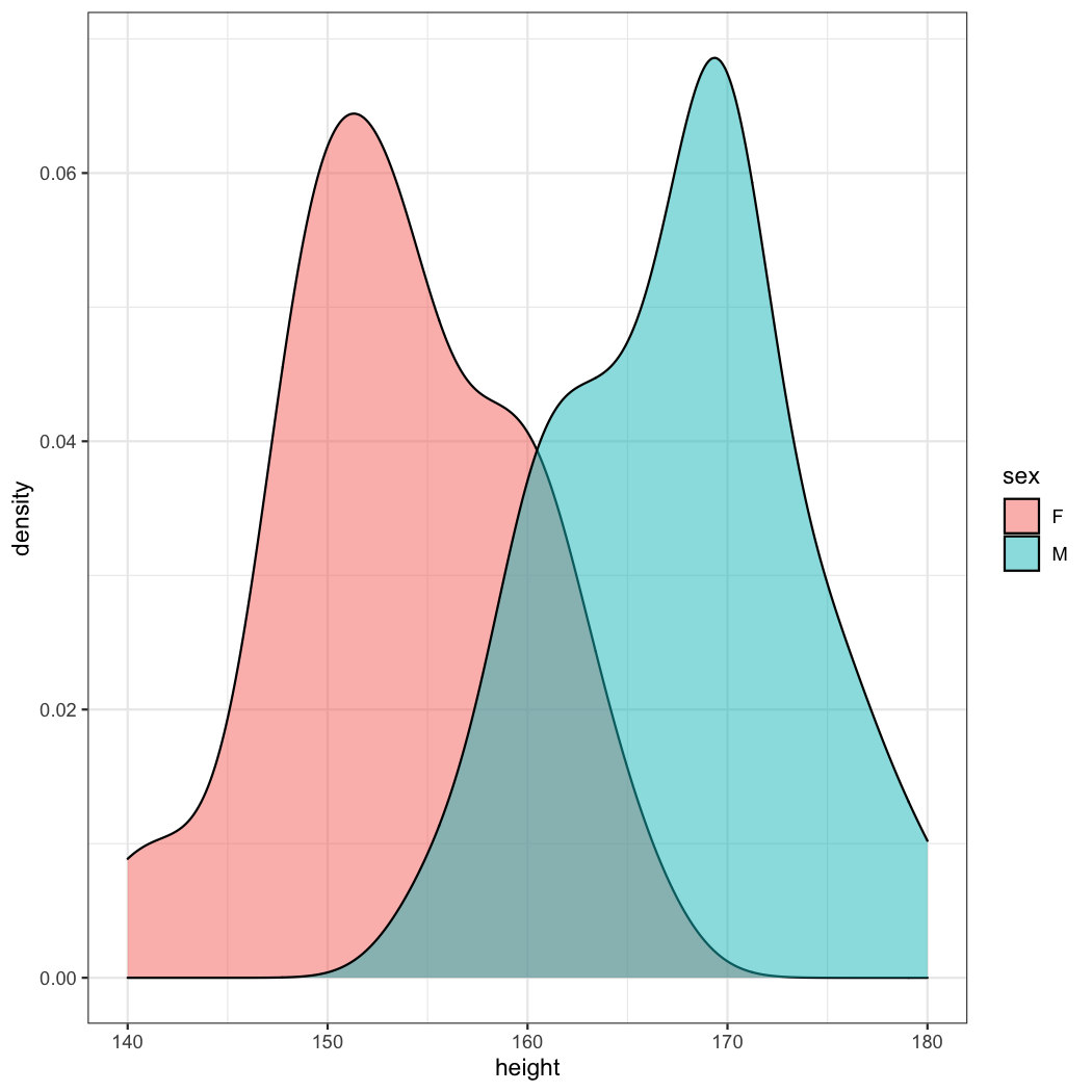
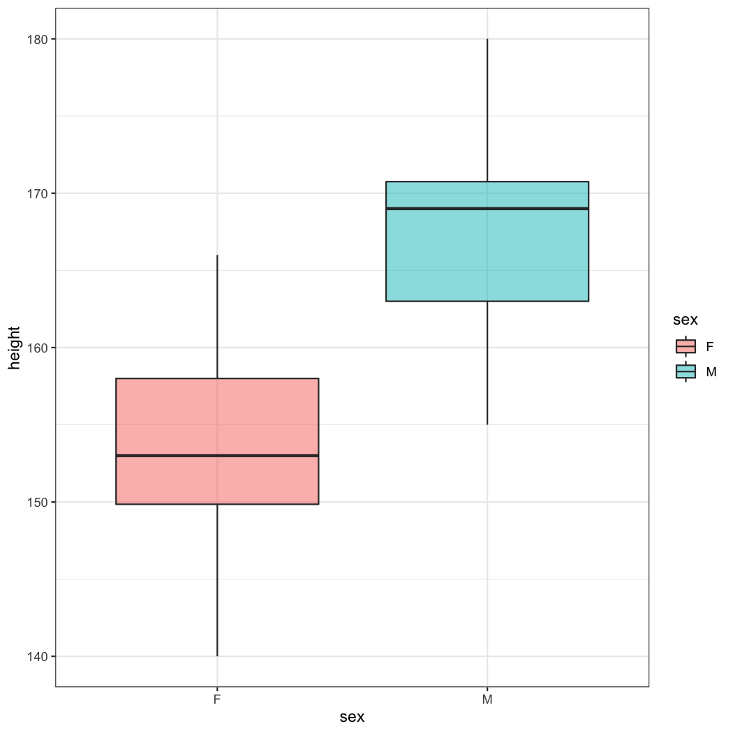 As you can see, male patients are taller than female patients. But how can I determine the optimal cutoff value?
To draw a ROC curve is one of the useful method to determine the optimal cutoff value. You can perform ROC analysis using the following R command.The following R command makes an object of class multipleROC and makes a plot.
data(radial,package="moonBook")
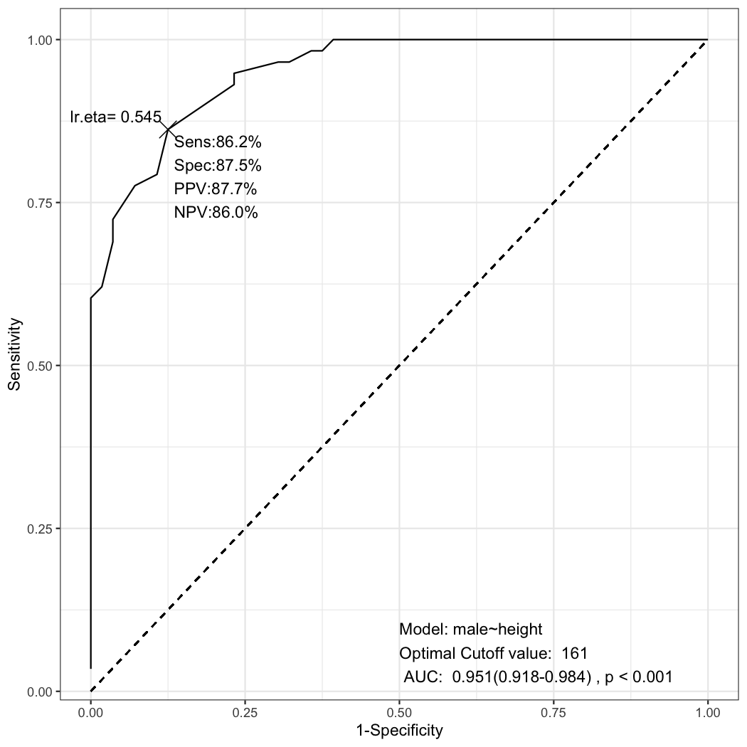
x=multipleROC(male~height,data=radial)You can see the ROC plot with sensitivity(Sens), specificity(Spec), positive predictive value(PPV) and negative predictive value(NPV) with the cutoff value 161. These rates comes from the following table.
table(radial$height>=161,radial$male)

         0  1
  FALSE 49  8
  TRUE   7 50
If you use the height
\begin{equation} Sensitivity=\frac{TP}{Male, Patients}=\frac{TP}{FN+TP}=\frac{50}{8+50}=86.2 % \end{equation}
Specificity measures a test’s ability to correctly generate a negative result for people who don’t have the condition that’s being tested for (also known as the “true negative” rate).
\begin{equation} Specificity=\frac{TN}{Female, Patients}=\frac{TN}{TN+FP}=\frac{49}{49+7}=87.5 % \end{equation}
Positive predictive value(PPV) is calculated as follows:
\begin{equation} PPV=\frac{TP}{Pts,with, height \geq 161cm}=\frac{TP}{TP+FP}=\frac{50}{50+7}=87.7% \end{equation}
Negative predictive value(PPV) is calculated as follows:
\begin{equation} NPV=\frac{TN}{Pts,with, height < 161cm}=\frac{TN}{TN+FN}=\frac{49}{49+8}= 85.9 % \end{equation}
You can calculate the sensitivity, specificity for all the height data of radial. The radial data are from 115 patients, but 1 patient's height is missed. But the length of unique values of radial$height is 39 due to duplication.
length(unique(radial$height))
[1] 39
You can calculate all the ratio by hand. For your convenience, you can use calSens() function included in multipleROC package.
calSens=function(x,y){
     newx=sort(unique(x))
     completeTable=function(res){
          if(nrow(res)==1){
               res1=matrix(c(0,0),nrow=1)
               temp=setdiff(c("TRUE","FALSE"),attr(res,"dimnames")[[1]][1])
               if(temp=="FALSE") res=rbind(res1,res)
               else res=rbind(res,res1)
               res
          }
          res
     }

     getSens=function(cut){
          res=table(x>=cut,y)
          res=completeTable(res)
          sens=res[2,2]/sum(res[,2])
          spec=res[1,1]/sum(res[,1])
          ppv=res[2,2]/sum(res[2,])
          npv=res[1,1]/sum(res[1,])
          data.frame(x=cut,sens=sens,spec=spec,fpr=1-spec,ppv=ppv,npv=npv,sum=sens+spec)
     }
     map_dfr(newx,function(cut){getSens(cut)})
}result=calSens(radial$height,radial$male)
result
x sens spec fpr ppv npv sum
1 140.0 1.00000000 0.00000000 1.00000000 0.5087719 NaN 1.000000
2 142.0 1.00000000 0.03571429 0.96428571 0.5178571 1.0000000 1.035714
3 144.0 1.00000000 0.05357143 0.94642857 0.5225225 1.0000000 1.053571
4 147.0 1.00000000 0.07142857 0.92857143 0.5272727 1.0000000 1.071429
5 147.5 1.00000000 0.08928571 0.91071429 0.5321101 1.0000000 1.089286
6 148.0 1.00000000 0.10714286 0.89285714 0.5370370 1.0000000 1.107143
7 149.0 1.00000000 0.17857143 0.82142857 0.5576923 1.0000000 1.178571
8 149.4 1.00000000 0.23214286 0.76785714 0.5742574 1.0000000 1.232143
9 150.0 1.00000000 0.25000000 0.75000000 0.5800000 1.0000000 1.250000
10 151.0 1.00000000 0.35714286 0.64285714 0.6170213 1.0000000 1.357143
11 152.0 1.00000000 0.37500000 0.62500000 0.6236559 1.0000000 1.375000
12 153.0 1.00000000 0.42857143 0.57142857 0.6444444 1.0000000 1.428571
13 154.0 1.00000000 0.55357143 0.44642857 0.6987952 1.0000000 1.553571
14 155.0 1.00000000 0.60714286 0.39285714 0.7250000 1.0000000 1.607143
15 155.5 0.98275862 0.62500000 0.37500000 0.7307692 0.9722222 1.607759
16 156.0 0.98275862 0.64285714 0.35714286 0.7402597 0.9729730 1.625616
17 157.0 0.96551724 0.67857143 0.32142857 0.7567568 0.9500000 1.644089
18 158.0 0.96551724 0.69642857 0.30357143 0.7671233 0.9512195 1.661946
19 159.0 0.94827586 0.76785714 0.23214286 0.8088235 0.9347826 1.716133
20 160.0 0.93103448 0.76785714 0.23214286 0.8059701 0.9148936 1.698892
21 161.0 0.86206897 0.87500000 0.12500000 0.8771930 0.8596491 1.737069
22 162.0 0.79310345 0.89285714 0.10714286 0.8846154 0.8064516 1.685961
23 163.0 0.77586207 0.92857143 0.07142857 0.9183673 0.8000000 1.704433
24 164.0 0.72413793 0.96428571 0.03571429 0.9545455 0.7714286 1.688424
25 165.0 0.68965517 0.96428571 0.03571429 0.9523810 0.7500000 1.653941
26 166.0 0.62068966 0.98214286 0.01785714 0.9729730 0.7142857 1.602833
27 167.0 0.60344828 1.00000000 0.00000000 1.0000000 0.7088608 1.603448
28 168.0 0.55172414 1.00000000 0.00000000 1.0000000 0.6829268 1.551724
29 169.0 0.51724138 1.00000000 0.00000000 1.0000000 0.6666667 1.517241
30 170.0 0.39655172 1.00000000 0.00000000 1.0000000 0.6153846 1.396552
31 171.0 0.25862069 1.00000000 0.00000000 1.0000000 0.5656566 1.258621
32 172.0 0.22413793 1.00000000 0.00000000 1.0000000 0.5544554 1.224138
33 173.0 0.17241379 1.00000000 0.00000000 1.0000000 0.5384615 1.172414
34 174.0 0.15517241 1.00000000 0.00000000 1.0000000 0.5333333 1.155172
35 175.0 0.13793103 1.00000000 0.00000000 1.0000000 0.5283019 1.137931
36 176.0 0.08620690 1.00000000 0.00000000 1.0000000 0.5137615 1.086207
37 177.0 0.06896552 1.00000000 0.00000000 1.0000000 0.5090909 1.068966
38 180.0 0.03448276 1.00000000 0.00000000 1.0000000 0.5000000 1.034483You can make exploratory plot of sensitivity and specificity. First, You have to transform the data in long from.
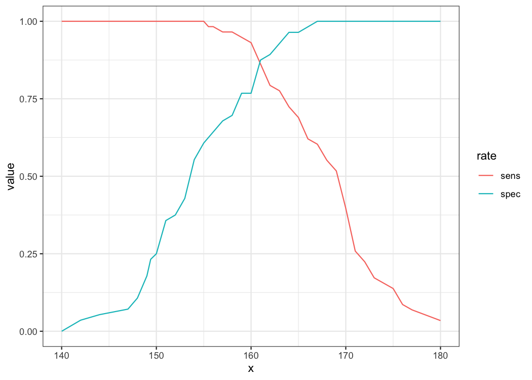
longdf <- result %>% pivot_longer(cols=sens:spec,names_to = "rate")
ggplot(data=longdf,aes(x=x,y=value,color=rate))+geom_line()
As you can see, the higher the sensitivity, the lower the specificity. The optimal cutoff value is determined where the sum of specificity and sensitivity is the highest.
result[which.max(result$sum),]
     x     sens  spec   fpr      ppv       npv      sum
21 161 0.862069 0.875 0.125 0.877193 0.8596491 1.737069
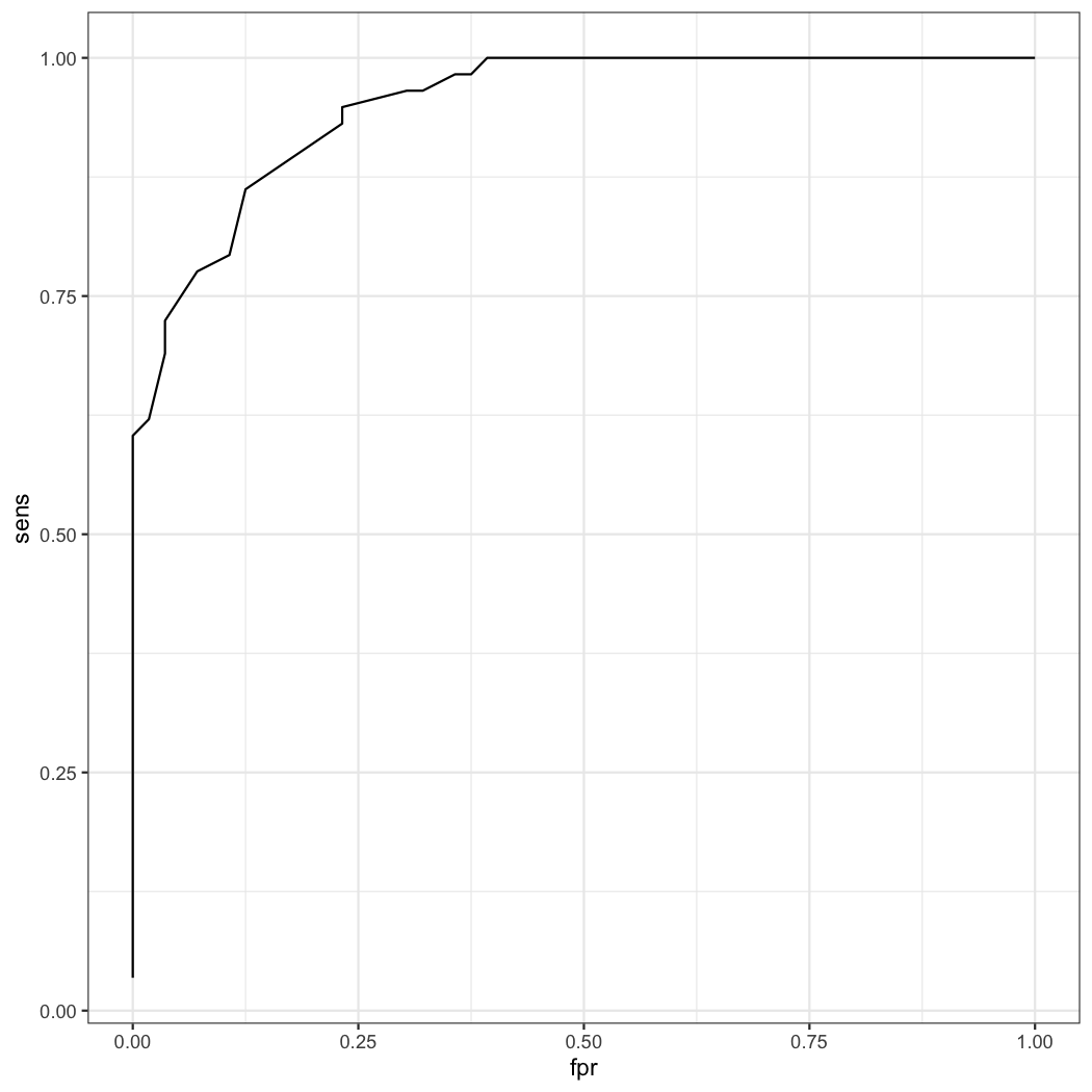
You can see when the height is 161cm, the sum of sensitivity and specificity is the highest. So the best cutoff value of height is 161cm. With the result, you can draw the ROC plot.
result=result[order(result$sens),]
ggplot(data=result,aes(x=fpr,y=sens))+geom_line()Look at the first ROC plot again. In the ROC plot, you can see the cutoff value of lr.eta is 0.545. Where does this value come from? This value comes from the generalized linear model.
fit=glm(male~height,data=radial,family=binomial)
fit$fitted.values
           1            2            3            4            5            6            7            8
0.0647799156 0.0089609908 0.5450612249 0.1902888834 0.7301078853 0.0134046841 0.8593140964 0.2609731323
           9           10           11           12           13           14           15           16
0.9688855513 0.1131501263 0.8593140964 0.9972179420 0.0134046841 0.0059814642 0.9790755722 0.6428952491
          17           18           19           20           21           22           23           24
0.9688855513 0.0089609908 0.9790755722 0.0059814642 0.0440658619 0.0039886420 0.9539663976 0.9859766507
          25           26           27           28           29           30           31           32
0.0134046841 0.8593140964 0.4436202683 0.9906234843 0.9906234843 0.8593140964 0.9688855513 0.5450612249
          33           34           35           36           37           38           39           40
0.9688855513 0.4436202683 0.9987659427 0.0440658619 0.9972179420 0.0059814642 0.5450612249 0.4436202683
          41           42           43           44           45           46           47           48
0.4436202683 0.0440658619 0.3466721723 0.5450612249 0.4436202683 0.9323927854 0.0297645408 0.0297645408
          49           50           51           52           53           54           55           56
0.9790755722 0.9790755722 0.7301078853 0.9688855513 0.7301078853 0.9937403001 0.9790755722 0.0011789400
          57           58           59           60           61           62           63           64
0.1352457877 0.9539663976 0.7301078853 0.0059814642 0.7301078853 0.0134046841 0.9996359536 0.9790755722
          65           66           67           68           69           70           71           72
0.6428952491 0.4436202683 0.1352457877 0.0942707968 0.0647799156 0.5450612249 0.9906234843 0.9017500029
          73           74           75           76           77           78           79           80
0.9859766507 0.2609731323 0.9981468171 0.4436202683 0.6428952491 0.9996359536 0.0005224834 0.2609731323
          81           82           83           84           85           86           87           88
0.4436202683 0.9688855513 0.4436202683 0.9017500029 0.0440658619 0.8593140964 0.9323927854 0.0002314699
          89           90           91           92           93           94           95           96
0.9972179420 0.0297645408 0.8025624552 0.9958254317 0.0647799156 0.9790755722 0.0089609908 0.0048849508
          97           98           99          100          102          103          104          105
0.0105295308 0.0134046841 0.0440658619 0.9688855513 0.0942707968 0.0200074872 0.0440658619 0.8025624552
         106          107          108          109          110          111          112          113
0.9790755722 0.4436202683 0.9987659427 0.0440658619 0.0134046841 0.0002314699 0.1352457877 0.2609731323
         114          115
0.2609731323 0.9323927854
You can see the fitted mean values, obtained by transforming the linear predictors by the inverse of the link function. You can use this value to make a ROC plot. Again, you can use calSens() function.
result2=calSens(fit$fitted.values,fit$y)
result2[which.max(result2$sum),]
           x     sens  spec   fpr      ppv       npv      sum
21 0.5450612 0.862069 0.875 0.125 0.877193 0.8596491 1.737069
The optimal fitted value is 0.5451. You can draw ROC curve with this value.
result2=result2[order(result2$sens),]
ggplot(data=result2,aes(x=fpr,y=sens))+geom_line()
What is the relationship of the fitted value of 0.5451 and height 161cm ? As you knows, you can interpretate the logistic equation as follows.
\begin{equation} log(\frac{p}{1-p})=\beta_0+\beta_1*X \end{equation}
This equation is expressed with the following R command.
qlogis(x$cutpoint)=coef(x$fit)[1]+coef(x$fit)[2]*X
So you can calculate the optimal cutpoint of height with the optimal fitted value 0.5451 as follows.
height=(qlogis(x$cutpoint)-unname(coef(x$fit)[1]))/unname(coef(x$fit)[2])
height
[1] 161In the lower right corner, you can see the area under curve(AUC) and the p value from Wilcoxon Rank Sum test. The p value comes from:
wilcox.test(radial$height,radial$male)

	Wilcoxon rank sum test with continuity correction

data:  radial$height and radial$male
W = 13110, p-value < 2.2e-16
alternative hypothesis: true location shift is not equal to 0
The AUC is calculated by the simpleAUC function included in multipleROC package.
simpleAUC <- function(df){
     df=df[order(df$x,decreasing=TRUE),]
     TPR=df$sens
     FPR=df$fpr

     dFPR <- c(diff(FPR), 0)
     dTPR <- c(diff(TPR), 0)

     sum(TPR * dFPR) + sum(dTPR * dFPR)/2
}

simpleAUC(x$df)
[1] 0.9510468You can convert a multipleROC object to a roc object. You can use this object to calculate auc or compare the AUC of two ROC curves.
class(x)
[1] "multipleROC"
multipleROC2roc=function(x){
     pROC::roc(x$fit$y,x$fit$fitted.values,ci=T)
}

x2 <- multipleROC2roc(x)
class(x2)
[1] "roc"
pROC::auc(x2)
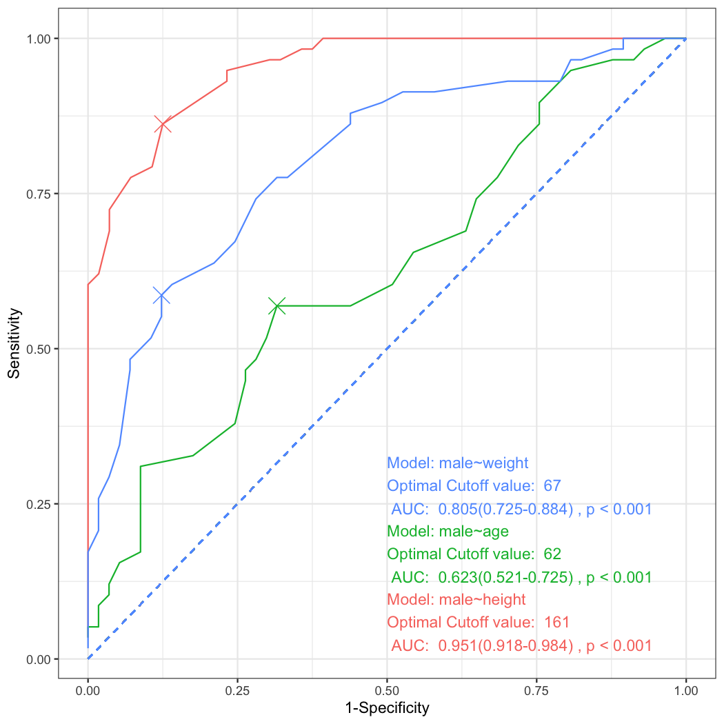
Area under the curve: 0.951You can draw multiple ROC curves in the same plot. First, make a list of multipleROC objects and use the plot_ROC function.
a=multipleROC(male~height,data=radial,plot=FALSE)
b=multipleROC(male~age,data=radial,plot=FALSE)
c=multipleROC(form=male~weight,data=radial,plot=FALSE)
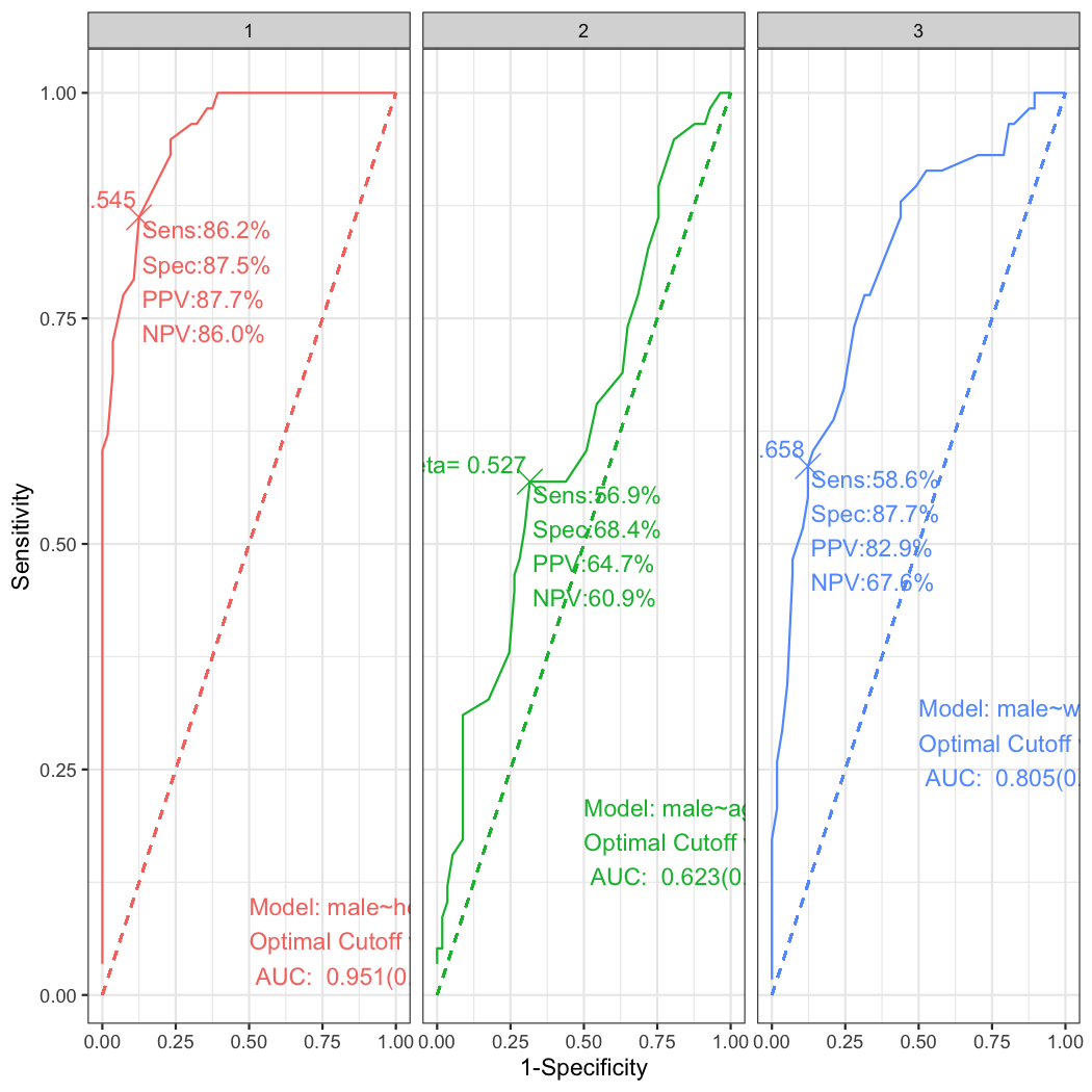
plot_ROC(list(a,b,c),show.eta=FALSE,show.sens=FALSE)
You can make facetted plot with the following R command.
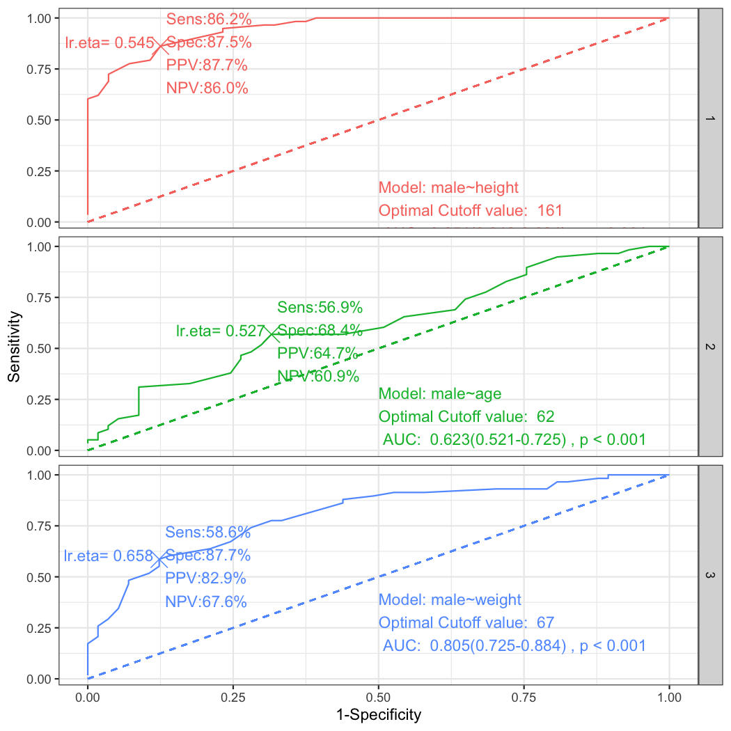
plot_ROC(list(a,b,c),facet=TRUE)By setting the facet argument TRUE, you can get the facetted plot. Alternatively you can use the facet_grid() function of the package ggplot2.
require(ggplot2)
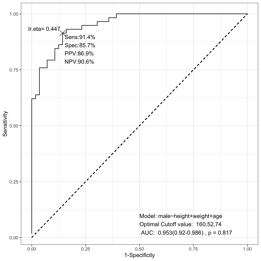
plot_ROC(list(a,b,c))+facet_grid(no~.)You can make ROC plots with multiple predictors.
multipleROC(male~height+weight+age,data=radial)This plot is made from the following glm object.
fit=glm(male~height+weight+age,data=radial,family=binomial)You can use automatic stepwise backward elmination by AIC in multiple glm model.
final=step(fit,trace=0)
summary(final)

Call:
glm(formula = male ~ height, family = binomial, data = radial)

Deviance Residuals:
     Min        1Q    Median        3Q       Max
-2.15418  -0.30022   0.02699   0.25143   2.17328

Coefficients:
             Estimate Std. Error z value Pr(>|z|)
(Intercept) -65.38126   12.72530  -5.138 2.78e-07 ***
height        0.40722    0.07918   5.143 2.71e-07 ***
---
Signif. codes:  0 '***' 0.001 '**' 0.01 '*' 0.05 '.' 0.1 ' ' 1

(Dispersion parameter for binomial family taken to be 1)

    Null deviance: 158.002  on 113  degrees of freedom
Residual deviance:  63.462  on 112  degrees of freedom
  (1 observation deleted due to missingness)
AIC: 67.462

Number of Fisher Scoring iterations: 6
You can compare the initial and final model.
anova(final,fit,test="Chisq")
Analysis of Deviance Table

Model 1: male ~ height
Model 2: male ~ height + weight + age
  Resid. Df Resid. Dev Df Deviance Pr(>Chi)
1       112     63.462
2       110     63.352  2  0.11025   0.9464
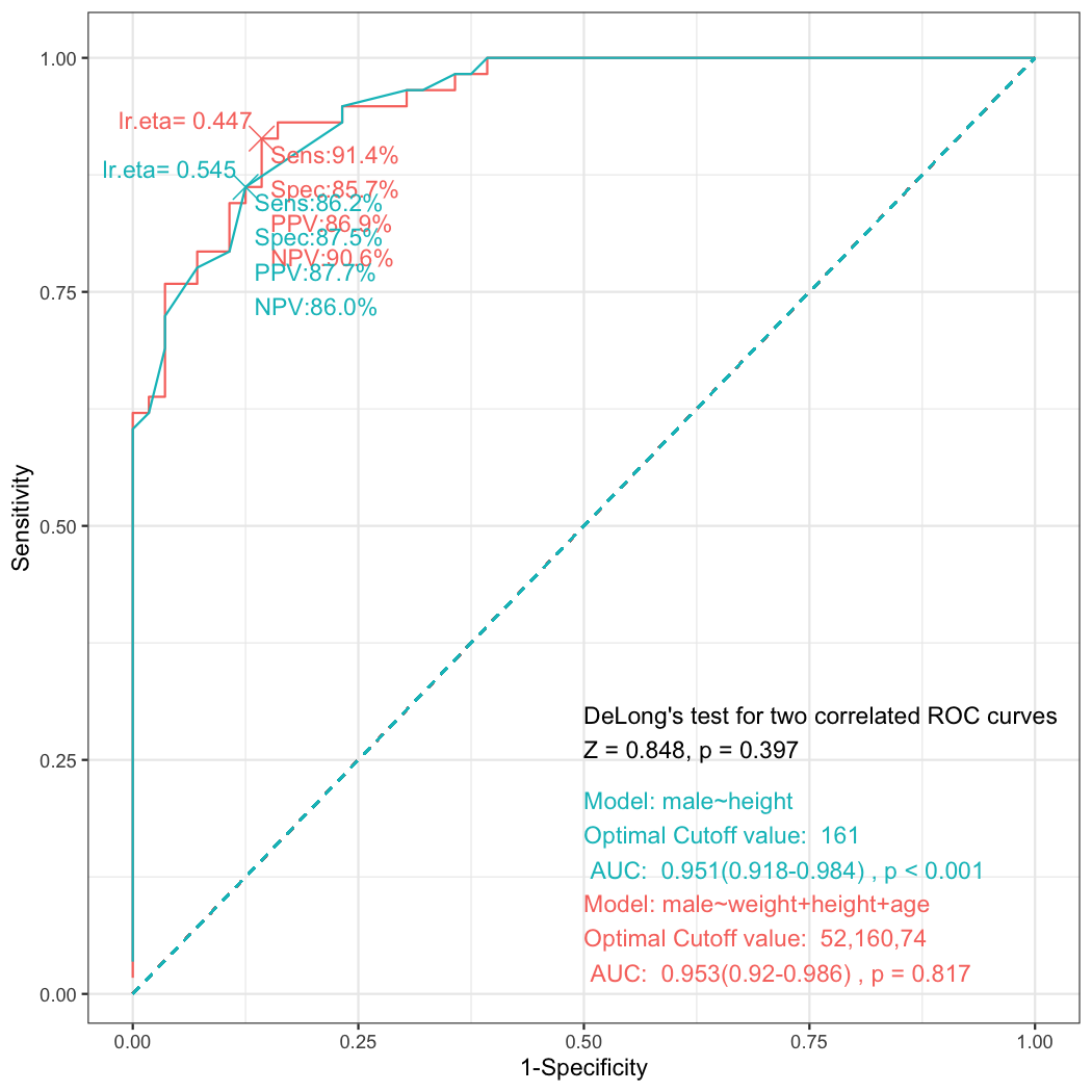
You can draw plot comparing two ROC curves of the initial and the final model.
step_ROC(male~weight+height+age,data=radial)You can get the anova table.
step_ROC(male~weight+height+age,data=radial,plot=FALSE)
Analysis of Deviance Table

Model 1: male ~ height
Model 2: male ~ weight + height + age
  Resid. Df Resid. Dev Df Deviance Pr(>Chi)
1       112     63.462
2       110     63.352  2  0.11025   0.9464