Edward Tufte is a professor and author known for his excellent (and beautiful!) books on the visual display of statistical information. Last year I had the opportunity to attend one of his courses and was inspired to apply his ideas to my favorite plotting library, matplotlib.
The result is etfames, a python module that operates on matplotlib plots. So far I've implemented two graph types described in the The Visual Display of Quantitative Information (VDQI): the dash-dot-plot and range frames.
A dash-dot-plot places a tick mark on the axis for each value in a scatter plot. When there are many values in the graph this can be a more effective way to understand their distribution than looking at the raw data. For example see
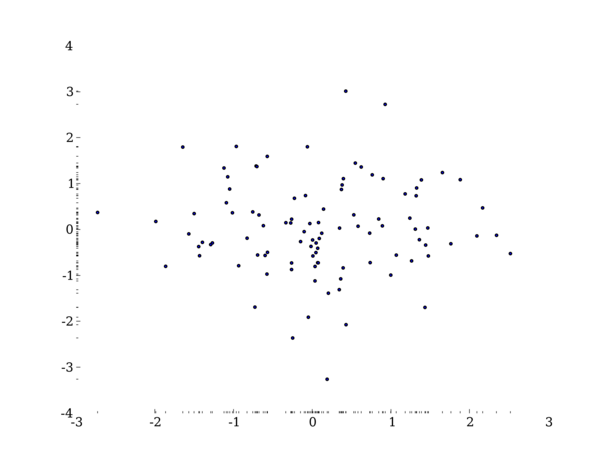
See demo_ddp.py for a working example.
The range frame re-uses the frame (edge) of a graph to display useful information. Instead of drawing a full frame around the graph the frame is only drawn from the minimum to the maximum value along that axis. For example:
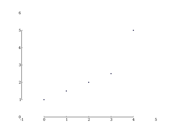
See demo_range.py for a working example.
There are several other graph types described in VDQI that would be nice to implement, particularly the extension of range frames that turns them into a box plot.
A related project is sparkplot which uses the matplotlib library to create sparklines.