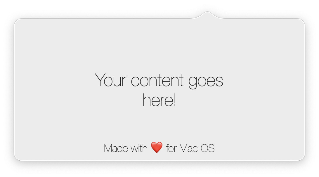
Custom macOS popover.
Since this is a Swift Package, the installation process is pretty stright forward.
Update your Package.swift dependencies:
dependencies: [
    .package(url: "https://github.com/iSapozhnik/Popover", from: "1.1.0")
]
- Go to
File -> Swift Packages -> Add Package Dependency. - Put GitHub URL
https://github.com/iSapozhnik/Popoverand clickNext - Select the latest version
- Click
Finish
- In your
AppDelegateimport Popover - Create a view you want to put into a status bar.
- Create a content view controller which would be embedded inside Popover
- Optionally create menu items
- Create a Popover instance. Here you can use either standard configuration (you don't need to pass
windowConfigurationparameter in this case) or you can subclassDefaultConfiguration, override some properties and pass a new instance as a parameter. If in step 4 you have created menu items, pass it here as well. You can see them by making right click on menu bar item. - Call
prepareto set everything up.
And here is how typical AppDelegate may look like:
import Cocoa
import Popover

class MyPopoverConfiguration: DefaultConfiguration {
    override var backgroundColor: NSColor {
        return NSColor.systemRed
    }

    override var borderColor: NSColor? {
        return NSColor.red
    }
}

@NSApplicationMain
class AppDelegate: NSObject, NSApplicationDelegate {
    var popover: Popover!

    func applicationDidFinishLaunching(_ aNotification: Notification) {
        let statusItemView = StatusItemView(frame: NSRect(width: 22.0, height: 20))

        let viewController = MainViewController()

        let menuItems: [Popover.MenuItemType] = [
            .item(Popover.MenuItem(title: "Settings", action: viewController.showSettings)),
            .separator,
            .item(Popover.MenuItem(title: "Quit", key: "q", action: viewController.quit))
        ]

        popover = Popover(with: MyPopoverConfiguration(), menuItems: menuItems)
        popover.prepare(with: statusItemView, contentViewController: viewController)
    }
}Quite a lot of things:
public protocol PopoverConfiguration {
    /// The distance from Popover's arrow to a status item.
    var popoverToStatusItemMargin:  CGFloat { get }

    /// Popover's background color.
    var backgroundColor:            NSColor { get }

    /// Popover's border color.
    /// - Important:
    ///     If `borderColor` returns `nil`, settings `borderWidth` won't make any effect. See also: `borderWidth`.
    var borderColor:                NSColor? { get }

    /// Popover's border width.
    /// - Important:
    ///      If Popover's border color is set to `nil`, setting `borderWidth` won't make any effect.
    var borderWidth:                CGFloat { get }

    /// Defines Popover arrow height.
    var arrowHeight:                CGFloat { get }

    /// Defines Popover arrow width.
    var arrowWidth:                 CGFloat { get }

    /// Defines Popover corner radius.
    /// - Warning:
    ///     If this value is too big and if the Popover's status item (menu bar view) is too close to the right edge, the appearence of the Popover might be odd.
    var cornerRadius:               CGFloat { get }

    /// Defines Popover content edge insets.
    var contentEdgeInsets:          NSEdgeInsets { get }

    /// The distance from the right side of the Popover to the screen's edge.
    /// - Warning:
    ///     If this value is too big and if the Popover's status item (menu bar view) is too close to the right edge, the appearence of the Popover might be odd.
    var rightEdgeMargin:            CGFloat { get }
}Created and maintained by @iSapozhnik.
Released under the MIT License. See LICENSE for details.
Copyright © 2020-present Sapozhnik Ivan.
Heavily inspired by CCNStatusItem


