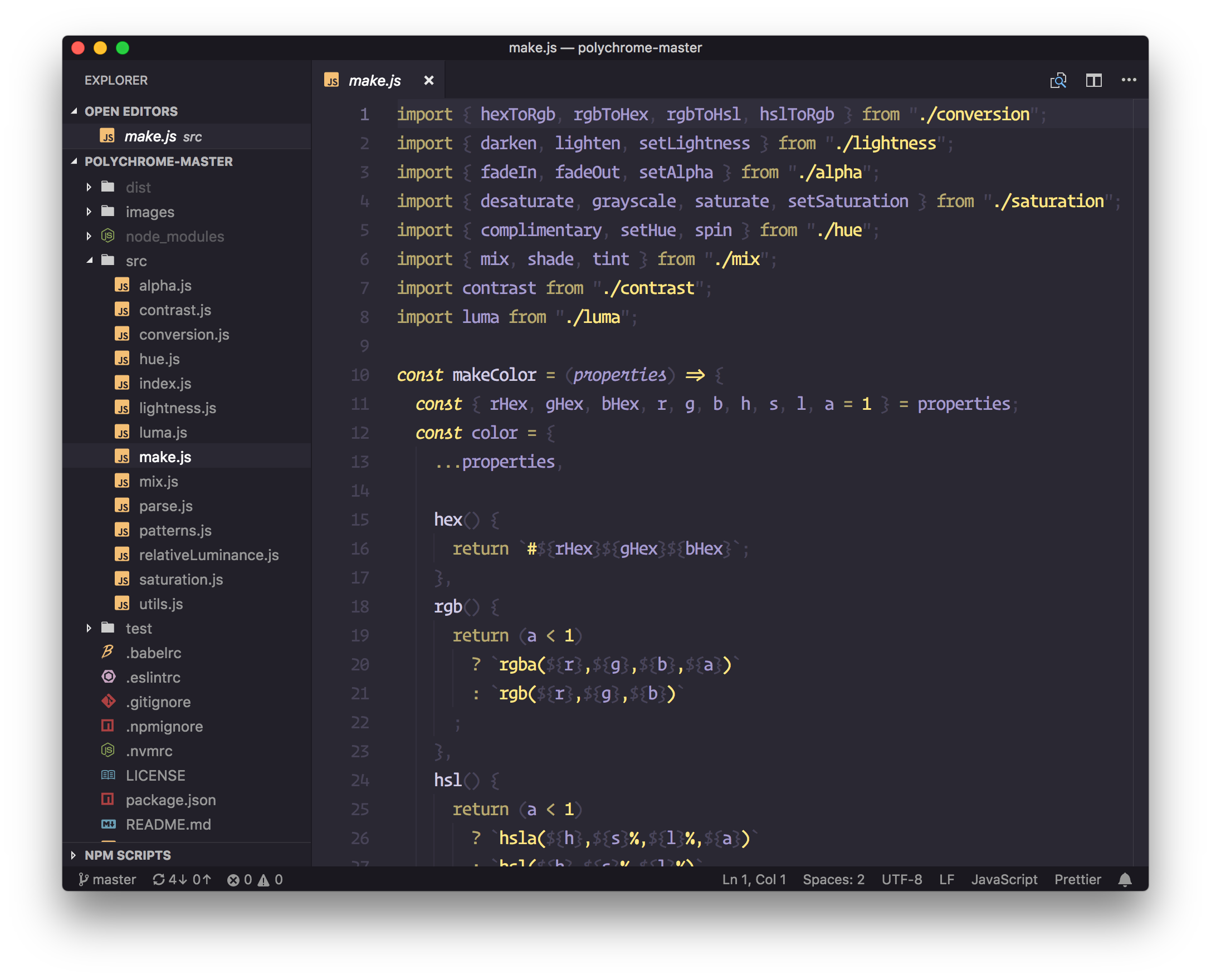
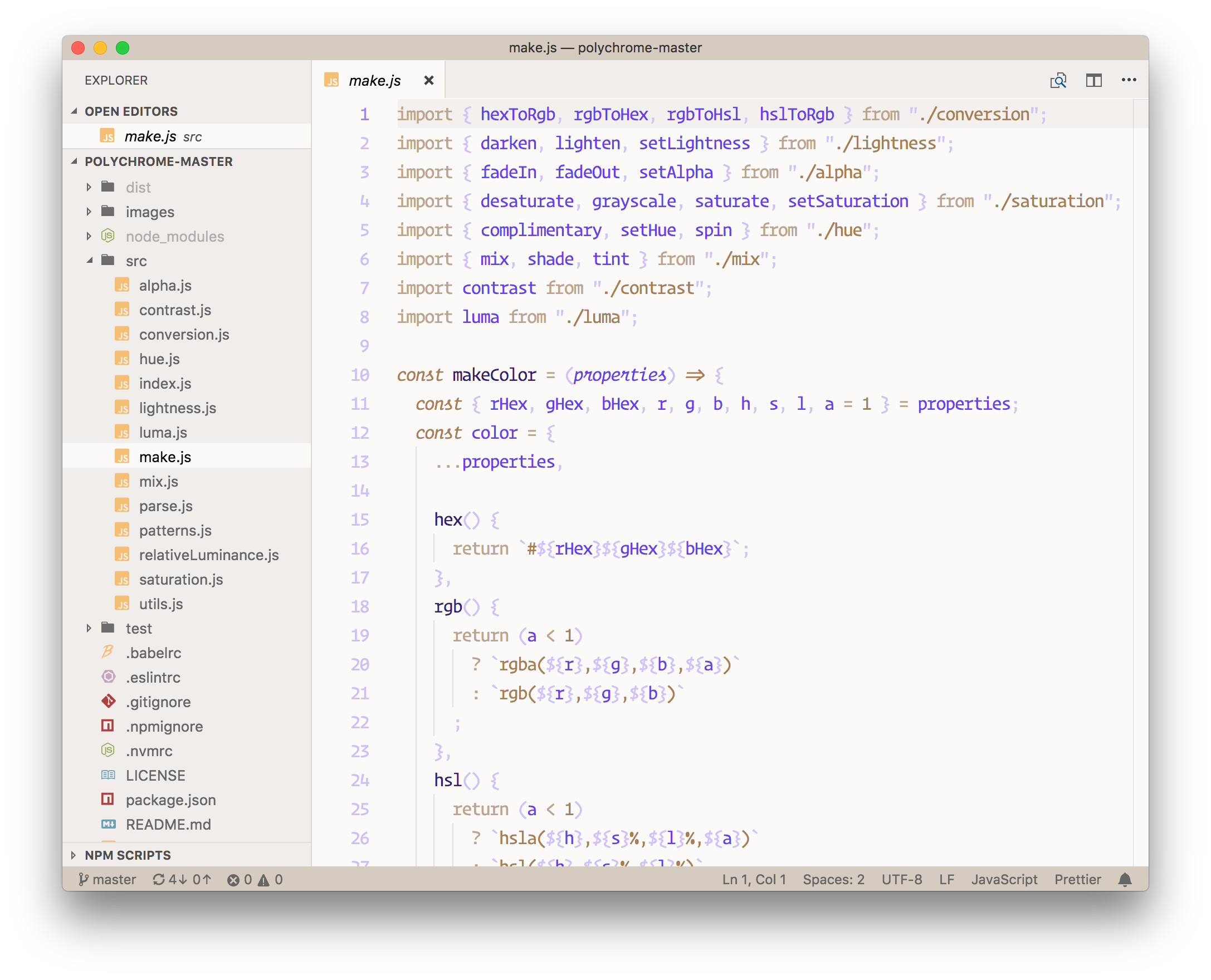
Generated Duotone themes using polychrome for your entire workbench!
Inspired by the work done by @simurai and the creation of duotone themes for Atom.
This extension ships with 2 base themes that can be modified:
Again, these are the base themes. You can modify the light and dark theme values in User Settings to your liking to create a custom duotone theme of your own (👇 See below in Extension Settings).
You can also head over to the Polychrome Theme Viewer to try out different color combinations before updating your user settings.
You simply provide a background, primary, and accent color. After that, the extension generates a duotone theme that contains shades and tints of your chosen colors.
When the theme is updated through the extensions view, there is a chance that your theme colors will reset if you have modified the dark or light settings for the theme. If you find that this is the case, simply run Polychrome: Generate Dark/Light Themes from the command palette. This command will use the user settings values and regenerate your theme files.
I hope to work with the VS Code team to add some sort of
:onupdatehook that can run for extensions needing to do any local cleanup when an update happens.
You must be running VS Code > version 1.21 for optimal appearance (due to recent changes in the notifications)
Make the theme your own by changing primary, accent, or background colors
This extension contributes the following settings:
polychrome.dark.primary: This serves as a base for the dark theme and is mixed with white and the background color to create 2 tints and 2 shades for a total of 5 primary colors.polychrome.dark.accent: Brightest accent color for the dark theme. 2 additional accent shades are created by mixing with the background color for 3 total accent colors.polychrome.dark.background: Determines the base editor background color for the dark theme. This value is then darkened/lightened throughout the UI where appropriate.polychrome.light.primary: This serves as a base for the light theme and is mixed with black and the background color to create 2 tints and 2 shades for a total of 5 primary colors.polychrome.light.accent: Darkest accent color used for the light theme. 2 additional accent shades are created by mixing with the background color for 3 total accent colors.polychrome.light.background: Determines the base editor background color for the light theme. This value is then darkened/lightened throughout the UI where appropriate.

