Created by Celeste Muniz - Lithgow
In this assignment, I analyzed the trends shaping people's lives, as well as created graphs with interactive elements to help readers understand my findings.
- Download repo to your local drive.
- Open in VS code.
- Open index.html with Live Server.
- More Data, More Dynamics
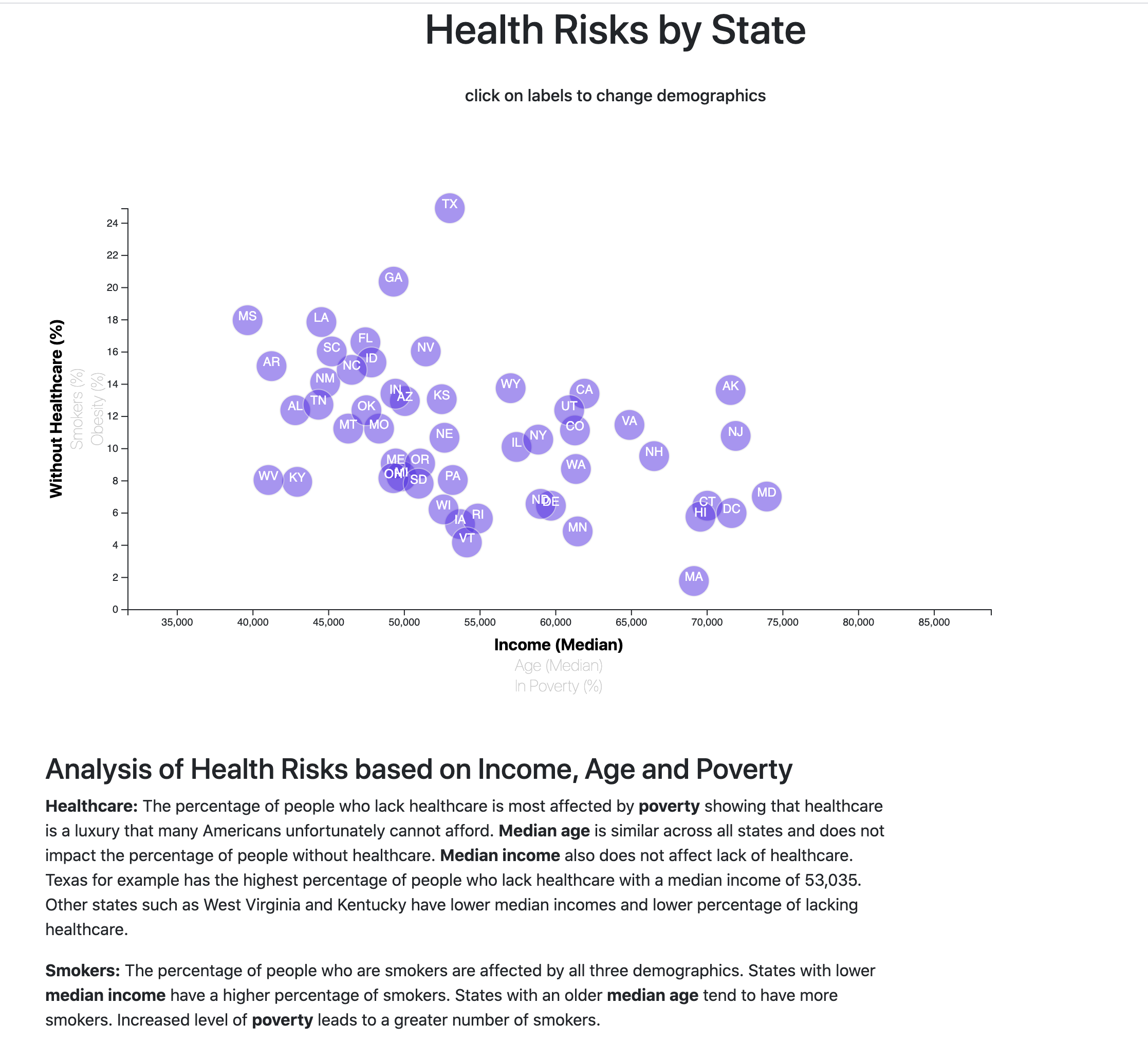
Including more demographics and more risk factors, I placed additional labels in your scatter plot and give them click events so users can decide which data to display. There are 3 labels per axis. I animated the transitions for the circles' locations as well as the range of axes.
- Incorporate d3-tip
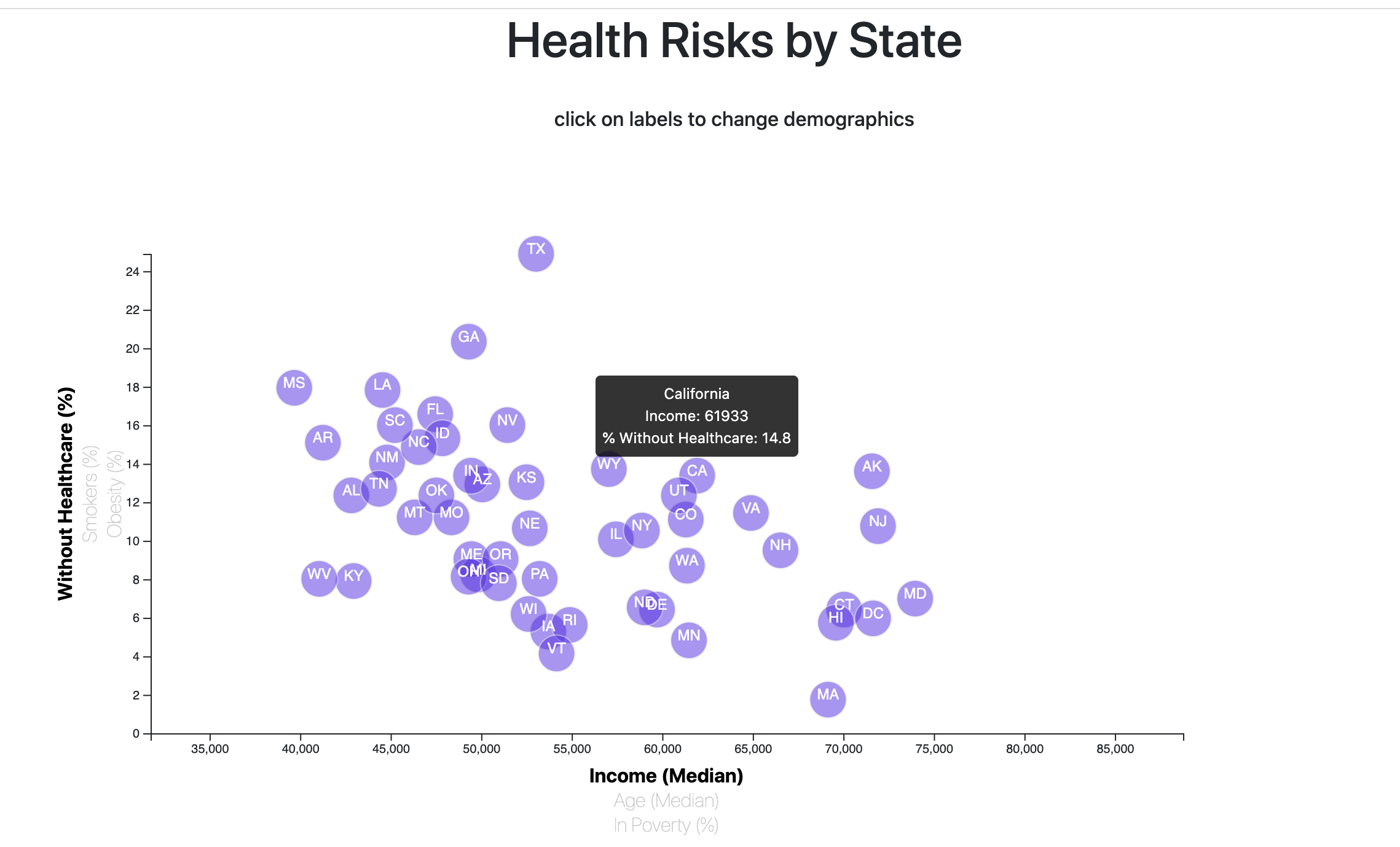
I added d3 tool-tips to my plot to reveal a specific element's data when the user hovers their cursor over the element. The data displayed includes full name of State, info from selected x axis and info from selected y axis.
D3
Java
Html
CSS


