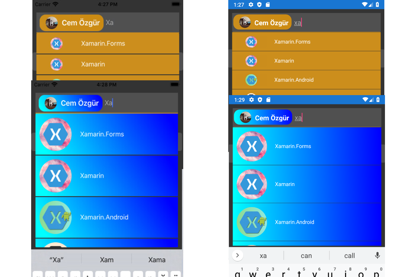
- When you add an item source, it automatically suggests items for you. If the text editor is empty and click back button delete last selected item. You can select single or multiple items and you can customize the visuals of the selected items.


https://www.nuget.org/packages/Xamarin.RisePlugin.AutoCompleteTextView
- Step1
Add the following NuGet package to your solution.
- Step2
You must add this line to your AppDelegate.cs before you use AutoCompleteTextView
Xamarin.RisePlugin.AutoCompleteTextView.iOS.AutoCompleteTextViewRenderer.Init();- Step3 (Important)
You must call these properties NamePath, ItemTemplate, SelectedItemTemplate, ItemsSource, SelectedItemsSource Like
            auto.ItemsSource = list;
            auto.SelectedItemsSource = new List<test>();
            auto.NamePath = "Text";
            auto.ItemTemplate =  new DataTemplate(() =>
            {
                var stc = new StackLayout() { BackgroundColor = Color.Blue };
                var lbl = new Label();
                lbl.SetBinding(Label.TextProperty, "Text");
                stc.Children.Add(lbl);
                return stc;
            });
            auto.SelectedItemTemplate =  new DataTemplate(() =>
            {
                var stc = new StackLayout() { BackgroundColor = Color.Blue };
                var lbl = new Label();
                lbl.SetBinding(Label.TextProperty, "Text");
                stc.Children.Add(lbl);
                return stc;
});| Platforms |
|---|
| IOS |
| Android |
| Property | What it does |
|---|---|
| TextColor | Set editor text color. |
| FontSize | Set editor font size. |
| FontFamily | Set editor font family. |
| FontAttribute | Set editor font FontAttribute. |
| BackgroundColor | Set view background color . |
| TextBackGroundColor | Set only editor background color . |
| PlaceholderColor | Set editor placeholder color. |
| BorderColor | Set editor border color. |
| BorderThickness | Set editor border thickness. |
| BackButtonPressDeleteSelected | Clicking back button deletes last selected item. |
| ClickDeleteSelected | Delets clicked item. |
| SeparatorColor | Set separator color dropdown. |
| SeparatorThickness | Set separator thickness dropdown. |
| SameItemControl | Checks selected items, will skip item if this is an already existing one. (Only work SelectionMode.Multiple) |
| SearchType | Set searching criteria |
| NamePath | Type the name you want to show up in the dropdown. |
| SelectionMode | You can select none, single or multiple items. |
| RowHeight | Set dropdown rows height |
| SelectAfterText | Setting the status of the text when selecting an object from dropdown. (Clear = clear the text, Complete = sets the name of the item you select to text, Default = does nothing) |
| ItemsSource | The list you want to show up. |
| SelectedItemsSource | Selected item list |
| ItemTemplate | You can customize the visuals of the dropdown items. |
| SelectedItemTemplate | You can customize the visuals of the selected items. |
| SelectItem | When an dropdown item is selected, properties of that item and the index returns. |
| SelectSameItem | When an dropdown selected item is similar, properties of that item and the index returns. |
| BackButtonPressDelete | When an delete item with back button, properties of that item and the index returns. |
| TextChanged | Triggered when text changes.. |
| ClickSelectedItem | Triggered when click selected item.. |
- Only for structured views.