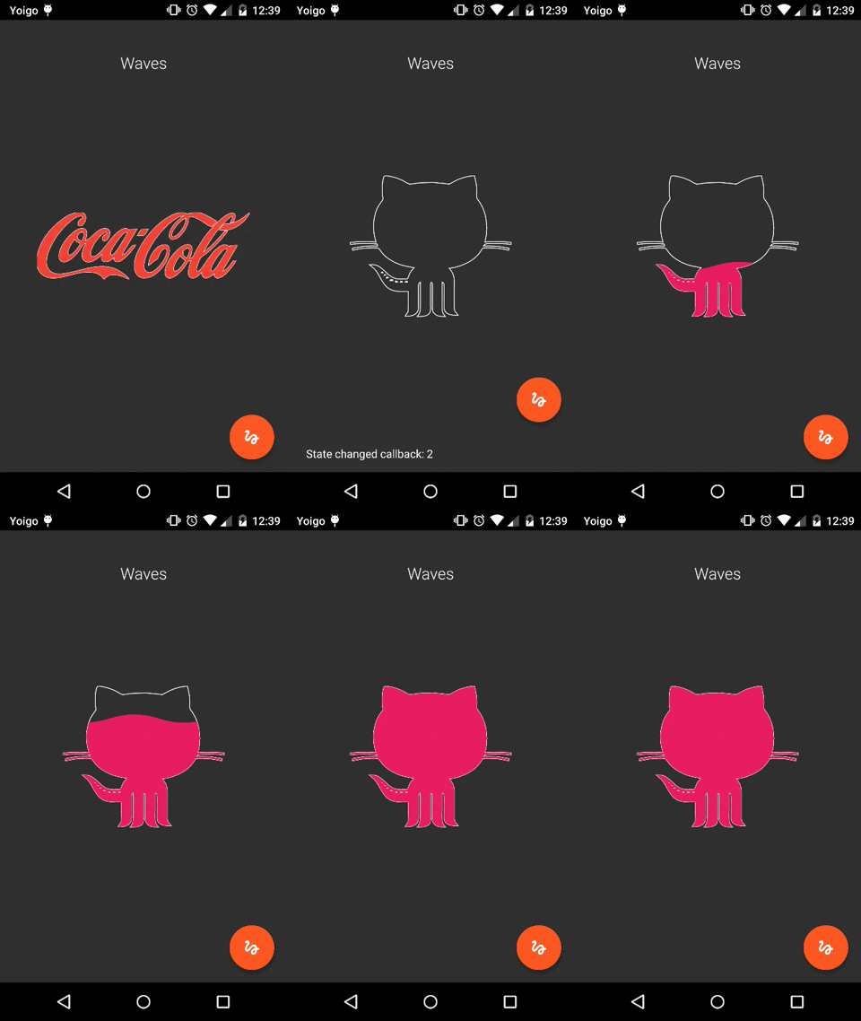
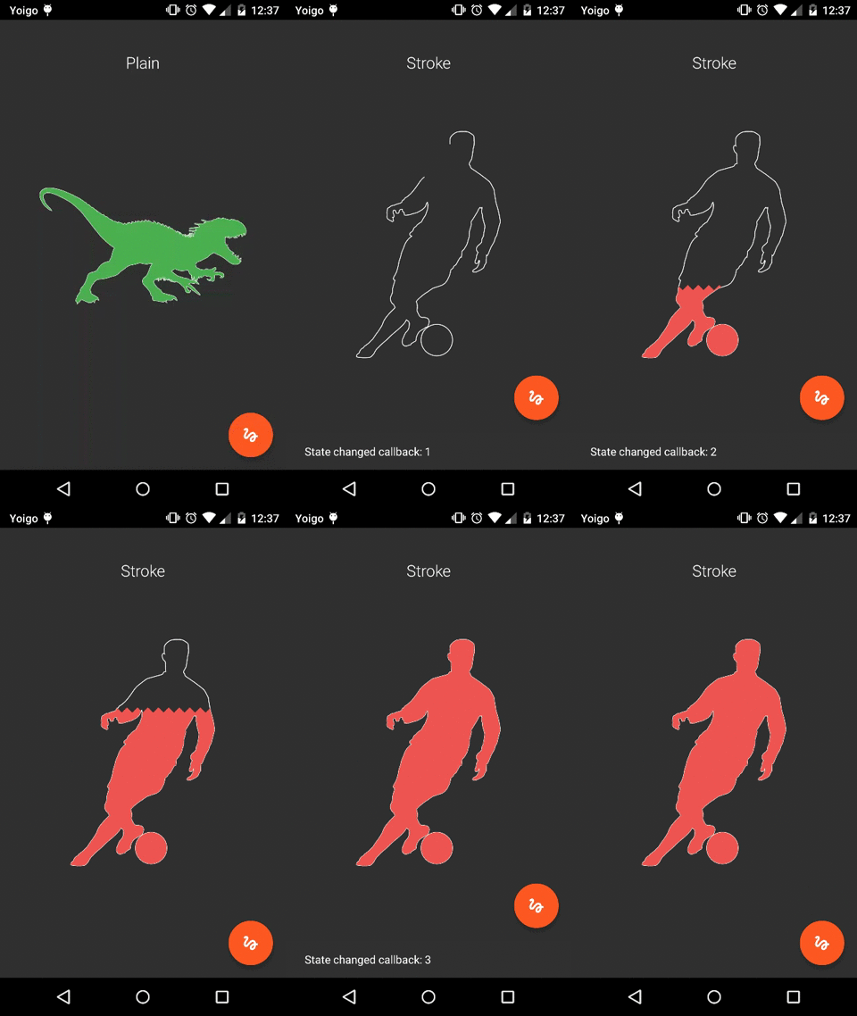
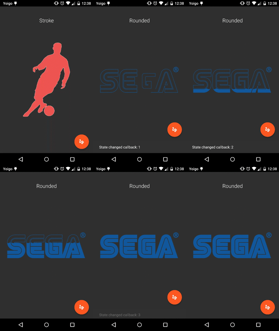
Android Open Source library providing an interesting fillable progress view working with SVG paths. This is a nice option too if you want to create an interesting branding logo for your app.
Check this blog post in order to get more technical details about the library.
As the library works with a standard String formatted source SVG Path, you need to generate it with some external tool. I usually use GIMP for that, as it has an interesting support to generate SVG Paths from original images. Here is the needed documentation to do it.
After that, set your generated path to the view. Be careful to just take the path, and not the full xml content generated. The path will look something like:
M 2948.00,18.00
   C 2956.86,18.01 2954.31,18.45 2962.00,19.91
     3009.70,28.94 3043.56,69.15 3043.00,118.00
     3042.94,122.96 3042.06,127.15 3041.25,132.00
     3036.37,161.02 3020.92,184.46 2996.00,200.31
     2976.23,212.88 2959.60,214.26 2937.00,214.00
     2926.91,213.88 2912.06,209.70 2903.00,205.24
     2893.00,200.33 2884.08,194.74 2876.04,186.91
     2848.21,159.81 2839.19,115.93 2853.45,80.00
     2863.41,54.91 2883.01,35.57 2908.00,25.45
     2916.97,21.82 2924.84,20.75 2934.00,18.51
     2938.63,17.79 2943.32,17.99 2948.00,18.00 Z
   M 2870.76,78.00
   ...
To set the generated path by code (do it just if you declared FillableLoader in the xml layout):
fillableLoader.setSvgPath(String generatedSvgPath);And to include it into your layout:
<com.github.jorgecastillo.FillableLoader
  android:id="@+id/fillableLoader"
  android:layout_width="200dp"
  android:layout_height="100dp"
  app:fl_originalWidth="@integer/original_svg_width"
  app:fl_originalHeight="@integer/original_svg_height"
  app:fl_strokeColor="@color/stroke_color"
  app:fl_fillColor="@color/fill_color"
  app:fl_strokeWidth="@dimen/stroke_width"
  app:fl_strokeDrawingDuration="@integer/stroke_drawing_duration"
  app:fl_fillDuration="@integer/fill_duration"
  app:fl_clippingTransform="waves"
  app:fl_fillPercentage="@integer/fill_percentage"
  />

  <!--
  Default supported clipping transforms: "plain", "spikes", "rounded", "waves", "squares" and "bites".
  Read "Customize filling" section to implement a custom one.
  -->
Or if you rather you can do it by code using the FillableLoaderBuilder class. It will get automatically
attached to the given parent view. Use the LayoutParams argument to position it:
FillableLoaderBuilder loaderBuilder = new FillableLoaderBuilder();
fillableLoader = loaderBuilder
    .parentView((FrameLayout) rootView)
    .layoutParams(params)
    .svgPath(Paths.JOB_AND_TALENT)
    .originalDimensions(970, 970)
    .strokeWidth(strokeWidth)
    .strokeColor(Color.parseColor("#1c9ade"))
    .fillColor(Color.parseColor("#1c9ade"))
    .strokeDrawingDuration(2000)
    .fillDuration(5000)
    .clippingTransform(new PlainClippingTransform())
    .build();
The only required arguments which does not have default values are the original dimensions from the svg image, and the svg path. Both of them are needed in order to get everything working properly. You can omit the other ones if you want.
In order to allow reaction to every State switch (NOT_STARTED -> TRACE_STARTED -> FILL_STARTED -> FINISHED)
you must implement OnStateChangeListener and override its onStateChange(int state) method.
@Override public void onStateChange(int state) {
  ((MainActivity) getActivity()).showStateHint(state);

  switch(state) {
    case State.FILL_STARTED:
      ...
      break;
    case State.FINISHED:
      ...
  }
}To get a custom "top border" style for the filling figure, you can implement the ClippingTransform interface,
which will force you to create an implementation for the transform() method.
You must think about the clipping figure as an invisible polygon that is going to clip your filling figure. (Like a DIFFERENCE operation between the total filling space and the custom transform figure you are applying). It must vary depending on the currentFillPhase.
public class PlainClippingTransform implements ClippingTransform {

  @Override public void transform(Canvas canvas, float currentFillPhase, View view) {
    canvas.clipRect(0, (view.getBottom() - view.getTop()) * (1f - currentFillPhase),
        view.getRight(), view.getBottom());
  }
}
The canvas would be the one used to draw the loader, the currentFillPhase argument is the current percent
of the animation step (from 0 to 1), and the view would need to be provided too, so it can be used
to create an animation based on view properties, like its current dimensions.
If your loader / brand logo needs to you can suppress the stroke drawing animation and go directly for the
filling one. To do that, just set app:strokeDrawingDuration="0".
If you only need to fill the pattern partially or you want to control the fill progress, you can use
fl_fillPercentage xml (resource) property or if you want to control from Java use.
fillableLoader.setPercentage(percent);If you are working with gradle, add the dependency to your build.gradle file:
dependencies{
    compile 'com.github.jorgecastilloprz:fillableloaders:1.03@aar'
}
if you are working with maven, do it into your pom.xml
<dependency>
    <groupId>com.github.jorgecastilloprz</groupId>
    <artifactId>fillableloaders</artifactId>
    <version>1.03</version>
    <type>aar</type>
</dependency>You can find a detailed explanation of the lib functionality in this blog post.
- The class
SvgPathParserused to convert from String SVG Path format to Android SDKPathstructures has been obtained from the interesting romannurik Muzei code. - This project has been inspired by this iOS Swift project created by poolqf.
- Jorge Castillo Pérez - jorge.castillo.prz@gmail.com

Copyright 2015 Jorge Castillo Pérez

Licensed under the Apache License, Version 2.0 (the "License");
you may not use this file except in compliance with the License.
You may obtain a copy of the License at

   http://www.apache.org/licenses/LICENSE-2.0

Unless required by applicable law or agreed to in writing, software
distributed under the License is distributed on an "AS IS" BASIS,
WITHOUT WARRANTIES OR CONDITIONS OF ANY KIND, either express or implied.
See the License for the specific language governing permissions and
limitations under the License.


