

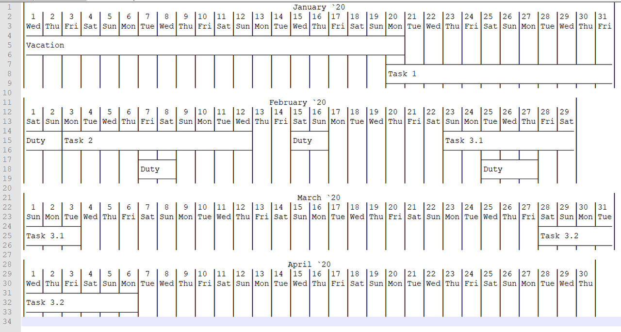
The tool for tasks visualization - like Gantt chart, but more compact.
Full documentation are available here. Also there is the GitHub project page.
If you need to visualize your schedule or working plan you are welcome to use Linum. Actually, you are able to use Gantt charts, but they are overloaded with extra information if you have many simple tasks. Gantt charts are better when tasks are sequential and connected between themselves.
Linum allows you to visualize your information on chosen time interval (week, month, year) like a timetable briefly and convenient.
- Console
- Text (.txt)
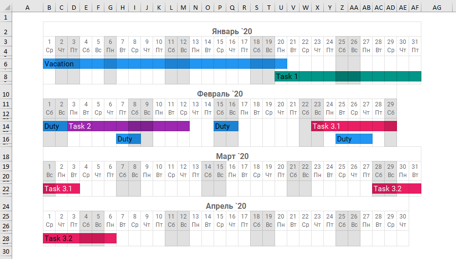
- Excel (.xlsx)
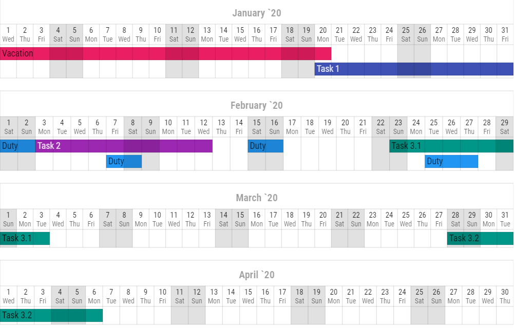
- SVG (.svg)
- HTML (.html)
- InDesign (.idml)
For now Linum is ready to go for rendering your tasks in several formats on a chosen time interval. Feel free to improve the project and develop any new output formats.