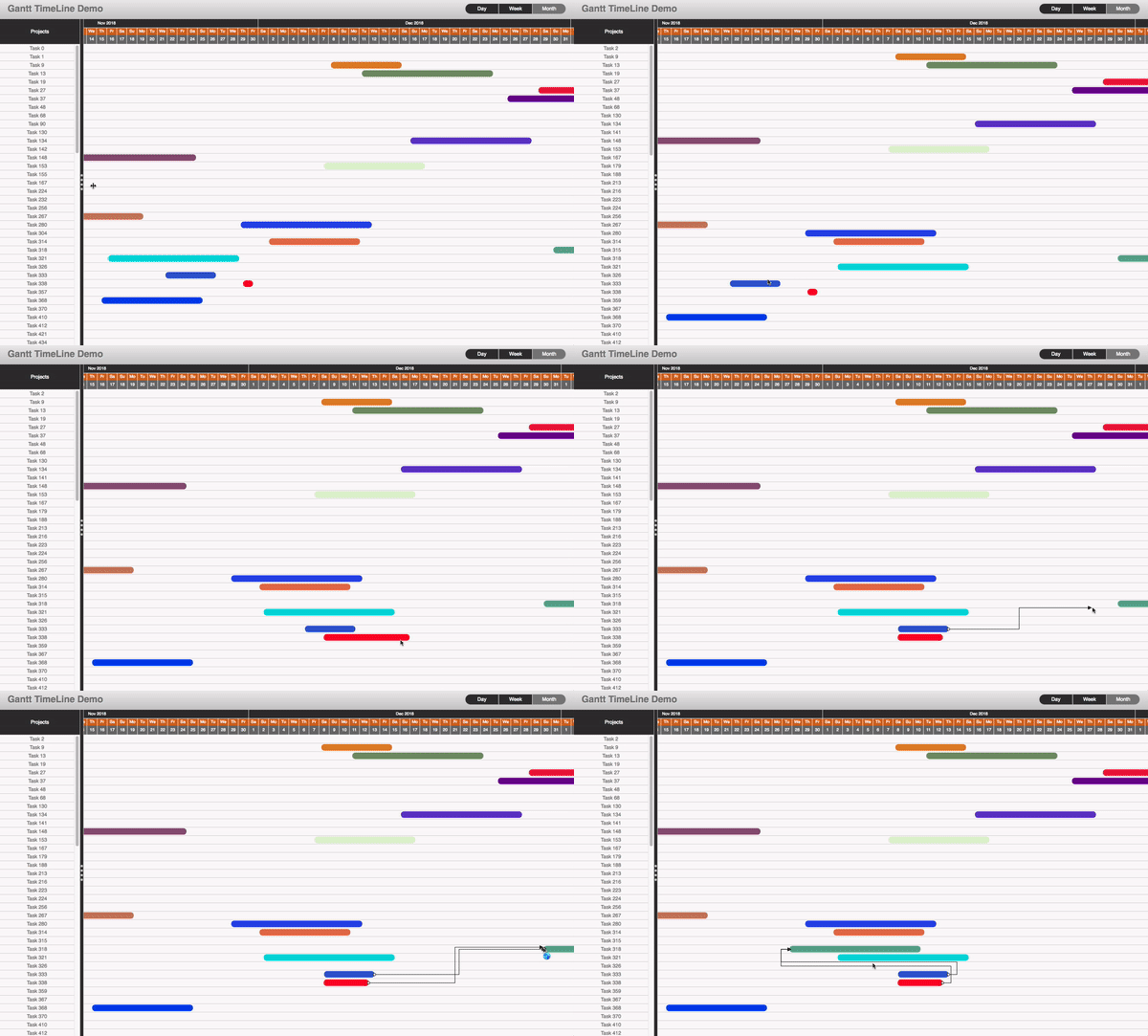
A react timeline gantt component.
React-timeline-gantt is a component built to display and manage calendar gantt charts. It use virtual rendering to be reactive an efficient.
The component is capable of:
- Can handle 100 thousands records.
- Infinite calendar scrolling
- Three Zoom levels : day, week, month
- Fully customisable.
- Support all CRUD operations.
- Task and Link creation.
- Support Paging.
- Can be easily integrated with Redux
To watch a demo take a look at video that shows how to use the component.
To play with a live demo .
- Better and optimize header
- Add "year" mode option.
- Touch Event Support for scrolling and task movement
- Subtask implementation
- Add start and end date columns to the task list
- Beter UX to create links
- Scroll up/donw in viewPort
npm install react-gantt-timelineThe component has the following dependencies: moment, react-sizeme
The first thing to once the component has been install and all it dependencies is create the data that the timeline component consume.The time line has two data providers data and links.
Data :is an array of objects that contains the task to be shown. Each one of the object that are part of the array need to have the following compulsory fields
| Property | value | Descriptions |
|---|---|---|
| id | String/Number | An unique identifier for the class |
| start | Date | The start date of the task |
| end | Date | The end date of the task |
| name | String | The name of the task to be diplayed |
| color (optional) | String | The color of the task to be diplayed |
An example of data definition:
 let data=[ {id:1,start:new Date(), end:new Date()+1 ,name:'Demo Task 1'},
			{id:2,start:new Date(), end:new Date()+1 ,name:'Demo Task 2'}]
Links :is also an array of objects that contains links between task. Each one of the object that are part of the array need to have the following compulsory fields:
| Property | value | Descriptions |
|---|---|---|
| id | String/Number | An unique identifier for the class |
| start | String/Number | The id of the start task |
| end | String/Number | The id of the end task |
An example of data definition:
 let links=[ {id:1,start:1, end:2},
			{id:2,start:1, end:3}]
Once the data is define we just need to declare the component and populate it with both data providers.
<TimeLine data={data} links={links} />Here is the demo code:
The React-timeline-gantt was build to be use under a Flux architecture, this means that the component should not be managing the state of the application, is up the store and only the store to modify the state of the application. What our component does is to give you callbacks to know when the component is asking for a change.
The TimeLine component is responsible for two things:
- Updating task:Changing name ,start and end date
- Creating Links
Adding,Deleting Task or links can be manage with logic outside the component. For this reason the react-timeline-gantt component provides the following callbacks:
| name | params | Descriptions |
|---|---|---|
| onCreateLink | link:Object | This callback is trigger when the component is notifying the creating of a link between two tasks |
| onUpdateTask | task:Object,props:Object | This callback is trigger when the component is notifying the updating of a Task, Sen the task we want to changes, and the properties we want to change |
| onSelectItem | item:Object | This callback is trigger when an item is selected this can be a task or a link |
Here is a simple demo of how to handle updates task and link creation:
- When you drag a task or resize an update will be triggered.
- You can create a task by clicking in the black dot at the end of a task and drag and drop it to the beginning of another task.A demo of how it works can be seen here
Here is a full crud example: This demo illustrate how to do a simple application
Here is a fully working Redux demo
Paging is manage using the event onHorizonChange.The timeline component preload a certain date range of data, once the user start scrolling when the timeline realise that needs data for a new range, it trigger the onHorizonChange event. This method then can be use to support serverside paging or client filtering.
| name | params | Descriptions |
|---|---|---|
| onHorizonChange | start,end:Date | This callback is trigger when the component is notifying that needs to load data for a new range of dates. |
Here is a demo app that shows how to use onHorizonChange, to only display the relvant data for a period:
To customise the look and feel the react-timeline-gantt component provides a configuration object that can be pass as a property. Here is the structure of the config object :
{
	header:{ //Targert the time header containing the information month/day of the week, day and time.
		top:{//Tartget the month elements
			style:{backgroundColor:"#333333"} //The style applied to the month elements
		},
		middle:{//Tartget elements displaying the day of week info
			style:{backgroundColor:"chocolate"}, //The style applied to the day of week elements
			selectedStyle:{backgroundColor:"#b13525"}//The style applied to the day of week elements when is selected
		},
		bottom:{//Tartget elements displaying the day number or time
			style:{background:"grey",fontSize:9},//the style tp be applied
			selectedStyle:{backgroundColor:"#b13525",fontWeight:  'bold'}//the style tp be applied  when selected
		}
	},
	taskList:{//the right side task list
		title:{//The title od the task list
			label:"Projects",//The caption to display as title
			style:{backgroundColor:  '#333333',borderBottom:  'solid 1px silver',
				   color:  'white',textAlign:  'center'}//The style to be applied to the title
		},
		task:{// The items inside the list diplaying the task
			style:{backgroundColor:  '#fbf9f9'}// the style to be applied
		},
		verticalSeparator:{//the vertical seperator use to resize he width of the task list
			style:{backgroundColor:  '#333333',},//the style
			grip:{//the four square grip inside the vertical separator
				style:{backgroundColor:  '#cfcfcd'}//the style to be applied
			}
		}
	},
	dataViewPort:{//The are where we display the task
		rows:{//the row constainting a task
			style:{backgroundColor:"#fbf9f9",borderBottom:'solid 0.5px #cfcfcd'}
			},
		task:{the task itself
			showLabel:false,//If the task display the a lable
			style:{position:  'absolute',borderRadius:14,color:  'white',
				   textAlign:'center',backgroundColor:'grey'},
			 selectedStyle:{}//the style tp be applied  when selected
		}
	},
	links:{//The link between two task
		color:'black',
		selectedColor:'#ff00fa'
	}
}
Once the object is defined we just need to pass the config object to the timeline config property.
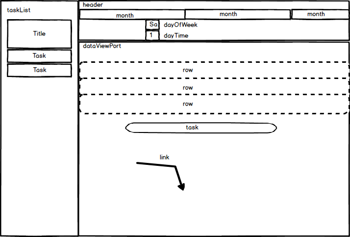
<TimeLine data={data} links={links} />This diagram shows the different elements of timeline component and where are they place:
Here is a demo:
| Property | value | Descriptions |
|---|---|---|
| mode | string | set the zoom level.The possible values are:"month","week","day","year" |
This project exists thanks to all the people who contribute.
Thank you to all our backers! 🙏 [Become a backer]
Support this project by becoming a sponsor. Your logo will show up here with a link to your website. [Become a sponsor]


