React-native smart tip, including Toast、Modal、SnackBar
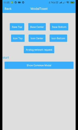

2019.7 Remove the method in the componentWillMount method. Compatible with future React 17 versions, React-Native@0.6 version.
yarn add react-native-smart-tip
or
npm i react-native-smart-tip --save 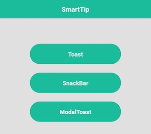
import {WToast} from 'react-native-smart-tip'
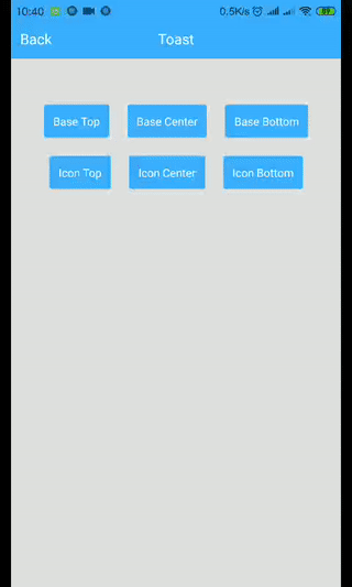
// Base
show = () => {
WToast.show({data: 'hello world'})
}
// Other
show = () => {
const toastOpts = {
data: 'Success',
textColor: '#ffffff',
backgroundColor: '#444444',
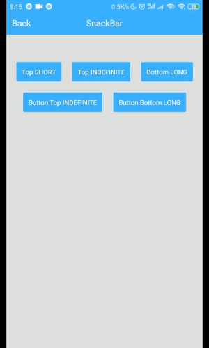
duration: WToast.duration.LONG, //1.SHORT 2.LONG
position: WToast.position.TOP, // 1.TOP 2.CENTER 3.BOTTOM
icon: <Image source={require('../data/img/success.png')} style={{width: 32,height: 32,resizeMode: 'contain'}}/>
}
WToast.show(toastOpts)
}
| Props | Type | Required | Default | Description |
|---|---|---|---|---|
| data | String | true | ' ' | Displayed content |
| duration | Number | false | WToast.duration.SHORT | The duration of the toast |
| position | Number | false | WToast.position.BOTTOM | Displayed position |
| inEasing | Easing | false | Easing.elastic(1) | Admission animation |
| textColor | String | false | 'white' | font color |
| backgroundColor | String | false | 'black' | background color |
| icon | Component | fasse | undefined | Image to be displayed |
import {WSnackBar} from 'react-native-smart-tip'

// Base
show = () => {
	WSnackBar.show({data: 'hello world'})
}

// Other
show = () => {
	const snackBarOpts = {
	    data: 'Please check the network first.',
	    position: WSnackBar.position.BOTTOM, // 1.TOP 2.CENTER 3.BOTTOM
	    duration: WSnackBar.duration.LONG, //1.SHORT 2.LONG 3.INDEFINITE
	    textColor: '#ff490b',
	    backgroundColor: '#050405',
	    actionText: 'Sure',
	    actionTextColor: '#ff490b',
	    actionClick: ()=>{
	    	// Click Action
	    },
	}

	WSnackBar.show(snackBarOpts)
}
| Props | Type | Required | Default | Description |
|---|---|---|---|---|
| data | String | true | ' ' | Displayed content |
| statusBarHeight | Number | false | -1 | Prevent Android statusBar |
| height | Number | false | 44 | Height to display |
| duration | Number | false | WSnackBar.duration.SHORT | The duration of the toast |
| position | Number | false | WSnackBar.position.BOTTOM | Displayed position |
| inEasing | Easing | false | Easing.linear | Admission animation |
| textColor | String | false | 'white' | font color |
| backgroundColor | String | false | 'black' | background color |
| actionText | String | false | undefined | action text |
| actionTextColor | String | false | 'white' | action text color |
| actionClick | Function | false | undefined | listener click |
import {WModal} from 'react-native-smart-tip'
// Base
show = () => {
WModal.show({data: 'hello world'})
}
// Other
show = () => {
const modalOpts = {
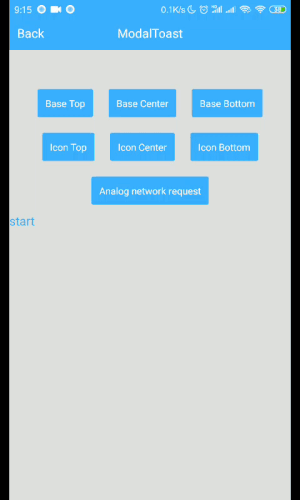
data: 'Loading',
textColor: '#fff',
backgroundColor: '#444444',
position: WModal.position.CENTER,
icon: <ActivityIndicator color='#fff' size={'large'}/>
}
WModal.show(modalOpts)
}
| Props | Type | Required | Default | Description |
|---|---|---|---|---|
| data | String | true | ' ' | Displayed content |
| position | Number | false | WToast.position.BOTTOM | Displayed position |
| inEasing | Easing | false | Easing.elastic(1) | Admission animation |
| textColor | String | false | 'white' | font color |
| backgroundColor | String | false | 'black' | background color |
| icon | Component | fasse | undefined | Image to be displayed |
| onRequestClose | Function | false | undefined | Android Back |