最近项目组决定使用 Flutter 来做新的App,在开发过程中遇到了这样的一个需求,渐变色的AppBar。
就是这样的,类似于 QQ ,iOS首页AppBar,Android中几乎所有的AppBar:
像 Flutter 这样强大的 UI 库,先看一下AppBar的属性。
 AppBar({
    Key key,
    this.leading,
    this.automaticallyImplyLeading = true,
    this.title,
    this.actions,
    this.flexibleSpace,
    this.bottom,
    this.elevation,
    this.backgroundColor,
    this.brightness,
    this.iconTheme,
    this.textTheme,
    this.primary = true,
    this.centerTitle,
    this.titleSpacing = NavigationToolbar.kMiddleSpacing,
    this.toolbarOpacity = 1.0,
    this.bottomOpacity = 1.0,
  }) : assert(automaticallyImplyLeading != null),
       assert(elevation == null || elevation >= 0.0),
       assert(primary != null),
       assert(titleSpacing != null),
       assert(toolbarOpacity != null),
       assert(bottomOpacity != null),
       preferredSize = Size.fromHeight(kToolbarHeight + (bottom?.preferredSize?.height ?? 0.0)),
       super(key: key);
有个 backgroundColor 属性,
final Color backgroundColor;凉凉,Color 类型。接下来,看一下网上帖子给的方案。
How to add gradient color in AppBar in flutter
https://stackoverflow.com/questions/50412484/how-to-add-gradient-color-in-appbar-in-flutter
大体思路就是继承一个 PreferredSize 类,内部通过 Container + decoration 实现自己需要的效果。(在 Scaffold 类中 appBar 参数需要一个 PreferredSize 类型的对象)
文章中的代码这里贴出来
Widget build(BuildContext context) {
    return new Scaffold(
      appBar: new PreferredSize(
        child: new Container(
          padding: new EdgeInsets.only(
            top: MediaQuery.of(context).padding.top
          ),
          child: new Padding(
            padding: const EdgeInsets.only(
              left: 30.0,
              top: 20.0,
              bottom: 20.0
            ),
            child: new Text(
              'Arnold Parge',
              style: new TextStyle(
                fontSize: 20.0,
                fontWeight: FontWeight.w500,
                color: Colors.white
              ),
            ),
          ),
          decoration: new BoxDecoration(
            gradient: new LinearGradient(
              colors: [
                Colors.red,
                Colors.yellow
              ]
            ),
            boxShadow: [
              new BoxShadow(
                color: Colors.grey[500],
                blurRadius: 20.0,
                spreadRadius: 1.0,
              )
            ]
          ),
        ),
        preferredSize: new Size(
          MediaQuery.of(context).size.width,
          150.0
        ),
      ),
      body: new Center(
        child: new Text('Hello'),
      ),
    );
  }
效果不是很满意,我还是想用AppBar中的特性啊,leading ,title 还是很好用的。那我们就自己来实现一个吧。
class AppBar extends StatefulWidget implements PreferredSizeWidget Appbar 继承了 StatefulWidget 实现了 PreferredSizeWidget ,所以我们直接看它的 State -> _AppBarState 。
直接去看 build 方法的返回,从后向前,看 AppBar 是如何实现的。
  @override
  Widget build(BuildContext context) {
    // 省略部分代码,后面来看
    ...

    final Brightness brightness = widget.brightness
      ?? appBarTheme.brightness
      ?? themeData.primaryColorBrightness;
    final SystemUiOverlayStyle overlayStyle = brightness == Brightness.dark
      ? SystemUiOverlayStyle.light
      : SystemUiOverlayStyle.dark;

    return Semantics( // 辅助功能相关
      container: true,
      child: AnnotatedRegion<SystemUiOverlayStyle>( // 处理主题相关,状态栏文字颜色
        value: overlayStyle,
        child: Material( // Material 控件,处理颜色,阴影等效果
          color: widget.backgroundColor
            ?? appBarTheme.color
            ?? themeData.primaryColor,
          elevation: widget.elevation
            ?? appBarTheme.elevation
            ?? _defaultElevation,
          child: Semantics( // child里面才是真正的内容,我们看内部的appBar的实现。
            explicitChildNodes: true,
            child: appBar,
          ),
        ),
      ),
    );
  }
返回了一个控件,处理了明暗主题,颜色,阴影,子控件,这里我们不想用这个颜色,再通过查看 child 能否设置颜色。
这里的 appBar 是在上面定义的:
    Widget appBar = ClipRect( // 用矩形剪辑其子widget
      child: CustomSingleChildLayout( // 通过deleagate 来约束子widget
        delegate: const _ToolbarContainerLayout(), // 这里的布局是一个宽充满,高度为kkToolbarHeight高度
        child: IconTheme.merge( // 处理IconTheme
          data: appBarIconTheme,// 通过判断,处理iconTheme的取值
          child: DefaultTextStyle( // 文字样式
            style: sideStyle, // 通过判断传入的textTheme处理style取值
            child: toolbar,
          ),
        ),
      ),
    );
这里可以看到,这里就是包装了一个 toolbar ,我们继续看 toolbar :
    // 这里是一个NavigationToolbar,我们设置的leading,title在这里使用
	final Widget toolbar = NavigationToolbar(
      leading: leading,
      middle: title,
      trailing: actions,
      centerMiddle: widget._getEffectiveCenterTitle(themeData),
      middleSpacing: widget.titleSpacing,
    );
关于 appBar 内部还进行一些处理,如处理 bottom ,增加 SafeArea 等处理,这里不做展开了
    if (widget.bottom != null) { // bottom
      appBar = Column(
        mainAxisAlignment: MainAxisAlignment.spaceBetween,
        children: <Widget>[
          Flexible(
            child: ConstrainedBox(
              constraints: const BoxConstraints(maxHeight: kToolbarHeight),
              child: appBar,
            ),
          ),
          widget.bottomOpacity == 1.0 ? widget.bottom : Opacity(
            opacity: const Interval(0.25, 1.0, curve: Curves.fastOutSlowIn).transform(widget.bottomOpacity),
            child: widget.bottom,
          ),
        ],
      );
    }

    // The padding applies to the toolbar and tabbar, not the flexible space.
    if (widget.primary) { // SafeArea
      appBar = SafeArea(
        top: true,
        child: appBar,
      );
    }

    appBar = Align( // Alignment.topCenter
      alignment: Alignment.topCenter,
      child: appBar,
    );

    if (widget.flexibleSpace != null) { // flexibleSpace效果
      appBar = Stack(
        fit: StackFit.passthrough,
        children: <Widget>[
          widget.flexibleSpace,
          appBar,
        ],
      );
    }
通过这里我们知道了,其实 AppBar 中,颜色是在 Material 中设置的,我们常用的设置是在 toolbar 中进行使用的,所以最简单的渐变色处理方式就是将 Material 的child 包一层做颜色处理,不去修改现有部分。
代码很简单,将AppBar的代码拷贝出来进行修改,这里的类名为GradientAppBar。
在自定义的 GradientAppBar 的构造方法中增加渐变颜色的初始值,和终止值。
  GradientAppBar({
    ...
    this.gradientStart,
    this.gradientEnd,
  })  : assert(automaticallyImplyLeading != null),
        ...
        super(key: key);

  final Color gradientStart;
  final Color gradientEnd;
再将 _AppBarState 类的代码拷贝出来,这里的类名是 _GradientAppBarState (记得修改 createState 方法)。
然后在修改对 build 方法 return 中 child 进行包装,使用传入的颜色作为渐变色背景。
    // 添加到build方法最后,return之前,通过使用decoration实现颜色的渐变
    if (widget.gradientStart != null && widget.gradientEnd != null) {
      appBar = Container(
        decoration: BoxDecoration(
          gradient: LinearGradient(
              colors: [widget.gradientStart, widget.gradientEnd]),
        ),
        child: appBar,
      );
    }
再进行处理 Material 的 颜色
    return Material(
      // 判断是否使用渐变色
      color: widget.gradientStart != null && widget.gradientEnd != null
          ? Colors.transparent
          : widget.backgroundColor ??
              appBarTheme.color ??
              themeData.primaryColor,
      elevation: widget.elevation ?? appBarTheme.elevation ?? _defaultElevation,
      child: appBar, // 使用包装后的appBar
    );
这样就实现了渐变效果。
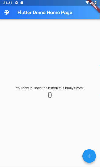
使用 GradientAppBar ,就是将原来使用 AppBar 替换为 GradientAppBar 。
    return Scaffold(
      appBar: PreferredSize(
        child: GradientAppBar(
          gradientStart: Color(0xFF49A2FC),
          gradientEnd: Color(0xFF2171F5),
          title: Text(widget.title),
          leading: Icon(Icons.ac_unit),
        ),
        preferredSize: Size.fromHeight(400),
      ),
      body: Center(
        child: Column(
          mainAxisAlignment: MainAxisAlignment.center,
          children: <Widget>[
            Text(
              'You have pushed the button this many times:',
            ),
            Text(
              '$_counter',
              style: Theme.of(context).textTheme.display1,
            ),
          ],
        ),
      ),
      floatingActionButton: FloatingActionButton(
        onPressed: _incrementCounter,
        tooltip: 'Increment',
        child: Icon(Icons.add),
      ), // This trailing comma makes auto-formatting nicer for build methods.
    );
效果图: