This monorepo contains multiple projects that work together to create an integrated Design Language System.
Packages are reusable libraries available for packages and apps
| Package directory | Description |
|---|---|
packages/ui |
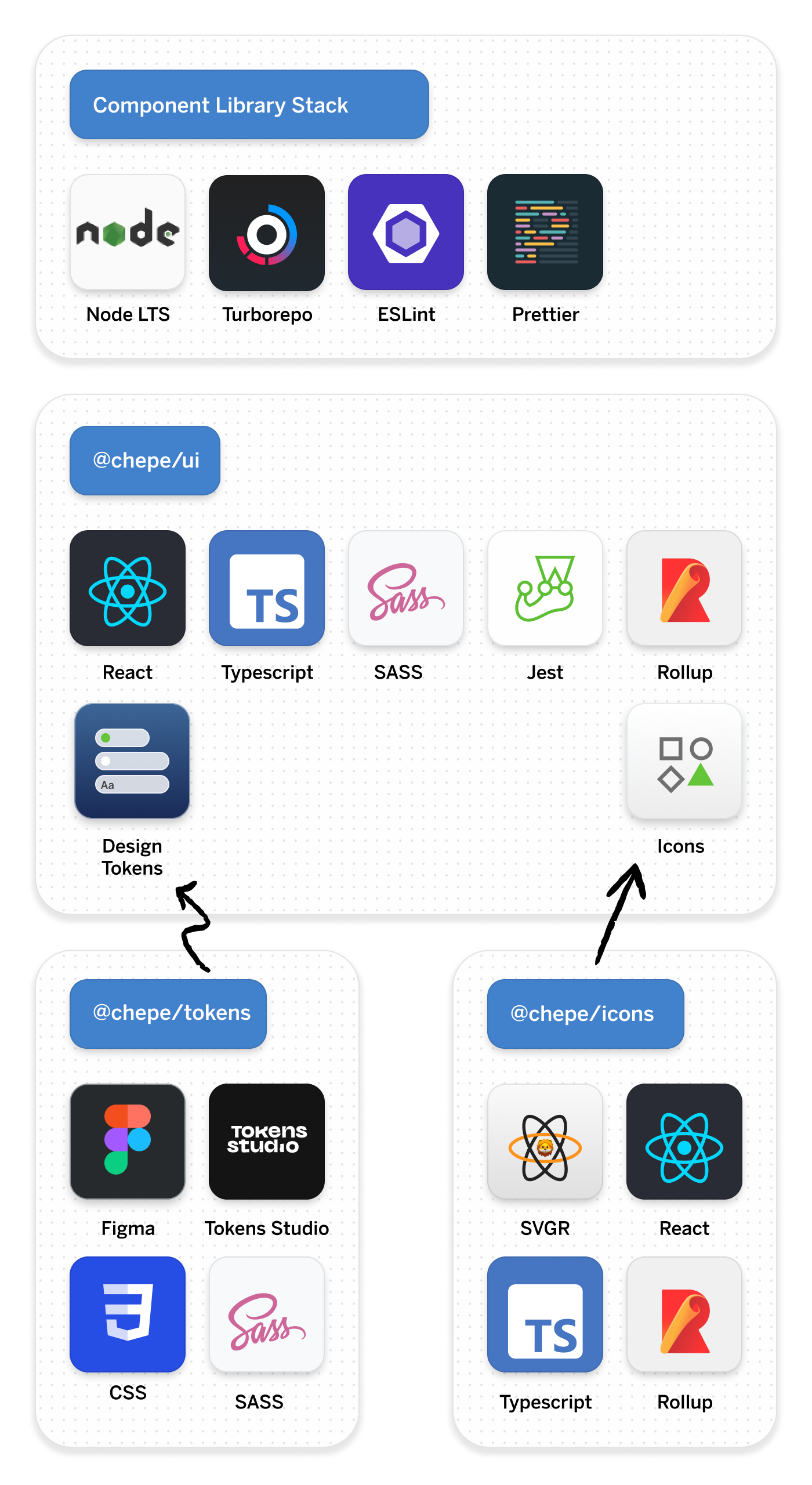
React based component library with Typescript, Rollup and SASS |
packages/tokens |
Design Tokens distributable package |
packages/icons |
React based icon library with SVGR and Rollup |
Apps can use all the available packages
| App directory | Description |
|---|---|
apps/docs |
Storybok instance that implements the React UI Library |
apps/web |
React web app that implements the React UI Library |
Config are reusable eslint and typescript configurations
| Package directory | Description |
|---|---|
config/eslint-config-custom |
Shared Eslint configuration for all packages |
config/tsconfig |
Shared Typescript configuration for all packages |
Tools to generate Components or get Tokens
| App directory | Description |
|---|---|
tools/generator |
CLI Tool that creates Components for the React UI Library |
These instructions will get you a copy of the project up and running on your local machine for development and testing purposes. See deployment for notes on how to deploy the project on a live system.
Make sure you have the LTS version of Node (18.7) installed in your machine. We recommend to use nvm (Node Version Manager).
This monorepository uses Turborepo to manage dependencies and scripts. The first step is to install the local node dependencies:
pnpm installThere are two main ways to develop new components:
- Storybook App (Vite)
- Watch the React UI Library (Rollup) + NextJs
To watch changes in the React Library and start the Storybook App, just run:
pnpm run storybookThis instance of Storybook uses the source code to compile the React Stories. It's faster than watching changes and reloading and it gets HMR. That's the reason components are imported using
@chepe/ui/srcinstead of@chepe/ui.
To watch changes in the React Library and start the Next.Js App, just run:
pnpm run webContrary to the Storybook instance, this React App uses the bundled code inside React. It should be really similar to the final package being used by product teams.
This project has multiple GitHub Actions for build, test and deployment.
You can finds all the GitHub actions files inside .github/workflows/
| Name | File | Description |
|---|---|---|
| Build | ci.yml |
Builds the main Component Library. (@chepe/ui) |
| Storybook Tests | storybook-tests.yml |
Turns all the Storybook stories into executable tests including a11y. |
You can add a new Component Boilerplate using the Generator Tool.
npm run generate:component --name=Heading
npm run generate:component --name=InputFieldMade by @chepetime at Mexico City 🇲🇽


