Students: Justin Snider, Anchit Srivastava, and Diksha Chouhan
Professor: Juliana Freire
TAs: Rupesh Bagwe and Christina Ye
Paper: paper.pdf
Slideshow: slides.pdf
We compared the mobility patterns of people in Chicago, New York City and Los Angeles metropolitan area in 2020 as they respond to the COVID-19 pandemic. Then, within each city, we compared the mobility patterns of census block groups with different levels of poverty. Using the SafeGraph Social Distancing Data mobile phone metadata, generated from mobile phone records, we were able to observe daily behaviors such as full-time work, part-time work and full-time stay at home behavior. The daily statistics are provided for each Census Block Group (CBG). The data we use to find the population size of each CBG, the number of people in poverty in each CBG and calculate the percentage of the population in poverty is the American Community Survey (2016) 5-year estimate available from SafeGraph. We compare the mobility of Census Block Groups with high and low percentages of individuals in poverty. We visualize and explain who has been able to effectively decrease their mobility. Understanding who has not been able to decrease their mobility can help us understand who is most at risk and who is most in need of assistance to reduce their exposure to COVID-19. [5]
You can read the full paper here.
- Abstract
- Introduction
- Related Work
- Findings
- Computational Reproducibility Instructions
- Notebooks
- New York Times COVID-19 Data // Extraction and Cleaning:
- SafeGraph Census Data // Extraction and Cleaning:
- SafeGraph Social Distancing Dataset // Extraction (Using Pandas):
- SafeGraph Social Distancing Dataset // Extraction (Using Spark):
- SafeGraph Social Distancing Dataset // Cleaning:
- SafeGraph Social Distancing Dataset // Analysis:
- Data Sources
- Data Acquisition
- Data Extraction
- Data Cleaning
- Citations and Bibliographies
Many recent papers, including "Mobility network models of COVID-19 explain inequities and inform reopening" [1] and "Coronavirus infections and deaths by poverty status: The effects of social distancing" [2] have established an essential link between mobility and COVID-19 infection rates and deaths. We study the daily change in mobility of the general population during 2019 and 2020 in the three most populous cities in the US: New York, Los Angeles and Chicago. Using the SafeGraph Social Distancing Metrics data\cite{safegraph_social}, we analyze mobility at the resolution of the census block group level. We use attributes such as the number of devices that remain at home, the count of devices with full-time work behavior, the median distance traveled by devices and other vital actions relevant to mobility. We then visualize each city’s mobility using graphs and maps produced with the GeoJSON file provided by SafeGraph of the Census Blocks.
We compare the mobility of census blocks with the largest and smallest percentage of people in poverty based on the Census American Survey data provided by SafeGraph [3]. Our objective is to better understand and visualize to what degree different groups have adopted limited mobility to mitigate the documented threat of COVID-19 exposure created by higher mobility.
All code used to extract, clean, integrate and visualize the data is available on the project Github repository https://github.com/chouhandiksha/bigdataproject. All the steps used for acquiring, extracting, integrating and cleaning the data used for the project are described in sections 3 through 6.
In the \textit{Nature} article "Mobility network models of COVID-19 explain inequities and inform reopening"\cite{Chang2021} Chang et al. produce a model that predicts the number of anticipated SARS-CoV-2 infections. The model takes as an input mobility data derived from mobile phone data. The model tracks the predicted number of susceptible, exposed, infectious and removed (SEIR) people anticipated to be in the population. The model is able to predict real case trajectories on held out data. The model correctly predicts higher infection rates among disadvantaged racial and socioeconomic groups solely as the result of differences in mobility.
Several months have passed since the publication of this article. All the 2020 data is now available from SafeGraph. There is now an opportunity to evaluate visualize the relationships between mobility, income, race and the impact of COVID-19 in our communities.\cite{Reeves_RV_Rothwell_J_2020}
"Coronavirus infections and deaths by poverty status: The effects of social distancing"\cite{jung_manley_shrestha_2021} have shown the highest initial number of cases are in both the wealthiest and poorest countries. However, there is a great difference between the wealthy and poor countries when stay at home policies are put in place. The wealthiest countries have been able to show much greater reductions in mobility. As a result the wealthiest countries are able to curb the infection rates more effectively than poorer countries.
During our study includes identical analysis on the cities of New York, Los Angeles and Chicago. Starting in March of 2020 much of the population in Chicago, New York City and Los Angeles metropolitan area drastically changed their mobility patterns. Using the SafeGraph Social Distancing data we visualize the scale of the change in population mobility through analysis of the amount of people staying at home, leaving home for full-time work and leaving home for part-time work. We compare the ability of the three cities to adopt new mobility patterns revealing both similarities and differences.
Comparisons are also made between the mobility patterns of census block groups with the highest and lowest levels of poverty in all three cities. We find areas with low levels of poverty reduce their mobility much more than those areas with high poverty. Specifically vulnerable populations in census block groups where 80% to 100% of the population are living in poverty are less able to reduce their mobility by staying at home and working from home. The majority of the population exhibit a rapid change in behavior to stay at home in March and April of 2020. However, for the poorest census block groups the response tends to be slower, less drastic, less lasting, or all three.
One of the most notable findings we observed was New York stands out from Chicago and Los Angeles at all stages of analysis. The disparity between the richest and poorest groups is seen to be the most prolonged and continuous in New York [8]. It is also clearly visible that the mobility between the two groups are distinct from each other throughout the year. As soon as the stay at home orders are imposed, the two lines that show our mobility parameters including completely home, full-time and part-time work begin to separate. For the entire 2020, we see that this disparity continues. This finding is also presented and talked about in a studies published in the International Journal of Population Research. [9]
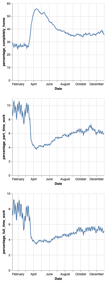
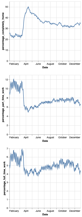
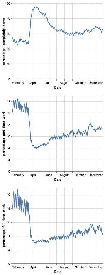
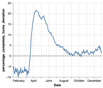
In all three cities the fully at home percentage of the population starts below the 2019 mean. However, in mid-march the percentage increases drastically with the trend continuing into April where all three cities peak.
The stay at home percentage reaches an extreme peak during April. New York has the highest peak at about 55 percent of individuals staying at home. Los Angeles just barely touches 50 percent and Chicago peaks below 50 percent.
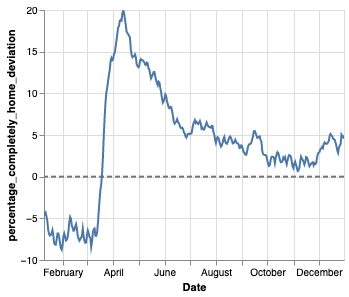
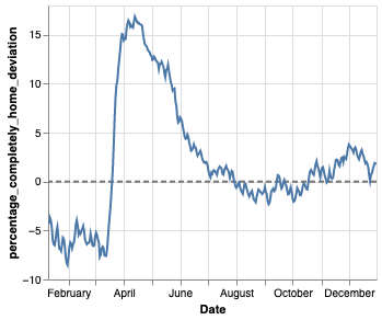
We get an even clearer picture of the change of behavior when we look at the 2020 stay at home percentage deviation from the 2019 mean. We can see both New York and LA were able to change their behavior to a much greater extent than Chicago. Specifically, New York and LA increase their stay at home percentage by about 25% from mid-March to mid-April. Chicago on the other hand exhibits an increase close to 20% and is not able to keep the stay at home percentage above the 2019 mean through the summer. New York and LA maintain slightly elevated numbers.
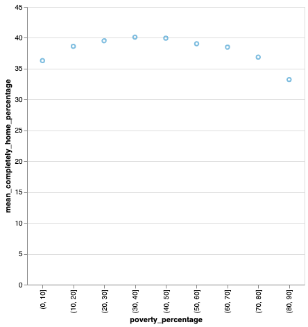
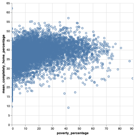
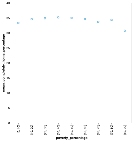
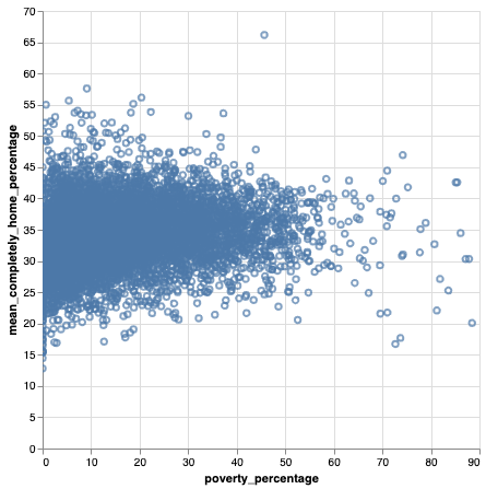
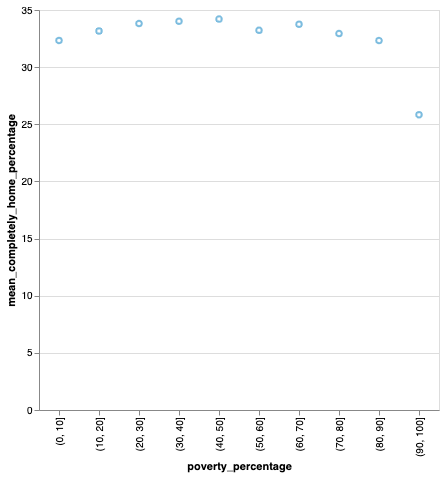
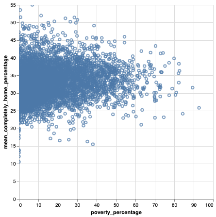
There are also consistent trends when it comes to the relationship between poverty and the fully at home percentage. When we group census block groups by the percentage of the population in poverty we find areas with highest levels of poverty, 90%-100%, have the lowest fully at home percentages in all three cities.
The mobility disparity between the wealthy and the poor is often most pronounced in March and April of 2020, which is a trend we see in all three cities. In areas with high poverty less people stay fully at home to reduce their exposure.
We see in all three cities that areas with 90%-100% of the population below the poverty line approximately 5% less of the population do not stay at home. A subtle trend that we see is that the wealthiest and poorest CBGs stay home the least on average in 2020. A larger percentage of those in the middle of the spectrum stayed home reducing their exposure. This surprising pattern is in parallel to the findings of Jung et al.[2] who found COVID infection rates to be the highest in the wealthiest and poorest countries.
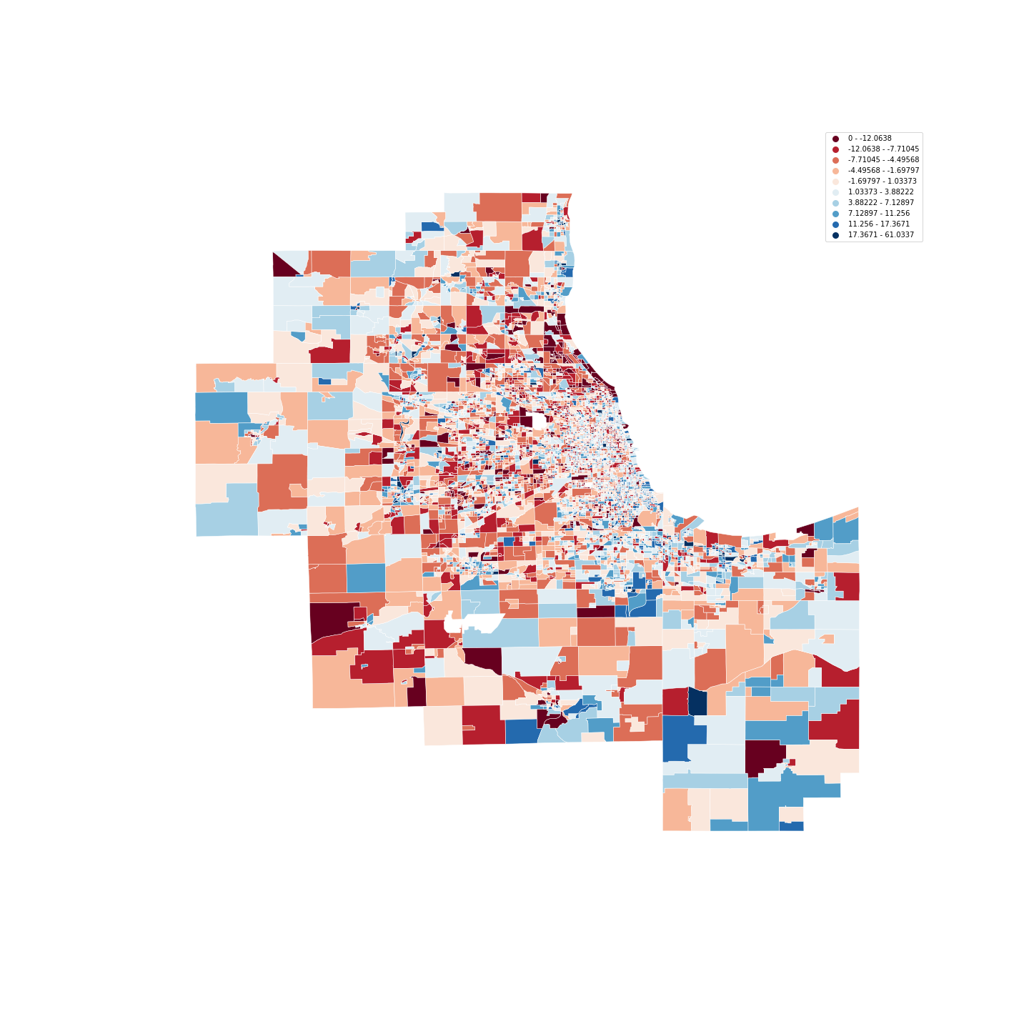
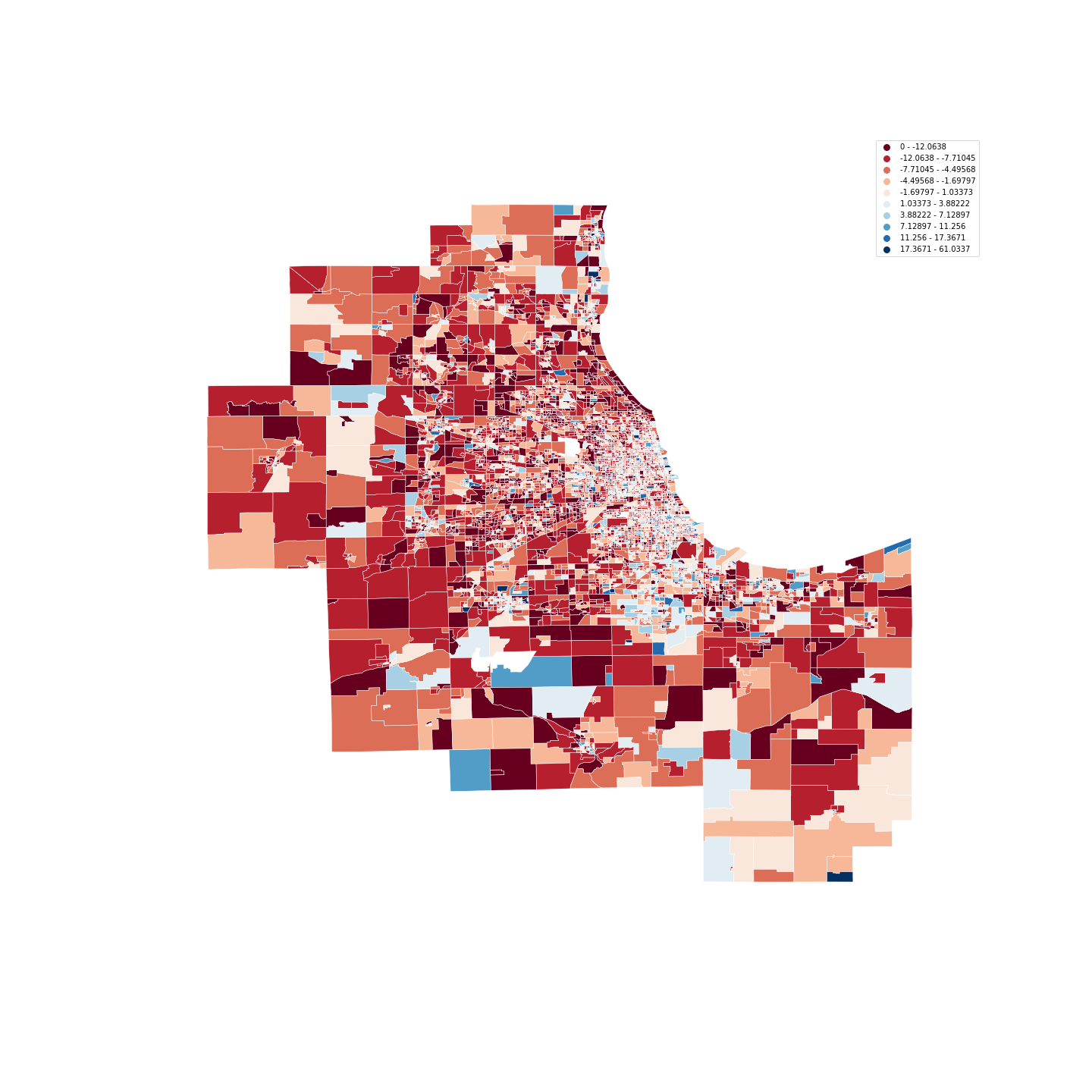
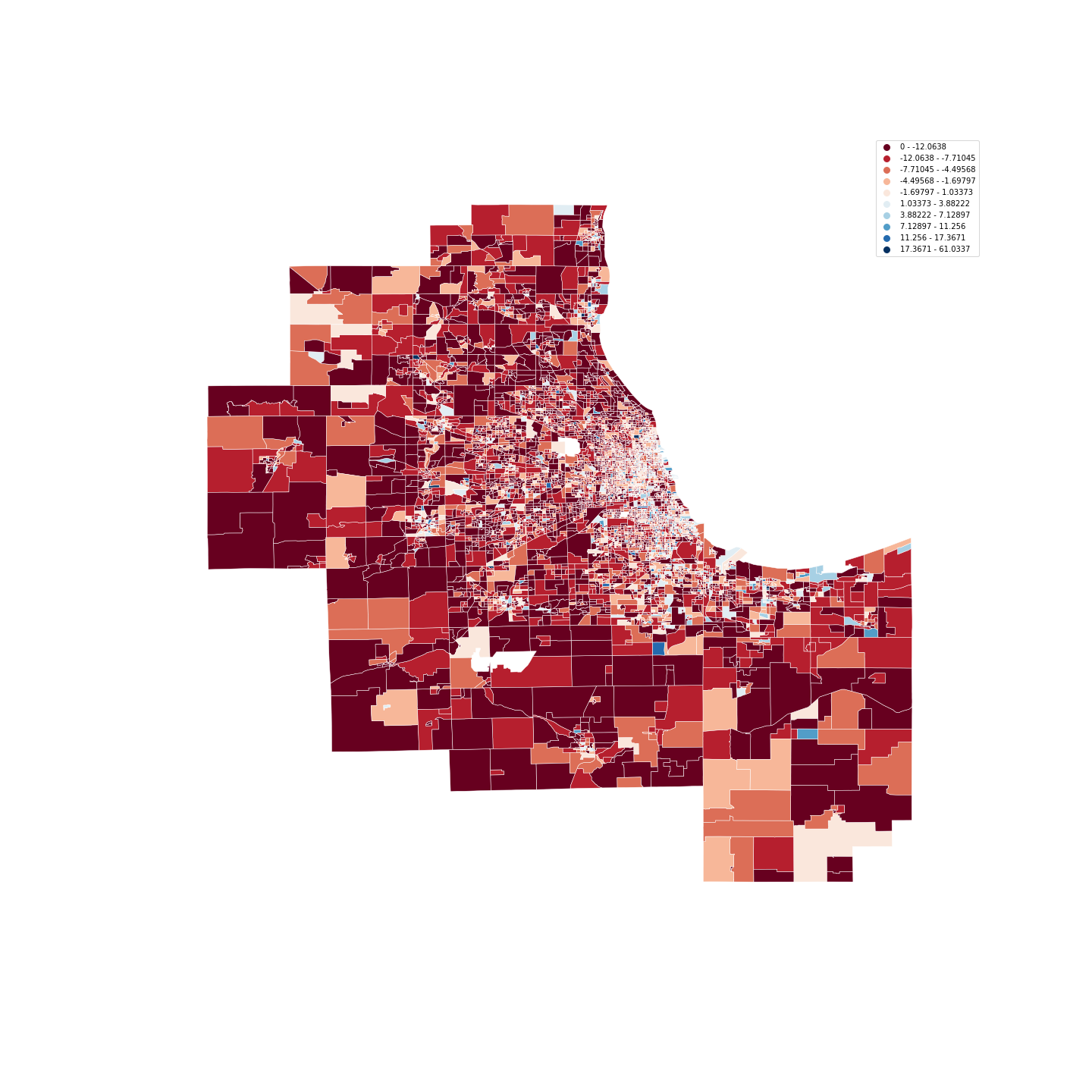
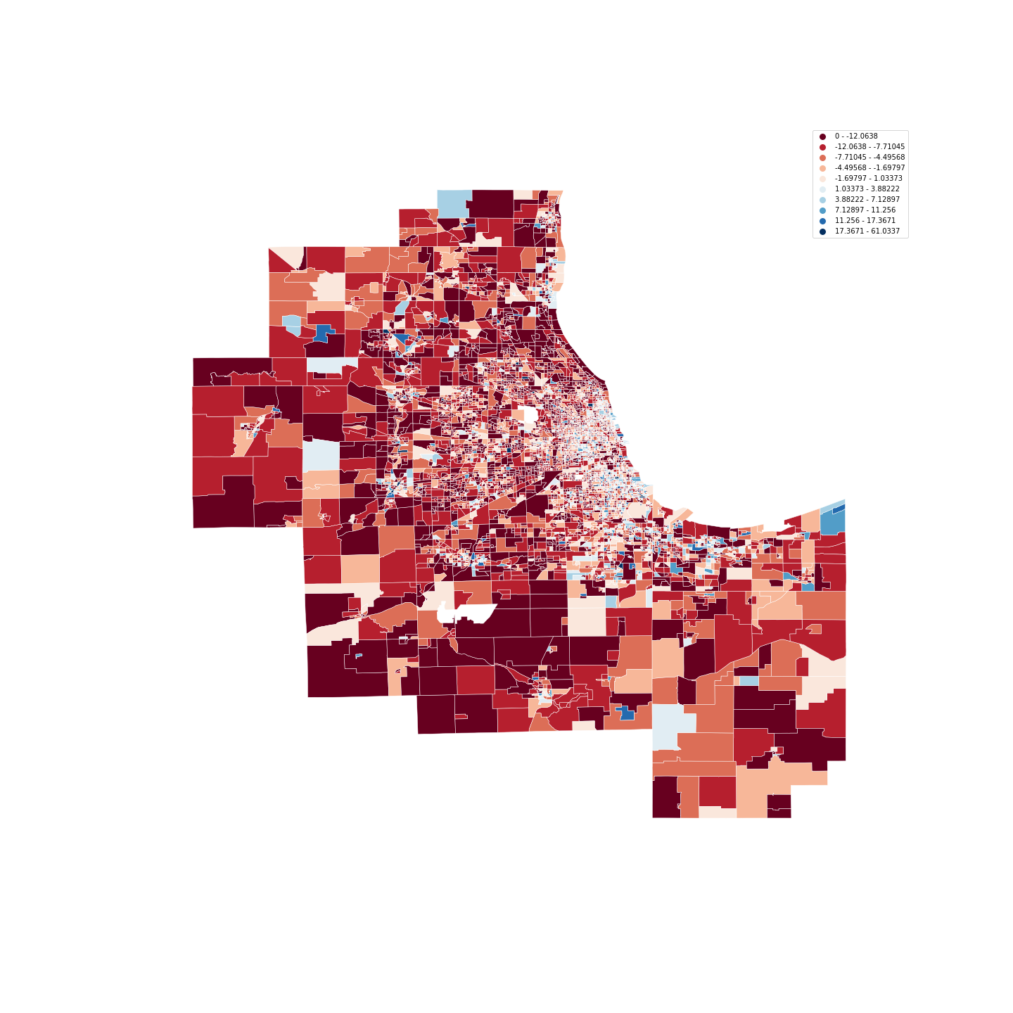
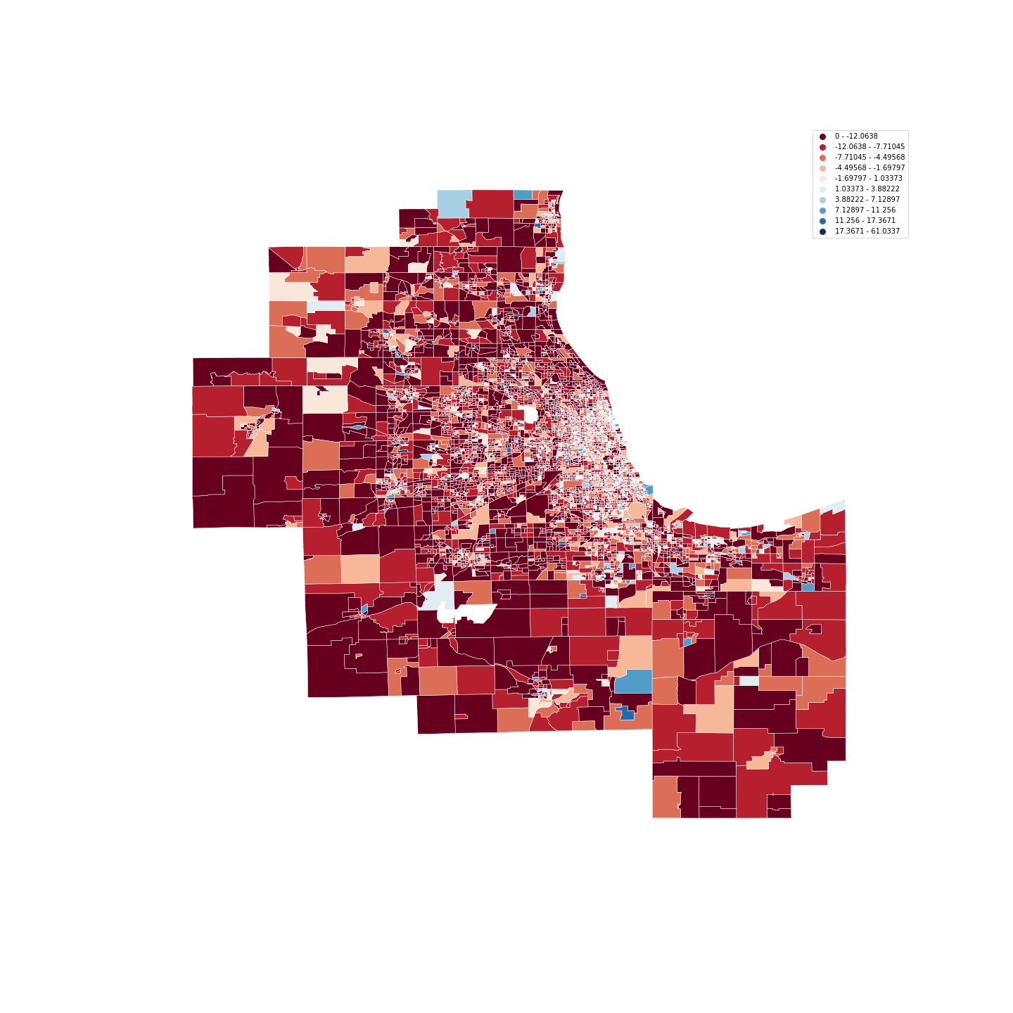
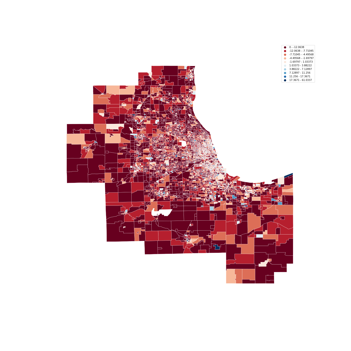
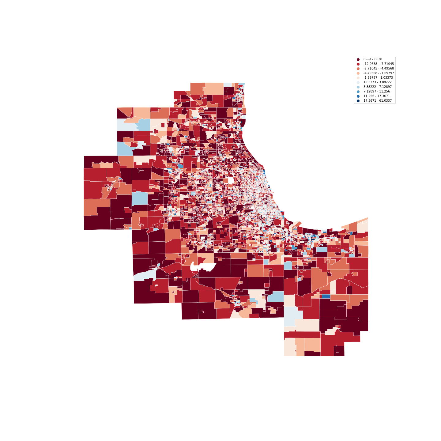
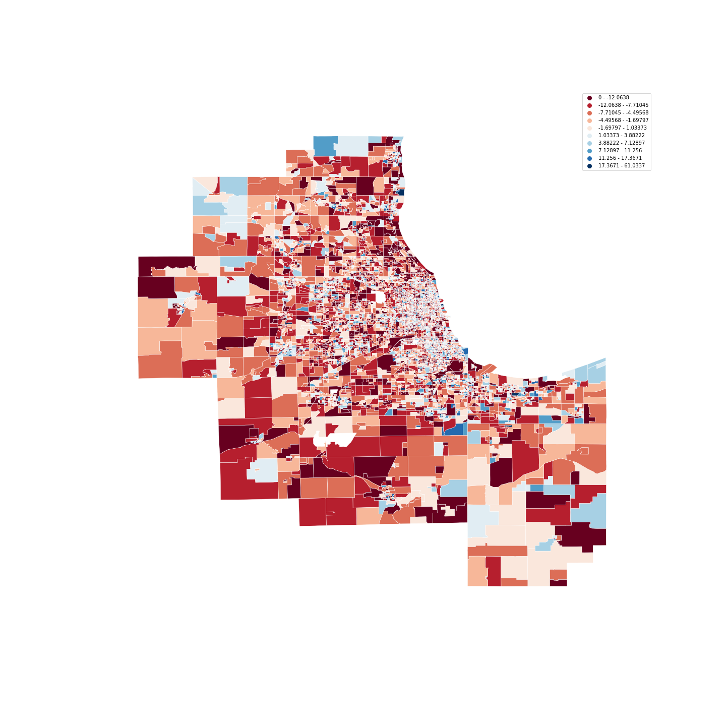
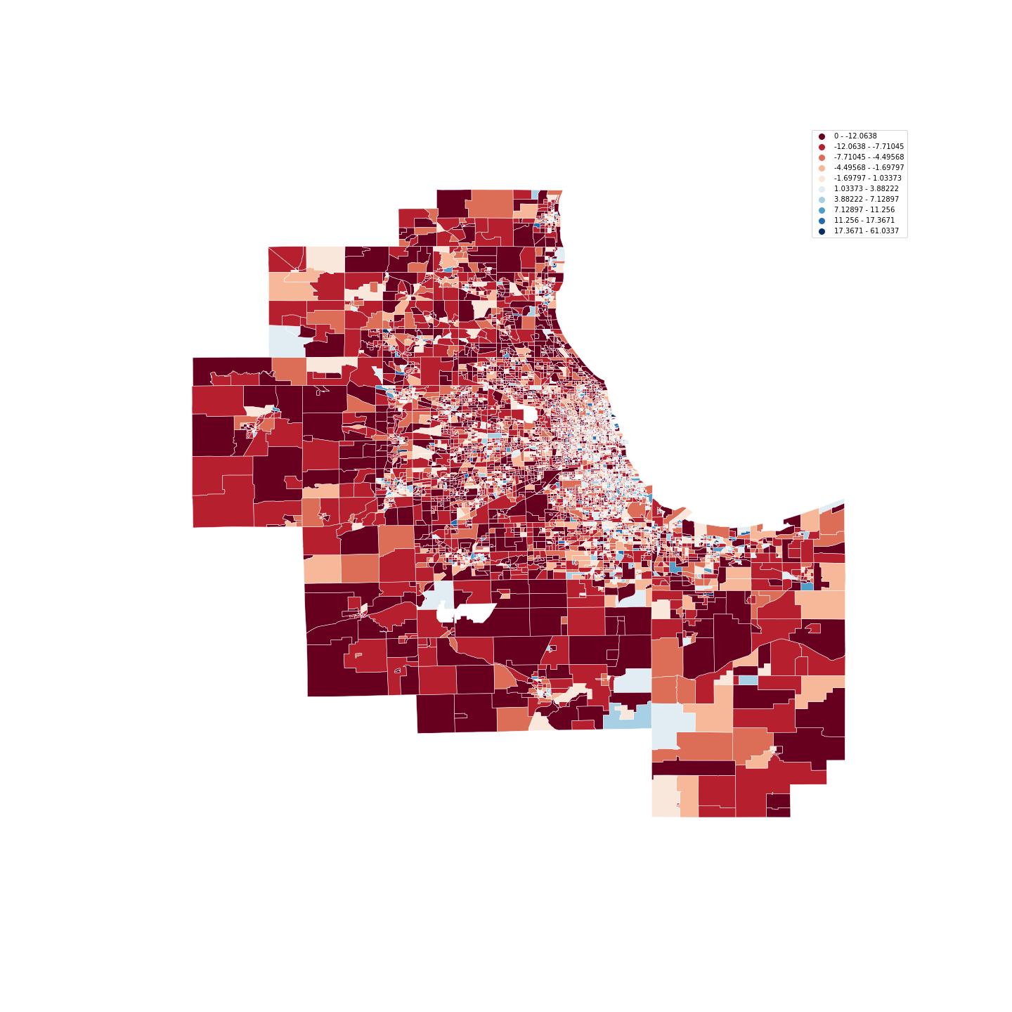
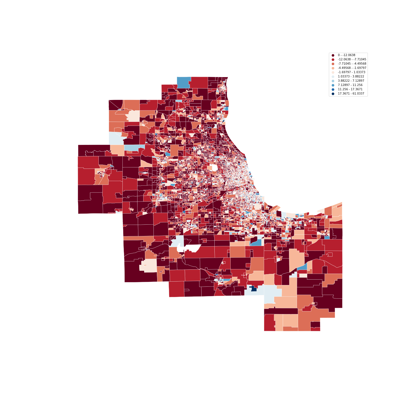
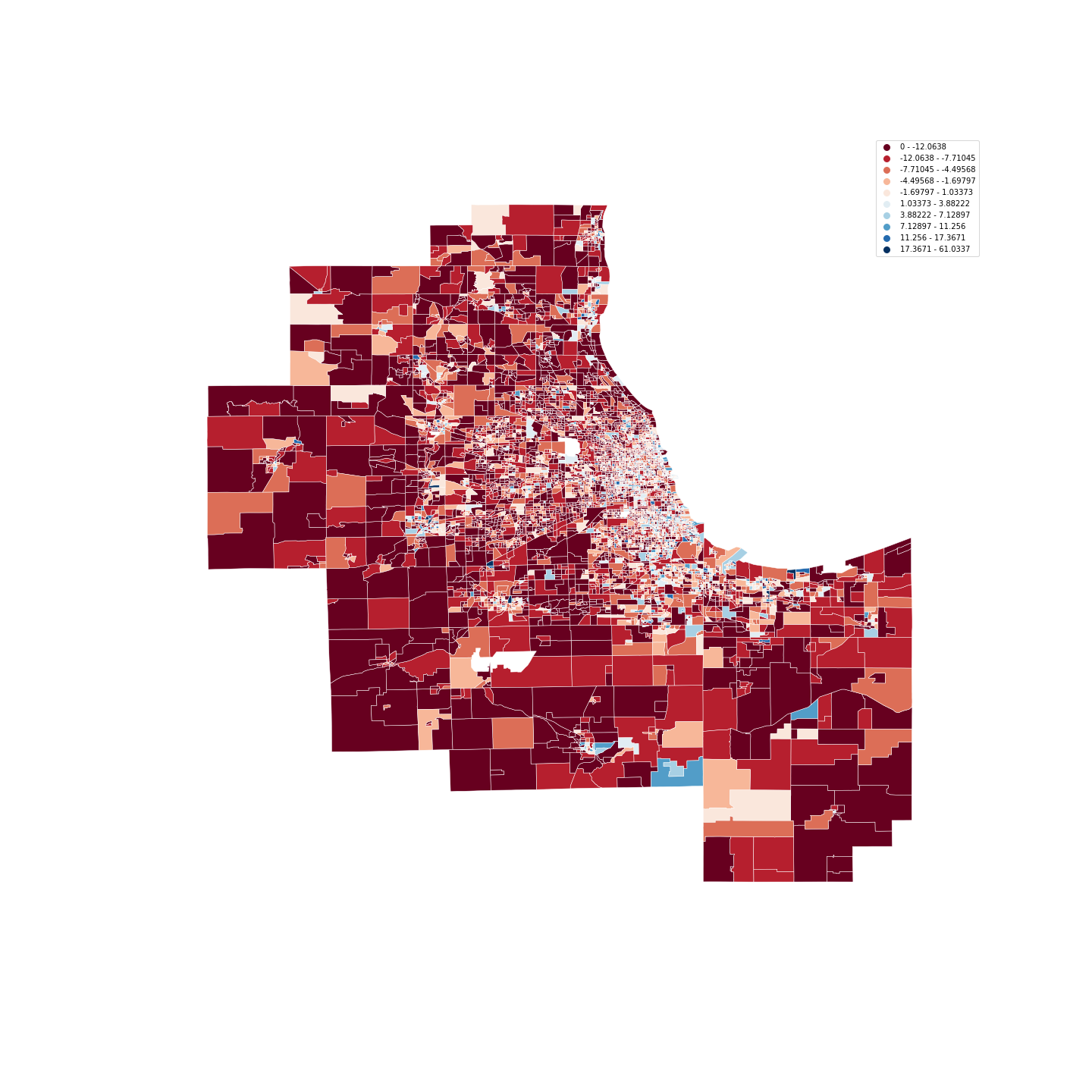
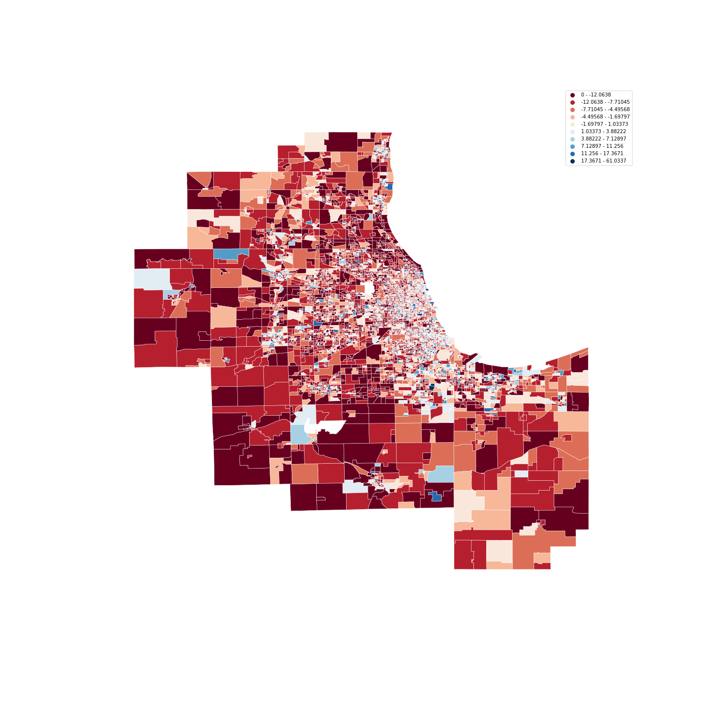
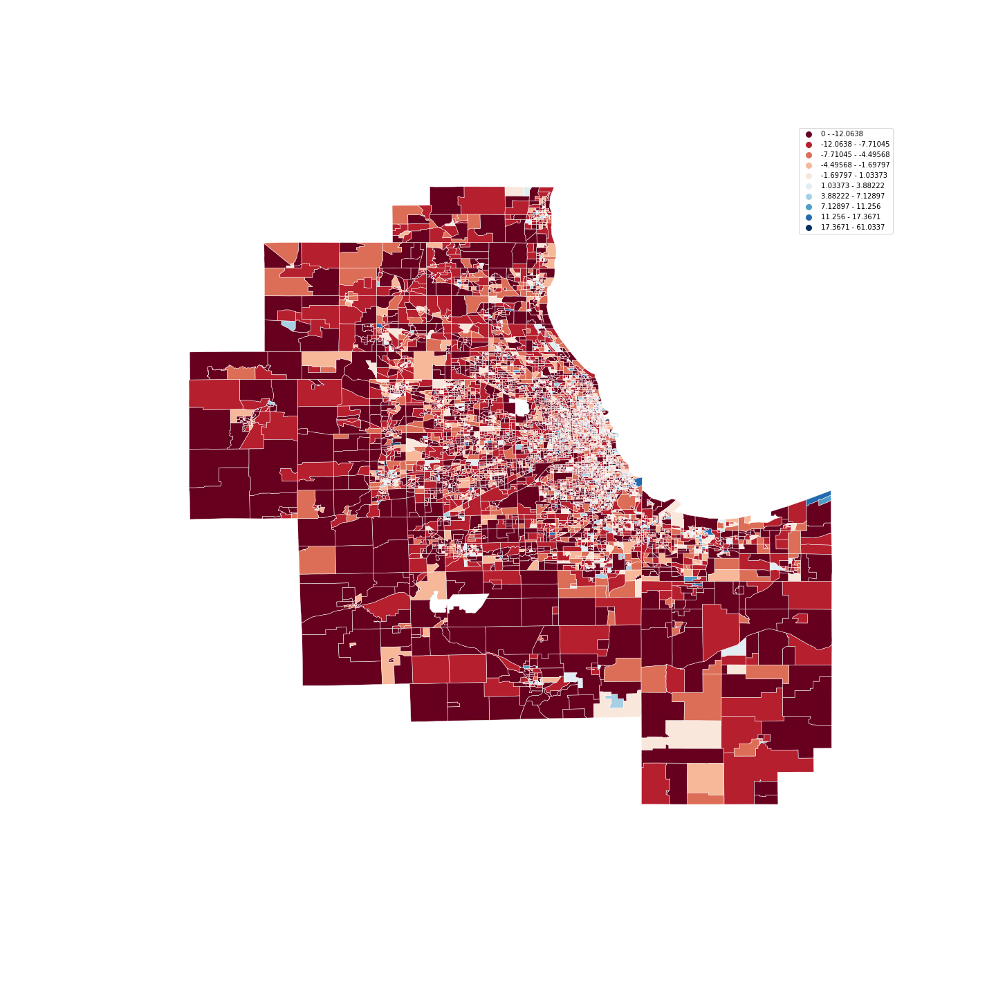
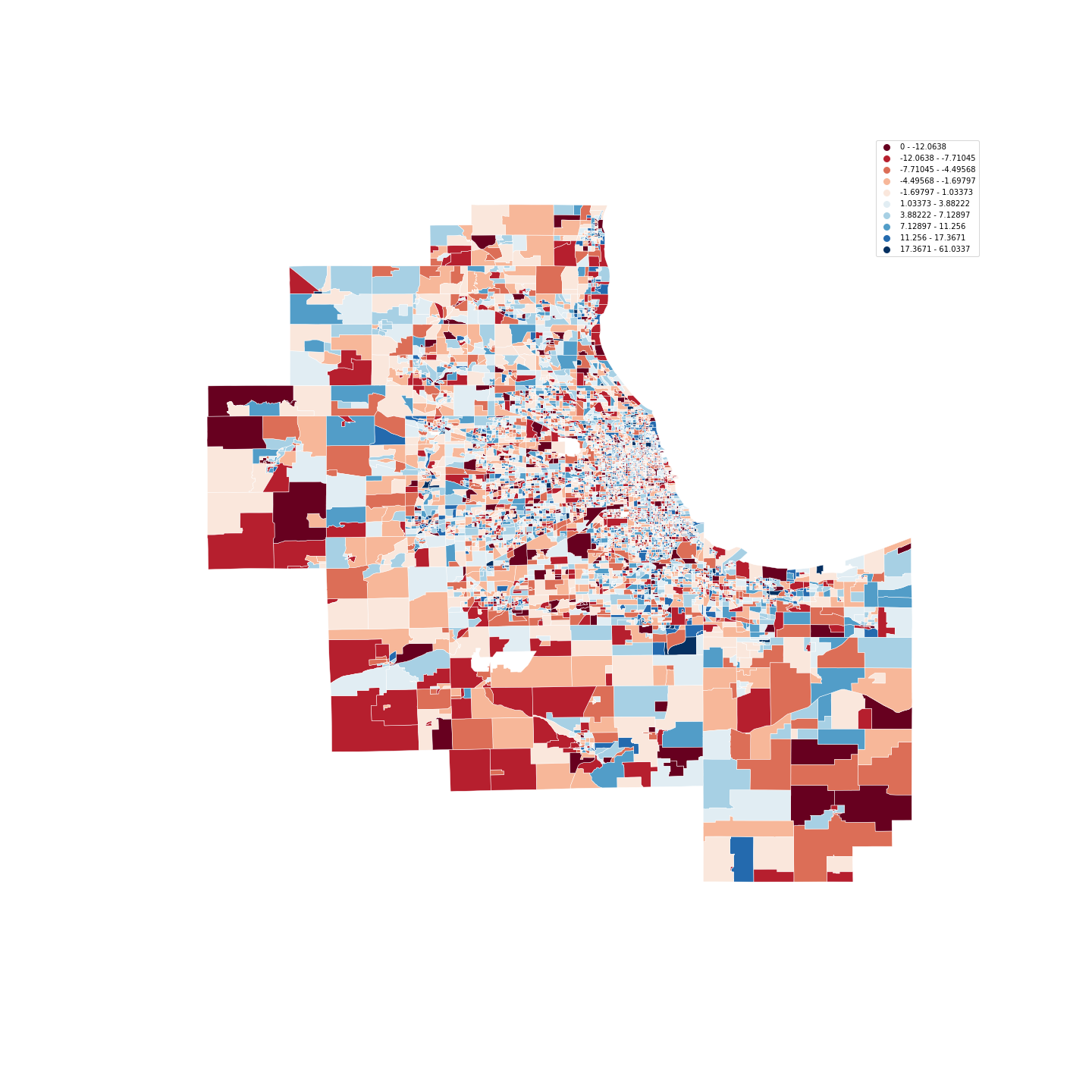
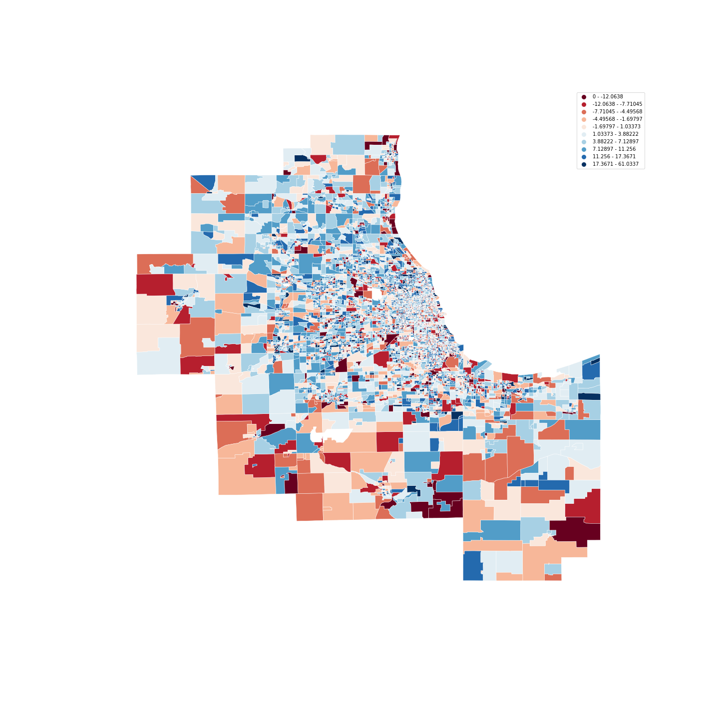
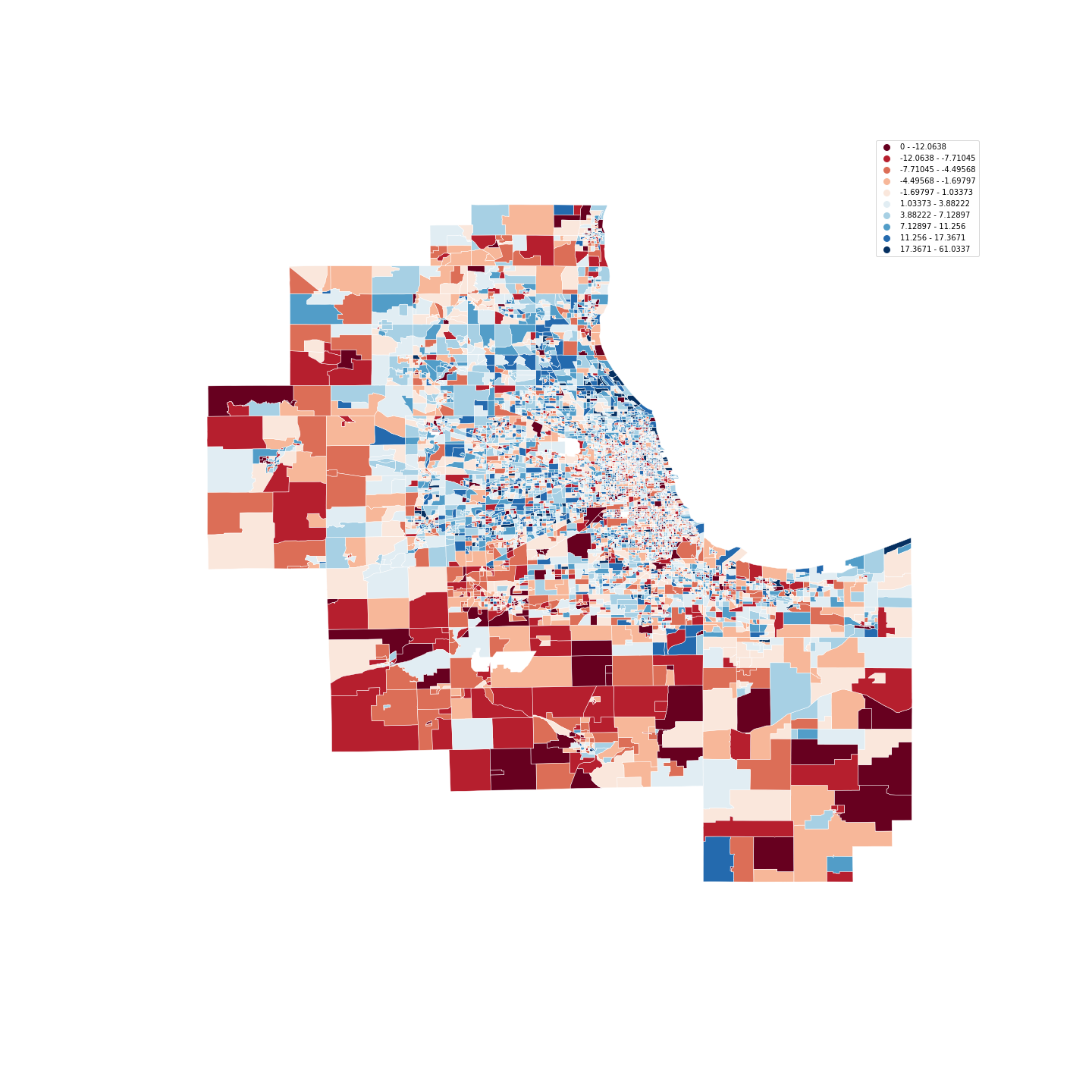
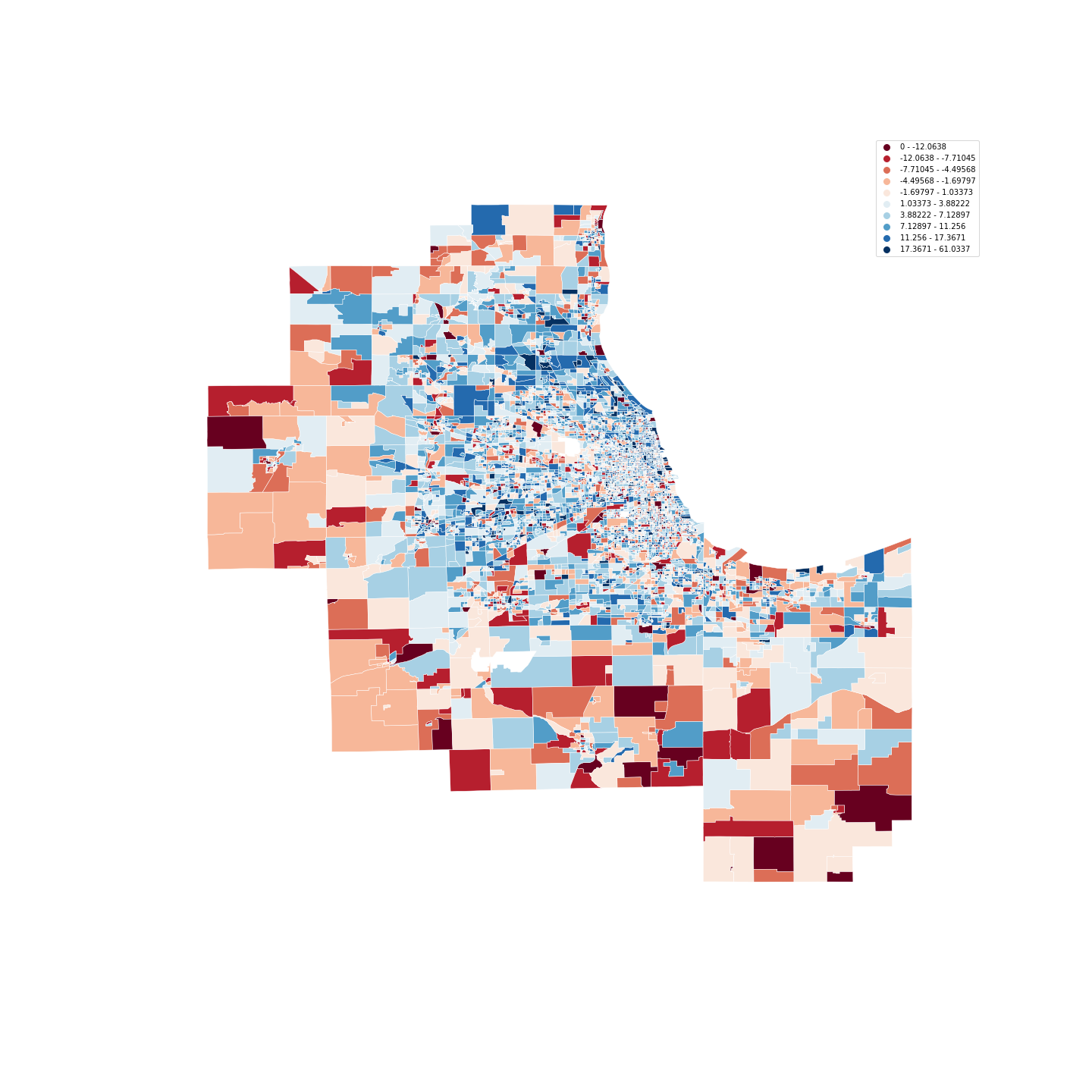
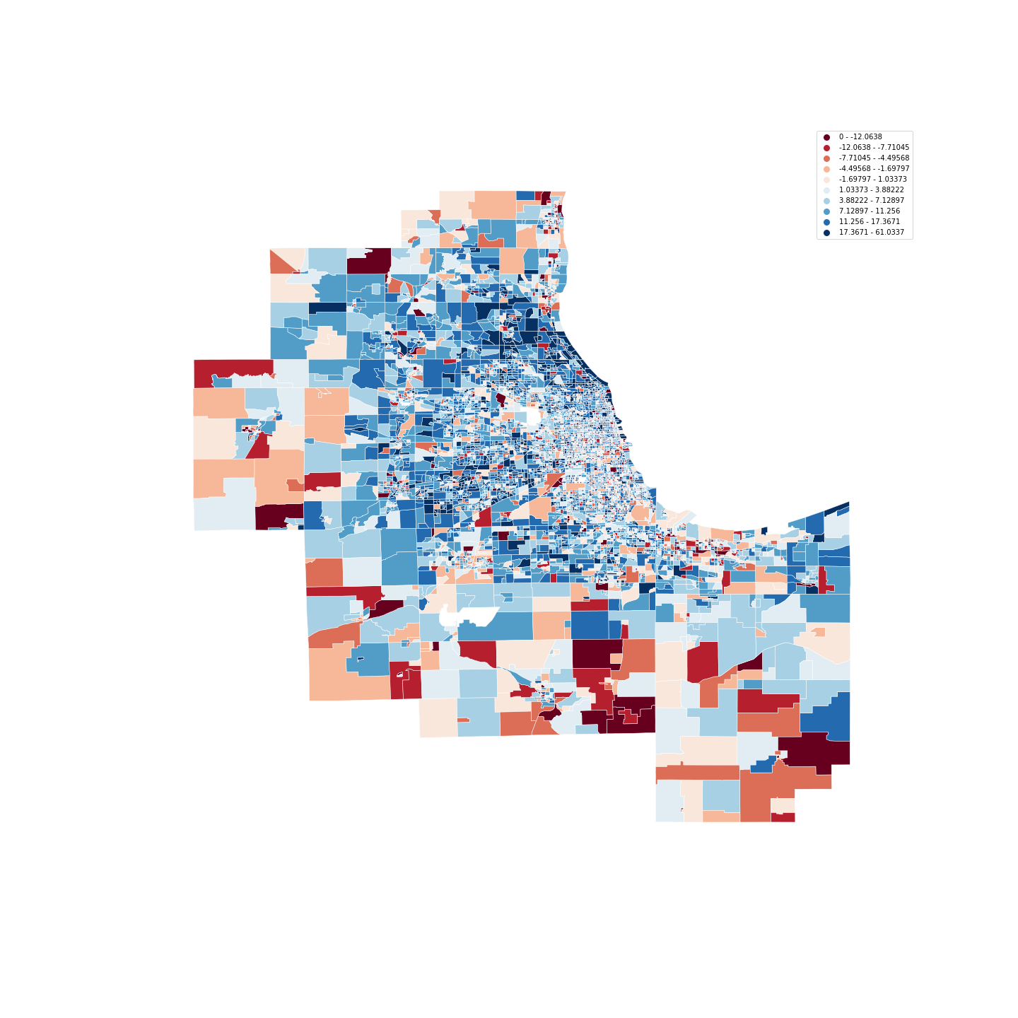
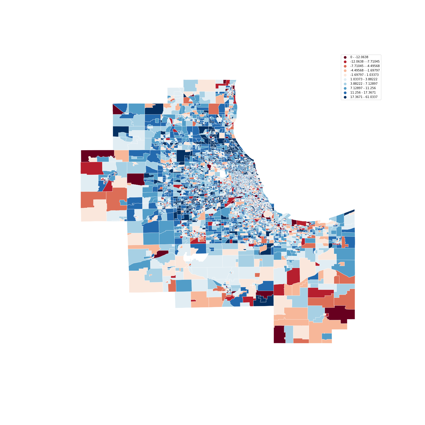
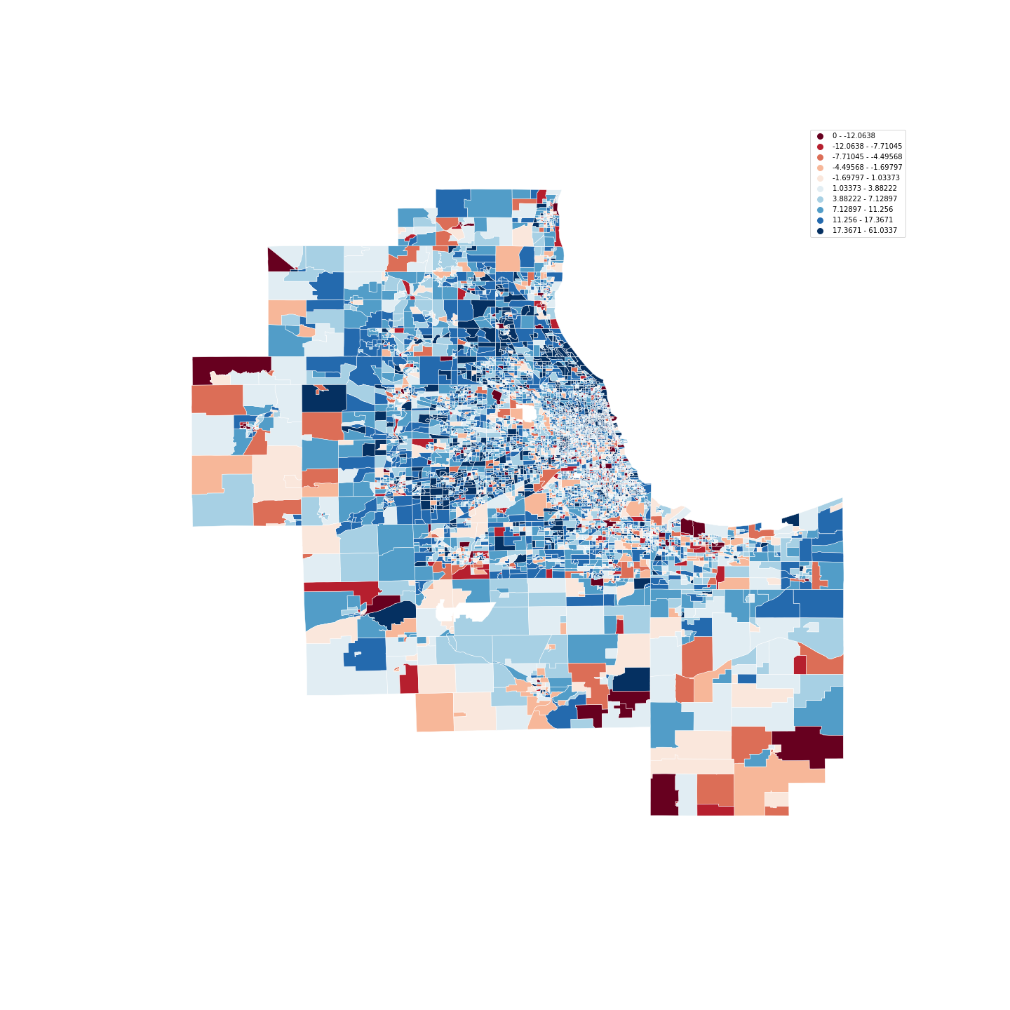
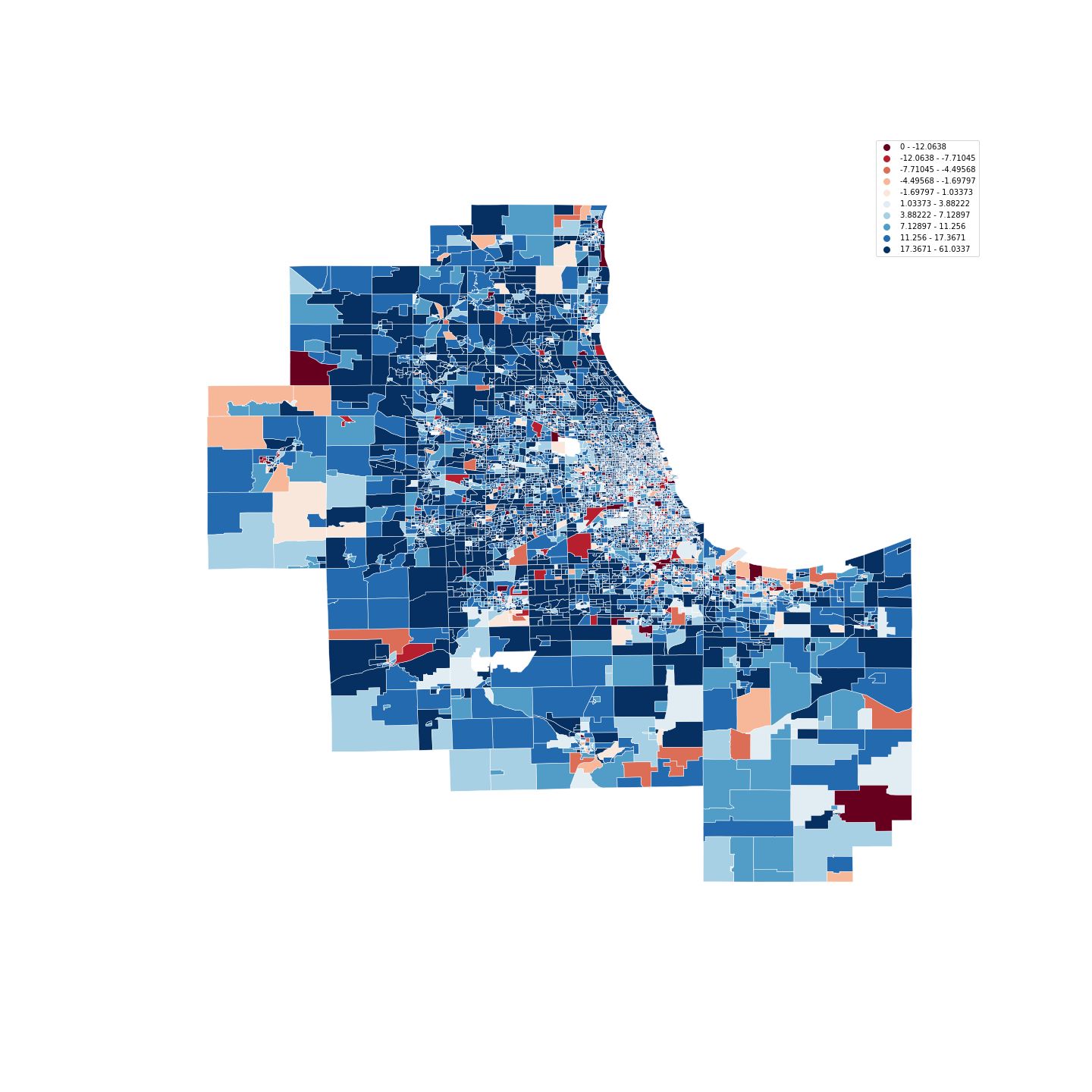
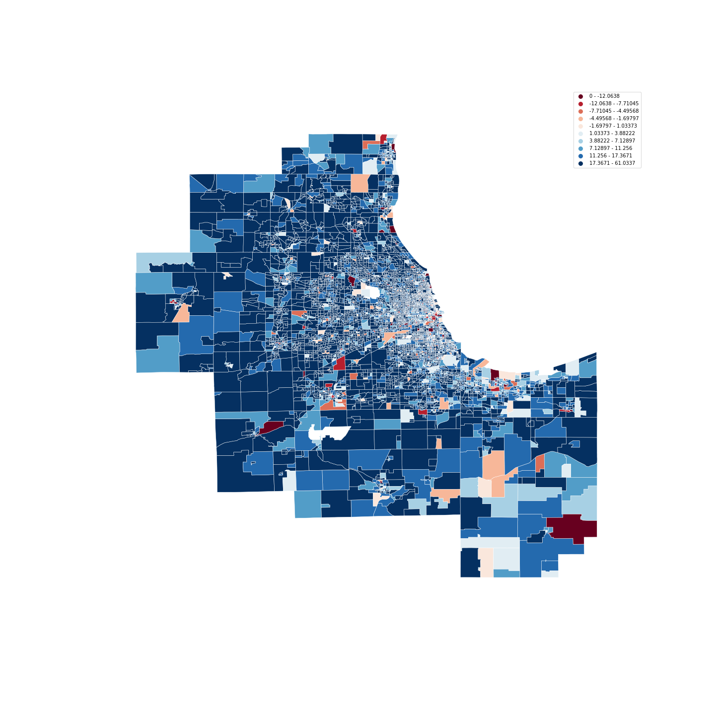
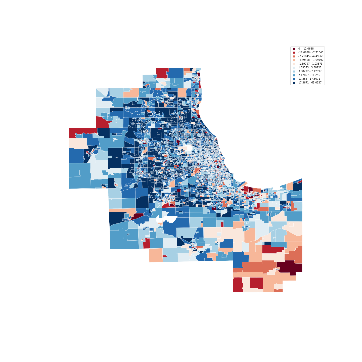
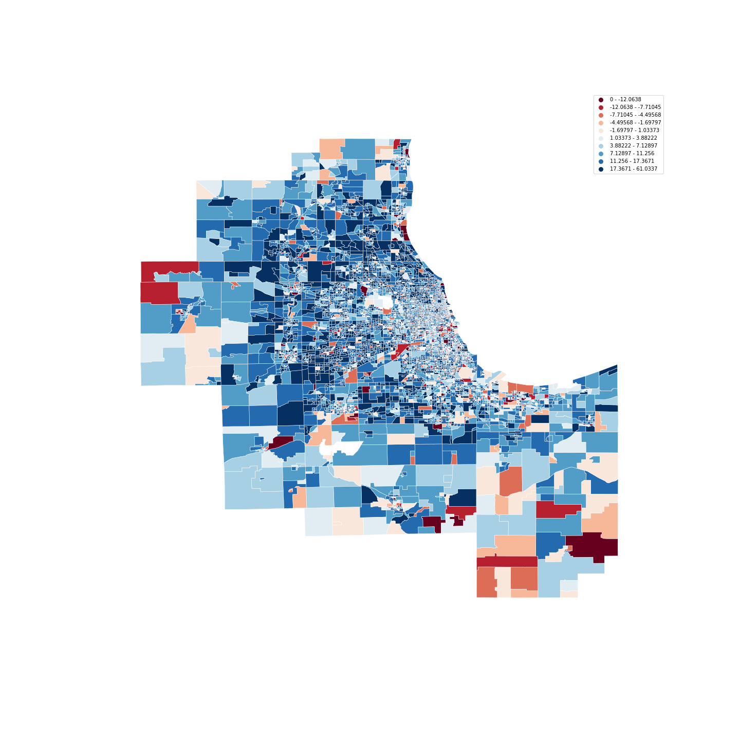
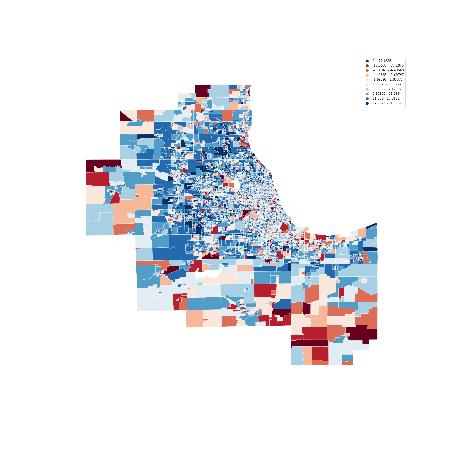
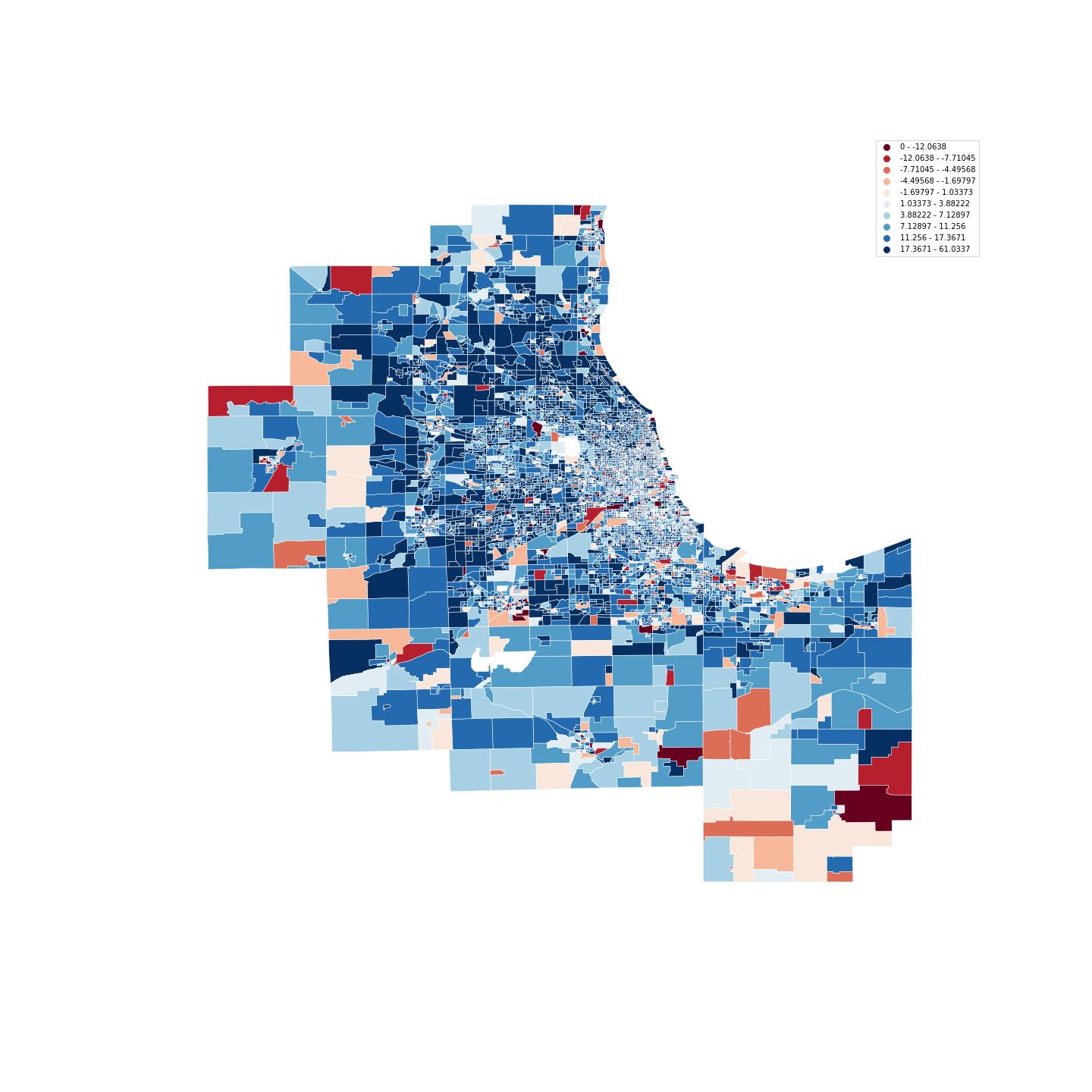
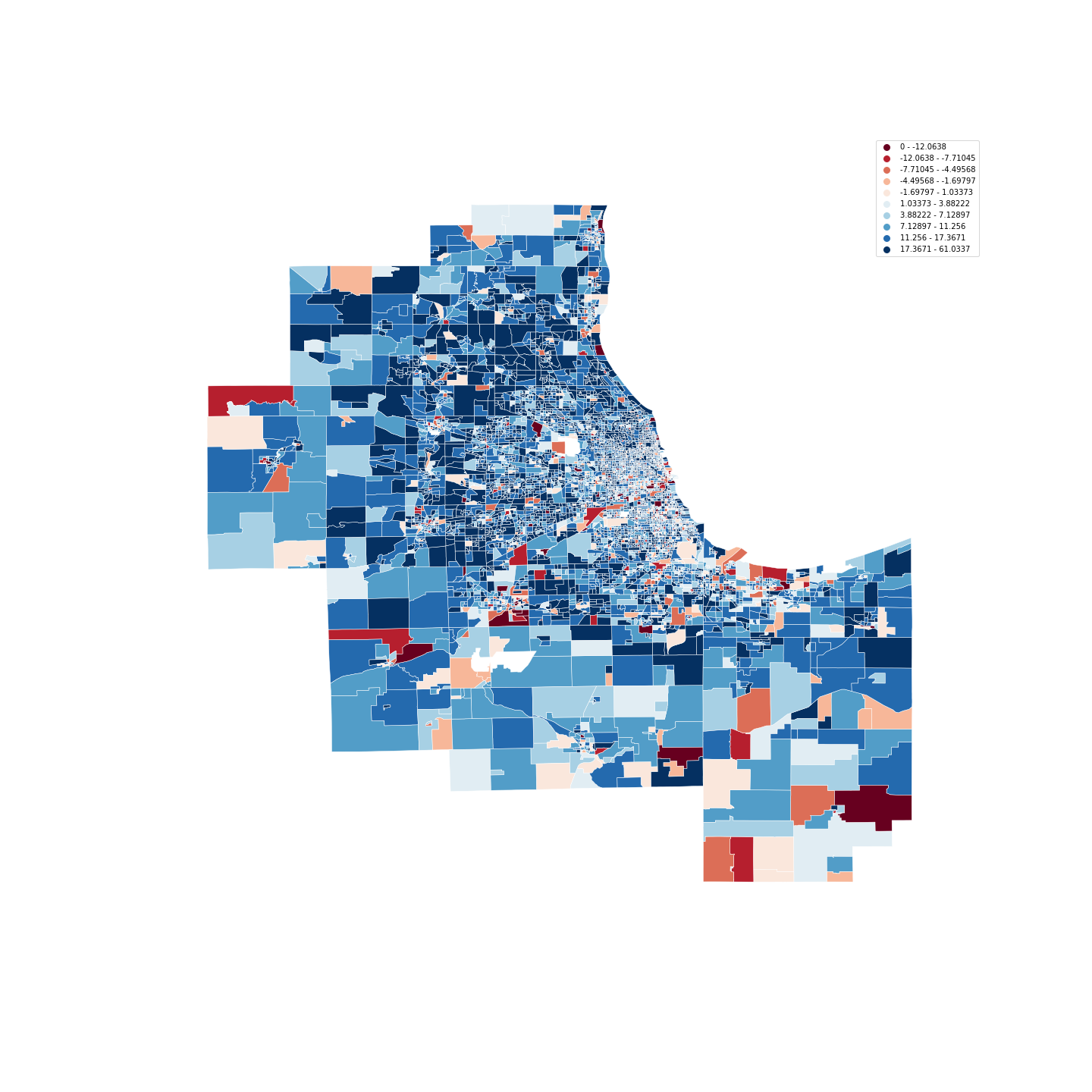
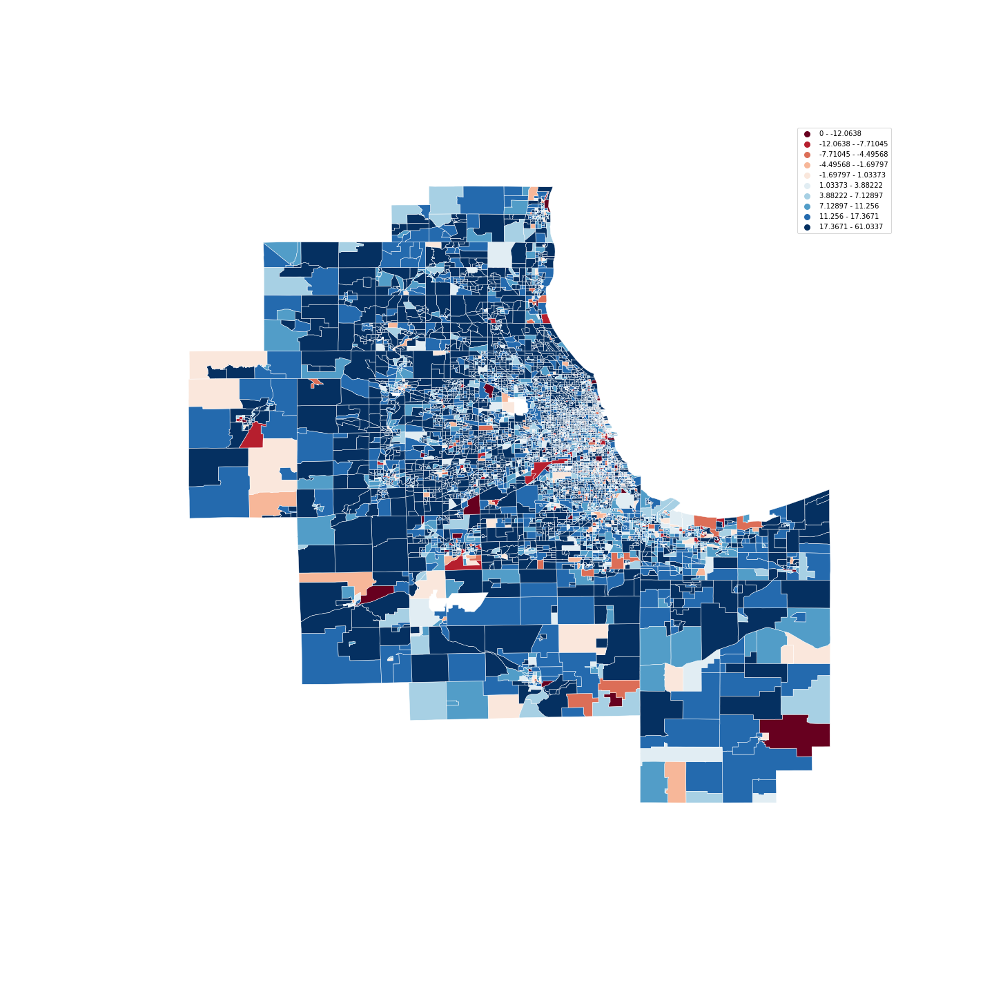
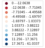
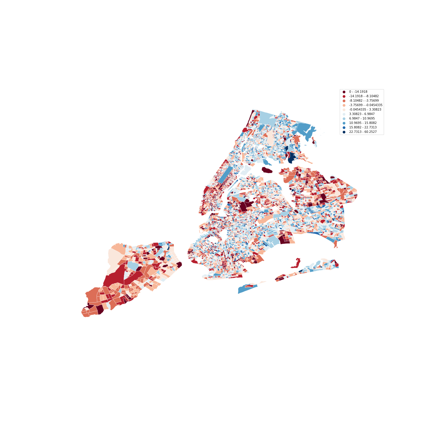
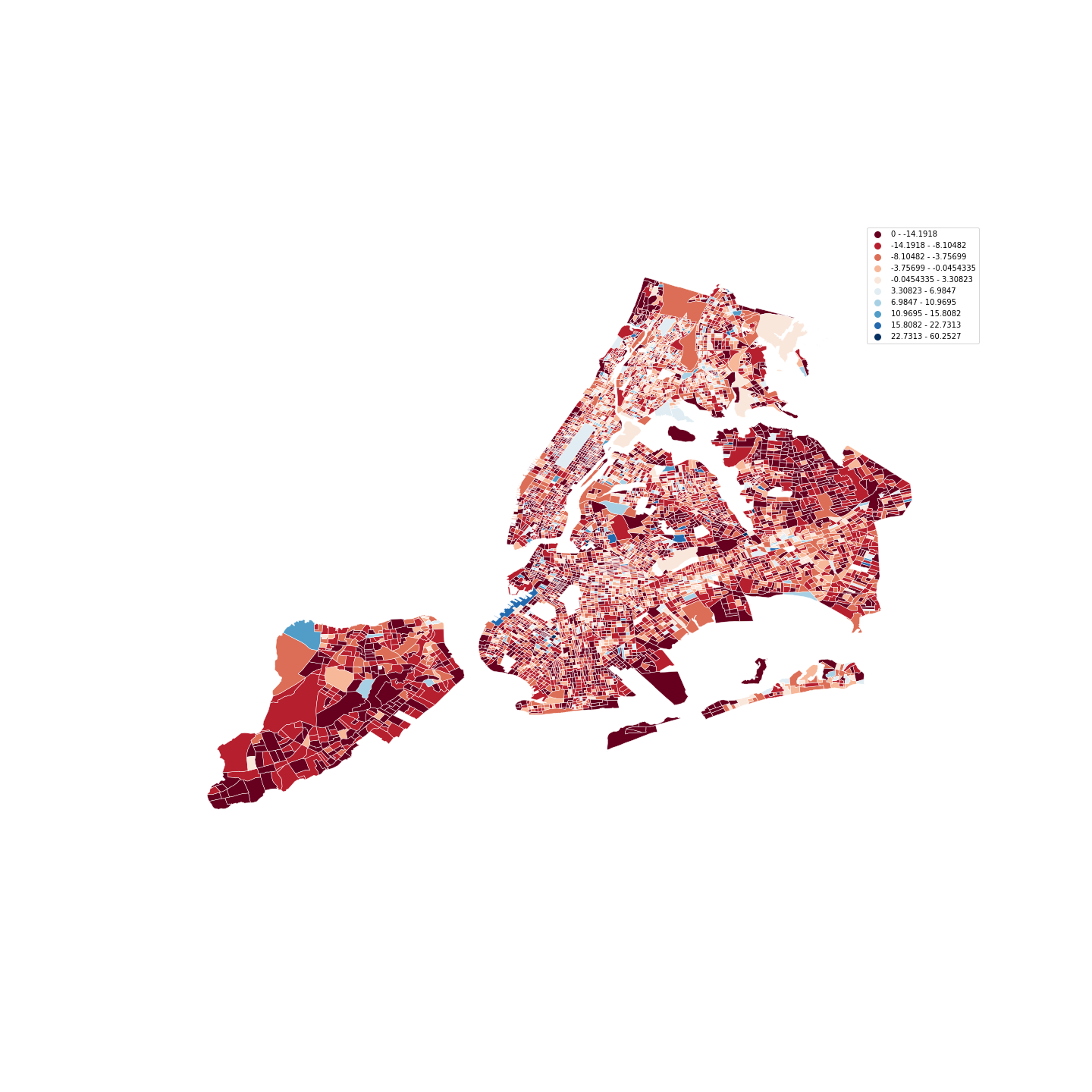
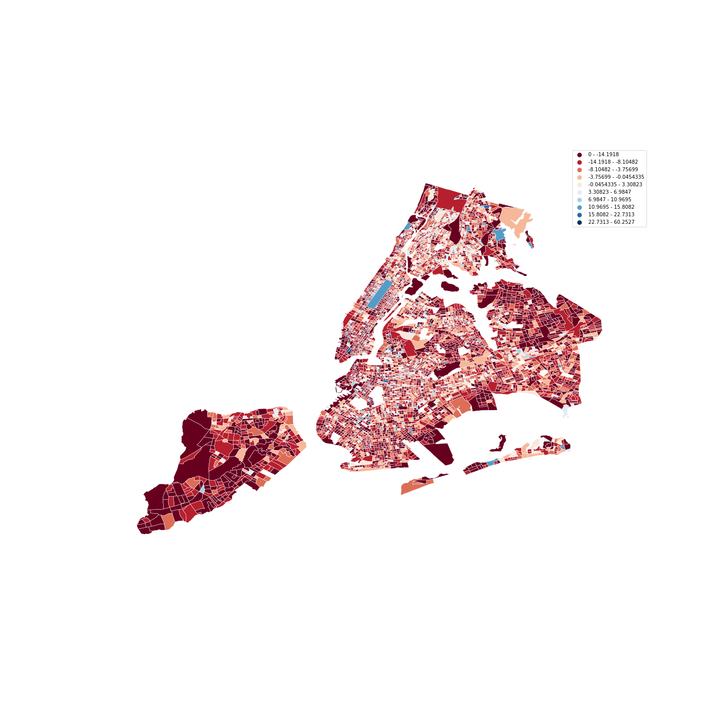
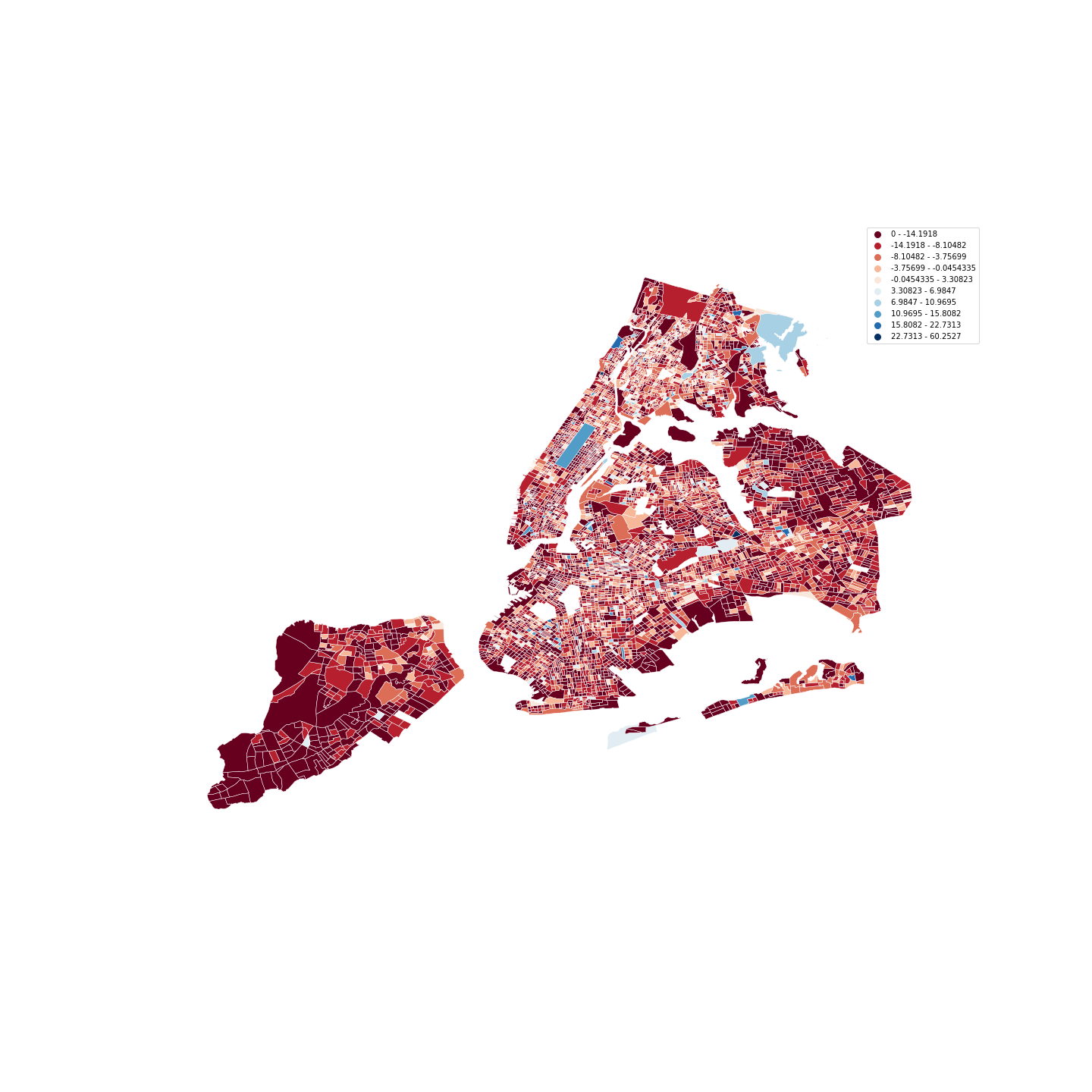
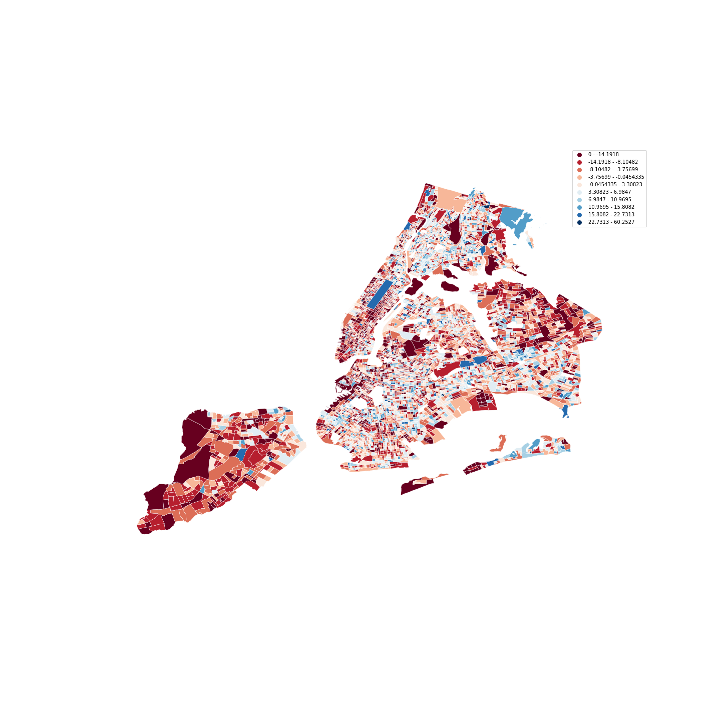
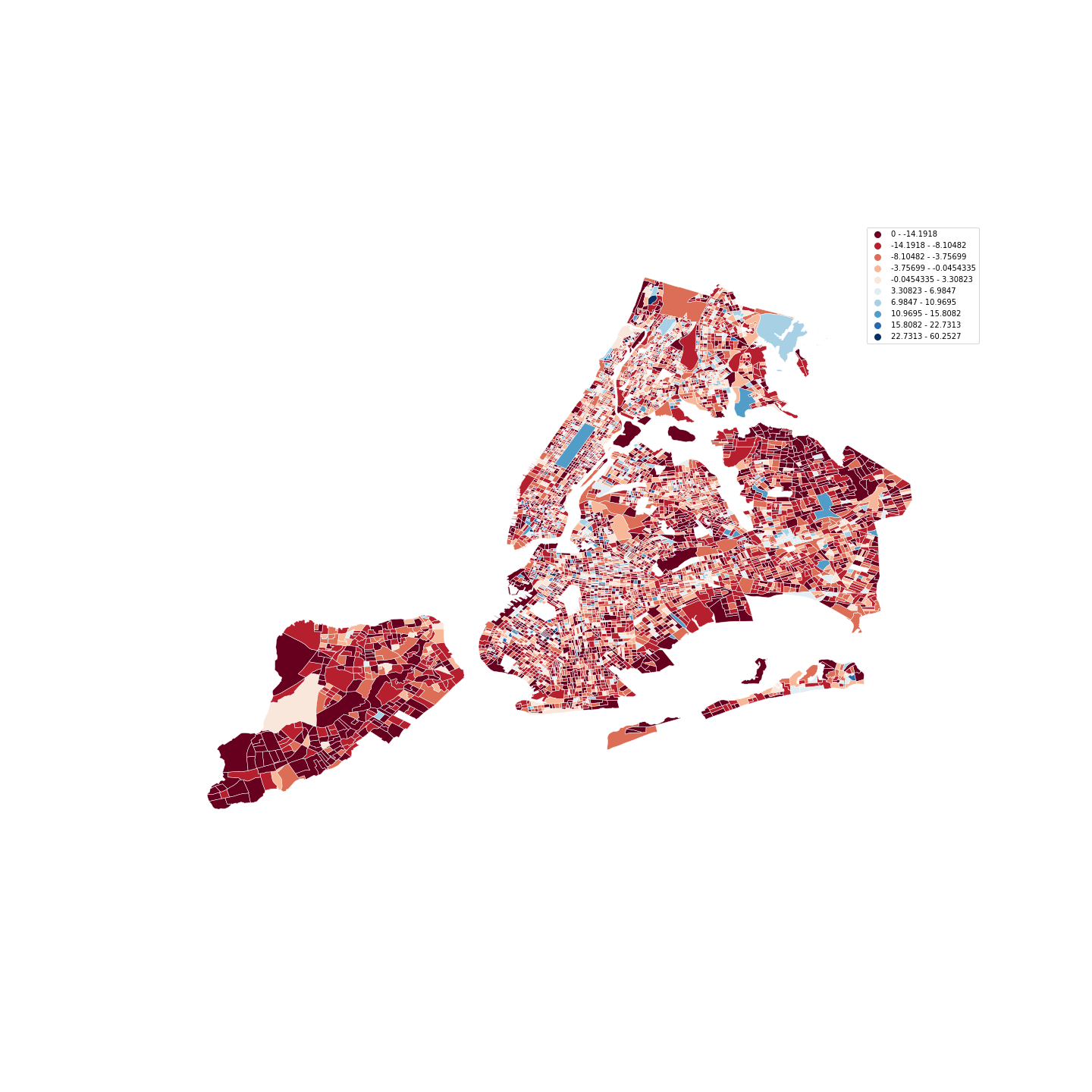
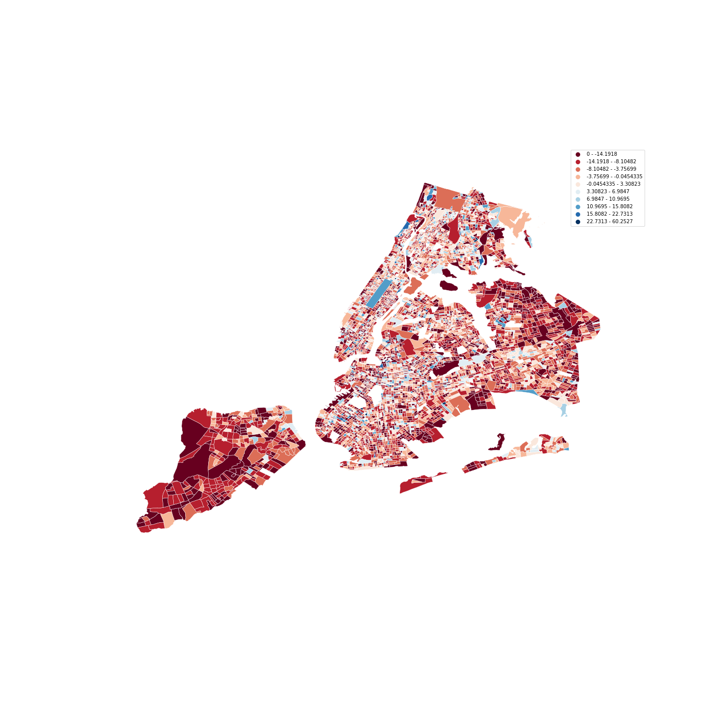
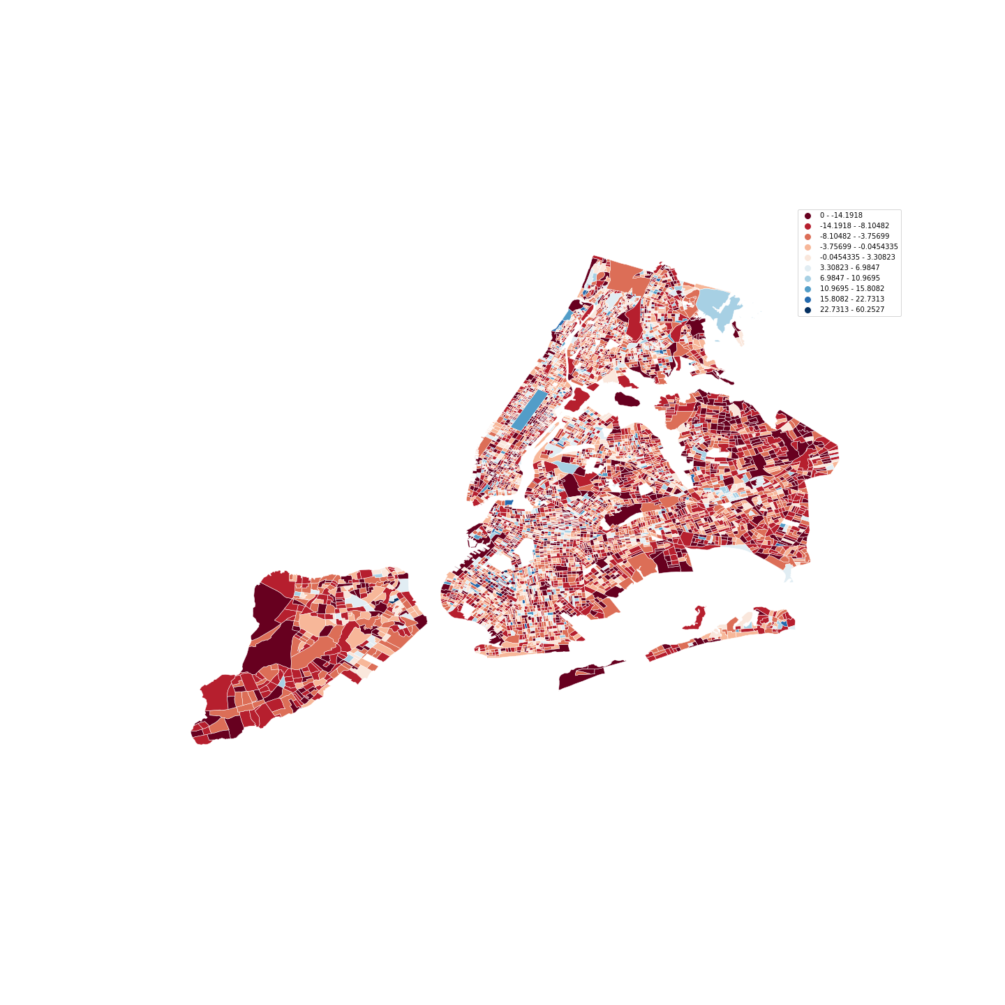
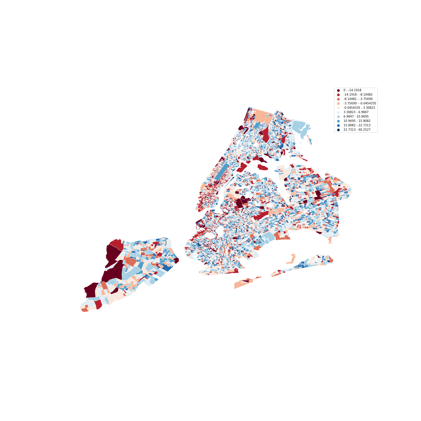
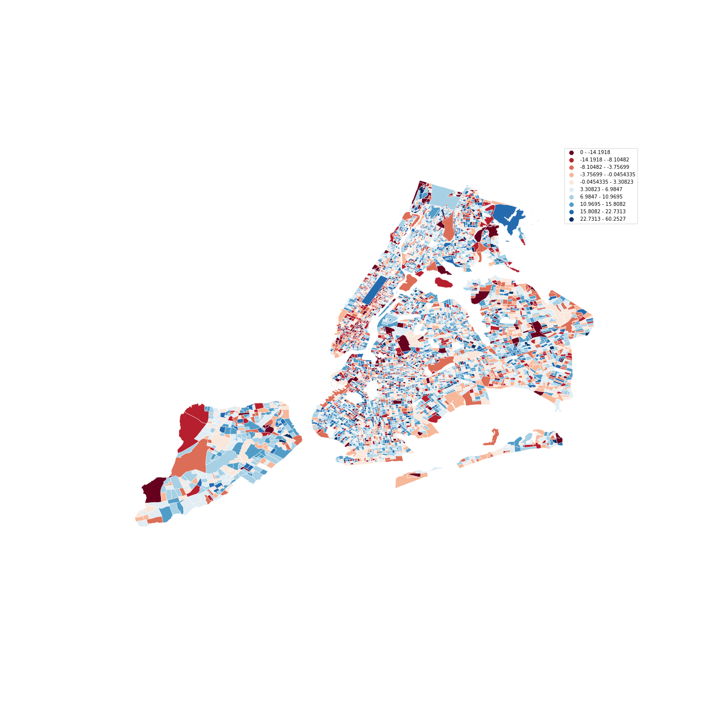
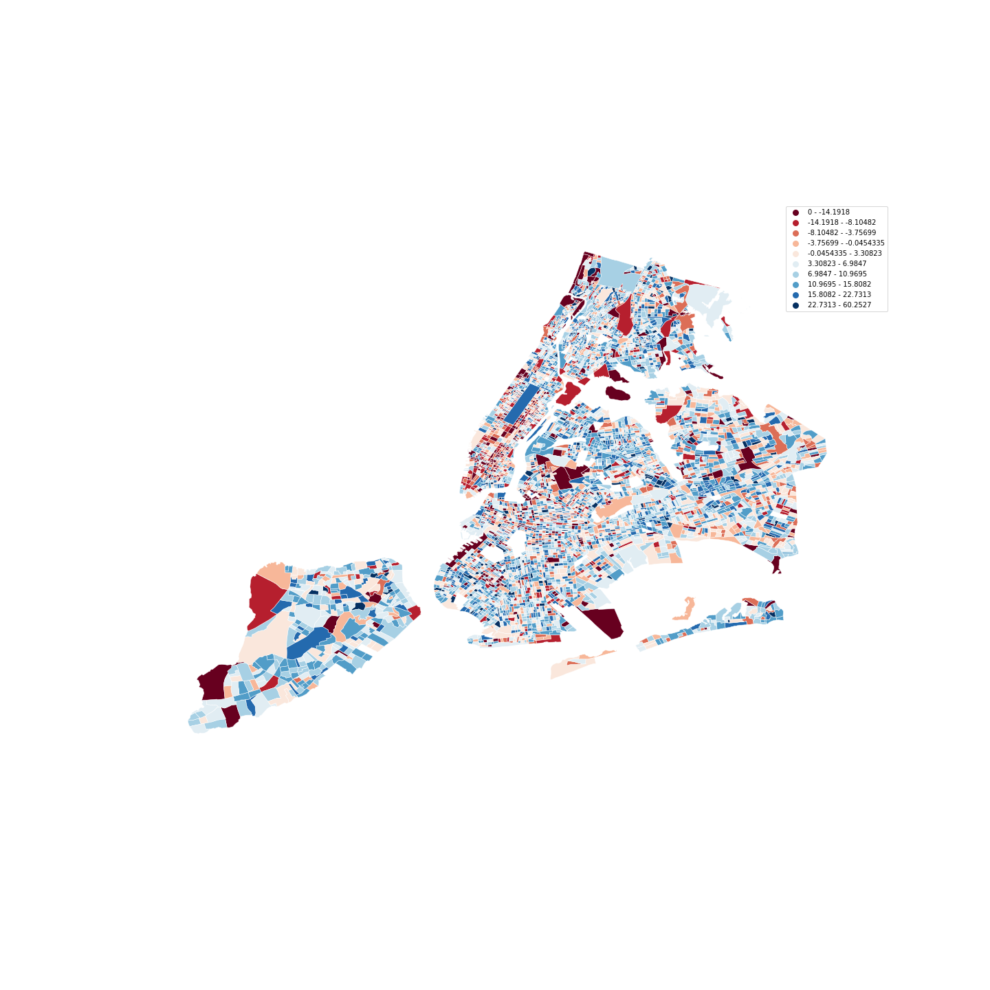
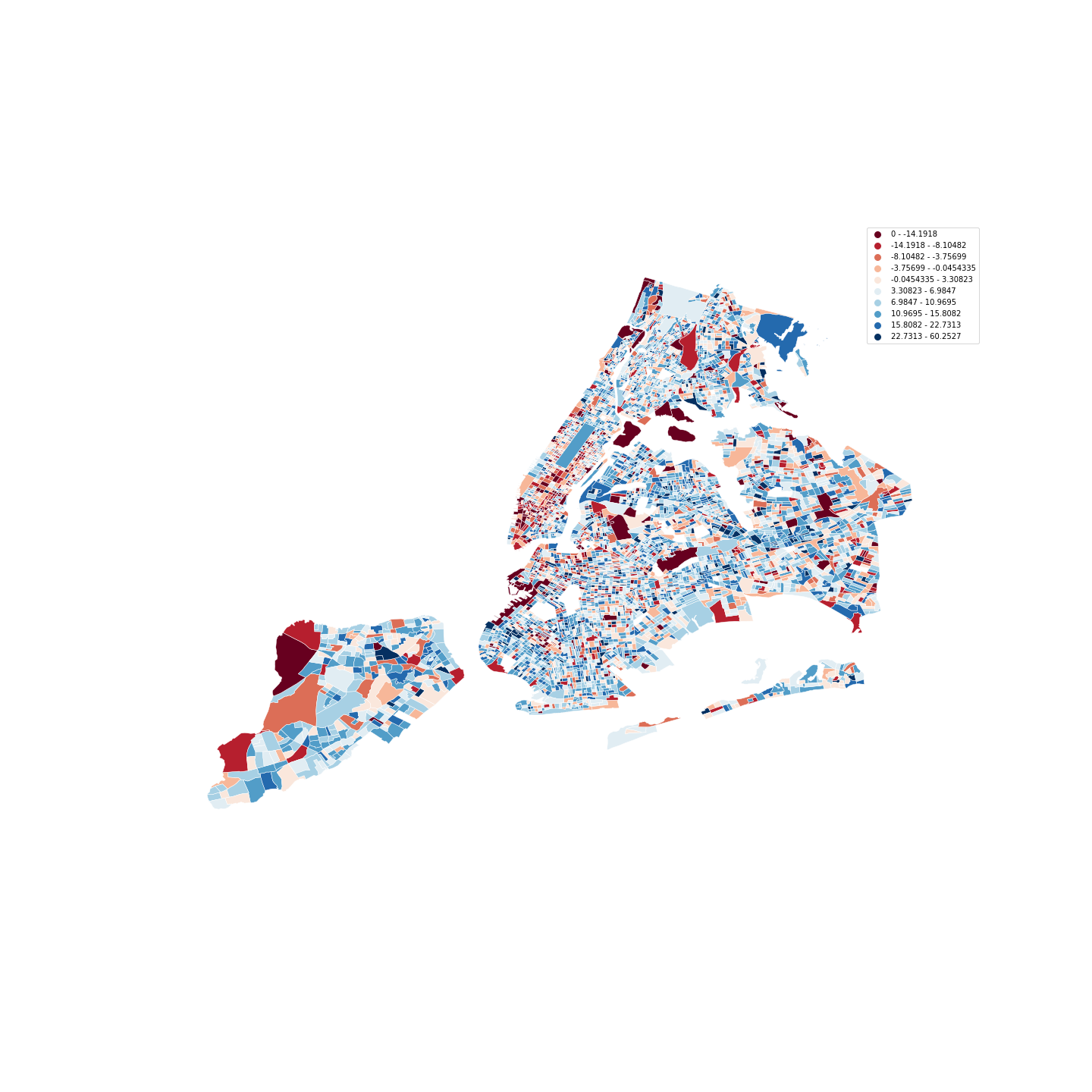
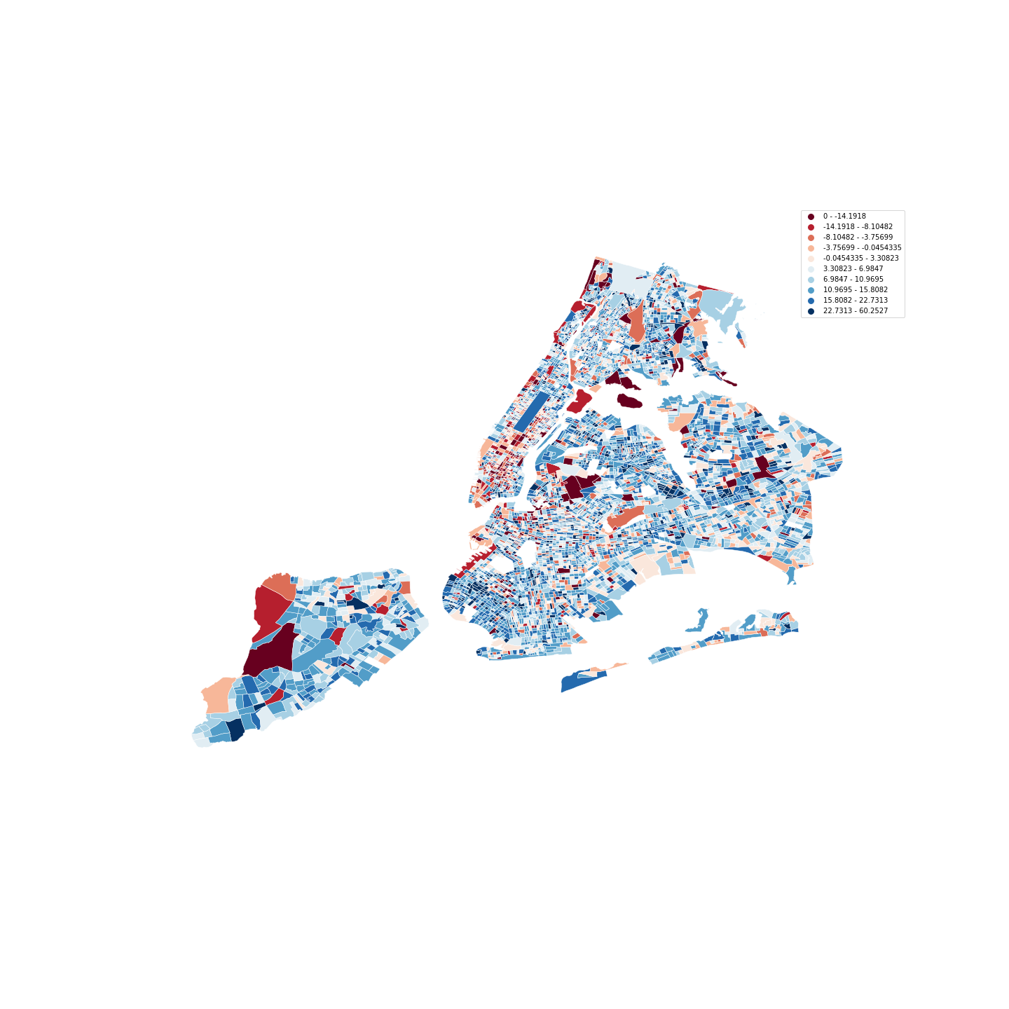
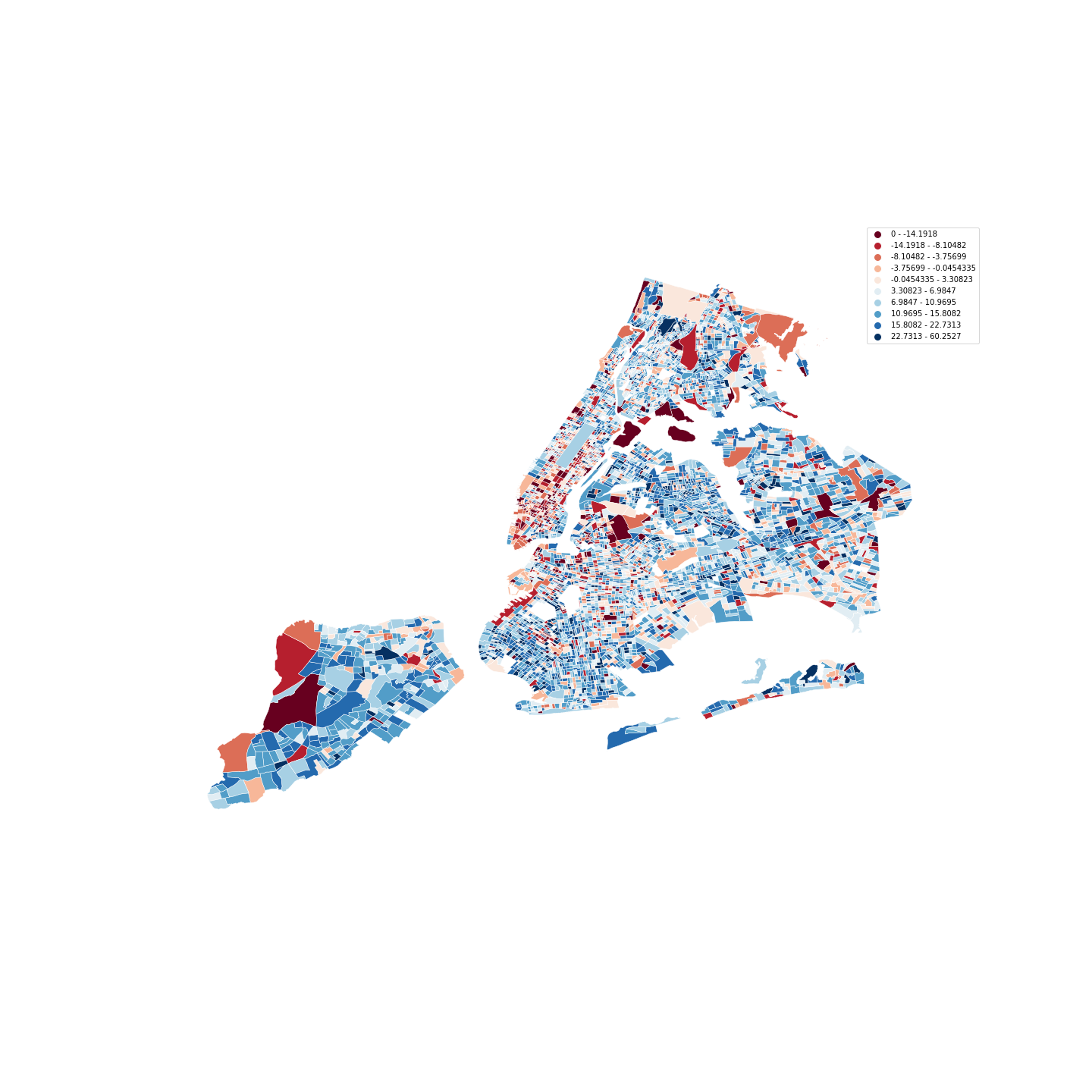
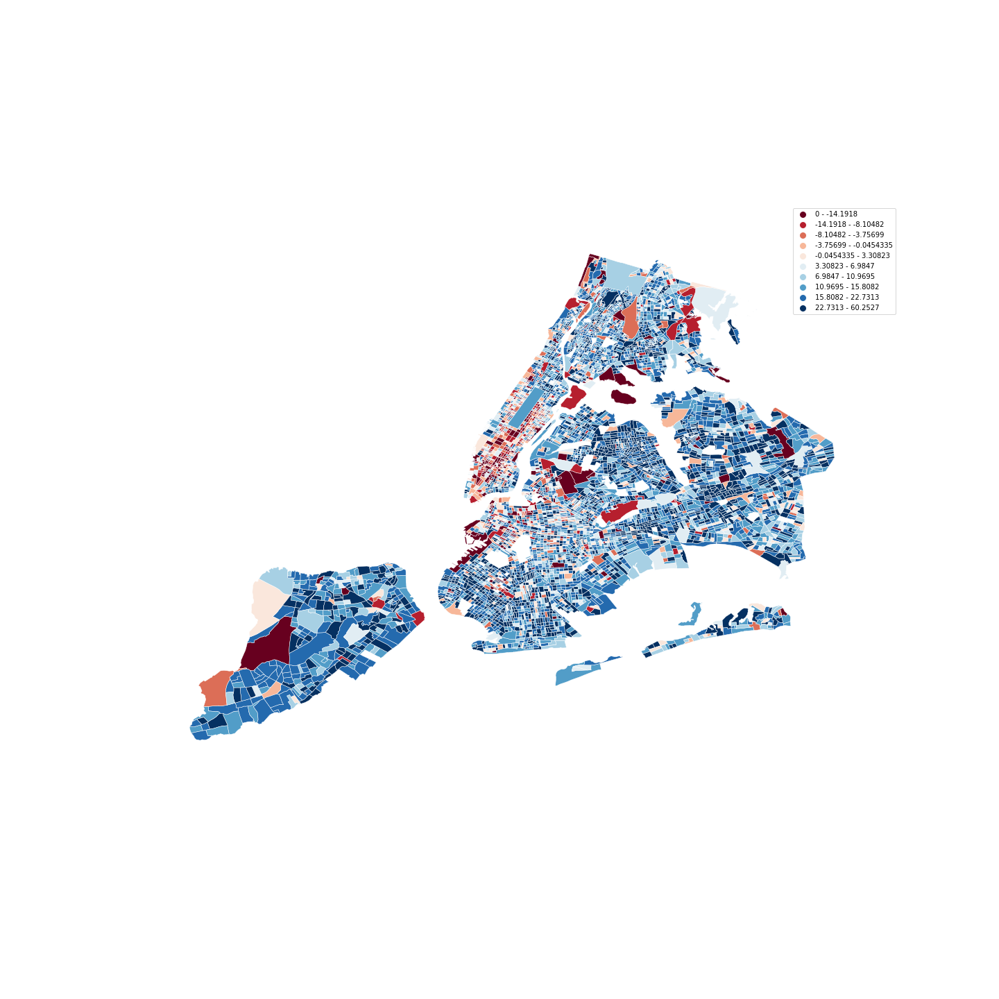
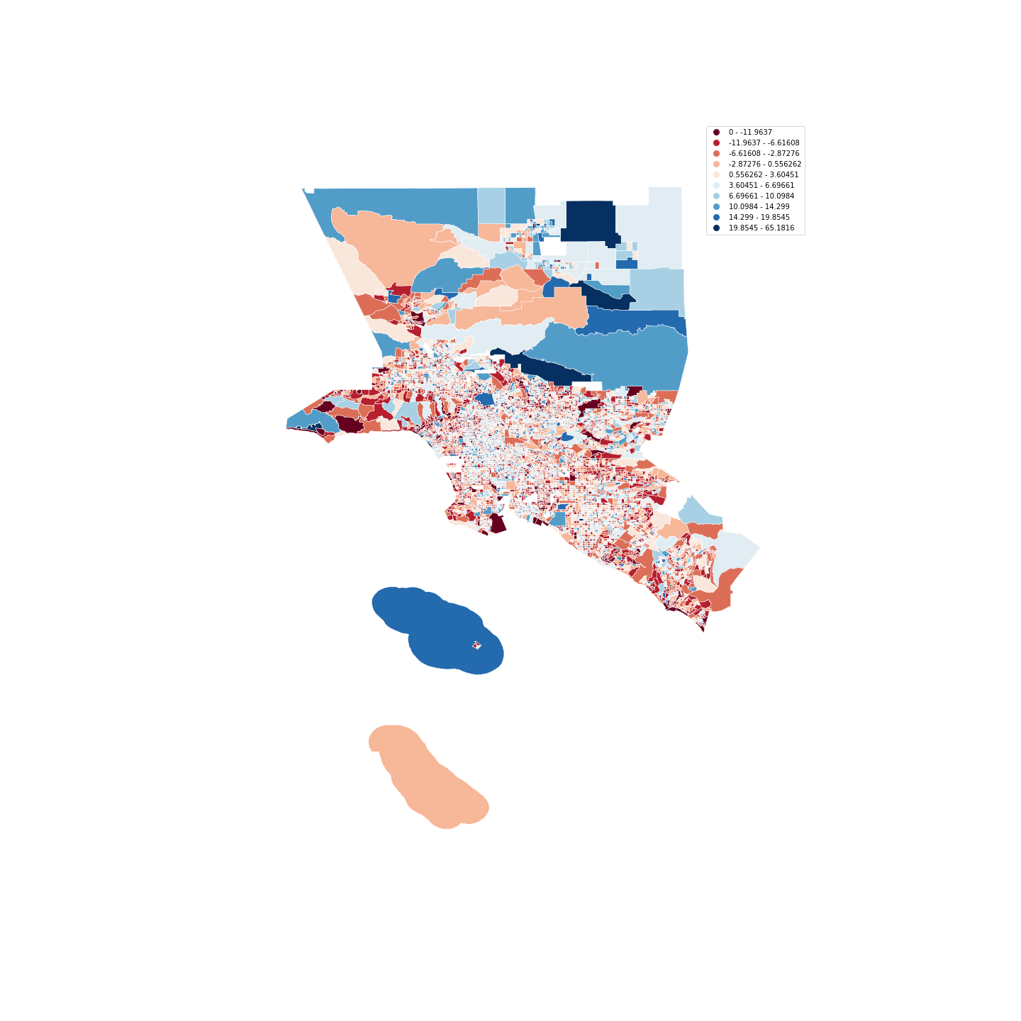
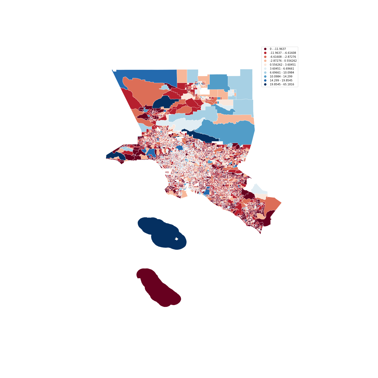
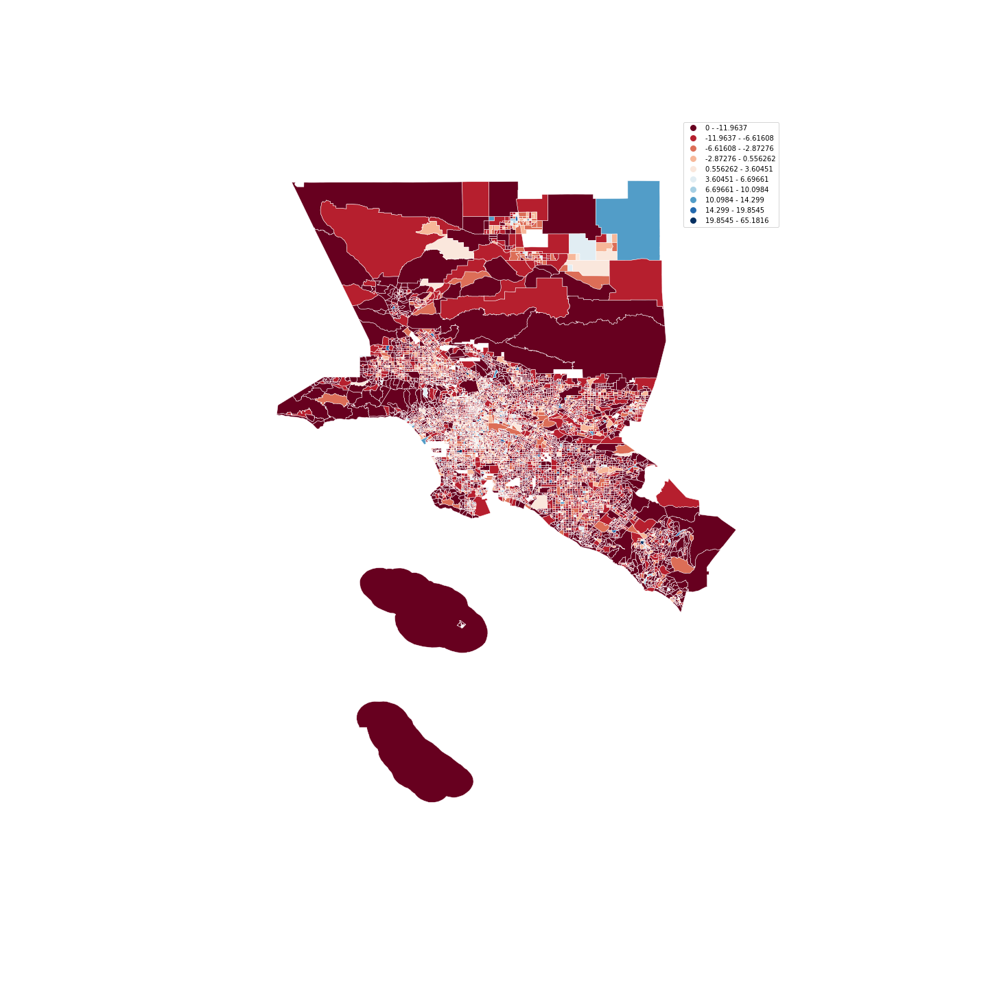
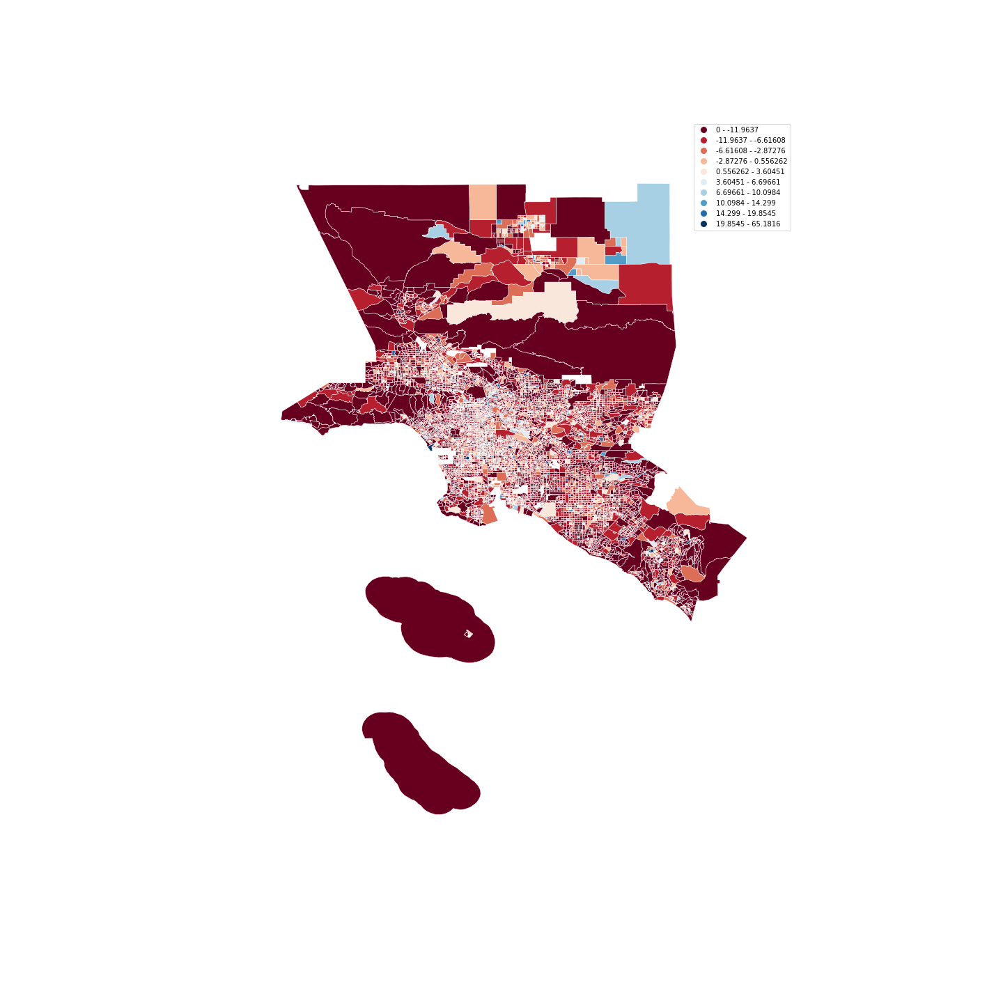
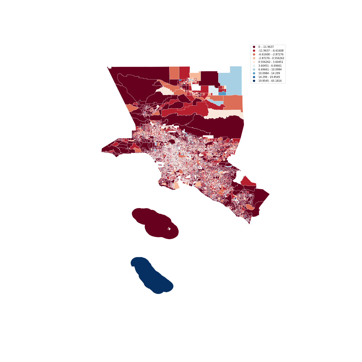
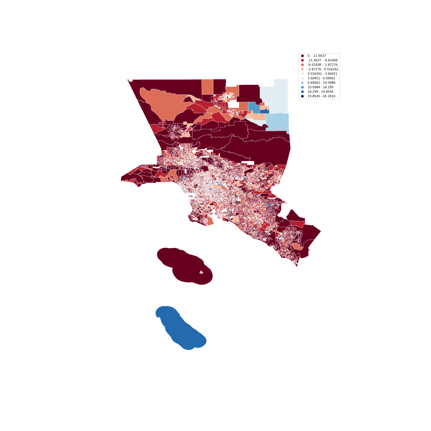
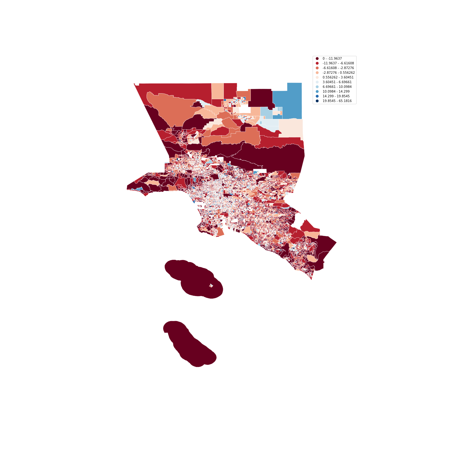
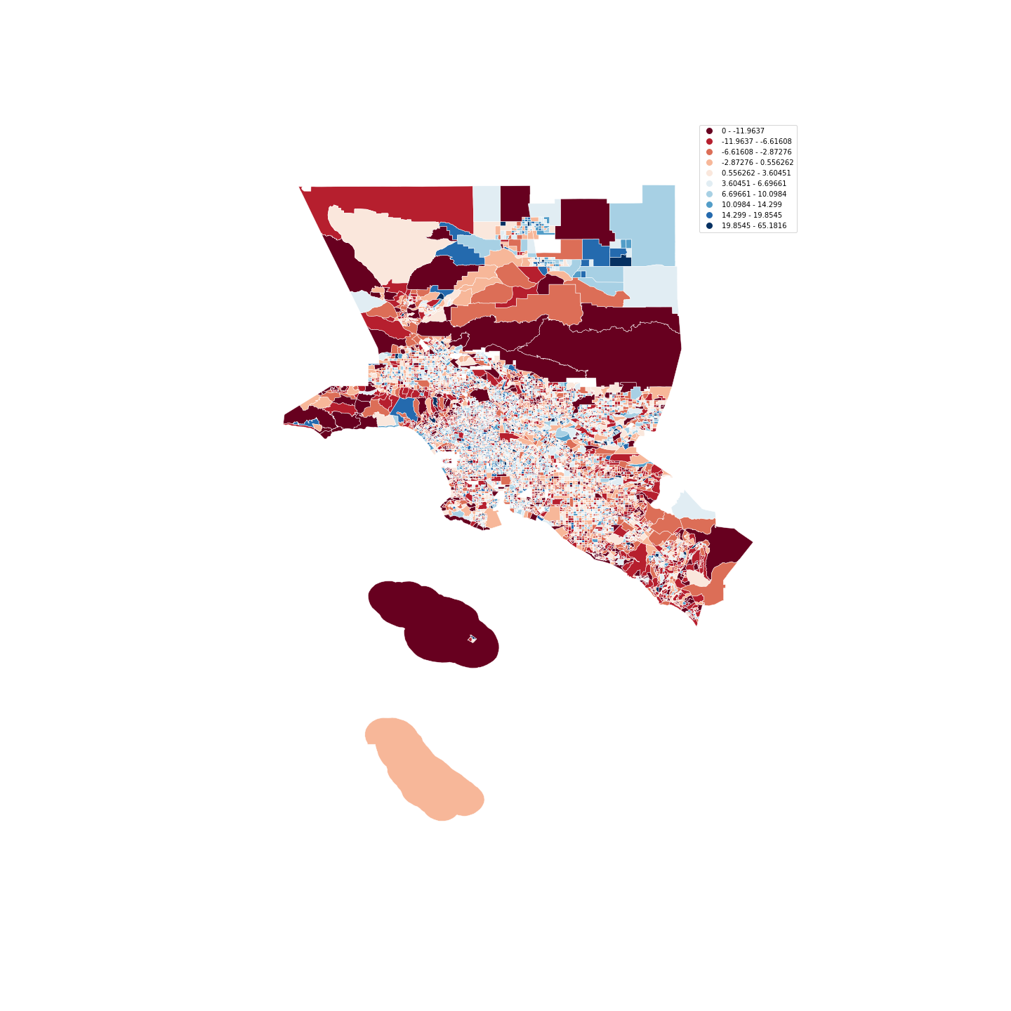
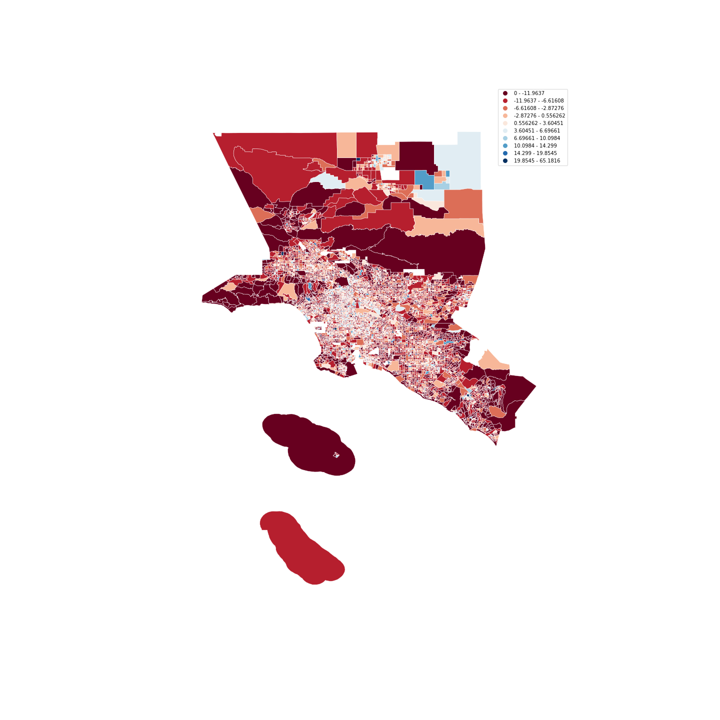
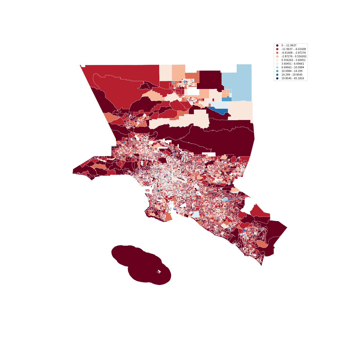
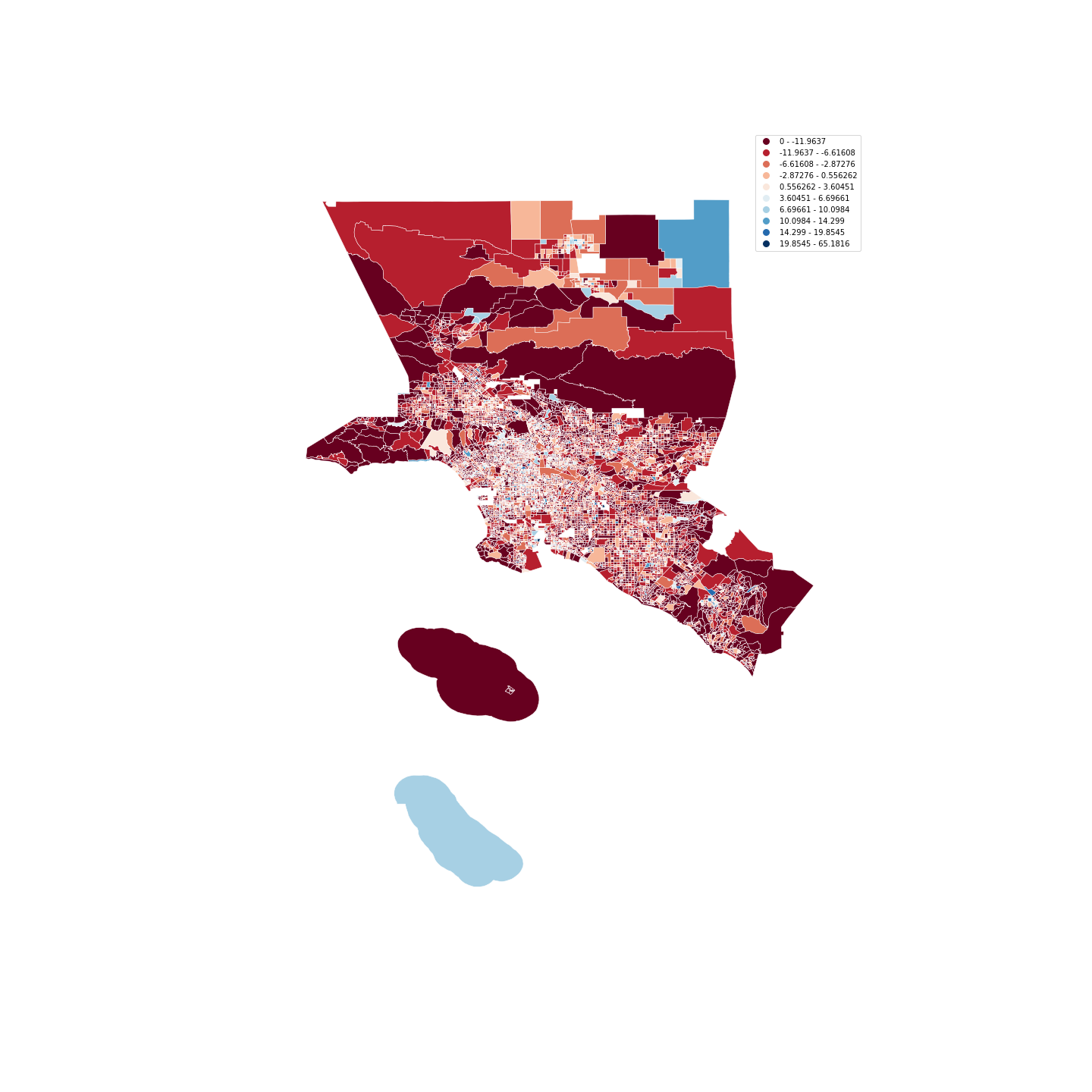
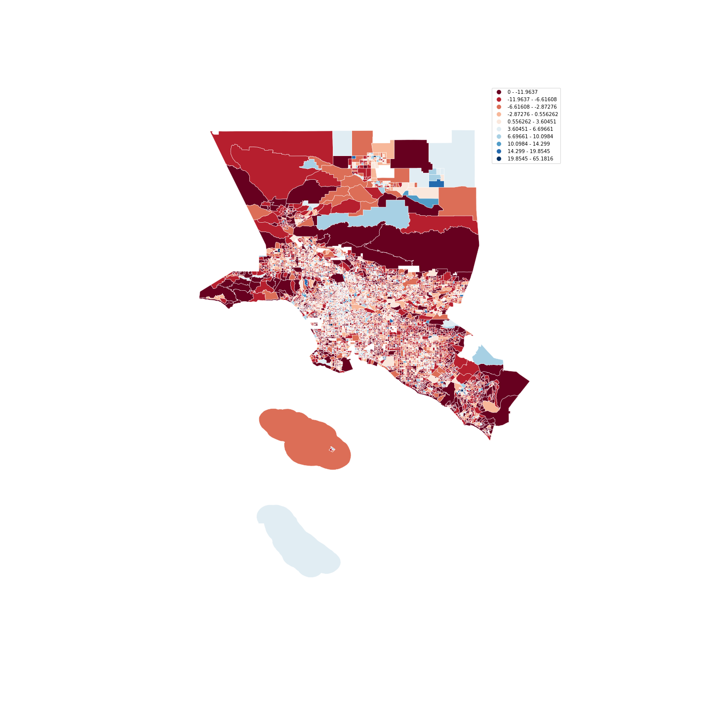
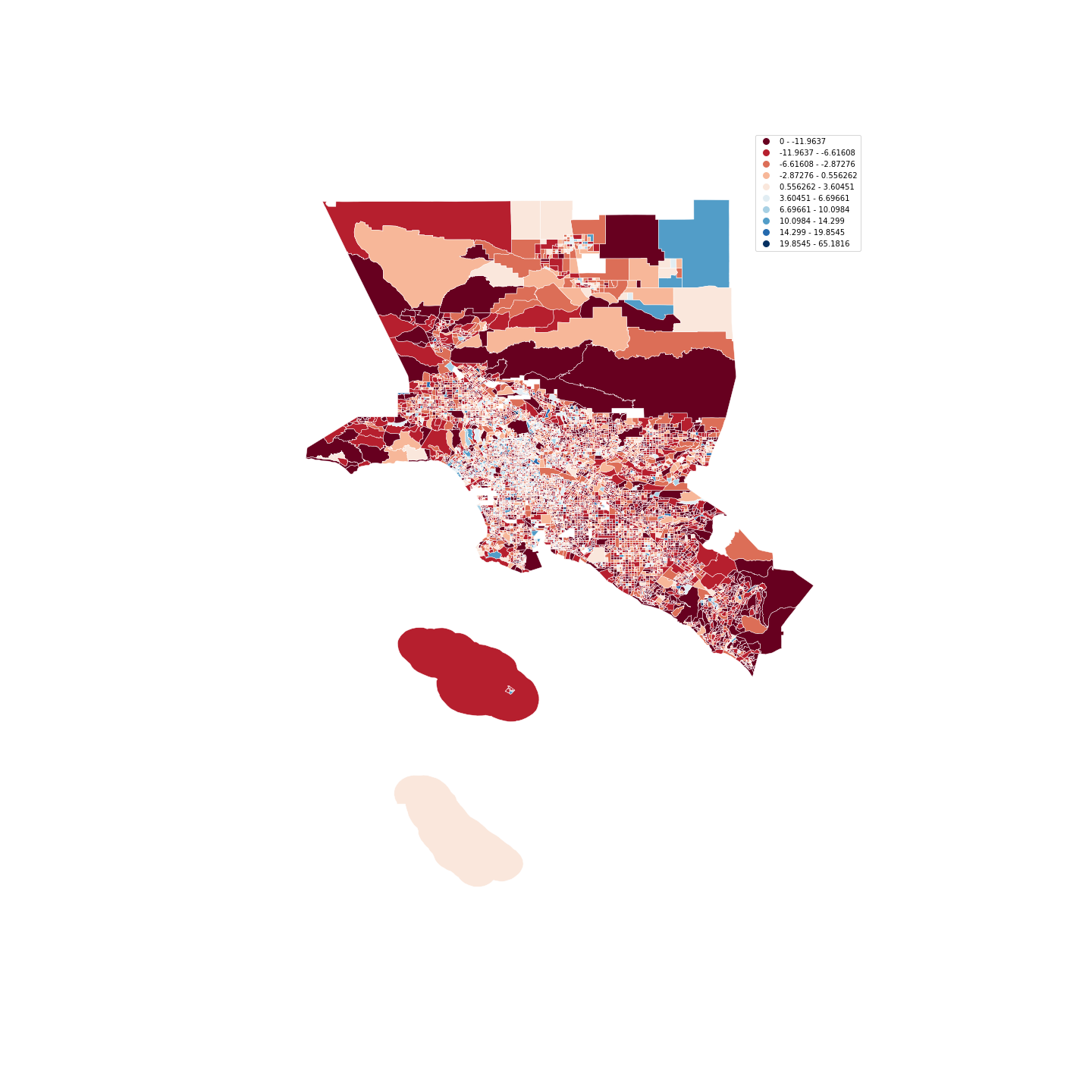
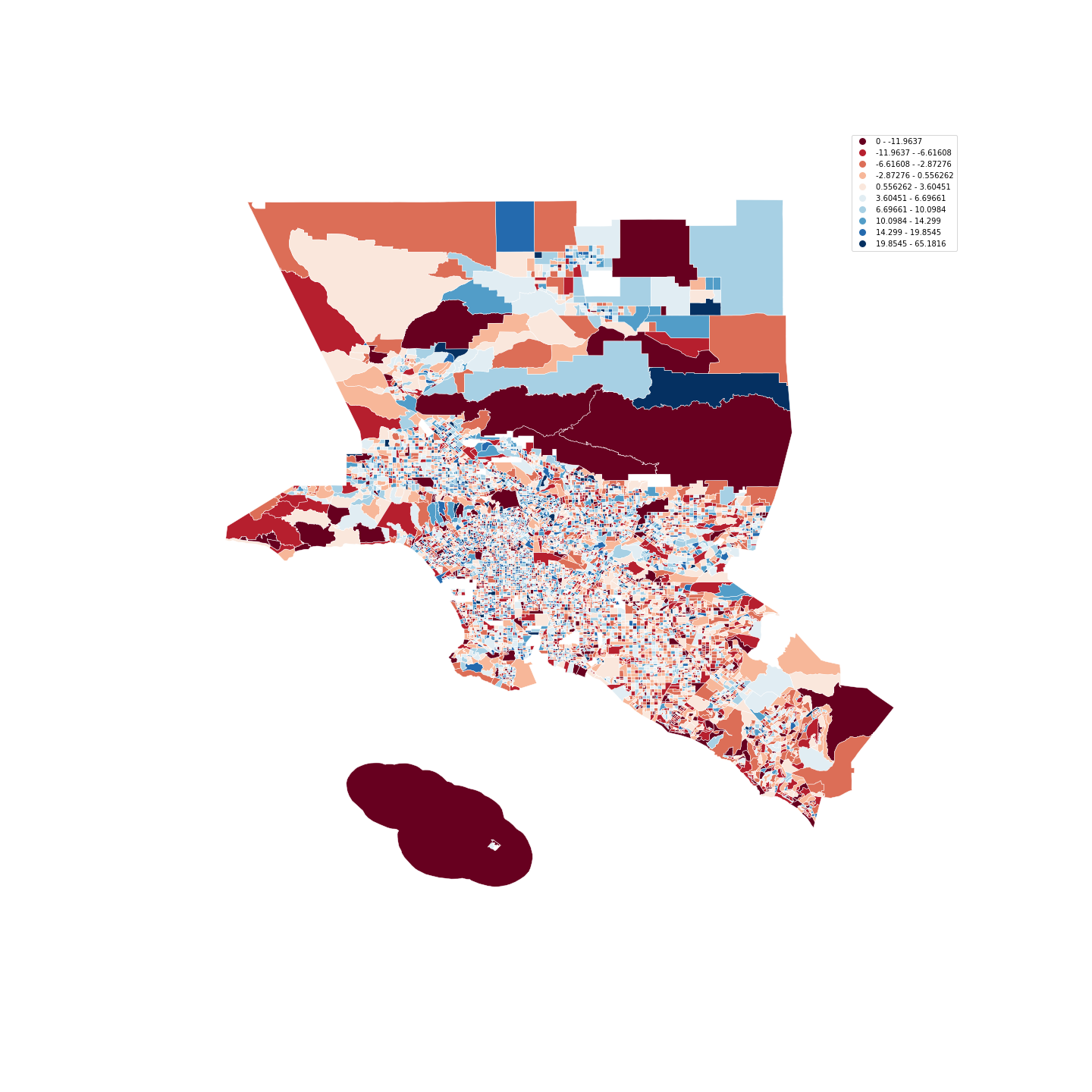
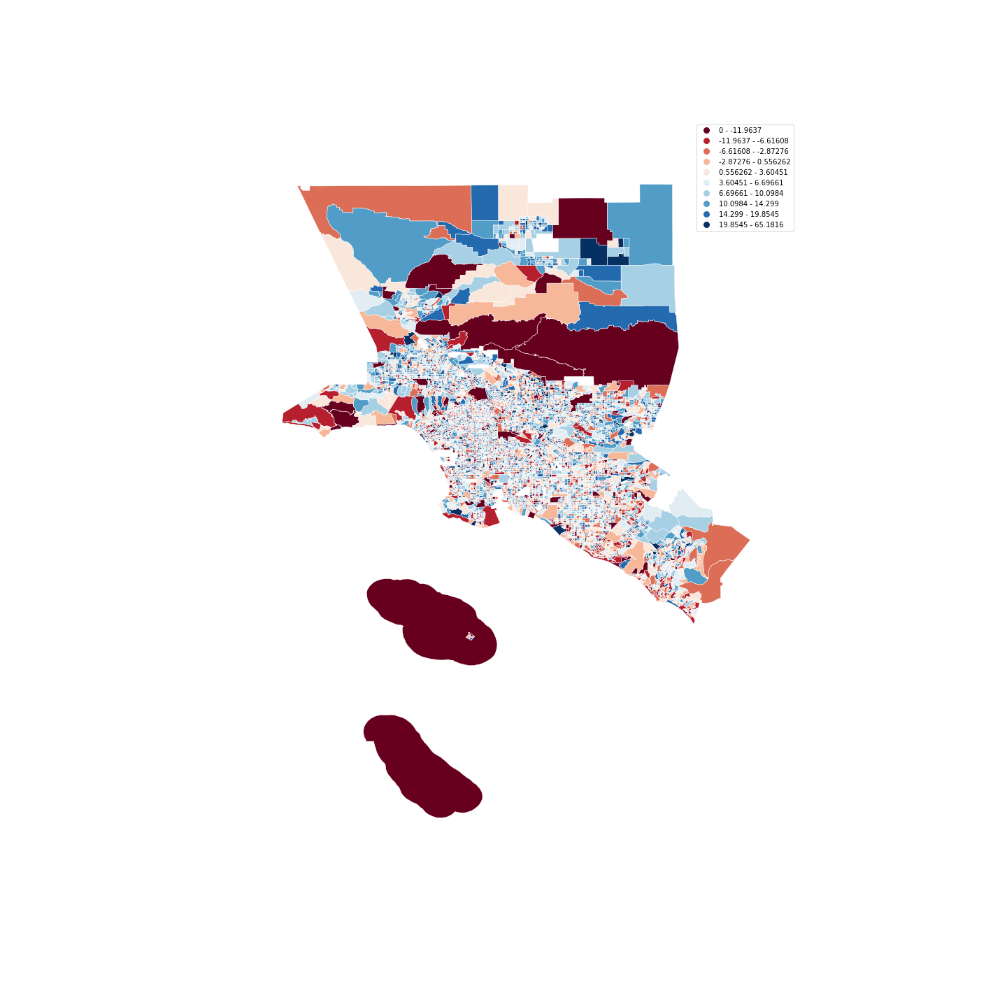
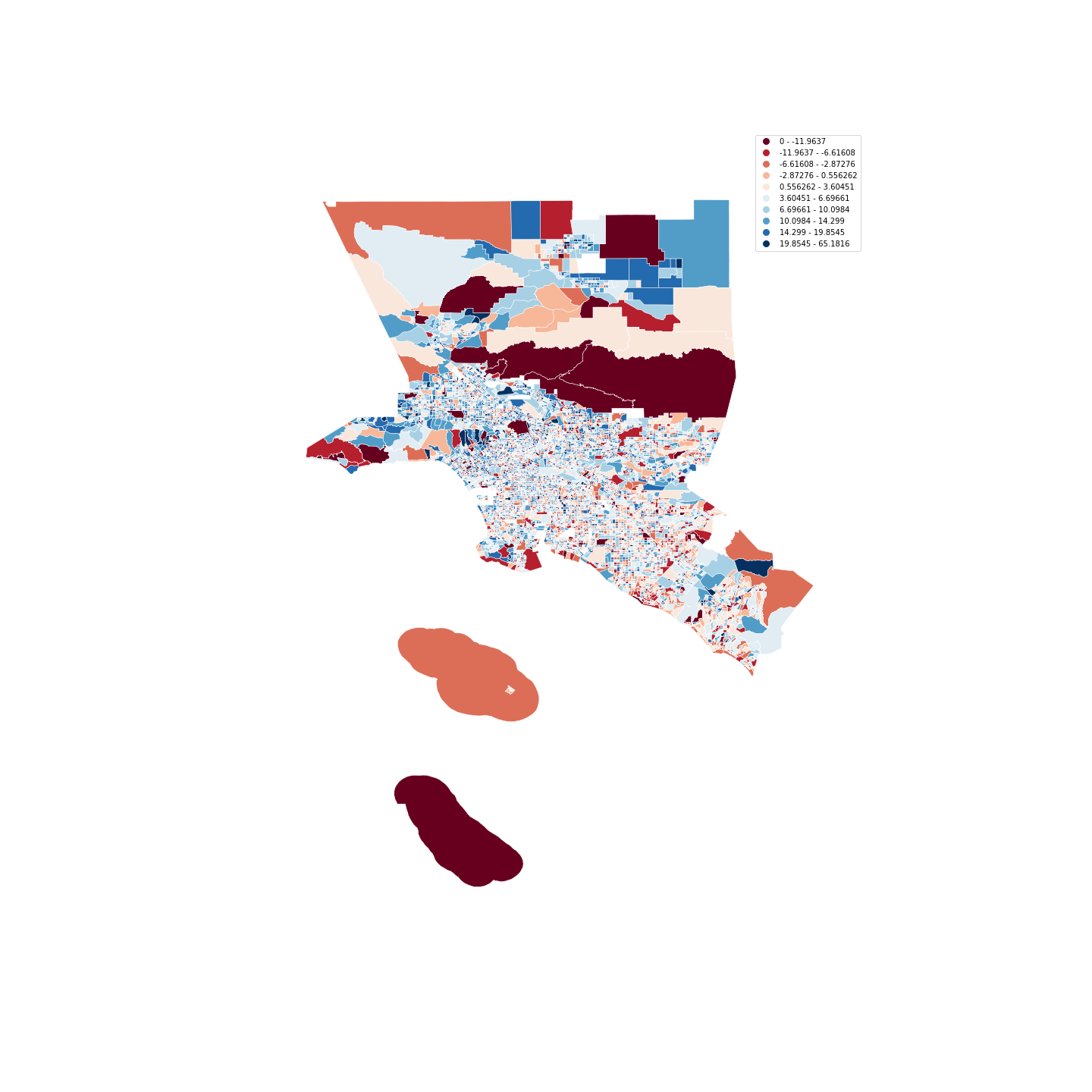
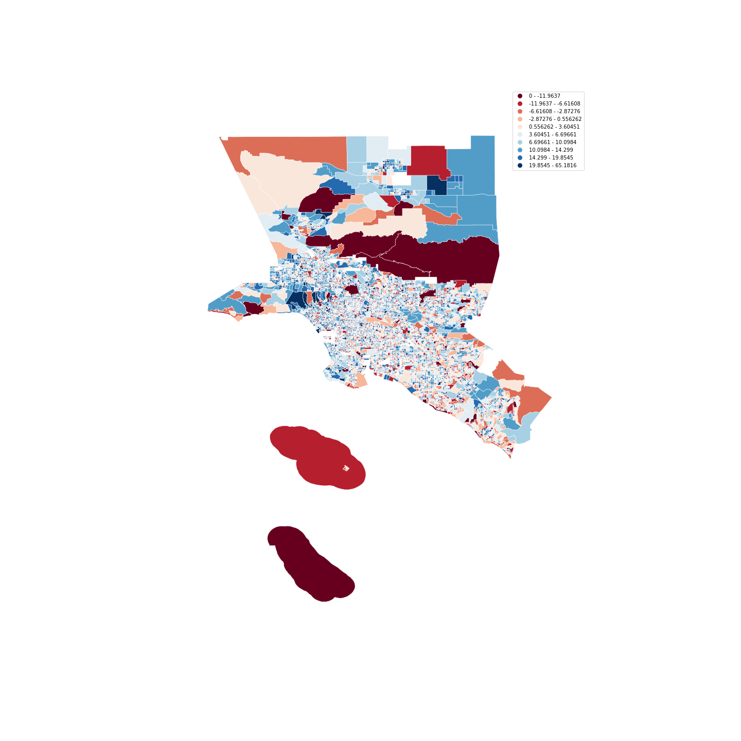
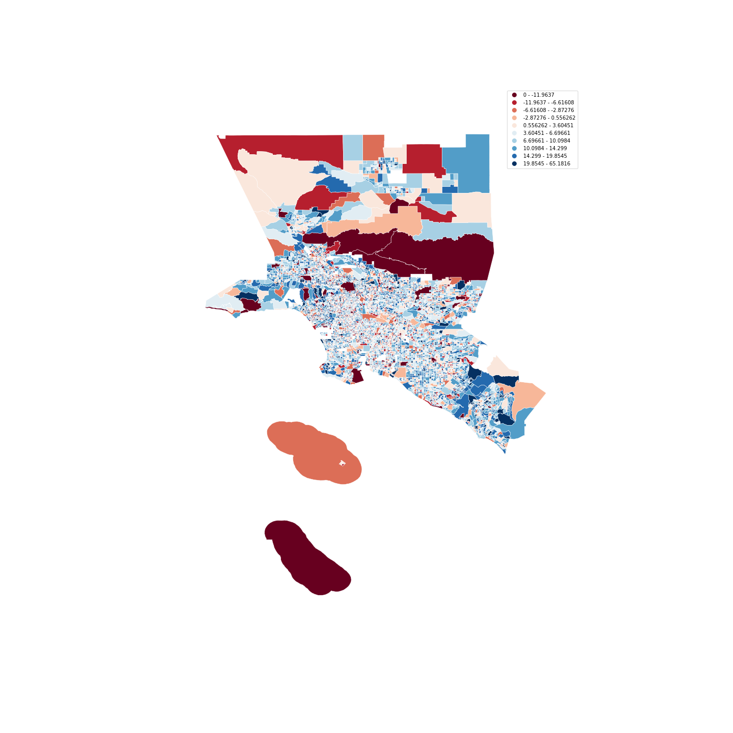
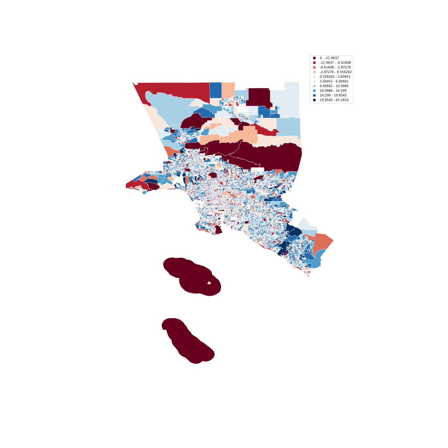
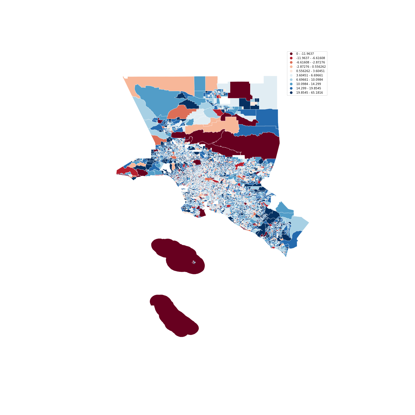
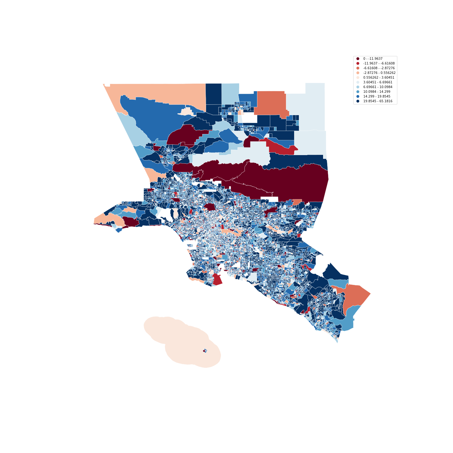
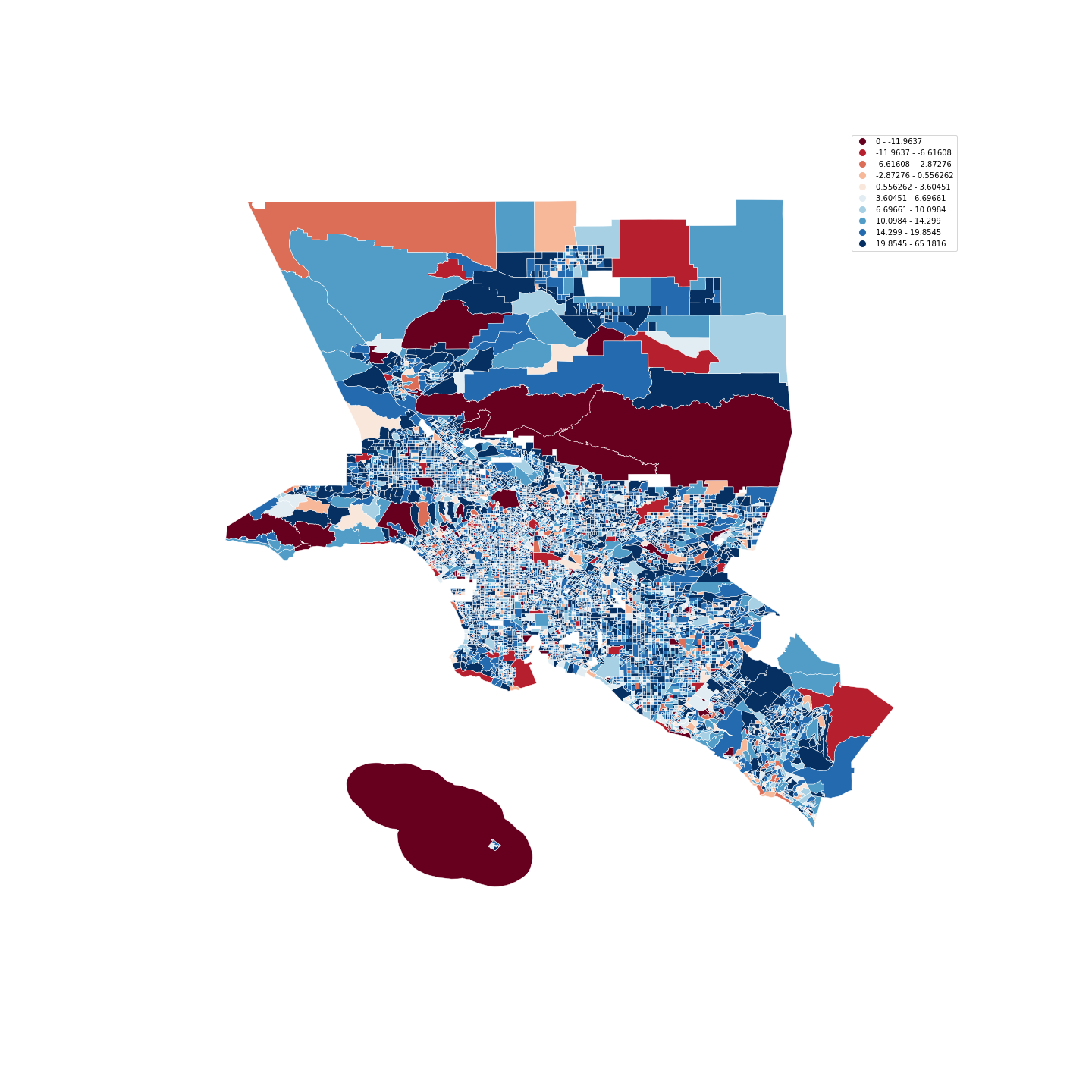
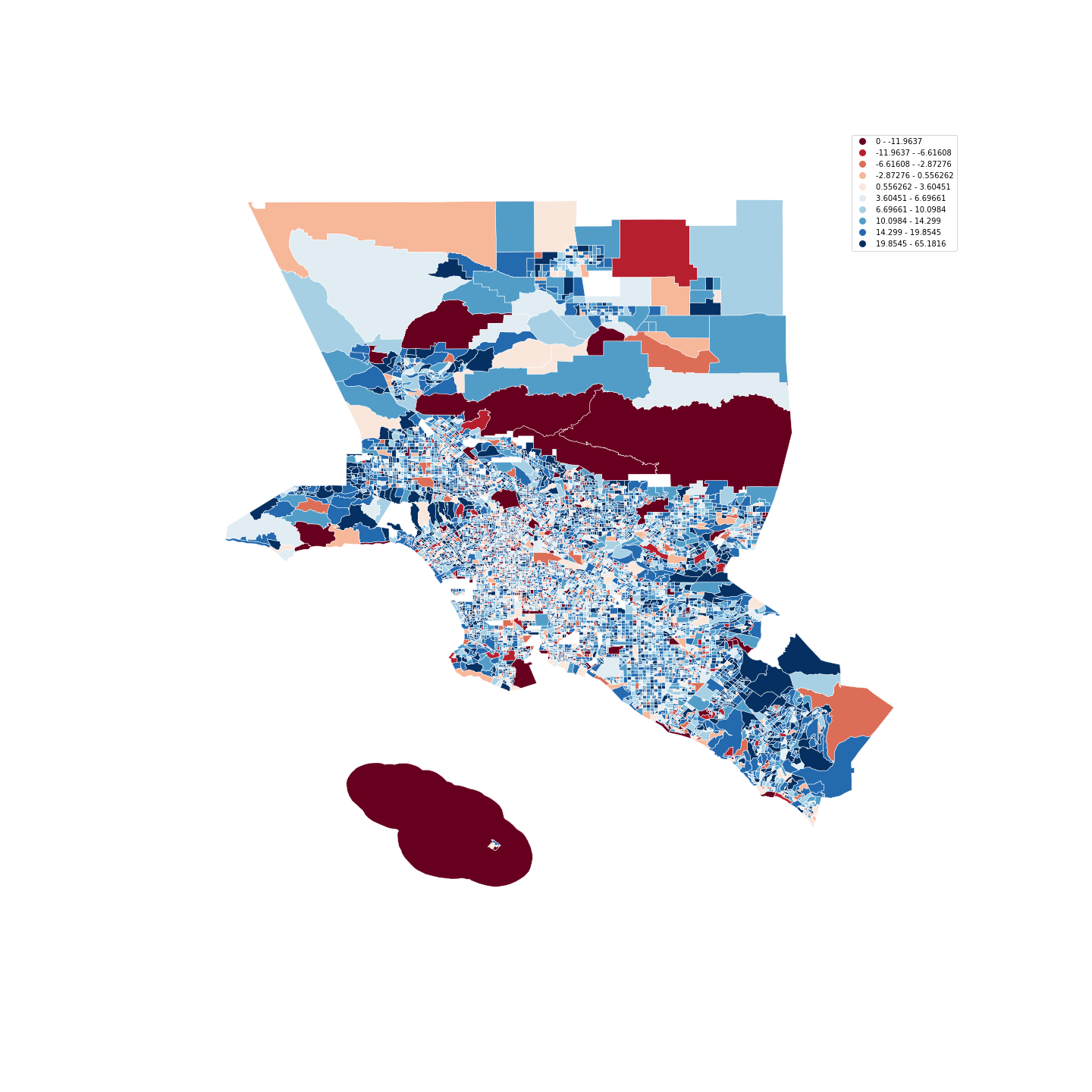
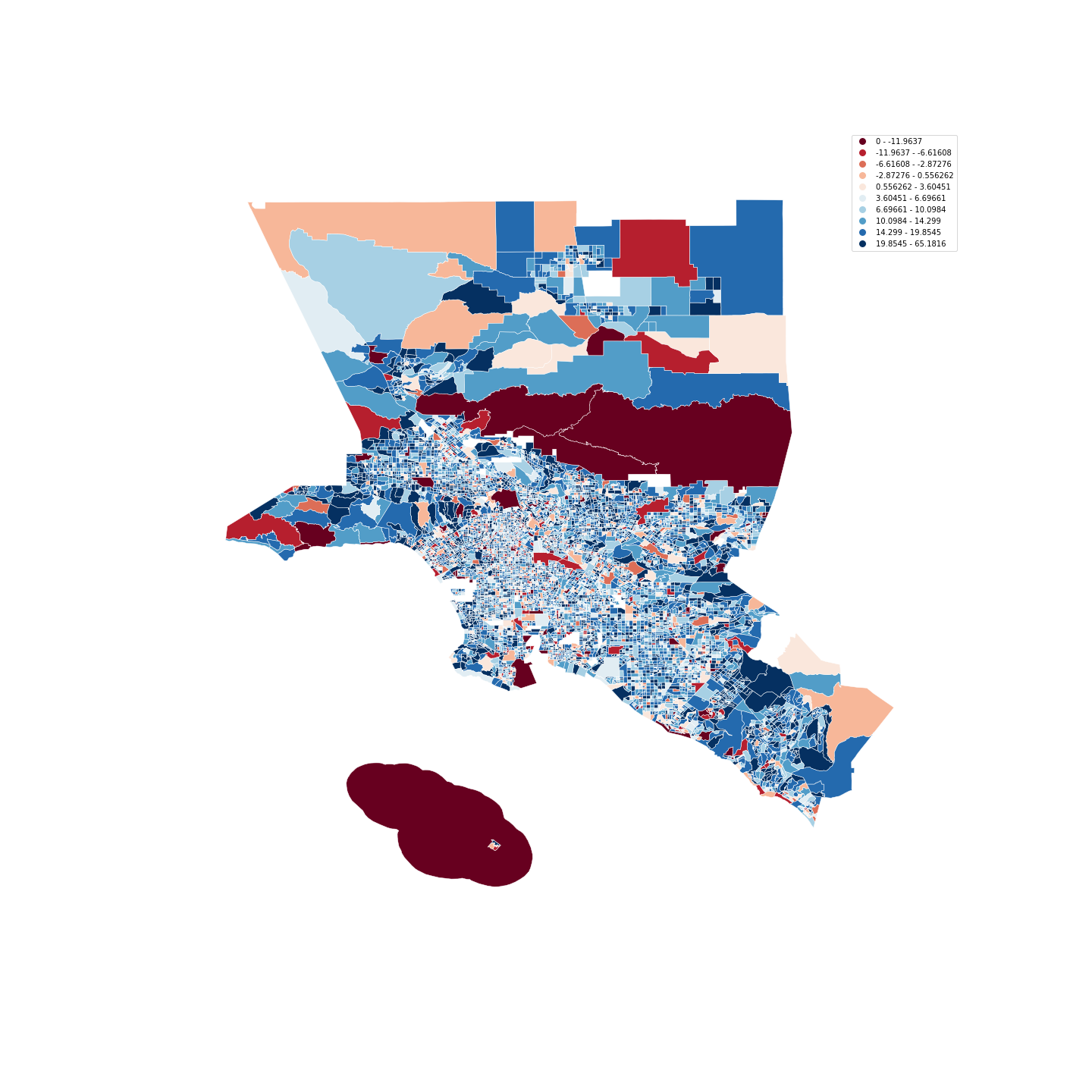
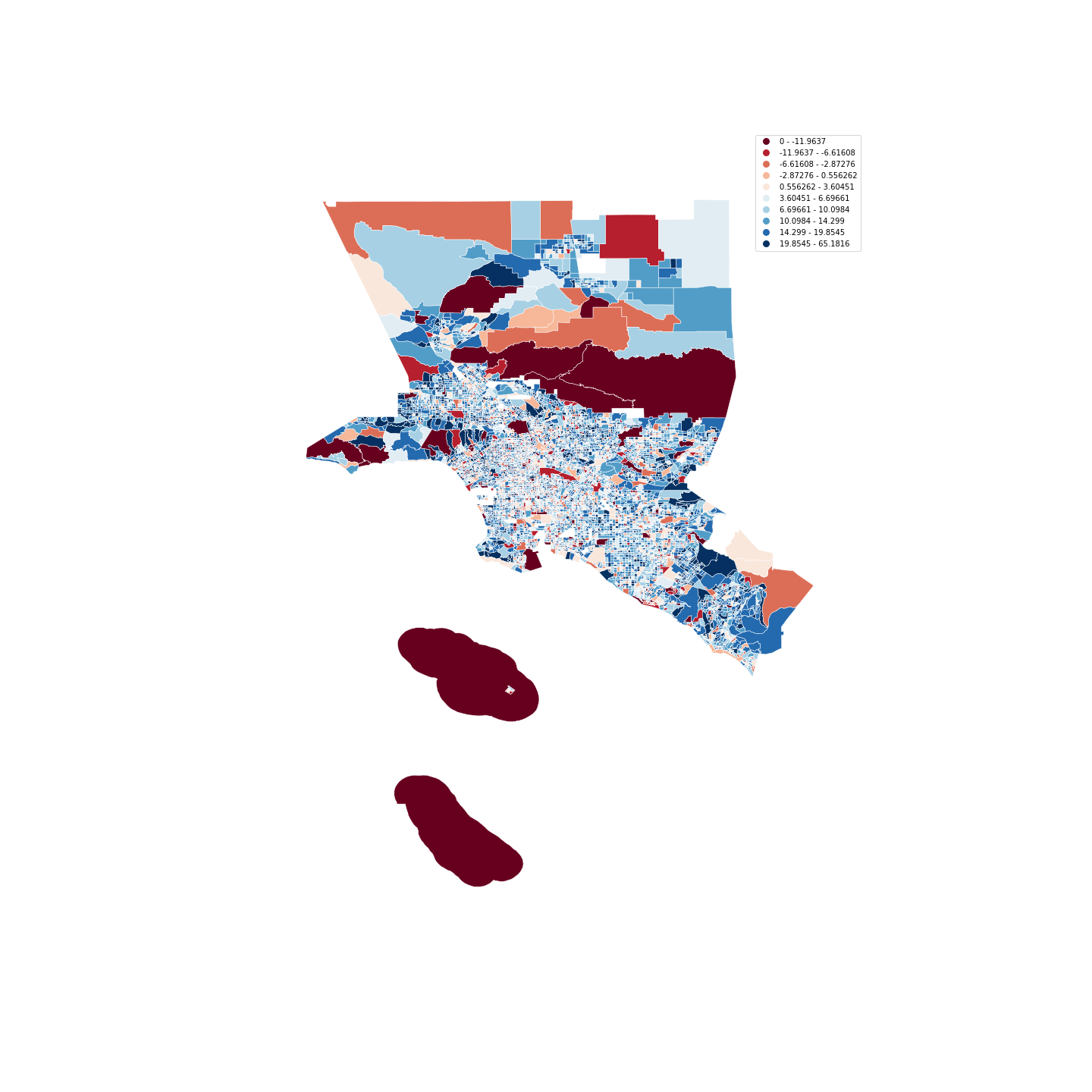
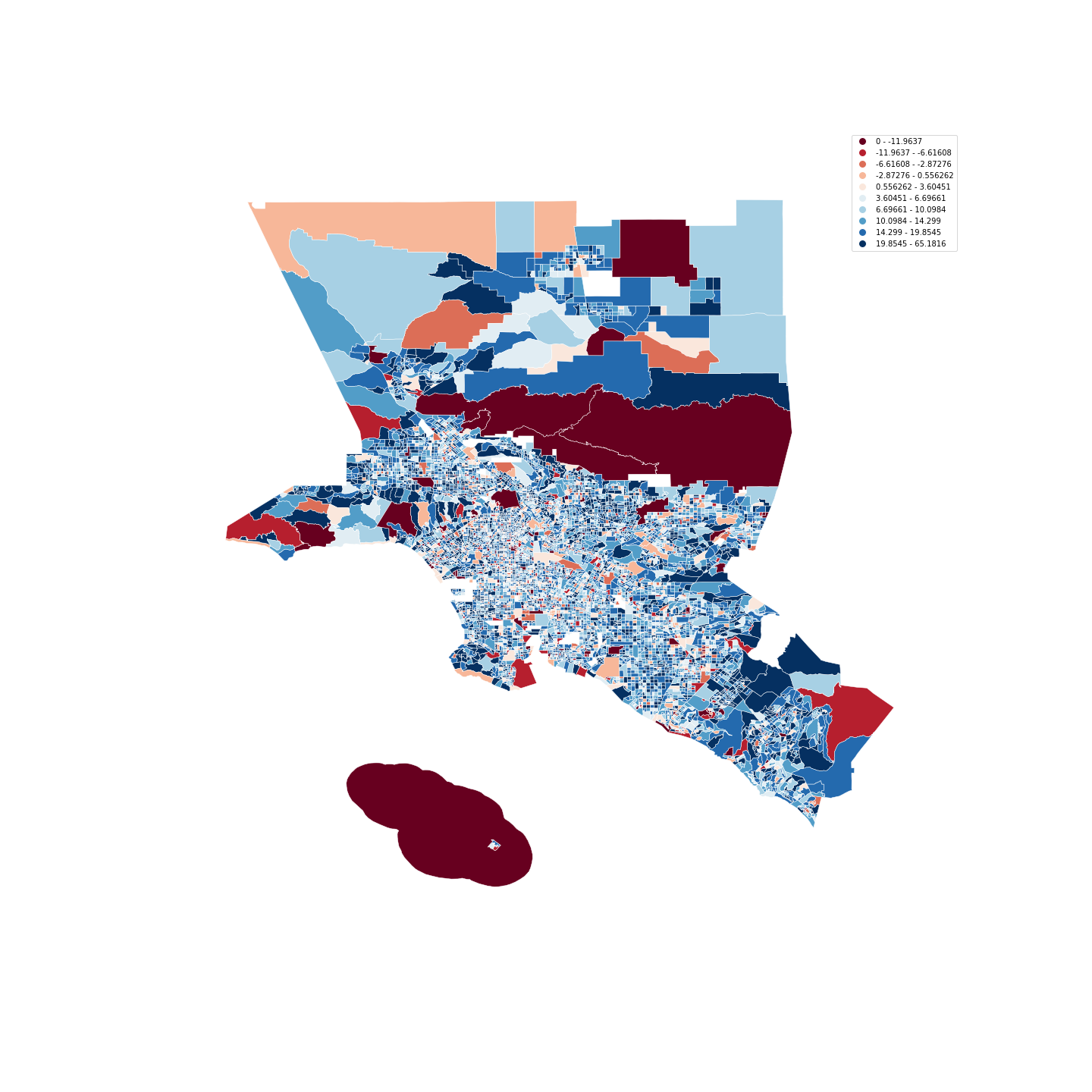
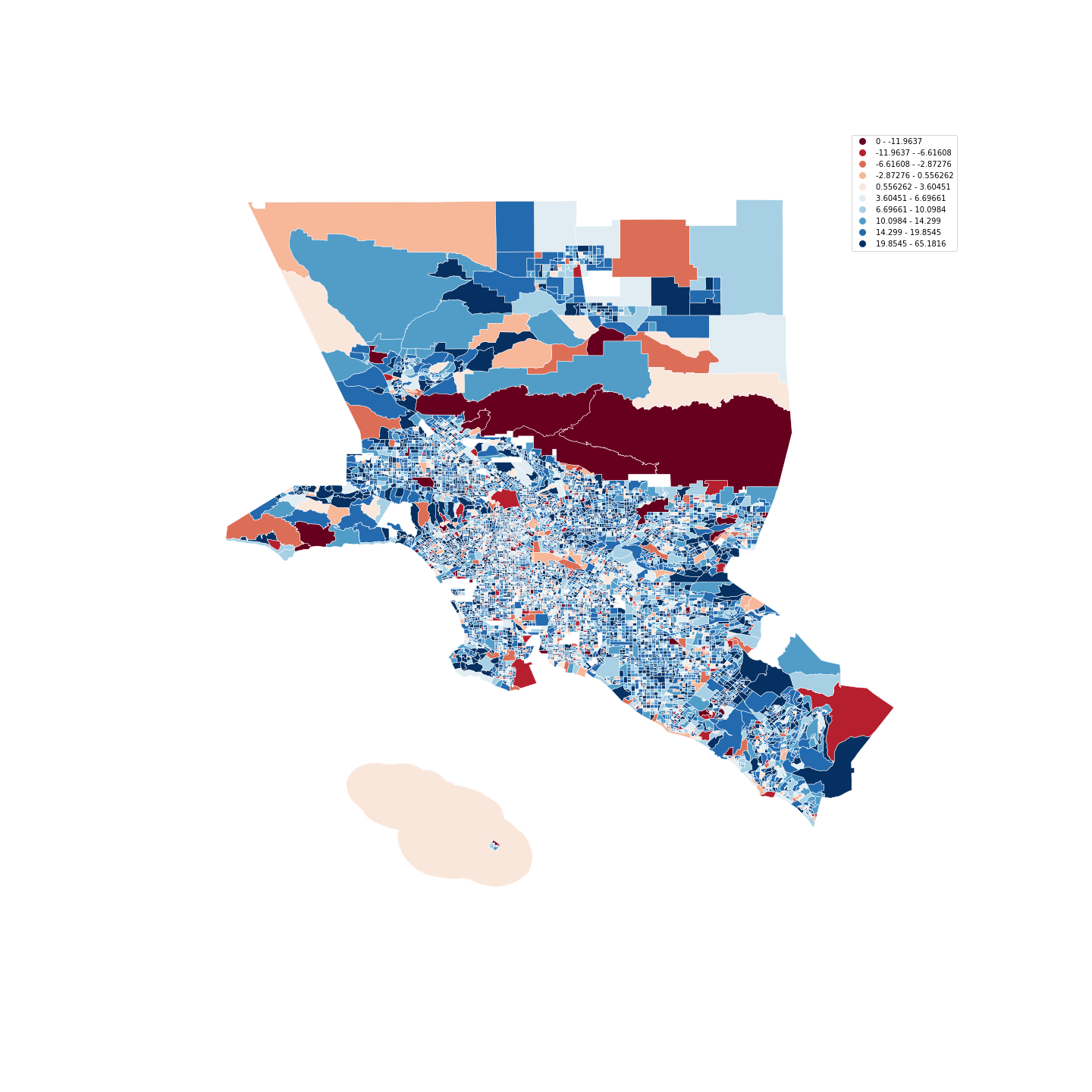
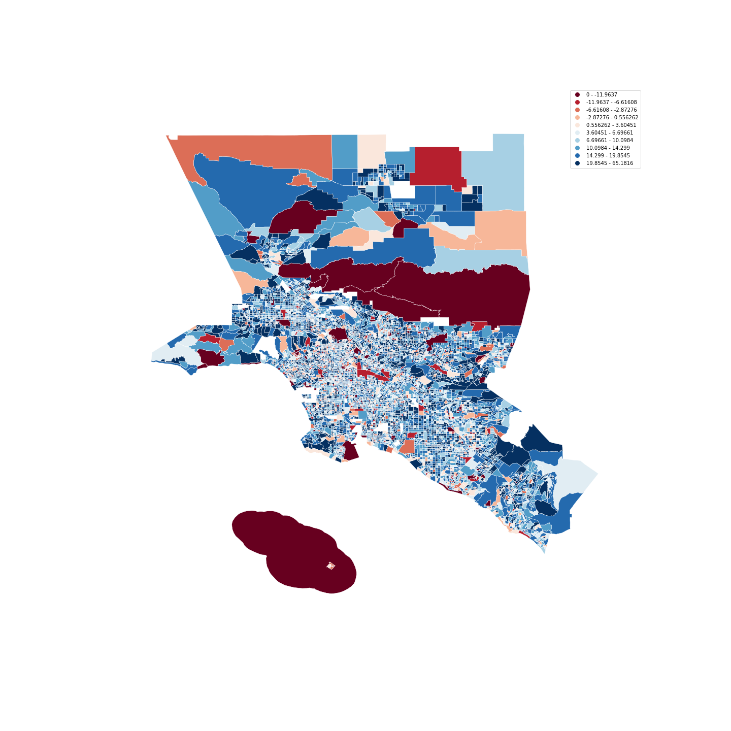
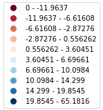
We plotted the map of Chicago, LA and New York for each day of 2020. The color of the CBG is set by the 2020 stay at home percentage deviation from the 2019 mean. A deep red represents over a 12% or more drop in the number of people at home from the 2019 mean. A deep blue represents an 11% or larger increase from the 2019 mean. 2020 up through the month of March starts out primarily red with a lot of activity. A relatively large percentage of people are out and not at home, especially during the weekdays. In all three cities we see a clear shift in behavior the days of March 14th, 15th and 16th. Monday, March 16th marked the first weekday we see a large number of people staying at home from work. Then, throughout the second half of March we see the majority of all three cities transition to a deep blue as many people stay at home. However, in all three cities you can still see deep red CBGs that are not staying at home.
In Chicago, we see that the wealthiest people stayed at home significantly more than the poorest people for the entire period from March to June. In Chicago the values for the wealthy and the poor areas both begin to increase at the same time. The two lines sometimes track closely together. The CBGs with the greatest levels of poverty have a substantially larger percentage of the population not staying at home when compared with the CBGs having the lowest levels of poverty. From March 17 the two lines deviate. We commonly see 10% less of the population at home and sometimes up to 20%. Despite the mobility disparity, the wealthiest and poorest areas fully at home percentage values tend to track more closely than in the other cities, usually within about 5%. Part of the reason the groups track closely together is Chicago does not increase the stay at home percentage as much as New York and Los Angeles. The Chicago mean daily fully at home percentage peaks below 50%. We tracked down the dates of the major announcements related to lock downs in Chicago in 2020, and analyzed their effect in the people's mobility.[11]
In the Los Angeles at fully at home percentages we see a large mobility disparity between the behavior of the areas with the highest and lowest levels of poverty. Areas with low poverty rapidly changed their behavior in March and April increasing the fully at home percentage of the population by almost 30%. However, we do not see the areas with low poverty making a substantial change in behavior for over a month and a half. The delay in changed behavior may have contributed substantially to the increased exposure of the poor to possible infection. In no other cities do we see such a slow response. While the wealthiest areas reach a peak stay at home percentage, the poorest have about 20% more of their population not staying fully at home. However, in May they is a rapid increase in the number of people in poor areas staying home that allows the two groups to predominantly converge on similar values.
In Los Angeles, the Governor imposed stay at home restrictions on March 19 but we already see an existing gap in mobility between the areas with the highest and lowest poverty levels. The gap remains the same throughout March and further in summer. During the second half of 2020, we see that the gap between the two groups minimizes but by the end of the year, it is evident from the visualisation that the difference in the mobility increases again.
The poorest areas in New York also have a delayed response, but the delay is shorter than we see in Los Angeles. The poorest areas took an additional 2 week to match the response of the rich when individuals began to stay home in March in New York. However, the poorest areas daily fully at home percentage stays 5% to 15% below the wealthiest for most of 2020. The mobility disparity is clear. In neither of the other two cities do we see such a sustained difference between the two groups.
In New York, there is a significant drop in the stay-at-home percentage in the CBGs with the poorest population from March 9. The areas with the richest population on the other hand continuously increased their stay at home percentage and the gap between the two groups remained throughout the year. Following the month of March, the CBGs with the wealthiest population maintained their stay at home over 25% in March- April and above 15% later during summer. The CBGs with the poorest population show many irregularities in their behavior. We see that they stayed at home during the weekends but often during the weekdays they do not stay at home despite the lockdown impositions becoming stricter with time [7].
The wealthiest areas in all three cities decrease the amount of the population commuting to full-time and part-time in mid-March. Then, they all maintain the low mobility throughout the rest of the year with only a slight gradual increase. The poorest areas in all three cities did not change their behavior in such a complete and consistent way. In all three cities the poor often leave home to go to work in larger numbers than those in more wealthy areas.
In Chicago, we see an inversion of the work behavior of the those with the greatest levels of poverty and those with the least. We see the behavior of the wealthy and the poor tracking more closely together than in New York and Los Angeles.
Unlike Chicago and New York, in Los Angeles the areas with the highest levels of poverty do not show a drastic decrease in full-time work in March and April. In fact the poorest areas show an increase in full-time work during all of 2020, including March and April. During the same period the wealthiest areas are steeply decreasing their commuting to work behavior. Even the average commuting to work behavior in all cities, including LA, shows a steep decline during this period. The poor areas in Los Angeles are initially low, often around 2%-3%, which may explain the lack of downward change. Perhaps the wealthy avoiding in-person work and many in poor areas not having work contributed to the increasing at-work numbers we see in Los Angeles through 2020.
The part-time work behavior the poorest areas does decline in March. However, the magnitude of the change is small in comparison with the radically changing behavior of the wealthy. Furthermore, the poorest areas are back to high percentages of at-work patterns of behavior by August of 2020.
The lack of rapid change in the fully at home home percentage among those living in poor areas is partly explained by the lack of substantial change in part-time work behavior and the increase in at-work behavior. We see a steep increase in the number of fully at home people at the end of April. At the same time full-time work is increasing steeply and part-time work is relatively stable. April is when the first round of stimulus checks went out, which may have been a major contributing factor to allow the increased at home percentage. Especially since full-time work is increasing at the same time.
In New York, wealthy people went out for full-time work more than the poor people, but this trend inverts sharply during March. Furthermore, we see that during subsequent months, there are some time periods when rich people go out more than the poor. However, these time periods are very rare and it is mostly poor people who couldn't avoid going out for work. In fact, there are big peaks in the trends for poor people on some weekdays. This directly implies that while rich people were able to continue their jobs from home, poor people do not have the luxury to do the same. A similar observation can be made for the part-time work behavior. Both the groups increase their participation in the part-time work increases during weekdays and decreases during weekends, but until December it is mostly poor people that go out of home for part-time. Only until December, we see both the groups leaving homes for their respective jobs.
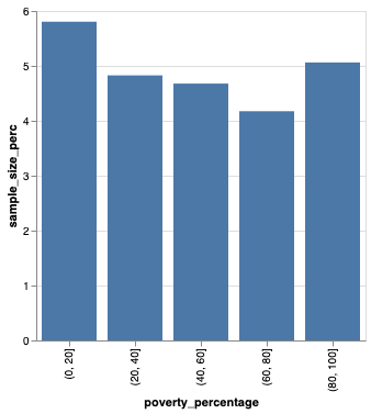
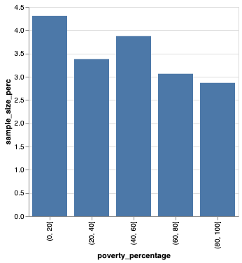
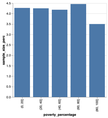
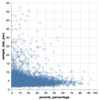
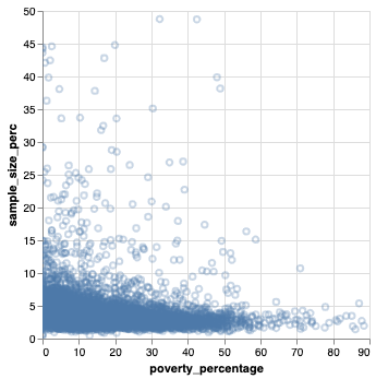
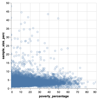
We divided the average number of devices by the population size in each census block group, which was multiplied by a 100 to get the percentage of the population included in the SafeGraph Social Distancing in each census block group. We found in Chicago and Los Angeles the areas with the least poverty have a larger sample percentage than those with more poverty. In New York the sample percentage is smaller for the areas with the highest poverty.
New York was most able to reduce their fully at home percentage peaking at 55%, followed by Los Angeles peaking around 50%. Chicago's population shows the least amount of change in their fully at home percentage peaking below 50%. Chicago has the most unified response, both the wealthiest and the poorest census block groups often stay with 5% of each other throughout 2020.
New York shows the most consistent mobility disparity where the poorest areas have a fully at home percentage 5% to 15% below the wealthiest areas for most of 2020. In New York the disparity is also apparent in the working patterns. The areas with the most poverty have full-time and part-time that often rises 5% to 10% above the wealthier areas. The wealthier areas on the other hand had a very stable low value with none of the erratic increase seen with the poor.
The disparity between the areas with high and low poverty plays out differently in Los Angeles. While the wealthy immediately and drastically change their stay at home behavior in mid-March the poorest areas do not see a substantial increase for a full month and a half. Only in May did the poorer areas begin to change their behavior and stay at home in larger numbers. In Los Angeles we see another surprising event. The areas with high poverty actually increase their at-work behavior throughout most of the year, peaking after a 4% increase in September. The striking increase in mobility above the baseline moves counter to the behavior in Chicago and New York. Also, the increase in mobility moves counter to the wealthy areas in Los Angeles, which reduce their at-work behavior starting in March and lasting through the rest of 2020.
Out of all three cities Chicago had the largest mean percentage of the population included in the sample when compared with Los Angeles and New York.
We found a bias in the percentage of the population sampled in the SafeGraph Social Distancing data relative to the amount of poverty in the census block group. In all three cities higher areas with higher poverty had a lower percentage of the population included in the sample. In Chicago and Los Angeles areas with the least poverty, 0% to 20% of the population in poverty, had the largest percentage of the population of the included. All areas with higher poverty, 20% to 100% of the population in poverty, the percentage of the population included in the sample is lower. In New York the areas with 80% to 100% of the population in poverty have a lower percentage of the population included in the sample than all other areas. We should be careful about the assumptions we make when using data such as cell phone data. It is possible for some groups to be overrepresented and other to be left out all together.
The SafeGraph data is of high quality. As a result, our comprehensive data quality study found no major issues. The Census Block Group data was unique, all the values were found to fall within the expected range and there were no null values.
The datasets are huge and require a lot of computational time. The data extraction process can be run on a modest machine, but very slowly. Especially the very large SafeGraph Social Distancing dataset, which can take two hours to extract the data for just one city. However, after the extraction process loading data for one year of one city into memory only takes 15 minutes. Once in memory exploration and analysis can be performed quickly.
Using Google Colab with Google Drive the data can be extracted from the raw data set. However, occasionally the Google API call limit is reached. The issue only occurred when extracting the very large SafeGraph Social Distancing dataset. When the API limit is reached we found that closing all notebooks and waiting 24 hours allowed us to finish running the extraction notebooks.
The semantics of working with the Census data is not very intuitive. You must understand the FIPS code system, which is the primary method used for encoding the geological entities throughout the United States. The ACS columns naming system is not intuitive. In addition, the column descriptions in the documentation are not always easily understood either. Fortunately, the ACS documentation is very rigorous and there are many resources online to provide additional instruction on how to work with Census data. In addition, once you figure out the semantics and structure of the data there is very little cleaning to do because the quality of data is very good.
We anticipated a spike in the number of individuals staying at home starting in March due to many factors, including the issuing of stay at home orders. Inversely, we expected to see the number of people exhibiting part-time and full-time work behavior decline in March. We visualized the mean percentage values for each of these three attributes for each of the three cities in our study. The line graphs conform to our expectations, which gives us confidence in the data. In comparison, the line graphs of 2019 show gradual change
We see an unmistakable increase in the percentage of individuals staying at home in March of 2020. The average for all three city moves spikes up approximatly 20% in all three cities from the begining to the end of March. A drastic change in the number of people leaving home for full-time and part-time work occurs at the same time.
| 2020 Rolling 10 Day Average | ||
|---|---|---|
 |
 |
 |
| New York City | Los Angeles | Chicago |
| 2020 Rolling 10 Day Average Stay At Home Percentage Deviation from 2019 Mean | ||
|---|---|---|
 |
 |
 |
| New York City | Los Angeles | Chicago |
| Mean percentage staying home grouped by percentage of the population below the poverty line | ||
|---|---|---|
  |
  |
  |
| New York City | Los Angeles | Chicago |
| Comparison of mobility between the wealthiest and poorest groups for 2020-Completely Home Percentage |
|---|
|
Chicago
|
|
New York
|
|
Los Angeles
|
| Comparison of mobility between the wealthiest and poorest groups for 2020 - Full Time Work Percentage |
|---|
|
Chicago
|
|
New York
|
|
Los Angeles
|
| Comparison of mobility between the wealthiest and poorest groups for 2020 - Part Time Work Percentage |
|---|
|
Chicago
|
|
New York
|
|
Los Angeles
|
During the month of March we can see the majority of Census Group Blocks go from a below average number of people at home, signified by a dark red, to many more people than average staying at home, signified by a dark blue.
Chicago Timeline
|
||||||
|---|---|---|---|---|---|---|
| First Week of March 2020 | ||||||
 |
 |
 |
 |
 |
 |
 |
| Second Week of March 2020 | ||||||
 |
 |
 |
 |
 |
 |
 |
| Third Week of March 2020 | ||||||
 |
 |
 |
 |
 |
 |
 |
| Fourth Week of March 2020 | ||||||
 |
 |
 |
 |
 |
 |
 |
|
2020 stay at home percentage deviation from the 2019 mean
|
||||||
| Chicago // Mondays in March, 2020 | ||||||
|---|---|---|---|---|---|---|
 |
 |
|||||
| 2020-03-02 | 2020-03-09 | |||||
 |
 |
|||||
| 2020-03-16 | 2020-03-23 | |||||
|
2020 stay at home percentage deviation from the 2019 mean

|
||||||
| Chicago Timeline |
|---|
|
Thursday, March 12, 2020
|
|
Tuesday, Mar 17, 2020
|
|
Friday, Mar 20, 2020
|
| New York City Timeline | ||||||
|---|---|---|---|---|---|---|
| First Week of March 2020 | ||||||
 |
 |
 |
 |
 |
 |
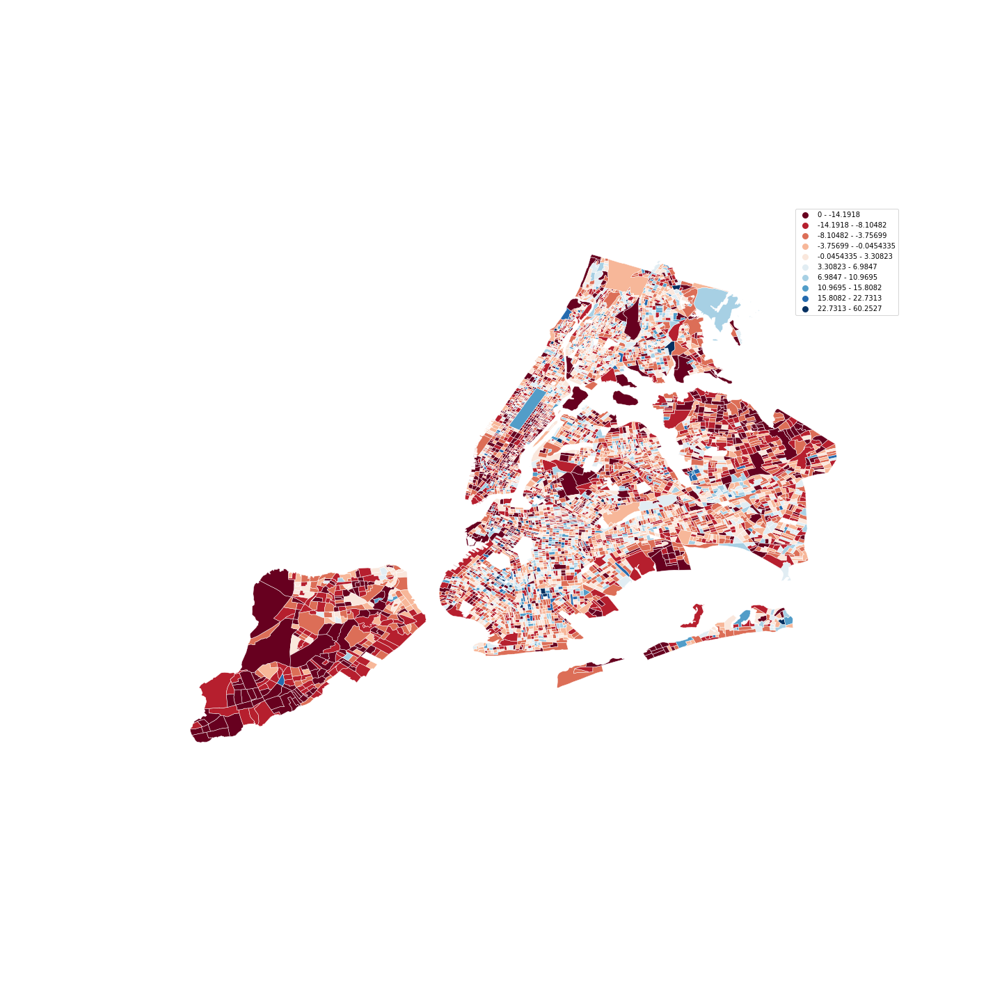 |
| Second Week of March 2020 | ||||||
 |
 |
 |
 |
 |
 |
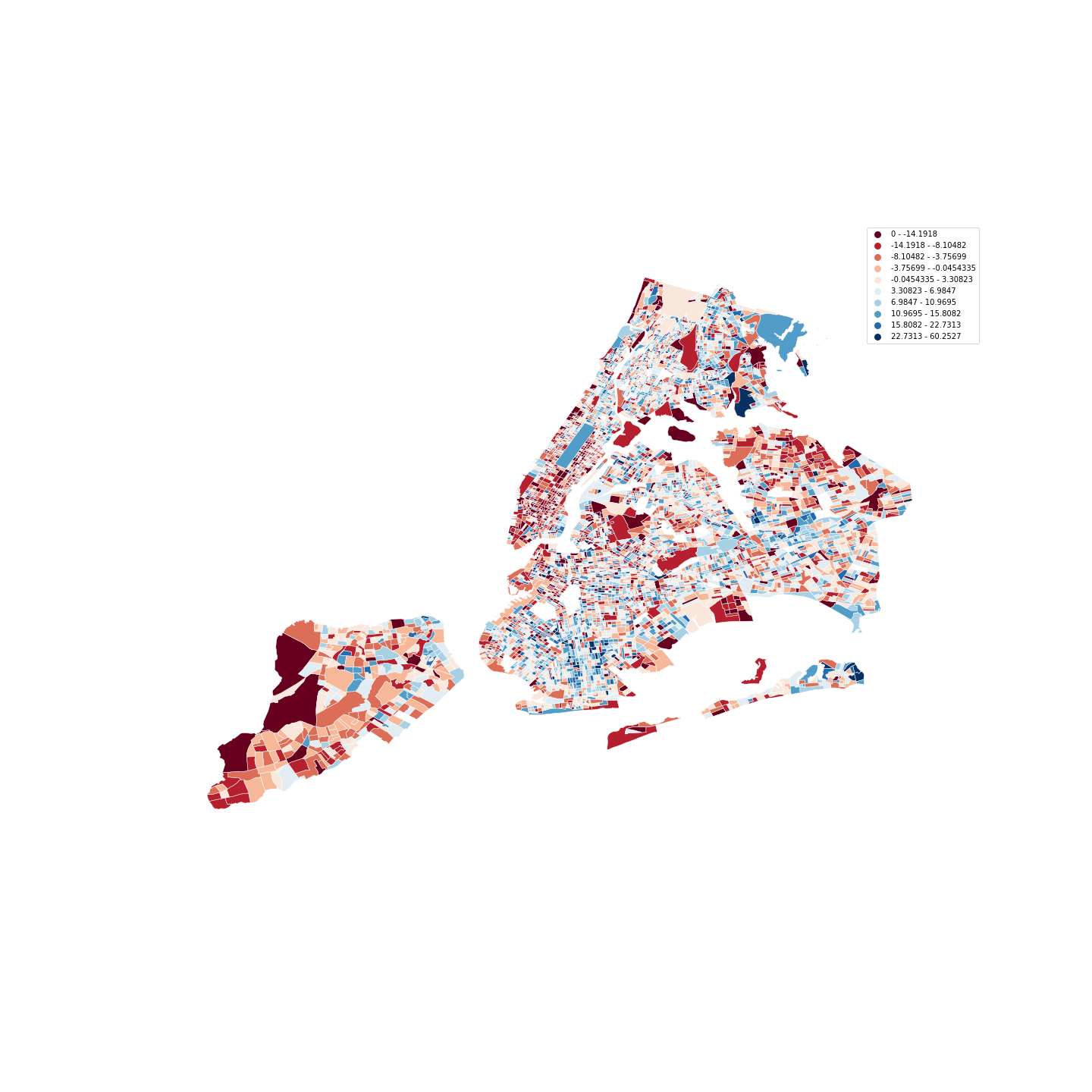 |
| Third Week of March 2020 | ||||||
 |
 |
 |
 |
 |
 |
 |
| Fourth Week of March 2020 | ||||||
 |
 |
 |
 |
 |
 |
 |
|
2020 stay at home percentage deviation from the 2019 mean
|
||||||
| New York City // Mondays in March, 2020 | ||||||
|---|---|---|---|---|---|---|
 |
 |
|||||
| 2020-03-02 | 2020-03-09 | |||||
 |
 |
|||||
| 2020-03-16 | 2020-03-23 | |||||
|
2020 stay at home percentage deviation from the 2019 mean

|
||||||
| New York Timeline |
|---|
|
Friday, March 6, 2020
|
|
Friday, March 7, 2020
|
|
Saturday, March 8, 2020
|
|
Saturday, March 14, 2020
|
|
Sunday, March 15, 2020
|
|
Monday, March 16, 2020
|
|
Tuesday, March 17, 2020
|
|
Sunday, March 22, 2020
|
| Los Angeles Metro Area Timeline | ||||||
|---|---|---|---|---|---|---|
| First Week of March 2020 | ||||||
 |
 |
 |
 |
 |
 |
 |
| Second Week of March 2020 | ||||||
 |
 |
 |
 |
 |
 |
 |
| Third Week of March 2020 | ||||||
 |
 |
 |
 |
 |
 |
 |
| Fourth Week of March 2020 | ||||||
 |
 |
 |
 |
 |
 |
 |
|
2020 stay at home percentage deviation from the 2019 mean
|
||||||
| Los Angeles Metro Area // Mondays in March, 2020 | ||||||
|---|---|---|---|---|---|---|
 |
 |
|||||
| 2020-03-02 | 2020-03-09 | |||||
 |
 |
|||||
| 2020-03-16 | 2020-03-23 | |||||
|
2020 stay at home percentage deviation from the 2019 mean

|
||||||
| Los Angeles Timeline |
|---|
|
Wednesday, March 11, 2020
|
|
Monday, March 16, 2020
|
|
Thursday, March 19, 2020
|
|
Friday, March 20, 2020
|
|
Sunday, March 22, 2020
|
| Mean percentage of the population included in the sample | ||
|---|---|---|
 |
 |
 |
 |
 |
 |
| Chicago | Los Angeles Metro Area | New York Metro Area |
In this repository we provide computational reproducibility for our findings. Detailed instructions on how to secure the same raw input data are provided below in the Data Sources and Data Acquisition sections. We have also prepared a shared private Google Drive to be used by the research team, TAs, and professor Freire. Please reach out to the research team if you do not have the login credentials. While all data used is available for academic researchers to use, the SafeGraph data requires an agreement that we do not make the data public ourselves.
The SafeGraph and NYTimes COVID data includes information on counties outside the 3 metropolitan areas of New York, Los Angeles, and Chicago. So the first step is to extract just the rows for our three cities. Also, we needed to select just the relevant subset of columns from each dataset. Detailed instructions on the process are provided in the Data Extraction section below.
We also provide jupyter notebooks for each step of the extraction process, allowing complete computational reproducibility. The NYTimes COVID data extraction notebook is here. The SafeGraph Census data extraction notebooks are here. The SafeGraph Social Distancing data extraction notebooks are here.
A word of warning, both Google Colab and Google Drive enforce API call quotas. If you receive an OS IO error you have likely reached your quota on API calls. In our testing we have always found closing all notebooks and letting 24 hours pass was sufficient to reset the Google Drive and Google Colab API quotas. Once the API quotas are reset we have always been able to run the notebooks successfully. Alternatively, you can download the data and code to run on your own machine. All code has been tested on a MacBook Pro with a 2.6 GHz Quad-Core Intel Core i7 with 16 GB of memory.
Once you have extracted the needed data we are ready to verifiy the data is clean. Fortunately the data sources we are using are of a high quality. So in our case the data cleaning process if more of a data quality verification process. You can read about all the data verification steps we cary out in the Data Cleaning section below.
For simplicity sake, the NYTimes COVID cleaning steps are in a single notebook with the extraction steps here. Also, for simplicity the SafeGraph Census data cleaning notebooks are also combined with the extraction notebooks here.
Finally, you can find all of the SafeGraph Social Distancing notebooks here. The SafeGraph Social Distancing set cleaning notebooks are not combined with the cleaning notebooks due to the large size of the dataset. So be sure to run the SafeGraph Social Distancing extraction notebooks from the above step 2 first. The SafeGraph Social Distancing Cleaning notebooks are broken up by city and year.
There are a series of notebooks used to extract, clean and visualize the data. The notebooks are organized by the dataset, city, and year. Click on the Colab badge to open the notebook directly in Google Colab. Below each badge is the Github link where you can download the notebook file. The notebooks need to be run in the order listed here. Each notebook depends on the files output by many of the previous notebooks.
Extract Chicago from Social Distancing.ipynb
Extract LA from Social Distancing.ipynb
Extract New York from Social Distancing.ipynb
Extract Chicago from Social Distancing Spark.ipynb
Extract LA from Social Distancing Spark.ipynb
Extract New York from Social Distancing Spark.ipynb
-
Analysis CH Compare 2019 with 2020 Social Distancing Dataset.ipynb
-
Analysis NY Compare 2019 with 2020 Social Distancing Dataset.ipynb
-
Analysis LA Compare 2019 with 2020 Social Distancing Dataset.ipynb
-
Analyse CH Compare Completely Home Percentage For Wealthiest And Poorest.ipynb
-
Analyse CH Compare Full Time Work Percentage For Wealthiest And Poorest.ipynb
-
Analyse CH Compare Part Time Work Percentage For Wealthiest And Poorest.ipynb
-
Analyse LA Compare Completely Home Percentage For Wealthiest And Poorest.ipynb
-
Analyse LA Compare Full Time Work Percentage For Wealthiest And Poorest.ipynb
-
Analyse LA Compare Part Time Work Percentage For Wealthiest And Poorest.ipynb
-
Analyse NY Compare Completely Home Percentage For Wealthiest And Poorest.ipynb
-
Analyse NY Compare Full Time Work Percentage For Wealthiest And Poorest.ipynb
-
Analyse NY Compare Part Time Work Percentage For Wealthiest And Poorest.ipynb
We propose to use the SafeGraph COVID-19 Response Social Distancing Metrics[4], The SafeGraph Demographic American Survey Census Data[3], and The New York Times COVID-19 Data. [5] We have verified all three datasets are available to researchers, secured access to, and downloaded the datasets.
The SafeGraph COVID-19 Response Social Distancing Metrics [4] schema can be viewed online at https://docs.safegraph.com/docs. The dataset is organized by Census Block and includes mobility statistics generated from cell phone data such as median distance travel from home, completely at-home device count, full-time work behavior, and many more mobility aggregate statistics.
The SafeGraph Demographic American Survey Census [3] schema can be viewed online at https://docs.safegraph.com/docs/open-census-data. The dataset is organized by Census Block and contains demographic information, including statistics about race, household income, and poverty.
The New York Times COVID-19 Data [5] can be accessed online at https://github.com/nytimes/covid-19-data. The dataset contains reported daily COVID cases and deaths organized at the Country, State, and county levels.
Description: The New York Times COVID-19 Data can be accessed online at https://github.com/nytimes/covid-19-data. The dataset contains reported daily COVID cases and deaths organized at the Country, State, and county levels.
Data Source: https://github.com/nytimes/covid-19-data
Data Schema: https://github.com/nytimes/covid-19-data
The New York Times COVID-19 data can easily be downloaded directly from the Github repository at https://github.com/nytimes/covid-19-data. We are using the us-counties.csv file for county level daily case and death counts. The CSV file was about 46 MB, a manageable size.
Description: Due to the COVID-19 pandemic, people are currently engaging in social distancing. In order to understand what is actually occurring at a census block group level, SafeGraph is offering a temporary Social Distancing Metrics product. The SafeGraph COVID-19 Response Social Distancing Metrics schema can be viewed online at https://docs.safegraph.com/docs. The dataset is organized by Census Block and includes mobility statistics generated from cell phone data such as median distance travel from home, completely at-home device count, full-time work behavior, and many more mobility aggregate statistics.
Social Distancing Metrics Data Source: https://www.safegraph.com/covid-19-data-consortium
Social Distancing Metrics Data Schema: https://docs.safegraph.com/docs
Includes: COVID-19 Response Social Distancing MetricsDates: January 1, 2019, to present
Attributes:
- Number of devices
- Median distance travelled from home
- Completely home device count
- Median home-dwelling time
- Part-time work behavior
- Full-time work behavior
- Destinations (POI visited)
- many more...
The SafeGraph Social Distancing Metrics file size was 81 GB at the time of our download. The file includes daily aggregate data for each CBG for all of 2019, 2020, and the beginning of 2021.
The SafeGraph Census Block Group Data was 10 GB. The file includes the American Community Survey (2016) 5-year estimate on the Census Block Group level.
Steps to Download the Data:
- Step 1: Create an account at https://www.safegraph.com/covid-19-data-consortium. Those with academic NYU email address can register for free.
- Step 2: Follow the instructions and sign the legal document received in the email mentioning we should not release the data to the public and use it only for research/project purposes.
- Step 3: Open the links provided for the various datasets mentioned above including the Social Distancing Metrics and Census Block Group Data.
- Step 4: Download and Install AWS CLI using this link: https://docs.aws.amazon.com/cli/latest/userguide/install-cliv2.html
- Step 5: Click the “Reveal Access Key” button present on the SafeGraph data screen.
- Step 6: Complete the setup displayed on the screen after revealing the access key.
- Step 7: Go back to the dataset page and select the menu option “CLI”.
- Step 8: Run the command with the local directory to complete the downloading process.
Census Data Source: https://www.safegraph.com/open-census-dataData
Census Data Schema: https://docs.safegraph.com/docs/open-census-data
Census Data Guide: https://www.safegraph.com/blog/beginners-guide-to-census
Description: The SafeGraph Demographic American Survey Census Data schema can be viewed online at https://docs.safegraph.com/docs/open-census-data. The dataset is organized by Census Block and contains demographic information including statistics about race, household income, and poverty.
Includes:
- All demographic data from the American Community Survey (2016) 5-year estimate on the Census Block Group level.
- All census block group boundaries formatted as a GeoJSON file.
Steps to Download the Data: Same as the SafeGraph Social Distancing Metrics above.
A FIPS code is a number that uniquely identify a specific geographic area. Each Census Block Group (CBG) is represented by a 12 digit FIPS code. The first two digits of a FIPS code represents the state. The next three digits represent the county. Then, six digits give the Census Tract. Our final digit is the block group. Knowing the FIPS codes for the counties in a given metropolitan area allows us to extract the rows we need and leave the other behind.
The New York Times COVID-19 file us-counties.csv has a FIPS column. After loading the file into a dataframe using Pandas we filter out just the rows with FIPS matching the counties in the metro areas. The result allowed us to get all the relevant row for the counties of Los Angeles and Chicago.
Filtering for the New York FIPS counties returned no rows. Upon investigation we discovered ironically the New York Times does not maintain county level information for the counties of New York City. They just group all 5 counties of New York City together. Filtering for New York City in the county name column we were able to secure the city level cases and deaths for New York City.
SafeGraph provides a download of the 2016 American Community Survey (ACS) 5-year estimate on the Census Block Group level. We where able to filter out just the counties of the New York, Los Angeles, and Chicago Metro areas from the dataset one CSV file at a time using the FIPS code. We simply filter out CBGs where the first five digits of the CBG FIPS code matches a county from one of our 3 metro areas. Each row includes a Census Block Group that the row attributes describe. There are so many attributes in the ACS that the data is broken up into separate CSV files. The name of the file tells you want attributes are included in the file. Inside each file there is one row for each CBG.
We have extracted the following columns for all CBG in the three metro areas:
Column B01003e1: the total estimate population
Column B02001e2: the white only estimated population
Column C17002e1: the total population for whom poverty status is determined
Column C17002e2: the population for whom the ratio of income to poverty level in the past 12 month is under 0.5 from the population for whom poverty status is determined
Column C17002e3: the population for whom the ratio of income to poverty level in the past 12 months is between 0.5 to 0.99 inclusive from the population for whom poverty status is determined
To better make comparisons between CBGs we calculated the white only and poverty percentages for each CBG from the given population values. The CBG white only percentage is calculated using the standard formula where
is the white only population and
is the total population. The CBG percentage in poverty is calculated by
where
is the total population with income below the poverty level and
is the total population for whom the poverty status is determined.
The SafeGraph Social Distancing Metrics data is downloaded from AWS S3 storage to a local directory. The file structure provides the labels for the many separate gzip csv files. The folder structure pattern is: YYYY/MM/DD.gz. For instance, we have 12 folders representing each month i.e. from 01 to 12 in the “2019” folder, and in each of the folders a zipped file representing each day of the month were present. This was massive data that took us a significant amount of time to download.
There is one file for each day of 2019 and 2020. There are also daily files for the first few months of 2021. The data set is still being updated every day with about a 1 week lag time between when data is captured and when it is added to the data set.
We looped through all the files in the data set reading them into memory and keeping just the CBG rows from the 3 metro areas using the FIPS code column. For convenience once selected we save the filtered rows for each day to a csv file. Our new files follow a different format. The name of the file gives the year, month, and date by using the format YYY-MM-DD-social-distancing.csv and are all stored in a single directory for the entire year. For analysis we just read any needed daily data into memory by looping through the new filtered data files.
In addition to filtering the metro area rows, we have calculated several critical percentage values: the percentage of devices exhibiting part-time work behavior, percentage of devices exhibiting full-time work behavior, and percentage of devices exhibiting completely home status. Each of these percentages was taken using where
is the population exhibiting the behavior in the CBG and
is the total number of devices in the CBG.
Finally, for each of these three percentages we have also calculated the normalized value by using where
is the value to normalize,
is the mean, and
is the standard deviation.
In order to clean the data we have used Python, Pandas, and OpenRefine to take the following steps:
- Verify the dates fall between January 24th, 2020 and March 18th, 2021 using Pandas min and max function.
- We have verified the extracted rows only include the desired rows from the 3 metro areas using Pandas.
- We have verified all unique date and CBG combos have only one row by comparing the total number of rows to the number of unique combos. We found the count matches for all extracted data.
- Verify the cases and deaths are integer values as expected using the Pandas min and max function.
- We have verified there are no empty, Null or NaN values in the extracted data we are using.
In order to clean the ACS data we have used Python, Pandas, and OpenRefine to take the following steps:
- We have checked that each CBG is unique and is not duplicated.
- We have checked to make sure all percentages fall within the valid range from zero to a hundred using the Pandas min and max function.
- We have produced histograms for each attribute to verify the shape of the data and range of values are valid.
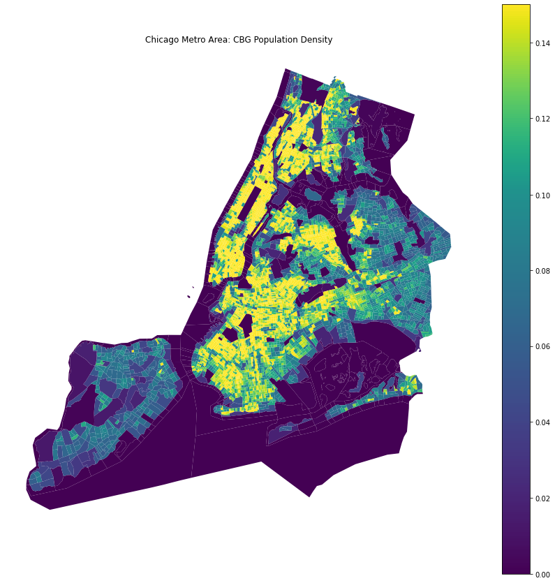
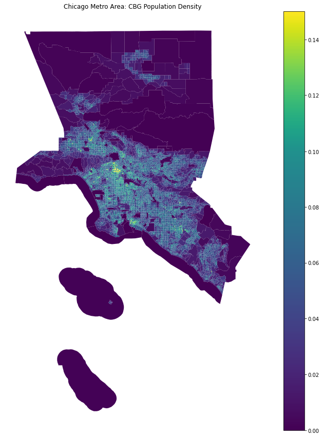
- We have visualized the CBG values on maps to give an intuition into the contents of the data and look for outliers.
- Using Pandas
.isnafunction we verified there are no empty, NaN, or Null entries in any of the Social Distancing CSV files.
| Census Block Group Population Density | ||
|---|---|---|
 |
 |
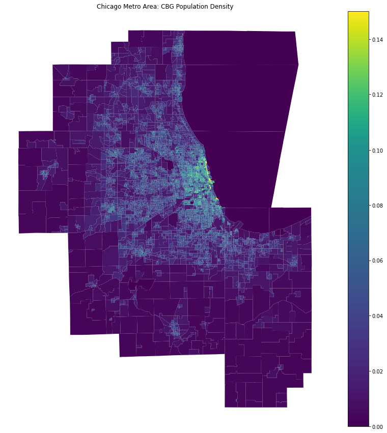 |
| New York City | Los Angeles | Chicago |
Clean CH 2019 Social Distancing Dataset.ipynb
Clean CH 2020 Social Distancing Dataset.ipynb
Clean LA 2019 Social Distancing Dataset.ipynb
Clean LA 2020 Social Distancing Dataset.ipynb
Clean NY 2019 Social Distancing Dataset.ipynb
Clean NY 2020 Social Distancing Dataset.ipynb
In order to clean Social Distancing data we have used Python, Pandas, and OpenRefine to take the following steps:
- OpenRefine we have checked for duplicate CBG on a subset of the hundreds of csv files. We found no duplicates in any files we checked.
- Using Pandas we checked the minimum and maximum date values to ensure all the dates fall within the expected time frame. We found no values outside the expected time frame for all Social Distancing CSV files.
- Using the Pandas max and min function we checked that all the percentage values fall within the expected range for all percentage columns. We found no values outside the expected range for all Social Distancing CSV files.
- Using the Pandas max and min function we checked that all integer data types fall within the expected range, which includes no negative values. We found no values outside the expected range for all Social Distancing CSV files.
- Using Pandas
.isnafunction we verified there are no empty, NaN, or Null entries in any of the Social Distancing CSV files. - For each city we visualized the mean daily and mean monthly values for all three percentage values percentage_completely_home, percentage_part_time_work, and percentage_full_time_work in both 2019 and 2020. All three cities show an increase in completely home individuals during 2020. There is also a visible decrease in part-time and full-time work behaviour in 2020. Given the documented decrease in mobility during 2020 these are the trends we expect to see.
Chang2021 [1] Serina Chang, Emma Pierson, Pang Wei Koh, Jaline Gerardin, Beth Redbird, David Grusky, and Jure Leskovec. 2021. Mobility network models of COVID-19 explain inequities and inform reopening. Nature 589, 7840 (01 Jan 2021), 82–87. https://doi.org/10.1038/s41586-020-2923-3
jung_manley_shrestha_2021 [2] Juergen Jung, James Manley, and Vinish Shrestha. 2021. Coronavirus infections and deaths by poverty status: The effects of social distancing. Journal of Economic Behavior & Organization 182 (2021), 311–330. https://doi.org/10.1016/j.jebo.2020.12.019
safegraph_acs [3] SafeGraph. 2016. Census Block Group Data. https://docs.safegraph.com/docs/open-census-data (All data from 2016 American Community Survey by Census Block Group).
safegraph_social [4] SafeGraph. 2021. Social Distancing Metrics. https://docs.safegraph.com/docs/social-distancing-metrics
nyt_covid_19 [5] The New York Times. 2021. Coronavirus (COVID-19) Data in the United States. https://github.com/nytimes/covid-19-data
nytimees_stayathome_richpoor [6] Denise Lu Jennifer Valentino-DeVries and Gabriel J.X. Dance. 2020. Location Data Says It All: Staying at Home During Coronavirus Is a Luxury. https://www.nytimes.com/interactive/2020/04/03/us/coronavirus-stay-home-rich-poor.html
ny_timeline_events [7] Alexandra Kerr. 2021. A Historical Timeline of COVID-19 in New York City. https://www.investopedia.com/historical-timeline-of-covid-19-in-new-york-city-5071986
income_inequality_threatens [8] Bijan Kimiagar and Jack Mullan. 2020. Opinion: NYC’s Growing Income Inequal- ity Threatens Pandemic Recovery. https://citylimits.org/2020/10/06/opinion-nycs-growing-income-inequality-threatens-pandemic-recovery/
contrast_poverty_cities [9] Robert G. Mogull. 2011. A Contrast of U.S. Metropolitan Demographic Poverty: Chicago, Los Angeles, and New York. https://www.hindawi.com/journals/ijpr/2011/860684
Reeves_RV_Rothwell_J_2020 [10] RichardV.ReevesandJonathanRothwell.2020.ClassandCOVID:HowtheLess Affluent face Double Risks. https://www.brookings.edu/blog/up-front/2020/03/27/class-and-covid-how-the-less-affluent-face-double-risks
chicago_timeline_outbreak [11] TRIBUNE STAFF WITH NEWS SERVICES. 2020. 6 months of COVID-19: Time- line of the outbreak and how politics, sports, entertainment and the economy changed. https://www.chicagotribune.com/coronavirus/ct-viz-coronavirus-timeline-20200507-uvrzs32nljabrpn6vkzq7m2fpq-story.html


