Waterfall charts are great at visualizing marginal value contributions to some system or starting value (bias). This package is a hassle free way to generate them in Python!
The idea was first brought to my attention by Jeremy Howard, who remarked that no such package existed. The underlying method borrows from Chris Moffitt's stacked bar charts approach, and improves upon data range reliability, appearance, and chart options.
The application use of waterfall charts is up to the user's creativity! These charts are great at visualizing revenue and expenses, but are universally applicable to showing any kind of marginal contributions to a system.
Thank you to Jade Yun for the random forest decision tree interpreter example, and for the sorted_values and thresholding features.
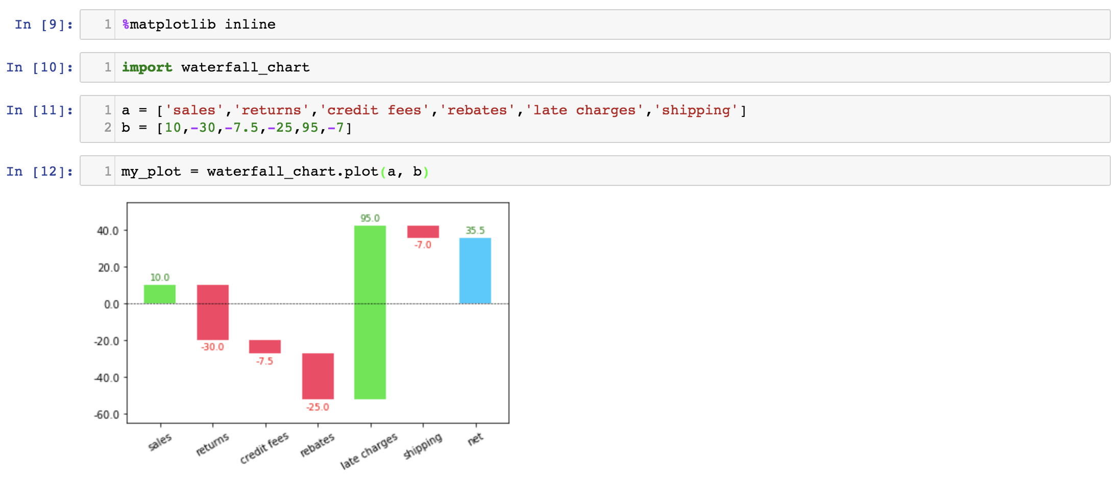
As detailed in the example and source code, the function assumes two list inputs, one of the contribution names and the other of the contribution amounts. Please note that the net sum of all contributions is not an input to the function, and is calculated for you.
import waterfall_chart

a = ['sales','returns','credit fees','rebates','late charges','shipping']
b = [10,-30,-7.5,-25,95,-7]

my_plot = waterfall_chart.plot(a, b)There is currently one function:
plot(): Given two sequences ordered appropriately, of contribution amounts and labels, generate a standard waterfall chart
There are three features:
-
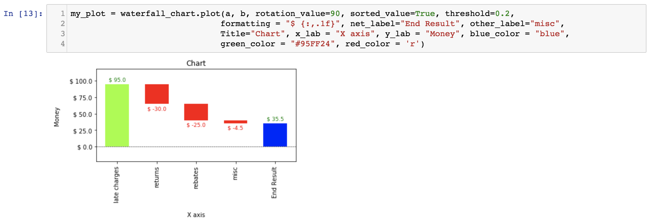
sorted_value: Sorts contributions by absolute value in the chart
-
threshold: Groups all contributions under a certain threshold value into an 'other' group
-
formatting: Formats Y axis labels and bar chart labels to the specified input
Additionally, there are several arguments that control for chart title, axis names, bar colors, custom bar labels for 'other' and 'net', and x label rotation angles
Check out these examples for simple charts.
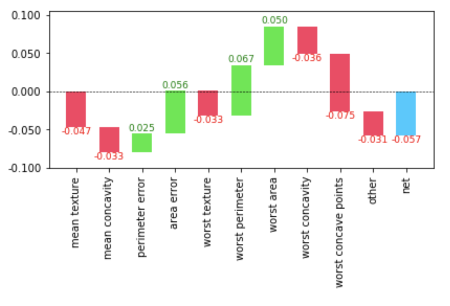
Additionally, the output metrics of a decision tree interpreter can be provided to a waterfall chart. This allows for a visualization of incremental contributions of the tree's nodes to the final prediction - a nice way to see what your random forest is doing. For example, after constructing a random forest on sklearn's breast cancer dataset, we obtain the breakdown of feature contributions to the final prediction for one row of the data. We can use a waterfall chart to intuitively relay this information to an audience. For example, the patient's diagnosis of whether they have breast cancer or not can be visually represented as:
Check out this example for the entire random forest code, built with the fastai library.
Simply install the Python waterfallcharts package:
$ pip install waterfallchartsor upgrade to the latest version:
$ pip install -U waterfallcharts$ python setup.py sdist upload

