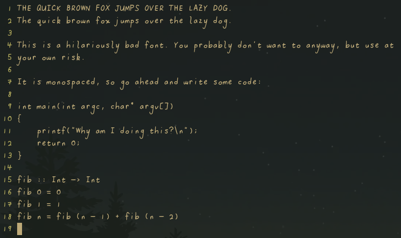
badfont
A project by me using my scanned handwriting to make terrible UI choices.
Why?
Why not?
Inconsistencies in the *.pngs
I have been changing up specs and workflows through out working through the alphabet. Please don't kill me.
Usage
Download the font from the Releases page and... well, install it the way it
works for your system. If on Linux, usually cp badfont.ttf ~/.fonts works.
Line spacing is currently wonky, for example on gnome-terminal set cell height to 1.45x to avoid issues.
Workflow
This font was made by writing on a piece of paper that was then scanned, before
tracing in GIMP using a tablet. The resultant traces (seen in traces/*.png
were imported into FontForge and autotraced using potrace.
GIMP brush settings:
- Brush: 2. Hardness 050
- Size: 9.00
- Aspect ratio: 0.00
- Angle: 0.00
- Spacing: 10.0
- Hardness: 50.0
- Force: 50.0
- Dynamics: Off
NOTE: I swear my handwriting isn't usually this bad, it's the flawed workflow that makes it look this bad. Really...
Disclaimer
Has errors. Does not have many characters. Is inconsistent. Don't use it.
