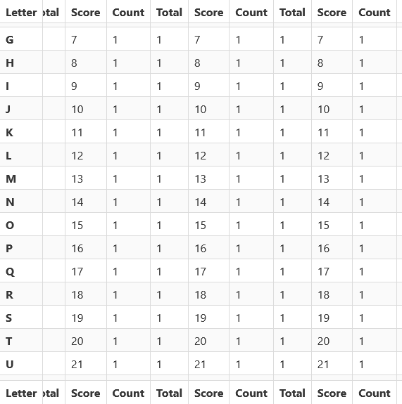
A Bulma-friendly way to stick a table header, table footer, first column, or all three!
Download a release, or grab the code from npm.
npm install @cityssm/bulma-sticky-table
When building your stylesheet, import _sticky-table.scss AFTER you import Bulma.
This will ensure your colour customizations are used.
@import 'bulma/bulma';
@import '@cityssm/bulma-sticky-table/sticky-table';
Alternatively, if you are using Bulma without any customizations,
you can replace your Bulma stylesheet with bulma-with-sticky-tables.css.
<link
  rel="stylesheet"
  href="path/to/cityssm/bulma-sticky-table/bulma-with-sticky-table.css"
/>
Need a CDN? Check out JS Deliver.
Build your Bulma table as per usual, using the Bulma Table Documentation as your guide.
Then, add any combination of the following classes to your <table> tag.
Use .has-sticky-header to stick the header.
- Note that the header should be inside of a
<thead>tag, and each cell should use a<th>tag.
Use .has-sticky-footer to stick the footer.
- Note that the footer should be inside of a
<tfoot>tag, and each cell should use a<th>tag.
Use .has-sticky-column to stick the first column.
- Note that the first cells in each table row should use the
<th>tag.
The Bulma .table-container wraps around a .table to assist with scrolling
around large tables. The basic idea is that the container changes the overflow
CSS rules on the container. This can affect the .table's ability to stick
as you'd expect.
While .has-sticky-column will likely work as expected,
.has-sticky-header and .has-sticky-footer may not. There are two options:
-
Remove the
.table-containeraltogether, and just use the.tableas is with the desired sticky classes. -
Add some additional styles to the
.table-containerto change the vertical overflow rule and set a specific height on the container. The example below uses the screen height. Something smaller may be better, depending on your application.
<div class="table-container" style="overflow-y:auto;max-height:100vh;">
  <table>
    <thead>
      ...
    </thead>
    <tbody>
      ...
    </tbody>
  </table>
</div>Heavily inspired by code found on CSS-Tricks.


