- I am experimenting with manually creating and applying tone curves
to images using R
- There’s a lot I don’t understand about image processing and colour
spaces.
- This code is very inefficient - it’s more of an
investigation/experiment on how to do this
library(tidyverse)
library(magick)
- Start by reading a test image
t <- image_read('https://sipi.usc.edu/database/preview/misc/4.1.04.png')
t
- Convert the image to a dataframe
- Add columns of the red, green and blue pixel values and scale them
to be between 0 and 1
t_tmp <-
  t %>%
  image_raster() %>%
  mutate(col2rgb(col) %>% t() %>% as_tibble()) %>%
  mutate(across(.cols = c(red, green, blue),
                .fns = ~scales::rescale(.x, to=c(0,1), from=c(0,255)))) %>%
  rename(original = col)
A contrast boosting curve
- Create some x-y points that I can then compute a spline curve from
- These points will create an ‘s-curve’ that should darken the darker
tones and lighten the lighter tones (increasing the contrast)
# Curve dataframe (cdf)
cdf <-
  tribble(
    ~x, ~y,
    0.0, 0.0,
    0.2, 0.1,
    0.5, 0.5,
    0.8, 0.9,
    1.0, 1.0
  )
- Create the spline function from the x-y points
- Different spline methods are available - here I’m using
natural
- Create a dataframe of the spline curve at higher resolution for
visualisation
- Clip the curve to be between 0 and 1 (valid values of RGB) as
sometimes the spline smoothing will give values outside the
range of zero to one
# Create spline function sf()
sf <- splinefun(x = cdf$x, y = cdf$y, method = "natural")

# Create a curve to visualise the spline function
curve <-
  tibble(x = seq(0,1,l=100)) %>%
  mutate(y = sf(x),
         y = case_when(y < 0 ~ 0, y > 1 ~ 1, TRUE ~ y))
- Visualise the curve over the scaled RGB distributions for the
original image
ggplot()+
  stat_density(data = t_tmp %>% pivot_longer(cols=c(red, green, blue)),
               mapping = aes(x = value, y=after_stat(scaled), fill=I(name)),
               alpha=0.5)+
  geom_line(data = cdf, aes(x, x), lty=2)+
  geom_point(data = cdf, aes(x, y))+
  geom_line(data = curve, aes(x, y))+
  facet_wrap(~name)+
  coord_equal()+
  scale_x_continuous("Input", breaks = seq(0,1,l=11))+
  scale_y_continuous("Output", breaks = seq(0,1,l=11))+
  scale_fill_manual(values = c(green = "green3", blue="blue", red="red"))+
  theme(legend.position = "none")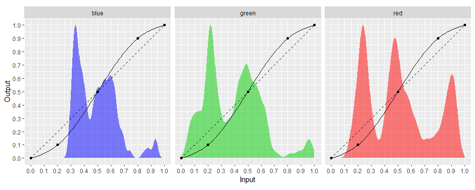
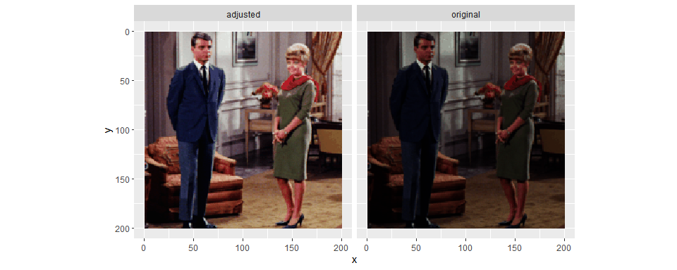
- Apply the spline function to each of the RGB channels
- Also applying the clipping of RGB values to be between 0 and 1
- A different curve could be applied to each of the RGB channels
t_tmp %>%
  mutate(across(.cols = c(red, green, blue), .fns = sf)) %>%
  mutate(across(.cols = c(red, green, blue),
                .fns = ~case_when(.x < 0 ~ 0, .x > 1 ~ 1, TRUE ~ .x))) %>%
  mutate(adjusted = rgb(red, green, blue)) %>%
  pivot_longer(cols=c(original, adjusted)) %>%
  ggplot()+
  geom_raster(aes(x, y, fill=I(value)))+
  scale_y_reverse()+
  coord_equal()+
  facet_wrap(~name)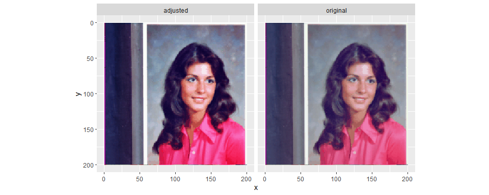
Increasing brightness curve
t <- image_read('https://sipi.usc.edu/database/preview/misc/4.1.02.png')

t_tmp <-
  t %>%
  image_raster() %>%
  mutate(col2rgb(col) %>% t() %>% as_tibble()) %>%
  mutate(across(.cols = c(red, green, blue),
                .fns = ~scales::rescale(.x, to=c(0,1), from=c(0,255)))) %>%
  rename(original = col)

# Curve dataframe (cdf)
cdf <-
  tribble(
    ~x, ~y,
    0.0, 0.0,
    0.1, 0.30,
    0.4, 0.75,
    1.0, 1.0
  )

# Create spline function sf()
sf <- splinefun(x = cdf$x, y = cdf$y, method = "natural")

# Create a curve to visualise the spline function
curve <-
  tibble(x = seq(0,1,l=100)) %>%
  mutate(y = sf(x),
         y = case_when(y < 0 ~ 0, y > 1 ~ 1, TRUE ~ y))

ggplot()+
  stat_density(geom ="area",
               data = t_tmp %>% pivot_longer(cols=c(red, green, blue)),
               mapping = aes(x = value, y=after_stat(scaled), fill=I(name)),
               position="identity",
               alpha=0.5)+
  geom_line(data = cdf, aes(x, x), lty=2)+
  geom_point(data = cdf, aes(x, y))+
  geom_line(data = curve, aes(x, y))+
  facet_wrap(~name)+
  coord_equal()+
  scale_x_continuous("Input", breaks = seq(0,1,l=11))+
  scale_y_continuous("Output", breaks = seq(0,1,l=11))+
  scale_fill_manual(values = c(green = "green3", blue="blue", red="red"))+
  theme(legend.position = "none")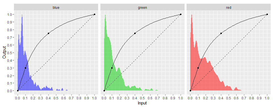
t_tmp %>%
  mutate(across(.cols = c(red, green, blue), .fns = sf)) %>%
  mutate(across(.cols = c(red, green, blue),
                .fns = ~case_when(.x < 0 ~ 0, .x > 1 ~ 1, TRUE ~ .x))) %>%
  mutate(adjusted = rgb(red, green, blue)) %>%
  pivot_longer(cols=c(original, adjusted)) %>%
  ggplot()+
  geom_raster(aes(x, y, fill=I(value)))+
  scale_y_reverse()+
  coord_equal()+
  facet_wrap(~name)