The purpose of this website is to promote an organisation that offers alternative therapy for vulnerable young people through the use of outdoor activities in nature.
A link to the live website is HERE
- Overview
- User Stories
- User Experience (UX)
- Technologies Used
- Testing
- Bugs & Fixes
- Deployment
- Credits & Resources
SafeTree Adventure Therapy is a service offering alternative therapy to vulnerable young people in the community across Ireland.
We are specialised in trauma-informed care, and we create family-focused and goal-oriented experiences in natural environments to build up resilience in young people, improve family functioning and promote long-term positive change.
-
As a visitor who is either a parent or is a professional that works with vulnerable children, and is looking for a service to meet the specific needs of their child/client
- I want to easily be able to navigate the site and be able to quickly find the information I need
- I want to get an explanation of the type of work completed by the service and the methodology behind it
- I want to know the type of environments that the service takes place in
- I want to know if the service is available in my area
- I want to be able to easily make contact with the service and discuss a referral
- I want to be able to easily find the service's social links in order to keep up to date with any additional news or see user reviews/feedback'
-
As a visitor who is a parent/family member/child that has been offered this service by a professional that they work with
- I want to be able to easily navigate the website
- I want to see that the experience will be fun and enjoyable
- I want to get see the environments that we would be exploring
- I want to know what activities we would be doing
- I want to know if the work is one on one or if the whole family is involved
- As a parent, I want to know that the service are professional workers and that my child is safe
- I want to easily make direct contact with the service for any additional questions I have
-
As a visitor that has already visited the website and is returning to reference some information
- I want to be able to immediately access the necessary part of the page to get the information I need
- I want internal links to bring me to the correct part of the page, that is organised clearly with sufficient headings
- I want to information to be legible and clear whether I am on desktop or whether I am accessing on the go from my mobile
This website will be aimed primarily at professionals working with children or parents.
Whilst the service is aimed at children, it is an organisation of skilled, professional workers completing complex trauma-informed work, so it must appear child-friendly, but yet polished and not 'childish'.
- The primary aim of the site is to encourage customers to make contact with our service to discuss a potential case/referral.
- We want to clearly identify our skills as a service in meeting the needs of vulnerable young people.
- The website should have a focus on visually highlighting the environments that adventure therapy takes place in, as this is a key and unique element of the service and is a primary factor that would entice customers to make contact.
- We should have good SEO, so that users searching for 'alternative therapy' or 'adventure therapy' will be able to find our page and read about our service.
- We should make it easy for users to contact us directly and through various means so they can discuss their unique case with us in a format that is most comfortable for them
- We should clearly outline our locations so that users know where our service is in relation to them and where we operate
- We should provide visual aids so that users can get a sense of what adventure therapy entails and the type of environments where it takes place
- We should provide a smooth and uncluttered browsing experience, that is clearly signposted and free of anything that will hinder the users' understanding of our service or ability to make contact.
- Due to the nature of the service, any visuals used must be anonymous and not containing clearly identifiable children/adults
- The site should not contain pricing as it should not present as a commercial price focused on profit and every programme is unique and thus will be uniquely costed.
Considering the strategy of our website and the users' needs as outlined, our website should:
- Clearly outline what our company does, what are our skills as professionals and what is the service that is offered to young people referred to us.
- Provide contact details for making a referral to our service and these should be clearly visible and immediately accessible
- Also include an integrated contact for immediate communication
- Clearly outline where our service operates and provide locations of our office bases
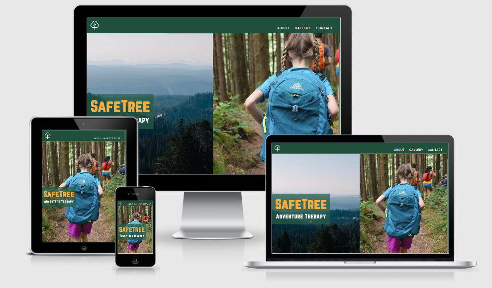
- be fully responsive for mobile use
- Have clearly visible links for the user to each relevant section of the page
- be built using best practices in terms of semantic HTML and accessibility.
The website should split into three areas. Considering the purpose of the website, these areas are of equal focus and priority.
- An Info Section
- This section should clearly outlines what our company does, what are our skills as professionals and what is the service that is offered to young people referred to us.
- A Gallery Section
- A visual presentation of what young people and families expect to experience on our programmes, highlighting the unique environments.
- A Contact Section
- Contact details for making a referral to our service should be clearly visible and immediately accessible
- An integrated contact form for making direct communication from the page itself
The website will be organised into the three sections above within a single scroll-able page.
A single page design works best, as it will allow users the best opportunity to take in each section of content.
This is particularly beneficial for first-time visitors as the information and visual sections both complement each other in terms of content.
The navigation links will allow users to jump to any particular section of the page, particularly for those who know of our service and simply want to make contact.
Following initial testing, I made two significant changes to the original wireframes:
- In landscape/desktop mode I added an additional image to the hero section rather than having a blank section. This worked better with the navbar and was much more vibrant.
- In tablet mode, I did not continue with having two cards next to each other side by side. This did not fit with the text content in the web page. Having larger cards fit the page better, and brought more focus to the photos incorporated in each about section card.
For the title/headings I chose 'Norwester' by Jamie Wilson. The mix of small and large uppercase letters is 'child-friendly' in terms of typography. It has the appearance of being hand-crafted whilst also being reminiscent of old western 'adventure' films, which fits with the theme.
For the paragraph font I chose 'Roboto' font by Christian Robertson. A clean and legible all-purpose sans-serif font.
Primary Colour | #20503C | a dark, mossy green inspired by Ireland and nature
Secondary Colour | #F1AE42 | a golden yellow, to represent sunlight, and offer a good contrast to the primary green and to brighten up the page without being too harsh
White Colour | #F8F8F8 | a softer white colour to prevent harshness in the blank spaces of the page and improve readability

Considering the importance of visuals for this website, I implemented animations into the initial page load.
The navbar animation is likened to the 'opening of a book' to create a more immersive experience on entry to the website - initially prioritising the SafeTree logo and title before bringing the hero image info primary focus.
- HTML
- CSS
- Google Fonts
- Used to import the 'Roboto' font designed by Christian Robertson.
- Font Awesome
- Used to import the social media link icons for the footer section
- Font Squirrel
- Used to import the Norwester font by Jamie Wilson
- Flaticon
- Used to import the main SafeTree icon, designed by Freepik
- Wireframe.cc
- Used for creating wireframes for mobile, tablet and desktop
- Canva
- Used for creating an original design for SafeTree logo and primary font
- SVG Optimizer
- For minimizing SVG path to for use in HTML
- cwebp
- For batch converting images to .webp format using Linux terminal
- jpegoptim
- For compressing and optimising images using Linux terminal
- ImageMagick
- For batch resizing images using Linux terminal
- AutoPrefixer
- For improving CSS compatibility with older browsers
- Grammarly VSCode Extension
- For spelling & grammar checking README
- Regex101
- For testing my telephone input pattern
- Favicon Ico Generator
- For creating favicon.ico from logo
Extensive testing took place on both desktop and mobile to ensure that the page was fully functional, accessible and responsive.
- When the logo in the navbar is clicked it brings the user to the top of the page
- Each of the internal links bring the user to the correct section of the page
- When an internal link is clicked, it brings users to the heading of each section - which is correctly offset to account for the fixed navbar
- The navbar stays fixed at the top of the screen on both mobile and desktop
- Each navbar link is highlighted when hovered over, active or when focused using Tab
- Text is legible and correctly aligned on both mobile and desktop
- When the width of the viewport exceeds the height of the viewport, the about sections switch to rows rather than columns
- This was tested with both chrome dev tools and mobile device in landscape vs portrait
- Each gallery item scales up and has a border when hovered over, active or when focused using Tab
- When clicked, each picture brings the user to the correct, full-size corresponding image
- The size of picture thumbnails loaded adjust for different viewport widths.
- This was tested by changing the specified image loaded at different viewports and adjusting vw with dev tools, to ensure that srcset is working as intended.
- Each input section is outlined when clicked in or when focused using Tab
- Tested that form validation works on every section
- Used regex101 to test my telephone input pattern with Irish numbers (accounting for inputs such as: 0871234567 || 087-1234567 || 087 1234567)
- Tested that submit button only works when all fields have been filled in with valid content
- Tested that email links in the contact details section open up a
mailto:link to correct email
- Each Tested that all links are outlined when hovered over, active or when focused using Tab.
- Tested that each link corresponds to the correct destination
- Tested that each link opens in a new tab
- Use of Chrome Dev Tools to test responsiveness on multiple devices, ranging from simulated Galaxy Fold (280vw) to a simulated 4K resolution (3840vw).
- Ensured text remained visible during webfont load with font-display: swap
- Testing markup on W3C Markup Validation Service
- Testing CSS on Jigsaw CSS Validation Service
- While there were errors produced in the CSS validation service (particularly in the prefixed CSS file) they were solely related to
- A. vendor prefixes
- B. that it could not validate an imported stylesheet (importing google fonts)
- While there were errors produced in the CSS validation service (particularly in the prefixed CSS file) they were solely related to
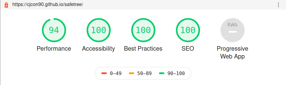
- Testing page with Lighthouse in Chrome Dev Tools to optimise performance, accessibility, best practices and SEO
- Lighthouse highlighted performance issues with images not being resized properly, particularly in mobile, however when I made images smaller as suggested there was a noticeable lack of definition, leading me to choose some minor errors rather than compromise page appearance.
- Lighthouse highlighted that some text was not meeting accessability standards in terms of contrast with background, so I altered the color scheme to ensure full accessibility
- Lighthouse Report (full report in repo docs/lighthouse folder):
- Ran CSS through auto-prefixer, and saved the result as a separate .css file
- Linked HTML to prefixed .css file before pushing to GitHub. Kept the original CSS file for future editing.
- I tested my contact form validation on both desktop and mobile, and used regex101 to test my telephone input pattern with Irish numbers (accounting for inputs such as: 0871234567 || 087-1234567 || 087 1234567)
Bug: Scrolling on mobile was laggy due to large gallery image sizes.
Fix: Used cwebp and ImageMagick to create loops in bash terminal to optimise all images for the website.
- Large resize loop:
for f in * ; do convert $f -scale 30% lg/$f ; done
- Medium resize loop:
for f in * ; do convert $f -scale 20% md/$f ; done
- Small resize loop:
for f in * ; do convert $f -scale 10% sm/$f ; done
- Batch convert files to .webp in each new directory:
for i in {1..20}; do cwebp -q 100 photo-"${i}".jpg -o photo-"${i}".webp; done
Bug: If the page was refreshed after a user had navigated to #about, #gallery or #contact internal links - the navbar animation would take up the whole screen despite not being at the top of the page.
Fix: I altered the animation to make the navbar begin with absolute positioning and then switch to fixed once it had reduced to it's regular size.
@keyframes navbar-start {
  0% {
    height: 100vh;
    position: absolute;
  }
  99% {
    position: absolute;
  }
  100% {
    height: 10vh;
    position: fixed;
  }
}
Bug: Input boxes moved position when adding a border to highlight when they were focused or active
Fix: Added a transparent border to input boxes when not focused or active
Bug: Navbar was going underneath title text when scrolling.
Fix: Made navbar z-index: 100 and then added z-index change to title text during animation:
@keyframes title-start {
  0% {
    top: 60%;
    left: 50%;
    transform: translate(-50%, -50%);
    z-index: 101; /*TEXT STARTS ABOVE NAVBAR*/
    background-color: transparent;
  }

  50% {
    background-color: transparent;
  100% {
    top: 60%;
    left: 0%;
    transform: translate(0, -50%);
    z-index: 99; /*TEXT ENDS BELOW NAVBAR*/
    background-color: var(--color-primary-fade);
  }
}
Bug: when using contact form inputs on mobile, styling would switch to landscape orientation when inputting data
Fix: Following advice on this StackOverflow post, adding min-device-aspect-ratio alongside the pre-existing orientation:landscape media query rule fixed issue and prevented keyboard from altering styles
Bug: Users in the Slack #peer-code-review channel who were using Safari said no images were displaying on the website. It appeared to be a compatibility issue with .webp images
Fix: On examination, my resized .jpg files were actually smaller than the .webp files, and (despite the Lighthouse warnings that I should serve images in next-gen format) were resulting in a quicker largest contentful paint time. Thus, rather than impelment .jpg files as a fallback, I replaced all .webp files with their .jpg counterparts. I also used jpegoptim to compress and optimise all images in the site using this guide to increase page performance even further.
Bug: As the header hero image is sized using 100vh, it can visibly change size on mobile device when scrolling downwards through page as the address bar in the mobile browser disappears (thus changing the viewport height)
Future Fix: Possible fix can be implemented with JavaScript, using window.innerHeight to size the image instead of vh, as per this article by GitHub user chanind
The site is deployed on GitHub pages. The setup involved was:
- Using Git, I pushed all my committed code to my repository at https://github.com/cjcon90/safetree.
- Opened the settings tab in my project repository
- Scrolled down to 'Github Pages' section
- Selected 'main' branch and 'root' folder to deploy to GitHub pages, and pressed 'Save'
- Navigated to https://cjcon90.github.io/safetree/ to view deployed website
- Github Pages deployment is automatically updated with every push
- Project can be downloaded as a .zip file by clicking the green 'Code' button in the project repository and pressing 'Download ZIP'
- Alternatively project can be cloned by entering
git clone git@github.com:cjcon90/safetree.gitin the terminal.
- Horizontal lines before and after section headings was inspired by this StackOverflow post
- Placeholder for
selectelement code found through this StackOverflow post - Using
srcsetto create responsive images of different sizes found on CSS Tricks - Using
nth-child(odd)selector found in this CSS tricks article - Using
padding-topandmargin-topto offset navbar for internal links found in this CSS Tricks article - Creating a loop in bash terminal to batch resize images found in this opensource.com post
- Using cwebp to convert images to .webp format found in this Tecmint post
- CSS Grid Gallery section & setting
html {font-size:62.5%}and usingremunits for responsive sizing both inspired by Jonas Schmedtmann's CSS course on Udemy - Updating site metadata following Open Graph Protocol guide.
- Added custom scrollbar following w3schools guide.
- Creating a
telinput pattern validation, following this StackOverflow post, which I modified to suit Irish phone numbers.
All photos were sourced from Unsplash. Photo & Artist links are as follows:
- Jeremy Chen @jeremychen
- Szilvia Basso @szilviabasso
- Daniel Nainggolan @caspersky123
- Alan Labisch @labisch
- Ben H @roguephoto
- Jaron Nix @jaronnix
- Andreas Strandman @strandman
- Ava Hermann @avahermann
- Todd Trapani @ttrapani
- Daan Weijers @daanweijers
- Vadim Sadovski @vadimsadovski
- John-Mark Smith @mrrrk_smith
- Benjamin Manley @benjaminmanley
- Kelly Sikkema @ kellysikkema
- Greg Rosenke @greg_rosenke
- Markus Spiske @markusspiske
- Wording for about/info sections was assisted by this research article on family enrichment adventure therapy
- My CI mentor for assisting in planning and preparing for milestone-project.
- Anna Greaves & Jim Morel for their respective webinars regarding writing a README and completing Milestone Project 1
- CodeInstitute lessons on user-centric front-end development
- Codeinstitute Slack channel for peer code review
- Jonas Schmedtmann for his advanced CSS course on Udemy, which I completed in September 2020