Hi there adventurer! Thanks for checking out this readme file.
This assessment is based on one of the many awesome projects that we build every day. We are a Shopify agency, so when working on a project like this you would normally code in liquid, working with actual data, template-logic and shopify-logic. For now, we like to keep it basic and test your knowledge on HTML, CSS and (vanilla) JavaScript, Git as working with Shopify and Liquid are things that you most likely will have to learn first.
All the source files you need are in the src folder and will be in the dist folder after compilation. The files in the dist folder will not be committed in the GIT repository, these are only the results of your efforts.
The assignments below describes what needs to be implemented. Don't be afraid to give feedback or mention points or optimizations you come across. The goal for us of this assessment is to get a clear image of how you approach challenges and how you handle them. Keep in mind that code structure, semantics and value for the client are very important in our projects. Finishing everything is not required to pass this assessment but we would like you to finish at least assessment 1 - 6.
- Fork this repository
- Clone from fork
- $ npm install
- $ npm run start
Please make the assessments in order as listed below. In your fork, create a new feature with your name, commit after each assignment and make a Pull Request of your total fork when you're done!
Important: In a real project situation, the order and content of Shopify-sections can be changed by the customer in a Theme Editor. The order of shopify-sections must be flexible.
- In the shopify-section "usp", on mobile it should only show 1 usp per line (<768px).
- In the shopify-section "usp" the icons should be placed (rendered) below the text.
- On the homepage the heading elements (h1, h2, h3) are not in a sequentially-descending order, please fix this.
- Do a lighthouse check on SEO for mobile and fix the issue.
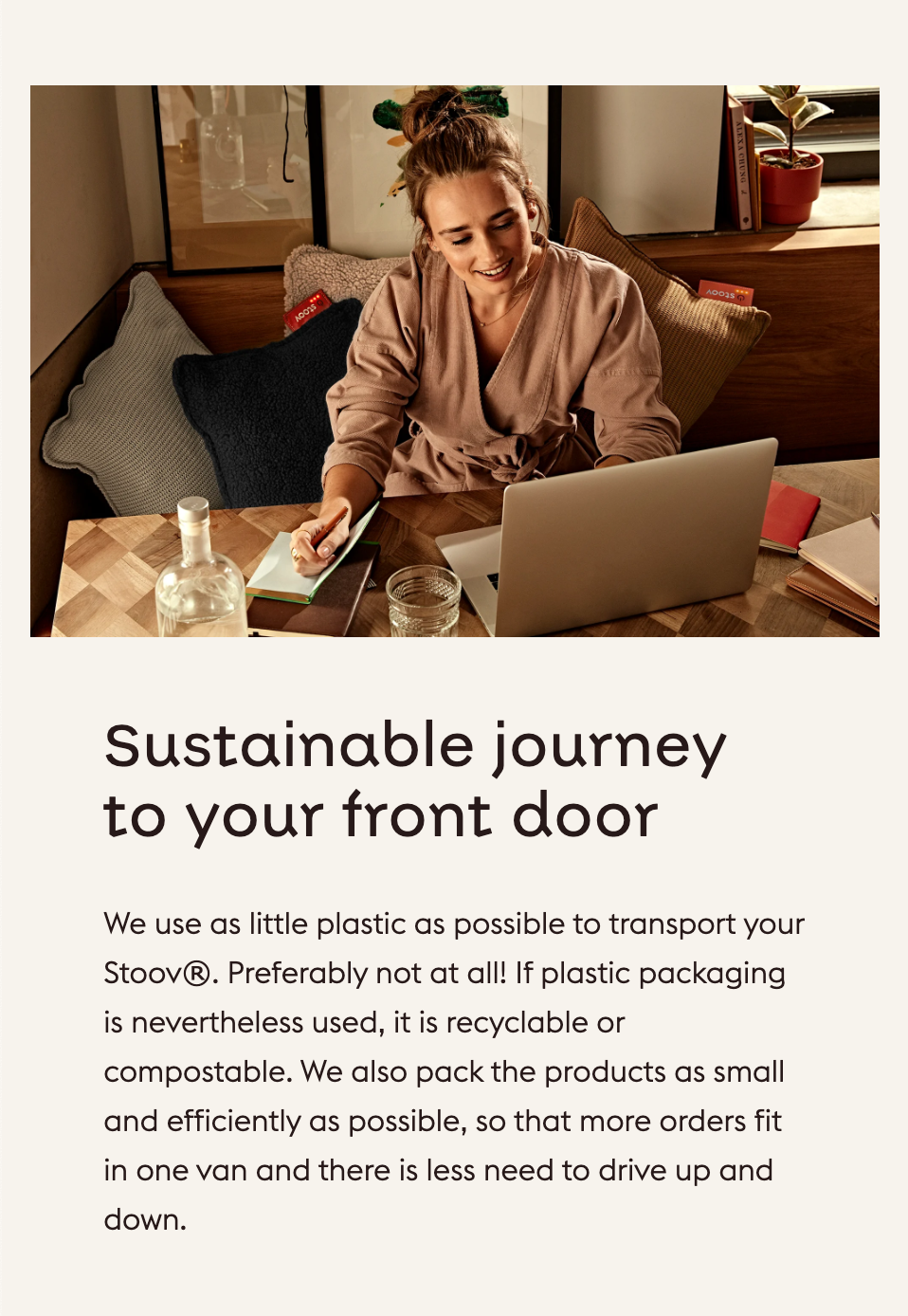
- Create a new shopify-section with a text and image pane. (See Assessment designs). Use this as image. The 2000x1300 in the url can be adjusted to render smaller images and crops.
- The footer navigation shows to much on mobile, make it 3 collapsible panes showing only the headings. Write a simple JavaScript function that will make the panes collapse and open when the heading is clicked.
- In the first shopify-section "Hero Slider", the content should always have enough extra spacing on the top to not show behind header when the slides content expands.
- In the shopify-section "Hero Slider", there is a scroll indicator which now doesn't work. Please make the scroll indicator work by make it scroll the page by clicking on it.
Good luck and have fun!

