Thanks for checking out this front-end coding challenge.
Frontend Mentor challenges help you improve your coding skills by building realistic projects.
Your users should be able to:
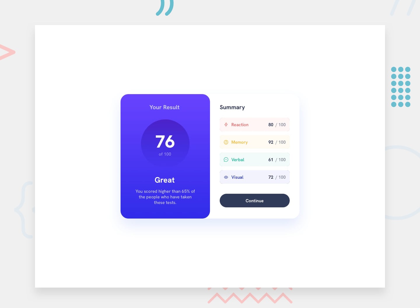
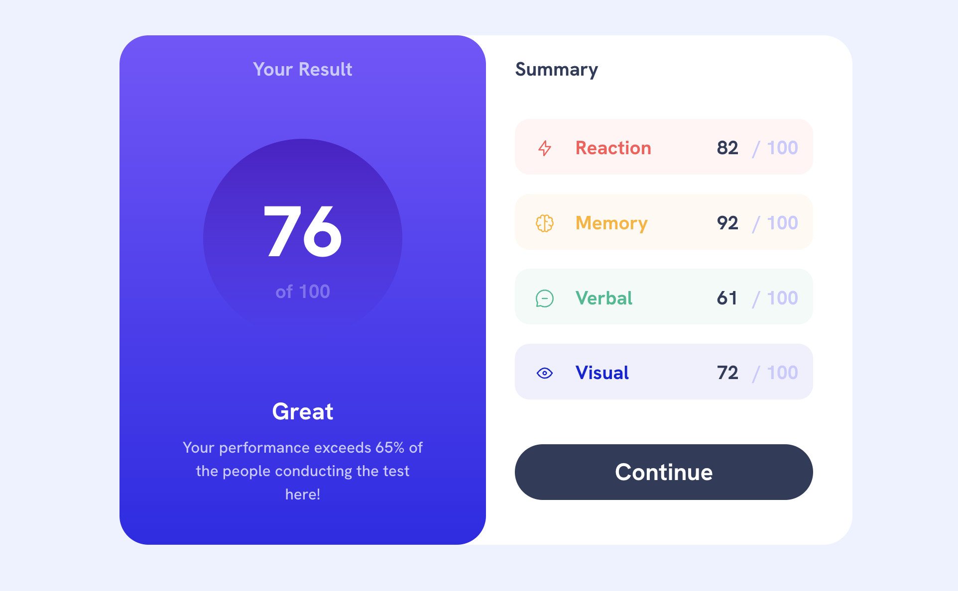
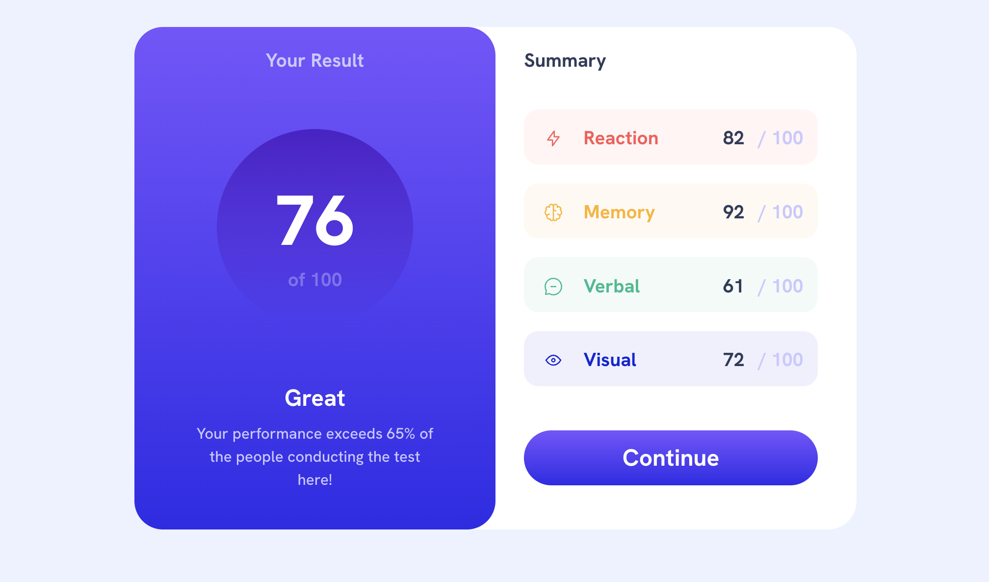
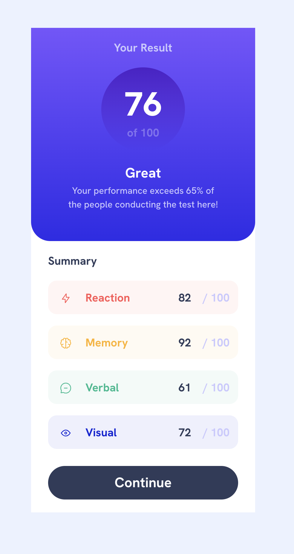
- View the optimal layout for the interface depending on their device's screen size
- See hover and focus states for all interactive elements on the page
- Bonus: Use the local JSON data to dynamically populate the content
- Solution URL: Code on Github
- Live Site URL: Live site on Github Pages
time estimate: 8 hours
My workflow:
- Study Figma file and design guide
- Create Git repo and connect to VSC repo
- Update workflow in README.md
- Copy reset.css file, create styles.css file, create main.js (if nescessary)
- Link reset.css, styles.css and main.js (defer!) in index.html
- CSS
- Build list of variables in :root
- Download fonts and insert font-faces in CSS;
- Create fluid font sizes and spacing with Utopia
- HTML
- Create anchors (main, header, footer)
- Structure content based on the design file
- Put content in sections
- Add CSS classes with BEM notation to the sections
- Develop CSS content for mobile. Work from elements high in the tree to elements lower in the tree.
- CSS Content for other formats
- JS
- Build js
- Test and iterate
- Publish and solve links
- Update README.md
- Figma
- Semantic HTML5 markup
- CSS custom properties
- Utopia fluid CSS system
- JS to fetch and integrate JSON
Workflow improvements To spend time and attention to details Improved CSS selectors Reduced classes in HTML Making fixed design with px;
- Frontend Mentor - @clickglue
This is where you can give a hat tip to anyone who helped you out on this project. Perhaps you worked in a team or got some inspiration from someone else's solution. This is the perfect place to give them some credit.


