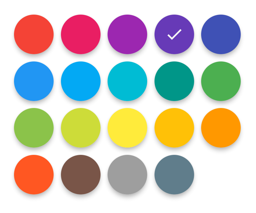
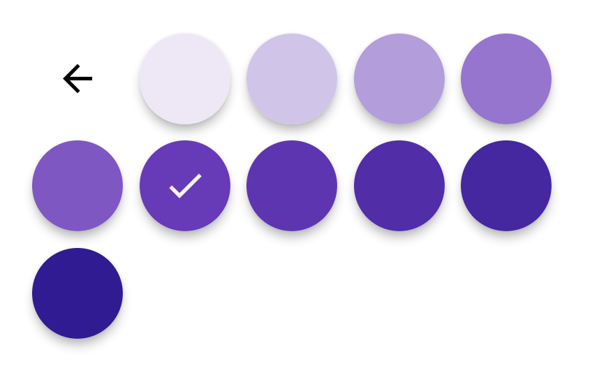
Material Color picker is a Flutter widget, that can be customizable.
By default, it's Material Colors, but you can define your own colors.
You can also use CircleColor widget to display color in your app. Example, you can set the color picker in a dialog and display the selected color in a ListTile, for settings.
This fork fixes a bug where the onColorChange was being triggered after the primary color was selected and before the
shade was selected, making it impossible to detect when a shade was selected. Now it only triggers onColorChange when
there are no shades in use, or when the shade itself is finally selected.
It also detects if there is only one shade (black and white cause this) and does not bring up the secondary shade color
circles (and also events on onColorChange when the primary color with only a single shades is selected).
These examples use a static color for 'selectedColor', but you can use a variable (state)
You just need to add material_color_picker_wns as a
dependency in your pubspec.yaml file.
material_color_picker_wns: ^1.0.8import 'package:material_color_picker_wns/material_color_picker_wns.dart';MaterialColorPicker(
onColorChange: (Color color) {
// Handle color changes
},
selectedColor: Colors.red
)MaterialColorPicker(
onColorChange: (Color color) {
// Handle color changes
},
onMainColorChange: (ColorSwatch color) {
// Handle main color changes
},
selectedColor: Colors.red
)MaterialColorPicker(
allowShades: false, // default true
onMainColorChange: (ColorSwatch color) {
// Handle main color changes
},
selectedColor: Colors.red
)If allowShades is set to false then only main colors will be shown and allowed to be selected. onColorChange will
not be called, use onMainColorChange instead.
In this example, custom colors are a list of Material Colors (class who extend of ColorSwatch). But you can create your own list of ColorSwatch.
MaterialColorPicker(
    onColorChange: (Color color) {
        // Handle color changes
    },
    selectedColor: Colors.red,
    colors: [
        Colors.red,
        Colors.deepOrange,
        Colors.yellow,
        Colors.lightGreen
    ],
)There is two step, first choose the main color, and when you press it, you have to choose a shade of the main color. By default it's all Material Colors, but you can define custom colors, a list of ColorSwatch.
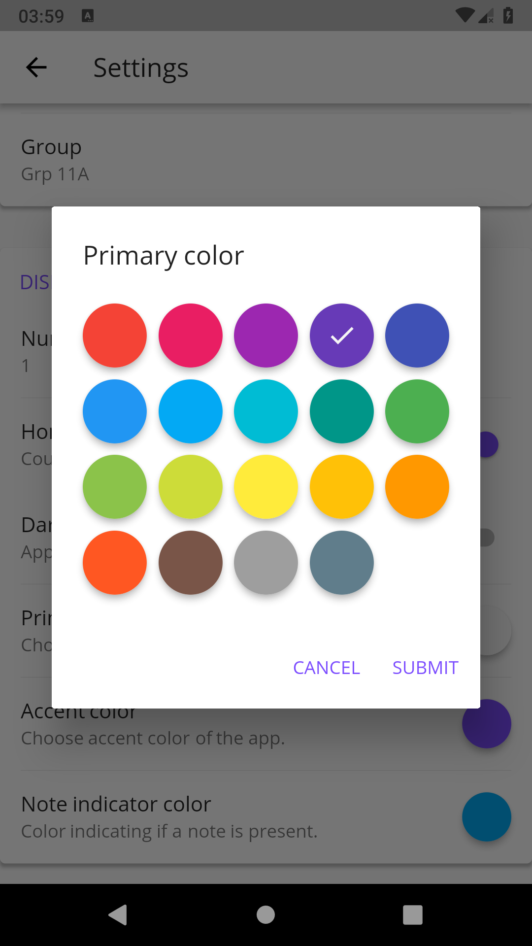
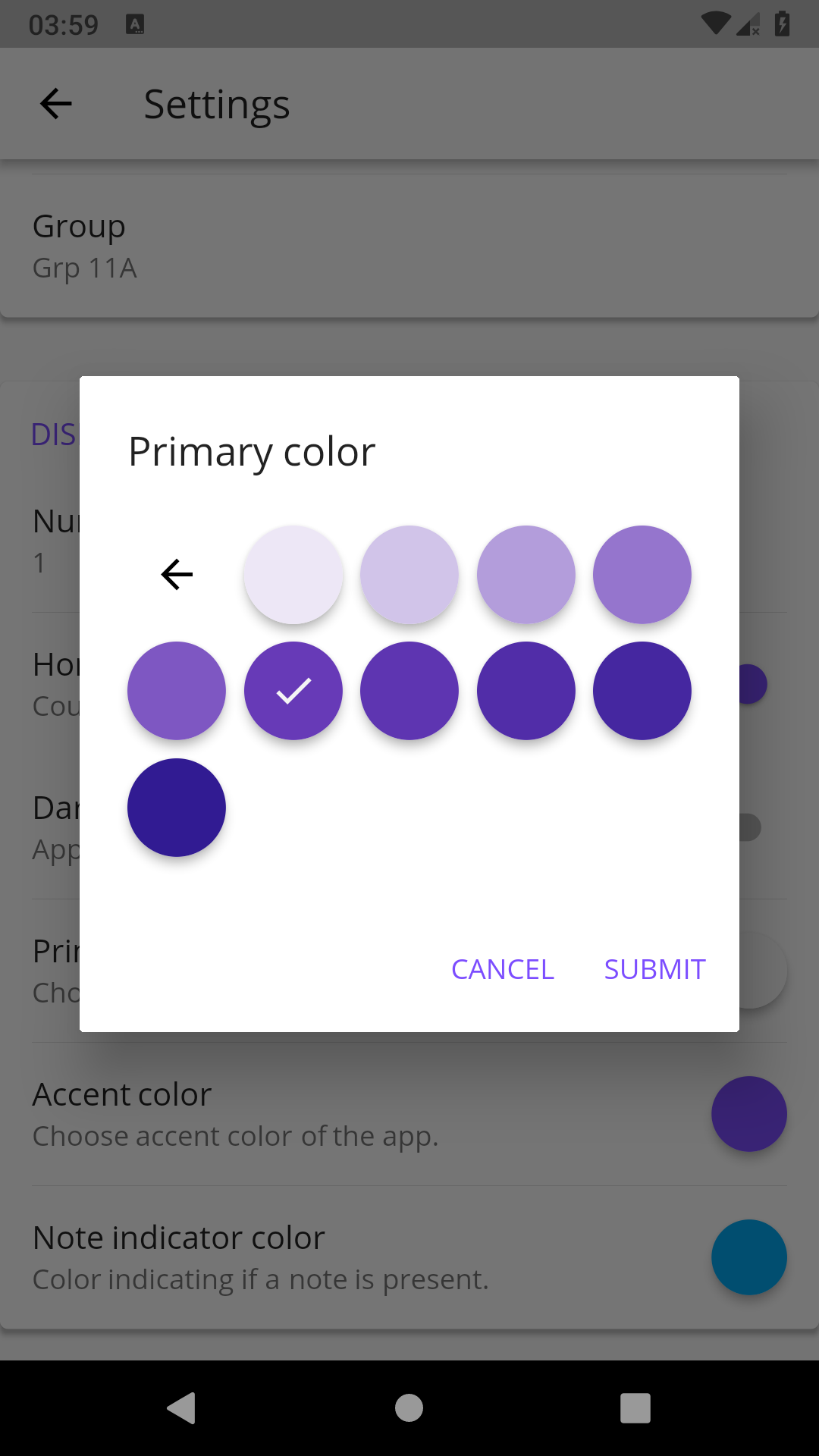
You can insert the color picker into a Dialog
You can use CircleColor widget, to display the selected color into your settings for example.


